In This Section
- Concepts
- Data
- Build
- Style
- Deploy
- Extend
- Skuid Developer Resources
- Skuid and JavaScript
- Skuid and Apex
- Create a Skuid Custom Component
- Dynamic Creation of Models and Components
- CI/CD with Skuid
- Automated Testing
- Reference
- API Reference
- skuid.$
- skuid.actions
- skuid.ajax
- skuid.builder.core
- skuid.builder.core.coreProps
- skuid.calendar
- skuid.collaboration
- skuid.component
- skuid.componentType
- skuid.events
- skuid.formula
- skuid.hotkeys
- skuid.label
- skuid.load
- skuid.model
- skuid.model.Model
- skuid.mustache
- skuid.page
- skuid.sfdc
- skuid.snippet
- skuid.time
- skuid.ui
- skuid.utils
- skuid.version
- Component-Specific APIs
- Skuid Model Metadata Object
- Skuid Model Child Relationship Metadata Object
- Skuid Model Condition Metadata Object
- Skuid Model Field Metadata Object
- Skuid Model Record Type Metadata Object
- Page XML API
- skuid-sfdx
- Skuid Metadata Object Reference
- Skuid Glossary
- Formula and Function Reference
- Open Source Software Attributions
- API Reference
- Site Administration
- Tutorials
- Skuid Page Tutorials
- Add Related Lists with the Table Component
- Build an Activities Related List Tab
- Build a Custom “Create New Record” Page
- Build a Custom Detail Page
- Build a Custom List Page
- Compose a Branded Header and Navigation
- Compose a One-Page App Using Tab Actions and Conditional Rendering
- Conditionally Display Fields
- Create a Custom Clone Page
- Create a Custom “Clone Account” page
- Highlight Critical Data: Wrappers, Rich Text, and Ui-Only Fields
- Mass Create Records
- Show Products in an Opportunity Page
- Skuid Pages for standard Salesforce CRM
- Salesforce Tutorials
- Add Product Line Items to Opportunities with a Popup
- Add Gmail to Salesforce functionality in your email fields
- Create a Custom Edit Page and Set Visualforce Overrides
- Getting Help: Grant Skuid Login Rights to your Org
- Reclaim the Salesforce Home Page
- Redirect to Salesforce Processes
- Skuid for Sales: A Turn-Key Template to Augment Lightning Sales Cloud
- JavaScript Tutorials
- Skuid Page Tutorials
- Legal terms and conditions
- Skuid for Salesforce Evaluation Guide
In This Topic
Navigation
The Navigation component is a layout component used to create custom navigation items that allow users to navigate Skuid apps, go to different web pages, or perform Action Framework actions.
Using the Navigation Component
Navigation is a vital element of a user interface and can guide users through an app, as well as any necessary workflow actions, more efficiently. Use the Navigation component to build custom navigation bars that are intuitive and tailored to unique processes.
In addition to facilitating traditional navigations, the Navigation component can be used to build handy drop-down menus within a Skuid page that are connected to a broad range of actions with the Action Framework.
Manually Add Items to the Navigation
- Drag and drop the Navigation component into a Skuid page.
- Format the Navigation component according to layout and orientation requirements.
- Click the Navigation component in the canvas, then click fa-plus-circle to add new navigation items and then rename them in the property pane.
- To remove an item, click fa-times-circle.
- Format items by clicking them, then editing in the Navigation Properties pane.(Optional)
Add actions to individual navigation items
Select a navigation item in the canvas and click the Actions tab.
Click fa-plus-circle to add a new action. (This defaults to the Go to URL action.).
Select the appropriate action and adjust preferences as necessary.
Note
Multiple actions may be added to a single menu item. Be mindful of actions that may interfere with each other.
Properties
Navigation Properties
Show all sections
Basic tab [[]]
Type: Controls the visual orientation of the Navigation component.
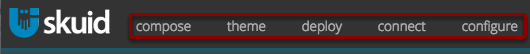
Horizontal: Navigation items align in a straight line from left to right.
- Overflow to Menu Navigation: If true, any navigation items that do not fit within the horizontal navigation—based on screen size—will be placed into a drop-down menu.
- Screen Size to Change Format:
- Never: The navigation component will not respond to screen size.
- Tablets and smaller: Navigation will respond to widths of 1024 pixels or smaller.
- Phones: Navigation will respond to widths of 480 pixels or smaller.
- Alternate Format: Available if Screen Size to Change Format is set to either Tablets and smaller or Phones.
- Collapse to Menu: The horizontal list will transform into a drop-down menu type at the set screen size.
- Wrap Centered: The horizontal list will transform into a vertical menu at the set screen size, with navigation items centered in the navigation menu.
- Menu Icon: Select the icon of the drop down menu (optional).
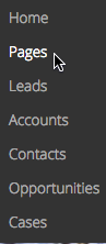
Vertical: Navigation items appear as a list, in straight line up to down.
- Screen Size to Collapse Item Text: At the selected screen size, navigation items will only display their selected icon without the explanatory text.
- None (default)
- Tablets and smaller: Navigation will respond to widths of 1024 pixels or smaller.
- Phones: Navigation will respond to widths of 480 pixels or smaller.
- Allow User to Expand or Collapse with a Toggle: This adds an icon that users can click to hide the vertical list of navigation items.
- Screen Size to Collapse Item Text: At the selected screen size, navigation items will only display their selected icon without the explanatory text.
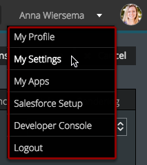
Drop Down: All navigation items are collapsed into a drop-down menu indicated by a down arrow.
- Use Icon: If true, an icon will display beside items in the drop down.
- Label: Creates a custom label for the collapsed drop-down menu.
Item Source: Choose the source of navigation menu items.
- Skuid Platform:
- Manual
- User Menu
- Apps
- Skuid on Salesforce:
- Manual
- Salesforce Tabs for Current App
- Salesforce Apps
- Salesforce Apps with Tabs
- Salesforce User Menu
- Skuid Platform:
Note
Other than Manual, all options automatically populate menu items.
Scroll Tall Drop Downs: If true, scrolling will be enabled within drop-downs that are taller than 50% of the browser window.
Advanced tab [[]]
- Unique Id (optional): Skuid automatically generates an alphanumeric Id for the component; if preferred, give it a practical name.
- CSS Class (optional): Assign a CSS class to the component’s DOM element.
Styles tab [[]]
You can add custom CSS values to change the appearance of the NAvigation component..
- Click fa-plus-circle Add New Custom Attribute and enter:
- Custom CSS property
- Custom CSS value
Need to remove a custom style attribute? Click fa-times-circle next to the newly-added attribute.
Rendering [[]]
Standard conditional rendering options are available.
Navigation Item Properties
These properties control the behavior and look of the individual navigation items within the Navigation component.
Show all sections
Basic tab [[]]
- Label: The text that appears within each navigation item. Used to indicate where the navigation item will take the user or what the item will do when clicked.
- Icon: A unique visual element that appears next each navigation item. Used to indicate where the navigation item will take the user or what the item will do when clicked..
Actions tab [[]]
Customize the actions taken when a user clicks a navigation item.
Add actions by clicking fa-plus-circle.
Note
Navigation items default to the Go to URL Action Type, but this property, Associated URL, and Open URL in can be changed in Properties Pane.
Rendering [[]]
Standard conditional rendering options are available.