Spark Update 2 Release
Here’s what we’ve been up to lately.
Heads Up!
As of the Spark Update 2 release, we are officially deprecating IE11 support for v2 components at runtime. Building v2 pages in IE11 also remains unsupported.
Improvements
DSC-30 - Affects v2
Display Logic for Style Variants
Conditionally apply style variants to components and some component elements, like Navigation items and individual buttons.
If you’ve ever wanted a button to change to a warning color because of unsaved changes or a Text component to change font size because a field value exceeds a specified value, then this is the feature for you!
Style variant conditions can be found in the Display Logic tab in the properties pane for components and elements.
Create rules that determine when the style variant will be applied.
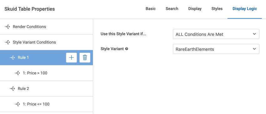
Don’t have any style variants? Create style variants in the Design System Studio.
DSC-956 - Affects v2
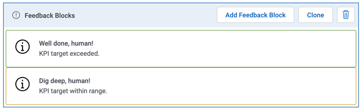
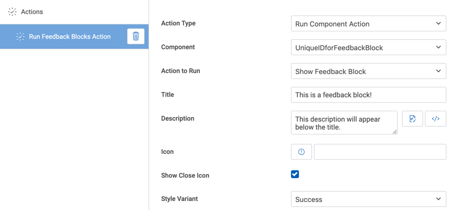
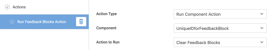
Message Area component and actions
The Message Area container displays messages with icons and text/model data. Assign style variants to communicate the intent of the message with color, size, spacing, and fonts.
Add messages by triggering a component action in the Action Framework.
Clear messages by triggering a component action in the Action Framework.
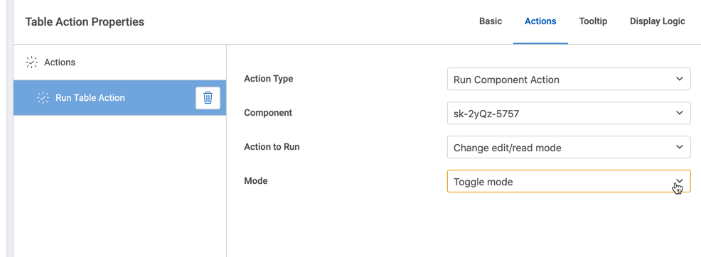
DSC-966 - Affects v1 and v2
New Component Action to toggle the mode (read, edit) of a Table component
Use the Action Framework to set a Table component’s mode to read, edit, or toggle from the current state to the other.
CORE-1592 - Affects v1 & v2
Create an action sequence from an interaction
Interactions allow users using a Skuid app on a mobile device to trigger action sequences from specific touch-specific actions such as a swipe or a press.
Actions set within an interaction can now be converted into an action sequence.
DSC-721 - Affects v2
Conditionally Render Filters
Apply conditional rendering to individual filters in the Table, Filter Set, List, and Deck.
DSC-780 - Affects v2
Reorder Filters in a Table Component
Now, drag and drop filters in a Table component into the desired order.
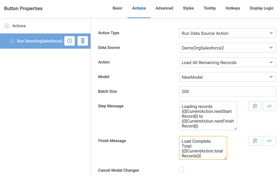
DS-64 - Affects v1 and v2
Data Source Action for Loading All Remaining Records
Now, use the Action Framework to load additional records into a model. The action allows the batch size to be specified. Configure a “step message” which appears after the completion of each batch. Configure a “finish message” which appears when all remaining records have been loaded into the model.
CORE-473
New models use the most recently selected data source as their defaults
Previously, we would assume that each new model should have Salesforce selected as its data source (when working with Skuid on SF), or SkuidLocal selected as its data source if working on Skuid Platform.
Now, each new model will select the most recently selected data source as its default. Selected Dynamics on the last model you created? The next model you create will default to the Dynamics data source.
To ensure that the composer adopts this behavior, clear your browser’s cache.
CORE-2365
New formula functions: DATE_ADD and DATE_DIFF
Working with dates can be a complicated process, so we’ve added two new functions to simplify things:
DATE_ADD is used to take a source date, add a specified amount of time to it, and return a new date. For example, you could add fifteen minutes, two weeks, five months, and so on.
DATE_ADD( {{MyDate}}, 1, WEEK )
You can even subtract time from a date by using a negative integer with the formula.
DATE_DIFF is used to calculate the difference between two dates. You can find out how many minutes, weeks, months, and so on between two dates—whether a specific date or the current date—with this function.
DATE_DIFF( {{MyDate}}, {{MySecondDate}}, DAY )
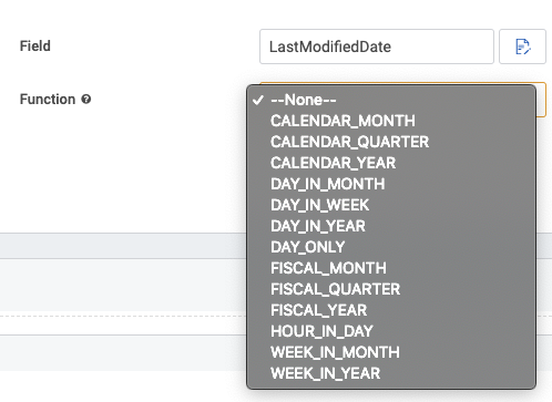
CORE-2319
Parse portions of date and datetime fields within Salesforce model conditions
Previously, filtering on date and datetime Salesforce fields could be tricky. If you wanted to filter to records created on specific days or in specifics quarters, you would often need two models, with UI-only formulas, and some crafty knowledge to get what you needed—and sometimes not even that would work.
Now, you can use date formula functions to parse specific portions of those date-related fields.
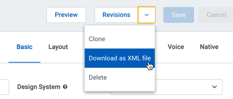
DSC-955 - Affects v1 and v2
Download a page as an XML file from the composer
A new action in the composer downloads the page as XML.
In v1, the new action can be found in the dropdown menu on the button labeled More Page Actions.
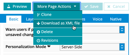
In v2, the new action can be found in the dropdown menu on the button labeled Revisions.
DSC-629 - Affects v2
Disable and/or hide progress indicator buttons
Previously, there was no way to hide or disable the clickable progress indicator step buttons in a Wizard component.
Now, it’s possible to both disable the progress indicator step buttons (and then conditionally enable them as needed) or simply hide the entire indicator.
CORE-2329 and CORE-2331 - Affects v2
New styling properties in the Design System Studio
For the Text component:
- Text transform (converts text to uppercase or lowercase)
- Letter spacing (the spacing between text characters)
For the Navigation component, under Nested Components:
- Assign a style variant from the Button nested component to the Navigation’s Collapsible Menu Navigation properties.
- Assign a style variant from the Button nested component to the Navigation’s Dropdown Type properties.
- Collapsible Menu Navigation and Dropdown Type properties allow you to create a navigation experience better suited to mobile pages.
For the Vertical Navigation component:
- Apply styling - like border, color, text size, and more - to the section item(s), not just to the action items
Note
If you have applied a style variant to the Vertical Navigation component before this release, then you may need to go the Vertical Navigation component in the DSS and apply styling to the Section Item of your style variant. The style of the section and action items are now configured separately, so the styling of the section and action items may not match after this update.
DSC-840 - Affects v2
Wrapper component supports entering custom heights
The open text field for custom height (in the composer, Wrapper Properties > Styles > Height/Scrolling > Height Strategy: Fixed height > Custom) allows you to define the value of the Wrapper’s height.
You can even input CSS functions, like calc(), into the open text field.
DSC-886 - Affects v2
Data components show a warning badge when no model is attached
Now, data components will display a warning if there is no model connected to that data component. A friendly reminder that the data component needs data.
DSC-902 - Affects v2
Render dependent picklists as buttons
New option to display the items in a dependent picklist as buttons. In the field properties for a dependent picklist field, select Button Group from the field’s Display As property and you’ll see a group of buttons instead of a picklist at runtime.
DSC-919 - Affects v2
Render reference fields as picklists
Reference fields may now be rendered as autocomplete fields and as picklists.
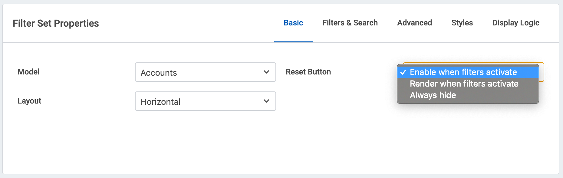
DSC-937 - Affects v2
Reset button in Filter Set
A new property for the Filter Set component gives you control over when and how Reset buttons appear next to filters at runtime.
You can choose to always display the Reset button or only display the Reset button when the filter is in use. You can also choose to not display the Reset button at all.
DSC-421 - Affects v2
Range of rows can be selected with Shift + Click
Previously, end users had to click each individual row they wanted to mass edit on the Ink Table component.
Now, we’ve introduced Shift+Click functionality to select multiple rows. Selecting one row and then holding the Shift key while clicking another record multiple rows down in the Table will select all rows between the first clicked row and the next clicked row.
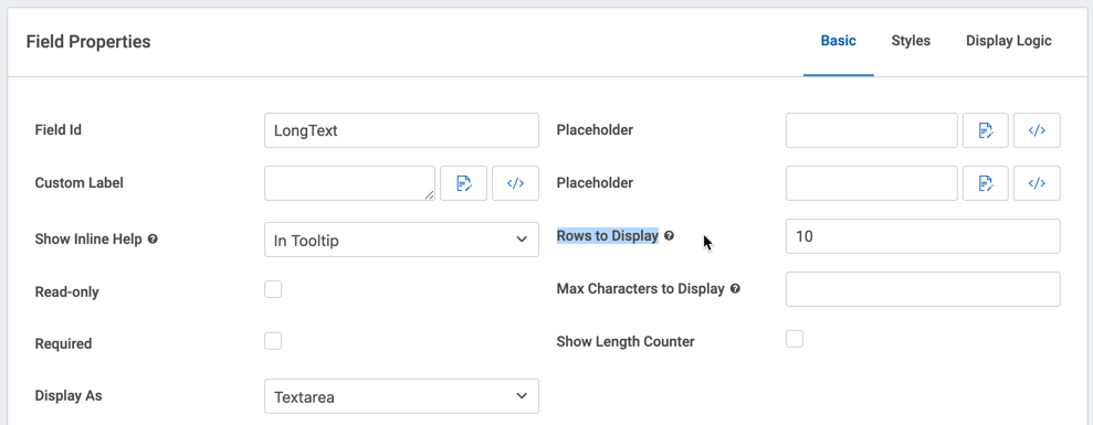
DSC-1016 - Affects v2
Property for text area fields in the Form component
Now, the number of rows for a text area field to display may be specified in the field properties of the Form component.
DSC-1046 - Affects v1
Mode of components within a Calendar popup now determined by property instead of event source model
We’ve made some changes to the way our Calendar component works. The Calendar component has a popup displaying event details whenever an event is clicked within the component. Previously, the Allow Editing of Events property set the mode for components nested within that popup to edit. When unchecked, this popup would simply show the event’s detail in read-only mode.
However when working with a custom popup, things got complicated. With a custom popup, it’s possible to show data from other models within the popup, which users may want to edit. It’s also possible to set the Default Mode property of components—which should control the mode they are displayed in. However, regardless of the nested component’s default mode or model, it would always yield to the Allow Editing of Events property’s setting. Confusing.
To prevent this confusion, we’ve changed the Allow Editing of Events property into Event Popup Mode, which has more predictable options**:**
- Read: All components within the popup will display in read-only mode, regardless of source model or component mode properties
- Edit: All components within the popup will display in edit mode, regardless of source model or component mode properties
- Per-component: All components will display in the mode selected in their Default Mode property.
Note that components will always yield to the data source permissions the end user has related to an object. End users that previously did not have access to an object still cannot edit those objects within Skuid.
DSC-1106 - Affects v2
Standard browser conventions for Go to URL actions on component interactions
Previously, component interactions using the Go to URL action didn’t expose standard browser conventions for links, such as the right-click dropdown menu, or ctrl-click for opening the link as a new tab.
Now, any component interactions using the Go to URL action will respond with standard link conventions.
DSC-1118: Affects v2
Ability to switch a filter’s input from a picklist to an autocomplete text entry
A new property, Switch Filter to Autocomplete at X, items allows filters to change how the end user selects a filter option.
If a filter is configured to display options as a picklist, then the picklist will switch to an autocomplete textbox if the length of that picklist exceeds the value of the property.
For example, if the Switch Filter to Autocomplete at X items property is set to 25 and a picklist has 50 options available to display at runtime, then the filter will render as an autocomplete field instead of a very long picklist.
CORE-1796
Performance improvement for Skuid models using metadata caching
For Salesforce data sources with metadata caching enabled, Skuid will not generate metadata requests to Salesforce if the necessary metadata for a Skuid model is already stored in cache. This performance improvement boosts page loads by reducing network traffic.
CORE-2447
Per-Page and per-theme/design system loader service caching
Improvements to the way Skuid caches page XML, themes, and design systems gives the loader service the ability to granularly select which resources require loading to the cache whenever that resource is modified. Bottom line: the composer should load a little bit faster!
CORE-2381 - Affects v1 and v2
Browser Caching for Static Files
Static files, like those for a Custom Component Pack, files uploaded to Skuid Platform, and v1 Themes, now load in the browser with a modstamp. The modstamp ensures the browser loads the current version of a static file, rather than potentially serving up a stale version of that static file.
CORE-2328
Page support files no longer needed to to include inline code in Skuid pages
Previously, Skuid stored inline JavaScript code and inline CSS within a Salesforce static resource known as a page support file.
Now, page support files are no longer needed for inline resources. Any inline code will run as expected.
Orgs with page support files will continue to work as expected. However, if users want to remove the unnecessary files from their static resources, Skuid has created a Page Support File Remover tool that will attempt to find any page support files and remove them.
CORE-2384: Affects v1 & v2
Improved error handling when assigning licenses and permission sets in Skuid Settings
We’ve improved error handling when using Skuid to manually or automatically assign licenses and permission sets. Previously, Skuid would group some errors under a generic error message which alerted you to a problem, but was not as specific as it could have been. Now, troubleshooting license and permission set assignment errors will be easier with better error message handling.
DSC-983 - Affects Spark v2
New JavaScript API for creating a modal
Create a modal from a JavaScript snippet by using the new skuid.utils function: createModal(). See the updated API reference docs for more details.
DSC-1000 - Affects v2
Picklist fields support additional usability affordances
Now, picklist fields now allow an end user to type ahead to a selection. For example, typing in ‘T’ on a picklist for states will jump down to ‘Tennessee’.
Also, picklist fields now retain a selected value when switching the field to edit mode.
For example, if the state value is ‘Tennessee’ and the field is toggled to edit mode, then the value of ‘Tennessee’ will be highlighted in the list of states.
Fixes
CORE-2275: Affects v1
Error when saving dates for end users with a locale of Thailand assigned to their user settings in Salesforce
Previously, an end user - with a locale of Thailand in their Salesforce user settings - would not be able to save records with a date field because a format error would occur.
Now, the format error for the Thailand locale is fixed and records with date fields will save for users with the Thailand locale.
CORE-2295 - Affects Spark v1 and v2
PostgreSQL field type of Money no longer breaks Skuid models
The field type of Money in PostgreSQL databases is a string combining numeric values and currency signifiers. This combination of character values breaks the Skuid model.
Now, Skuid interprets the Money field type as a text value. This allows the data in the field to be correctly displayed by components attached to the Skuid model.
If you need to run calculations on the Money field, then consider changing the field to a numeric field type in the PostgreSQL database.
CORE-2297
Address models persisting within Page Include components
Previously, users may notice that some Skuid models would persist within a Page Includes model list—as seen in skuid.model.map()—even when the Page Include would navigate to a new Skuid page.
Now, we’ve plugged some of those leaks, ensuring fewer models remain in the client as the user navigates between pages.
CORE-2301 - Affects v1
Unable to specify max height property of option list for manually created filters
Previously, if configuring a filter’s option source and conditions manually, then the property for setting the maximum height of the option list would not appear, even though the Maximum Height (Optional) would appear for filters with automatically generated options and conditions.
Now, manually and automatically configured filters enjoy the use of the same Maximum Height (Optional) property for the dropdown option list.
CORE-2339 - Affects v1
Select a specific data source within PostgreSQL type when overriding field metadata
Previously, when trying to override field metadata to reference a field in a PostgreSQL data source, the reference setup would allow a user to select PostgreSQL as a data source type, but wouldn’t update the data sources list to show PostgreSQL data sources that are configured.
Now, the data sources list will update as expected.
CORE-2351 - Affects v2
REST models within Page Includes do not save in v2
Previously, if a v2 Page Include loaded a page with a REST model, any changes to that model could not be saved at runtime.
Now, end users may properly save REST models in a v2 page at runtime, even if they exist within a Page Include.
CORE-2388
Record selector modal for reference fields now uses entity/object labels for modal title
Previously for Salesforce data sources, the record selector modal for reference fields in data components would display the object name instead of the object label.
For SQL data sources, the record selector modal for reference fields in data components would display the schema name instead of the entity label.
This would cause confusion when users where unfamiliar with the object or schema names and had only seen the object or entity label in previous interactions.
Now, the correct labels display in the title of record selector modal.
CORE-2398 - Affects v1 and v2
Trying to load a page with an aggregate model containing only grouping fields results in a page problem
Previously, aggregate models that only contained groupings would cause page errors within the App Composer in some instances.
Now, we’ve resolved that issue, and page problems will no longer appear in this scenario.
CORE-2399
The same icon set is sometimes requested twice
Sometimes Skuid would send duplicate requests for icons, even if they were already cached. This was most evident on pages with Page Includes or in Lightning pages.
Now, we’ve fixed that behavior, so you may see performance improvements and cleaner network request logs.
CORE-2403
Address timeout issues when using OData and Microsoft Dynamics data sources
Previously, Dynamics end users were seeing frequent timeouts. This was due to the way Skuid attempted to refresh authentication tokens forOData-based data sources.
Now, we’ve freshened up our token refreshing, and users should see far less logouts.
CORE-2406
Related Name fields on reference fields not being saved
Previously, adding a reference field’s Name field and clicking Save would not save the related Name field. This was due to an issue with the way page changes were registered.
Now, we’ve ensured that related name fields are considered page changes, and thus gets saved as an added field when builders click Save.
CORE-2408
File Upload Component now correctly updates metadata with record Ids for Sharepoint 365 data source types
Previously, uploaded files may not have received the record’s unique Id. This meant that uploaded files would not be linked with related records.
Now, uploaded files to a Sharepoint 365 data source will have the expected record Ids populated.
CORE-2427: Affects v1
Client-side sorting fails on reference fields
Previously, client-side sort would fail if the field was a reference field. This meant that checking the Allowing Sorting box on a reference field in a Table component would produce no result at runtime when an end user attempted to sort that column.
Now, client-side sort works for reference fields.
CORE-2443 and 2444 - Affects v1 & v2
Warning message for using pages of the opposite API version in the Page Include component Any users using the Page Include component to insert a v1 page in a v2 page, or vice versa, will now get the following error when they open those pages:
Including pages of different API versions is not supported. Doing so may result in unexpected behaviors and page errors.
If a page attempts to load a page of the opposite API version through a Page Include component at runtime, then errors will appear in the console.
DSC-417 - Affects v2
Data source-specific display methods now render in v2
Skuid has custom logic for some of its pre-configured data source types to allow for more intuitive display of some fields. For example, Salesforce picklists that are dependent on record types require additional logic to render properly.
Previously, these renderers—known as display methods in v2—would not work in Ink components.
Now, we’ve adjusted v2 components to properly render data source-specific display methods.
DSC-876 - Affects v2
Graceful exit after editing data in radio buttons, picklists, and Button Groups in Forms
After editing a field rendered as a radio button, picklist, or button group, click out of the field to toggle the field back to read mode. This design choice removed the necessity for button or an icon to toggle read mode.
Previously, radio buttons, picklists, and button groups in the Form component would toggle to edit mode, but would not toggle back to read mode.
DSC-910 - Affects v2
Fields in read-only mode in the Form component now apply the style set in the Form’s Read Mode section in the design system.
Previously, the style set for fields in read mode in the Form component failed to apply.
Now, the style set in the Design System Studio under the Read Mode section of the Form component correctly styles the field.
DSC-933 - Affects v2
Reordering tabs in a Tab Set component no longer requires an extra click before dragging the tab into place
Previously, the first click on a tab in a Tab Set would update the Properties Pane with the properties of that tab. Then, a second click on the tab would be required before dragging the tab into a new location.
Now, click and drag the tab into place within the Tab Set component.
DSC-940 - Affects v2
Show Modal action in the Action Framework no longer throws an error when attempting to launch the modal builder
Previously, clicking on the modal builder button in the Show Modal action of the Action Framework would result in an error - preventing the configuration of the modal.
Now, the modal builder launches as expected.
DSC-944 - Affects Spark v2
User-defined Style Variants in the Design System Studio are now added to the skuidtheme.css file
Previously, custom Style Variants would fail to load as expected because the styles were being loaded from the incorrect resource.
Now, user-defined Style Variants will load from the correct resource and display on the page.
DSC-948 and DSC-952 - Affects v1 and v2
Improvements to styling for pages in Lightning Experience
Previously, you may have seen a slight misalignments - for example, a ~4px misalignment between icons and text.
Now, checkboxes and other user interface elements of Skuid components now align properly with labels and text
DSC-953 - Affects v2
Style variants not applied to Charts
Previously, style variants created in the Design System Studio would not apply to Chart components at runtime; only the default style would be applied.
Now, style variants created and applied to charts will work at runtime.
DSC-999 - Affects v2
Mysterious Delete Button No Longer Appears after Successful File Upload to a REST Data Source
Previously, the delete icon would appear next to the upload button in the File component after a file successfully saved to a REST data source.
Now, a rogue delete icon no longer shows itself in the File component.
DSC-1031 - Affects v2
In the composer, child Items in the Navigation component inaccessible after page refresh
Previously, child items of parent items in the Navigation component could only be added and accessed up until the page was refreshed. After a page refresh, the child items could not be accessed and new child items could not be added to the Navigation component.
Now, add and edit child items, as needed, and not just the first time they are added to the Navigation component.
DSC-1039 - Affects v2
Filters with manually created source options work with property switching option list to autocomplete
Filters with manually generated source options and with any value specified in the property, Switch Filter to Autocomplete at X Items, would generate errors on the page.
Now, the filter property works for filters with manually created source options.
DSC-1048: Affects v2
For composers with the Dark design system, the “Value” label in the condition builder was camouflaged
Previously, those who prefer dark design systems would be unable to see the “Value” property label when configuring a model condition because the property label font color matched the dark background color.
Now, the dark design system for the composer is better than ever.
DSC-1053 - Affects v2
Show/Hide Menu Action Now Correctly Reads Row Context
Previously, the Show/Hide Menu action would only read the row context for the first row in a data component.
Now, the Show/Hide Menu action will correctly pick up the row context of all rows in a data component.
DSC-1060 - Affects v2
Record-type dependent picklists are not updating when record type is changed
Previously, record-type dependent picklists were not correctly updating if the record’s type was changed.
Now, the picklists correctly update after a record’s type has been changed.
DSC-1070 - Affects v2
Long picklists behave unpredictably
Previously, if a picklist exceeded the length of the page, the user’s attempts to access the picklist options what were further down the list resulted in unintended scrolling or jumping.
Now, long picklists on short pages behave more predictably.
DSC-1085 - Affects Spark v2
Read-only Property on Fields in the Form Component Now Works as Expected
Previously, a field marked as read only in the field properties of the Form component will remain editable at runtime.
Now, the read only property for fields in the Form component will be applied at runtime.
DSC-1093 - Affects v2
Create New Row(s) ignores Edit mode setting
Builders reported that, when setting a new action to Create new row(s), with Have associated components initially show this row in … set to Edit mode, the new row did not open in edit mode.
Users either had to double click the row, or click the edit icon to enter edit mode. Builders needed to add additional actions to the button that included the Create new row(s) action to ensure the correct edit mode when the row is created.
Now, Skuid respects the mode set in the Have associated components initially show this row in … property.
DSC-1096 - Affects v2
Nested Wrappers and incorrectly rendered child wrappers
Previously, a nested Wrapper in the composer would sometimes render as a property element from the parent Wrapper. This prevented changes from being made to the child Wrapper. At runtime, the nested Wrappers would render correctly.
Now, you don’t have to wonder if a nested Wrapper will be replaced with a property element in the composer. The nested Wrapper will render correctly.
DSC-1100 - Affects v2
Style variants not working on components included on Deck component cards
Previously, components displayed within a Deck component’s cards were not adhering to text style variants set in the DSS for that component but were instead reverting to the default text style variant.
Now, components within a Deck component adhere to their configured style variants.
DSC-1107 - Affects v2
Clicking/typing does not overwrite text in autocomplete field
Previously, when Select Option filters switched to autocomplete mode, the cursor moved to the end of the text that was already in the entry field. Typing therefore added new content to whatever value was already in the field.
Now, Select Option autocomplete’s behavior parallels that in v1: clicking the autocomplete field highlights the text in the entry field and overwrites it as the user types.
DSC-1134 - Affects v2
Button Sets connected to models will not display in the canvas
Previously, connecting a v2 Button Set to a model could result in this error:
There was a problem initializing a component of type skuid__buttonSet: r.getFirstRow is not a function
Now, connecting Button Sets to models does not result in an error.
DSC-1141 - Affects v2
Design System Studio now compatible with Firefox
Previously, designs created by the Design System Studio could not be edited while using the Firefox browser.
Now, designs will open in the Design System Studio in the Firefox browser.
DSC-1146 - Affects v2
Superfluous “id” attributes removed from page XML
Previously, the composer would, in limited cases, add additional id attributes to XML elements. This would generate errors at runtime.
Now, unnecessary id attributes will not appear in page XML.
DSC-1147 - Affects v2
Clone, Cut, and Copy keyboard shortcuts do not work in the App Composer
Previously, these keyboard shortcuts didn’t work in the App Composer.
Now, all three function as expected.
DSC-1154 - Affects v2
Conditionally-rendered v2 Page Includes are not loading
Previously, v2 Page Includes did not display, even when the display logic conditions were met.
Now, when display logic conditions are met, the v2 Page Include component displays on the page.
DSC-1159 - Affects v2
Table component would not accept fields dragged from a model
Previously, if a Table component did not contain at least one field, it was not possible for a builder to drag and drop any fields into the component—drag-and-drop did not function, and fields needed to be added using the Fields pane.
Now, the Table component allows the builder to drag and drop fields into the Table.
DSC-1167: Affects v2
Scroll bars no longer cover the slider in the last field on a Form component
Previously, if a field in a Form component within a Wrapper component was rendered as a slider and that field was the only field or the field at the bottom of the form, then a scrollbar would overlay the slider - rendering the slider useless.
Now, the Wrapper will not apply a scrollbar to the slider field in the Form component and the end user will be able to set the value on the slider without interference.
DSC-1173 - Affects v2
Unable to create or edit a v2 page in the App Composer
Previously, when creating opening a page in the App Composer, builders would receive an error message and the page would not load:
There was a problem initializing a component of type skuid__pageBuilder: (l || []).find is not a function
This occurred with both new pages, and when opening existing pages.
Now, Skuid pages open as expected.
DSC-1174 - Affects v2
Resolved the issue of the vanishing Add button in the Elements Pane
Previously, when switching from a tab in the Elements Pane that does not contain an “Add” button, like Components, to a tab in the Elements Pane that does contain an “Add” button, like Models, the “Add” button would disappear.
Now, the “Add” button will remain in its designated area.
DSC-1240 - Affects v2
Bug fixes for Responsive Grid and for v2 pages
Previously, the Responsive Grid component would sometimes render incorrectly in the composer. Also, if a page’s default design system was deleted, then that page may fail to load in the composer.
Now, the Responsive Grid component will render correctly in the composer and pages with a deleted design system will default back to the Ink design system.
DSC-1271 - Affects v2
Removing a field from a model may not work consistently under certain circumstances
Previously, if you attempted to remove a field from a model that you recently added, then the field may still appear after the page is reloaded.
Now, removing a field from a model will work even if that field had been recently added.
DSC-1281 - Affects v2
Changes to a page’s design system will now be immediately reflected in the composer for that page
Previously, if a change was made to a design system, then a page that was already open within the composer would not reflect the design system change until a browser refresh.
Now, a change in the design system will appear immediately in any open page using that design system.
DSC-1286: Affects v2
Some buttons on the canvas of the composer did not reflect the assigned style variants of the page’s Design System
Previously, Button Sets, button groups, and some buttons on components would not display in the canvas with the style variant assigned to them. This made it appear that a style variant had not been applied to that button when, in fact, a style variant applied and would appear at runtime.
Now, assigning a style variant to a Button Set, button group, or other buttons on components will change the appearance of those buttons in the composer.
o improve the v2 Table component’s sticky header, we changed the value of the CSS element position to sticky. While most browsers support this change, IE11 does not.