What’s New in Spark Update 3?
Glad you asked! Skuid builders told us what they wanted—and we listened. Skuid’s Spark Update 3 offers new features that make it easier to both learn—and use—Skuid.
The Grand Tour
If you’re new to Skuid and wondering what to do after you install and launch the product, we’ve got you covered. Just take the new in-app guided tour to get hands-on with Skuid.
Learn basic concepts and build your first page—all in less than 5 minutes. The tour walks you through creating and configuring a model, adding and customizing a Table component, then previewing the finished product.
To access the tour: from the Skuid navigation bar, click Help > Basic Resources, then choose Take the Tour.
Launch Skuid from Lightning
Builders told us that accessing Skuid from Lightning required several steps, so we fixed that. Now you open Skuid from Lightning’s App Launcher with just a single click—and once you’re in Skuid, there’s no Lightning Header. That’s right: Skuid in Lightning now has more “browser real estate” for you to work with.
Power up the Admin Experience
Skuid builders spent a lot of time outside the App Composer: organizing pages; creating data sources; managing and editing users; assigning subscriptions; and configuring SSO. So we redesigned the Admin Experience to make it clearer and more intuitive.
The reimagined data source creation flow allows you to edit and view the data source’s authentication provider while creating the data source. Plus, with an improved UI, each tab in the Admin Experience has been made more user friendly, helping you find what you need, when you need it.
We’ve also consolidated the Themes (v1) and Design Systems (v2) into one tab (Design Systems) for easier management, with icons to quickly differentiate v1 (blue) from v2 (green).
Finally, check out the new Help tab that includes links to documentation, the Skuid community, Skuid Learn, sample pages, and our handy Basic Resources page (Skuid Central)—plus more.
New in the Builder’s Toolbox
Two new App Composer features make the Builder experience much more streamlined and flexible.
- Ever been working on a Skuid page, made a modification, and then wished you could just undo it? Well, now you can! The App Composer’s new Undo and Redo buttons let you undo (or redo) the last action taken when working with page components. These buttons also work in the Models, Action Sequences, and Javascript tabs in the App Elements pane.
- On a complex page, it can be hard to find that one specific modal or button you need to modify. But not any more: the Page Index is a handy feature that displays page elements in a hierarchical outline. Use a search bar to find the specific element you need by name or type, click it, and Skuid navigates to that element on the page. (Yup. It’s just that easy.) Locate components, buttons, fields, tabs, modals, drawers and much more using the Page Index.
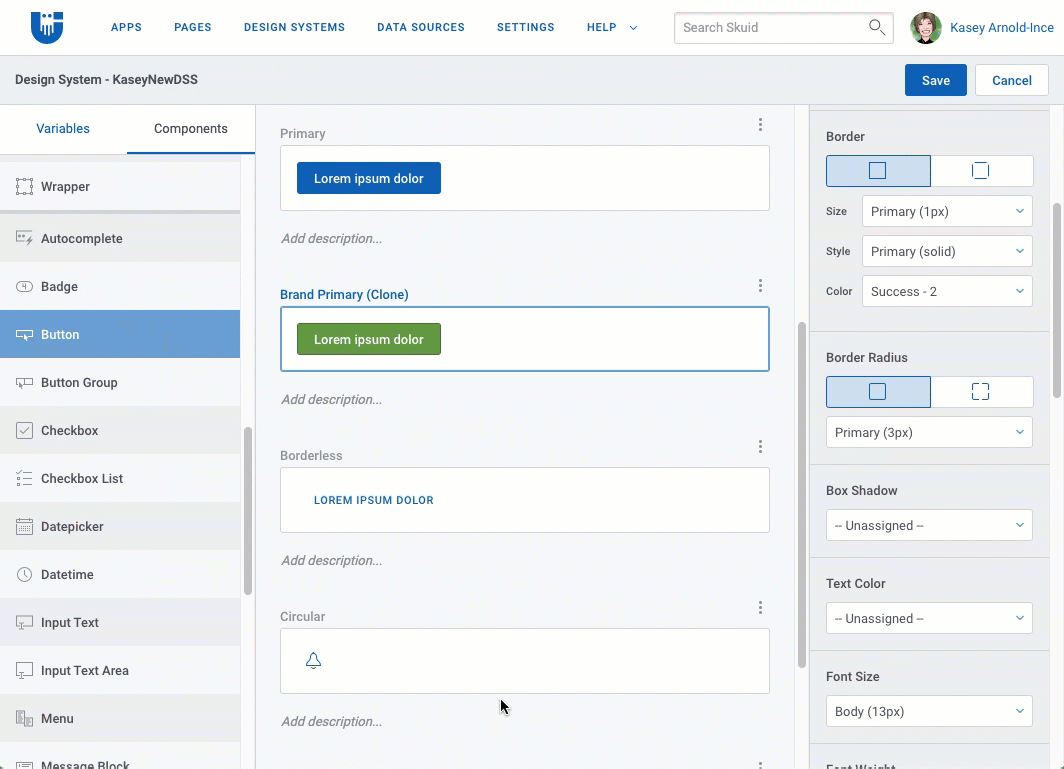
Express Yourself with the DSS
Skuid’s Design System Studio gives builders the ability to customize the look and feel of pages to a highly granular degree. So, how do you make a great feature even better?
- Provide the option to either clone a DSS style variant or create a child from it. Clones are copies that have no linked relationship with the variant they are copied from; child variants are linked to the “parent” variant, and inherit changes made to the parent variant.
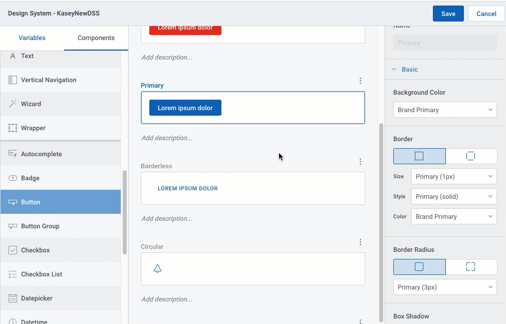
- Builders told us they liked the fact that they could set corner rounding for various components and elements—but they wanted to do it individually for each corner. So we made that possible.
- Include new properties that exercise more control over how date and numeric range filters—and vertical filters—are displayed in a Filter Set.
- Add more properties that govern fonts, borders, shadows, spacing, and colors to the Form, List, Table, Wrapper, Input Text, Input Text Area, and Tooltip.
More Functionality for Components
We’re ensuring that v2 components have all the handy features of their v1 counterparts—plus a few nice v2-only enhancements.
Accordion components
- Determine the default state for accordion sections: open when the page loads—or closed. You can select a state for the entire Accordion, or select states section-by-section.
- Also: easily move sections up or down within the Accordion with the Change Order property.
Button components
- Add a new property for Button Group that consolidates multiple buttons into a dropdown menu for a clean, uncluttered page.
Filter Set component and Filters
- In the new Layout section of the Filter Set’s Styles tab, you can now set both the alignment and justification of the filter within the Filter Set to better control how filters display.
- There are also new options in the Styles tab for Filter properties. Control the width and spacing of the filter within the Filter Set.
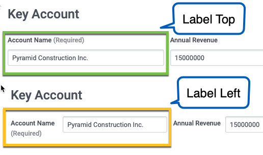
Form components
Ever wanted to control where the field’s label displays—above the field, or to the left of it? Well, now you can: new Field Layout properties let you place a Form’s field labels to the left of the field, and adjust their size.
Modals and Sliding Panels
Modals can now be customized in several ways:
- Adjust the size of the modal or display the modal full screen.
- Choose to display a header (with a Title embedded in it) in the modal. Or go header-free—it’s your choice.
- If desired, display buttons in the modal’s footer and set the alignment of those buttons.
If builders can set After Close Actions for Modals, why can’t they do the same for sliding panels? It was a good question, so now both component accessories have After Close Actions.
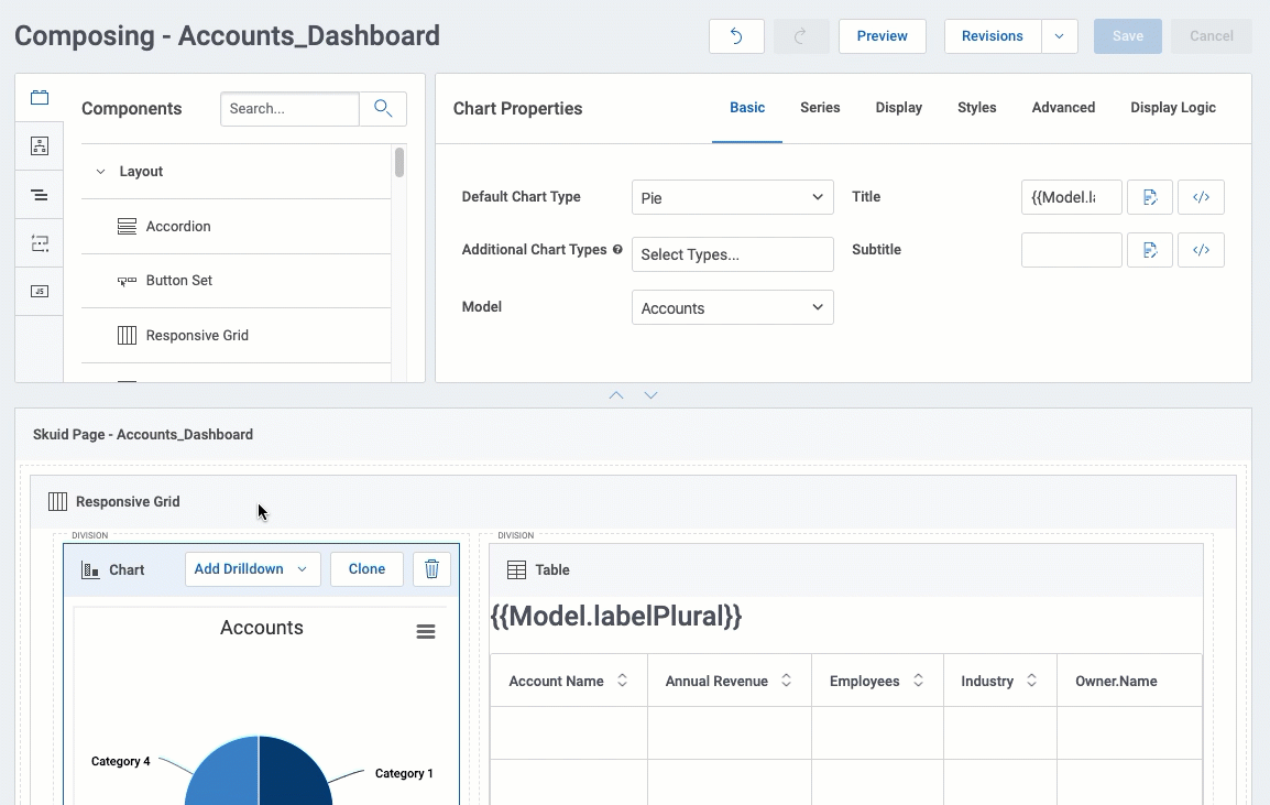
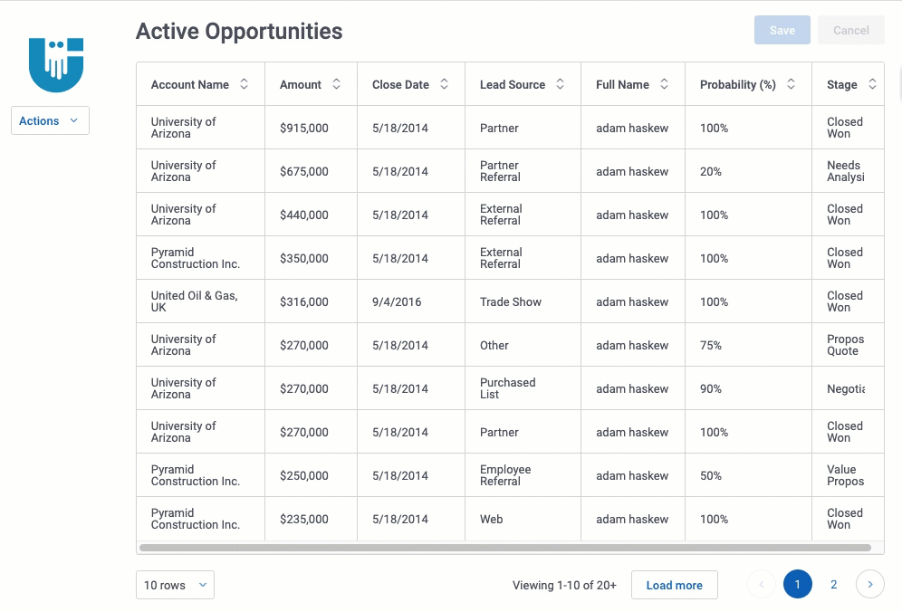
Table components
- Specify how many columns on the left side of the Table to freeze—and then give users the ability to adjust the number of frozen columns in runtime using either Table Settings or by dragging a “freeze bar.”
- Allow users to show or hide columns on a field-by-field basis.
- Set whether a designated column is shown or hidden by default.
- Display error messages right next to the field.
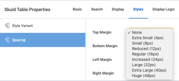
Component variants
When adjusting a component’s variant from the Styles tab, it can be hard to know what “Increased” or “Regular” really mean. Now, style variant menus include unit of measurement values alongside the variant name:
Behind the scenes
In addition to adding functionality to components, Skuid Spark Update 3 includes the following updates:
- Personalization data now persists even after changes are made to a Skuid page using (for example) filter states.
- The new Action Framework action Logout lets users log out of an instance of Skuid on either Salesforce VisualForce or Lightning Experience.
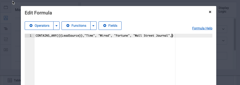
- We’ve leveraged the UI-Only formula editor to provide a consistent experience everywhere formula editing is available in Skuid (including branch, and other actions that use a formula to return values).
- Sometimes when users are mass editing within a Table Component, they need to be able to indicate that some fields in the row do not need to be updated in the Mass Edit popup. These fields should be left blank, or left with the current value. Now, the Mass Edit popup indicates where there are multiple (different) values for fields in a row, with an edit link that allows users to decide what kind of action they want to take on each field.
- With Spark Update 3, Skuid now supports the use of all Lightning Workspace API methods in both v1 and v2 pages. This allows builders to write code that can programmatically manipulate workspace tabs to close, refresh, get the currently focused tab, and so on—using Skuid code.
Sample Pages in Github
We completely reworked our publicly available Github resources.
We added new sample pages, updated existing pages, and removed less relevant pages. We added or rewrote the explanations and instructions for these resources to make them easier to find, understand, and install.
Now, finding a resource to help you get started or learn a new technique is simpler and easier than ever before.
For the first time, we added design systems to our Github repository. If you want to see what Material Design would look like as a Skuid design system, now you can!