Using Fields
Creating a model to call and hold content is only the first step to accessing the content in an external service’s data object. With some Skuid components, you need to indicate which of the object’s fields to display.
How do fields fit into the picture?
- Most objects collect records related to a specific data category or topic, for example, business contacts, a company’s accounts, technical service cases, a folder of business documents and spreadsheets.
- Records are related information about a single entity within that object: a specific company in the list of accounts; an individual contact; a single service request.
- Fields are pieces of data that have specific values. Collectively, records contain one—and usually more—fields. A particular contact record, for example, has name, address, and phone fields containing values for that contact. A record for a different contact has the same fields, but the values for name, address, and phone are different.
Field Origin
Some objects have predefined fields—fields that are standard (and in many cases cannot be deleted from the object). Even if a field is predetermined by the database’s schema, builders are not required to use it in their Skuid pages.
Custom fields are builder-defined within the object and usually created to address specific data needs. (These fields can be deleted from the external object.)
Field Types
Depending on the external service, the model will have access to the fields types such as the following:
- Picklist fields and multi-select picklists
The Salesforce data source type [[]]
When using dependent picklists with the Salesforce data source type, be sure to include the controlling field in the model.
- String fields
- Date and datetime fields
- Number/integer, and currency fields
- Address and phone fields
- Text and textarea fields
- URL fields
- Boolean fields
- and many more …
Specialized fields
In addition to standard fields like those indicated above, Skuid uses the following specialized field types:
Reference fields
Reference fields (sometimes called “lookup” fields) represent a relationship between different objects. For example, individual contacts, opportunities, or service requests are usually associated with a client company; that company has a record in the account object. So, an accountID field included in a contact, opportunity, or service case object connects those objects to the record for the associated account in the account object. That accountID field the contact object is a reference field: it “references” the account’s record in the account object.
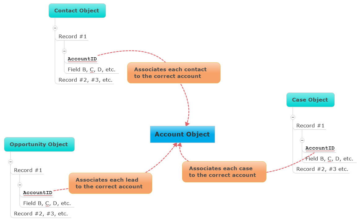
Because reference fields provide a list of values from other objects, users can access and select from those values at runtime. For example, a user adding a contact can click the new record’s empty Account field and start typing; Skuid autofills from the list of available accounts. (Users can also click the magnifying glass within the field to see a modal listing all account values, and select the correct account there.)
Reference fields also allow builders to:
- Add search capabilities within the field, which allows end users to search for content from within the model.
- Use the reference field as a link to the referenced record’s detail page.
- Create filters to limit the searched and returned content from reference fields.
- Use display logic to determine conditions under which the reference field values display.
Template fields
Template fields—much like the Template component—provide a way to display text or HTML alongside field data. Template fields are “containers” that allow builders to combine two (or more) fields into a single field entity using merge syntax. This saves space, and can also be used to establish relationships.
For example, to create a column in a table that displays both the record’s creator and the date created (two separate fields) in that single column, add a template field to the table that displays CreatedById and the CreatedDate fields, separated by a comma and a space: {{CreatedById}}, {{CreatedDate}}.
Template fields can be useful for:
- consolidating address fields into a single (template) field
- incorporating html into display fields
For additional information, see the Text component topic.
Adding template fields
Add template fields to a Table or Form component from the Add fields dropdown on the component.
Note
You can only select fields that are already included in the model.
Then adjust the Template’s properties:
Use the field picker on the Template property to select fields to combine within the template. The fields selected display in the property surrounded by double curly brackets
{{field selected}}.- Make any spacing adjustments (add spaces, dashes, or commas).
If desired, modify the field’s Label. This will re-name the field label (or the column heading in a Table component).
Template fields in runtime
Users can double-click on a template field to open a popup where they can see the fields the template includes and edit them (if applicable).
Using HTML in fields
When the Allow HTML property is checked, any HTML markup within the field value will be parsed and rendered per the markup.
This can be useful for introducing paragraph formatting in large text fields, or templates that include combinations of fields using merge syntax, such as a mailing address:
<p>{{Name}}</p>
<p>{{MailingStreet}}<br>
{{MailingCity}}, {{MailingState}} {{MailingPostalCode}}<br>
{{MailingCountry}}</p>
It’s also possible to use this feature for other, more advanced HTML elements.
Warning
While using custom HTML can allow for powerful customizations, it can come with risks. Custom HTML can result in unexpected behaviors. If you do use custom HTML, test your pages thoroughly in a sandbox environment after each Skuid update.
UI-Only Fields
UI-Only fields (“user interface-only”) are builder-determined “container” fields for “as-needed” data. These fields work with values that are input by users in runtime, values that result from data queried by the user, or values predetermined by the builder.
Think of UI-Only fields as “temporary”: the data in UI-Only fields is not stored in a data object, and if the page is refreshed, the data in a UI-Only field does not persist.
To learn more, see UI-Only Fields and Models.
Field Metadata
Metadata is data about data, information that describes the data itself. Think of field metadata as a kind of “summary” of what the field’s data is. Every field has standard metadata properties. Learn more in Field Metadata Overrides.
Properties
Fields
(Just need to look up a property? Try going directly to the Property Library.)
Field properties
Once fields are added to the Table or Form component, each has a specific set of properties. These properties vary, depending upon the component and field type. Click on the field within the table to reveal and edit its properties.
General tab [[]]
Field ID: The API name of the selected field.
Show inline help (Available on Form components): Determines how Skuid displays any help text associated with this field, whether through its metadata or a field metadata override.
As help icon tooltip: When selected, a help icon appears beside the field’s label. Hovering over the icon causes the tooltip to appear and display the help text.
Tooltip position: Determines where the tooltip containing the help text appears in relation to the icon/field.
Note
Skuid attempts to render the help text in the selected position, but if this is not possible due to height/width constraints at runtime, the help text may render in a different position.
Tooltip style: Determines which style variant to use when the tooltip is displayed.
Tooltip compact size: Determines whether to use the options specified in the Compact section of the chosen tooltip style variant, which have smaller line height, font, and padding settings by default.
As underline tooltip: When selected, the field’s label is underlined to indicate a tooltip is available. Hovering over any part of the label causes the tooltip to appear and display the help text.
Tooltip position: Determines where the tooltip containing the help text appears in relation to the icon/field.
Note
Skuid attempts to render the help text in the selected position, but if this is not possible due to height/width constraints at runtime, the help text may render in a different position.
Tooltip style: Determines which style variant to use when the tooltip is displayed.
Tooltip compact size: Determines whether to use the options specified in the Compact section of the chosen tooltip style variant, which have smaller line height, font, and padding settings by default.
Below label: When selected, help text appears directly beneath the field label. The help text is always present and can’t be dismissed.
Hidden: No help text is displayed.
Label/Custom label: The name for the field (or template field). Replaces default field label with custom text. Use the field picker to select a field to use as the column label.
Note
This feature lets you choose another field’s name and re-label the column with it, to shorten or clarify the column’s identity or purpose for users.
Placeholder: Text or prompts that appear inside editable sections within the component. Commonly used to provide instruction for more complex field requirements, this field is compatible with merge syntax.
Read-only: If checked, text fields are read only and cannot be edited by users. This setting does not persist across Skuid pages.
Note
Skuid automatically respects the validation rules and field-level security from your data source.
Required: If checked, text input is required.This setting does not persist across Skuid pages and will not override existing data model settings within the data source.
Note
Skuid automatically respects the validation rules and field-level security from your data source.
Clip heading text: If checked, if a column’s heading text exceeds the size of the column, the text is truncated (with ellipses indicating additional content.)
Horizontal alignment: Adjusts alignment of text or value within a field to left (default) or right.
Display as: Determines how values are entered in Edit mode.
Text (String fields): Renders the field as text.
Password (String fields): Renders the field as a password, with the content hidden by asterisks.
Picklist: (Reference fields) Renders the reference field options as a picklist: a dropdown menu of selectable options.
Radio: (Picklists fields) Renders the field as radio buttons.
Note
For multi-select picklists, Skuid renders a multi-select list of checkboxes instead.
Button Group: (Picklist fields) Renders the field as a set of buttons.
Combobox (Picklist fields): Renders the picklist field options as a combobox, a text box in which user entry triggers a dropdown menu. As users type, the menu narrows available options. Users can also access the dropdown using the combobox’s menu selector ().
Enable autocomplete: When enabled, available options are filtered and suggested to the user based on what they’ve entered in the field. Selecting an option then places that value in the combobox.
Skuid searches for the user’s input across the entire value, so values do not have to match exactly. For example, inputting
Example Valuewould matchFirst Example ValueandDifferent Example Value
Date (Date-time fields): Renders the field as a date.
Datetime (Date fields): Renders the field as a datetime.
Autocomplete: (Reference fields) The default for reference fields, this renderer tries to autocomplete entries based on the options available for this field.
Checkbox (Boolean fields): Renders the field as a checkbox.
Switch (Boolean fields): Renders the field as a toggle switch.
Custom:
- Display method: Sets a custom display method defined in JS snippets.
Numeric field types have different field renderer options:
Number: Renders the field as a number.
Slider: Allows the user to enter the value as a position on a slider.
- Minimum value: The starting numerical range for the slider.
- Maximum value: The ending numerical range for the slider
- Step: The increments used in the slider.
Stepper: Allows the user to enter the value via an entry box with “+” and “-” handles to increment or decrement the numeric value
- Minimum value: The starting numerical range for the stepper.
- Maximum value: The ending numerical range for the stepper
- Step: The increments used in the stepper.
Add “None” option: Includes a null value in the list.
- None Option Label: Sets the text for the “None” option.
Limit # values to: For reference fields rendered as picklists, restricts the number of allowed values on the picklist.
Note
The default behavior displays all values for the field. However, if the field includes a large number of distinct values, the page may need to query a lot of data, resulting in a slow page load. Limiting the number of picklist options reduces the query and load time.
Allow user to hide/show?: Permits the user to show or hide columns using the Table Setting modal, and determines whether the selected column is shown by default.
- Yes, and show the field by default
- Yes, and hide the field by default
- No
Note
This property is available when Allow column hiding is checked in the Display tab’s Configuration section (in Table properties).
Column summaries: (Number fields) Add summaries to the bottom of each column: Sum, Average, Min, Max, or Median. Enter the value as a:
Minimum value: The starting numerical range for the stepper.
Maximum value: The ending numerical range for the stepper
Step: The increments used in the stepper.
# of decimal places: (Currency and measurement fields) Choose the number of decimal places. Options: 0-8 or use the field’s metadata to determine the number of decimal places.
Show length counter (Textarea fields): When the field is in Edit mode, it displays a character countdown (“25/ 128”) indicating the number of characters used and how many total characters are allowed.
Note
- The counter is enabled by default for standard textarea fields.
- The counter is not available for Salesforce rich text area fields.
- Template: (Template fields) Specifies which fields the template field should include by either selecting them from the field picker, manually entering their merge variables, or using custom text.
- Sort field: (Template fields) When sorting is enabled for the table, specifies which of the template’s fields to use for sorting.
Search tab [[]]
(For reference fields)
The Search tab is available for reference fields on the Form and on the Table component when the Table or Form is in Edit mode. Search allows end users to search for content from within the model (or from a selected model) when editing a reference field.
Search properties [[]]
Option source:
Automatic: Searches for and lists possible content options from within the object the reference field is referencing.
Model: Searches for and lists possible content options from any model on the page.
- Option model: If using “Model” as the Option source, the name of the model.
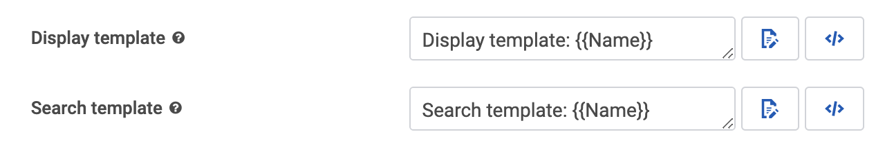
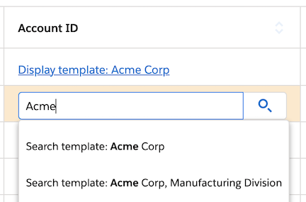
Display template: Determines how the reference field’s selected value is displayed. Configure the template with fields (via merge syntax), text, and formatting.
Search template: Determines how reference fields display in the search dropdown. Configure the template with fields (via merge syntax), text, and formatting.
In this example, the display and search templates are configured with merge syntax and text.
Notice where the display and search templates appear at runtime.
- Visible Rows: Determines the amount of results available from the model (5, 10, 25, 50, Show all)
- Tokenize autocomplete search: If checked, each word typed into the search bar is “tokenized” — meaning each word is searched for individually. A tokenized search for “George Washington” returns any record with “George” and “Washington”. For example, “George Washington,” “George Michael Washington,” and “George is headed to Washington”. An untokenized search for “George Washington” returns only records with “George Washington” exactly.
Search fields [[]]
Note
Depending on the data source used for the model attached to the component, this property may not be available.
Use SOSL to improve search performance: (Salesforce data sources only) SOSL quickly can search multiple objects at a time within a single search query. SOSL does not directly search the database, but instead queries an index of Salesforce text fields. Individual search fields may not be added when this property is enabled.
Warning
Because the search is against the index, results are limited to what is present in the index, and will not include data that may have been recently updated in the database. The index updates very quickly, but expect a delay of up to 30 seconds between changes made to the database, and their appearance in the search results.
Note
SOSL can search text fields (including long text fields), but not picklist fields and reference fields.
Fields to search: Sets which Types of fields to query with SOSL. The options are:
- Name Fields (default)
- All Text Fields
- Email Field
- Phone Fields
- SideBar Fields (Name, Phone, Email, External Ids)
Searches on Salesforce data sources can use one of two query languages: SOQL or SOSL. SOQL can only search one object at a time in a single query, but searches all searchable fields in that object in real-time.
Use default ordering: If checked, no additional sorting is applied to the result of the search.
- Fields to order records by: If Use default ordering is unchecked, sets how the returned items will be ordered using the field name and the order instructions. For example, Name ASC orders the list by name, from A to Z; Name DESC orders the list by name, from Z to A.
If Use SOSL to improve search performance is not checked, Search can be narrowed to individual fields by clicking Add new search field and then configuring the search parameters
- Field: The field to use in the search. Use the field picker to select.
Note
(Salesforce data sources only) SOQL can search picklist fields and Reference fields, but not long text fields. To search long text fields, use SOSL.
Return field in query results: Returns field data, even if the field isn’t searched, and makes that field data available for merge variables
Show field in search popup: Show a field in the search popup, even if the column that contains the field is hidden on the table.
- Custom label: Displays a custom header for the column being searched in the popup.
Search using Salesforce fields [[]]
By default, Salesforce Objects use SOQL. To ensure proper functionality, enable the Allow Search property on any Salesforce objects to be included in the search.
For more information on using these search options with Salesforce, check out Salesforce’s SOQL and SOSL Reference Guide.
Link tab [[]]
(For reference fields)
The Link tab determines whether an end user can navigate to a referenced record’s detail page (or some other custom URL) by clicking on the record in the table. If using the field as a link, you can set the following properties:
Navigation type:
Data source default: If a data source type has default behaviors configured for reference fields—for example, navigating to a detail page using the record ID a la Salesforce—then that behavior will be used in Skuid.
No link: The reference fields will display as unclickable plain text.
Skuid page: Set the field to link to a Skuid page.
- Skuid page: The name of the linked Skuid page.
Custom URL: Set the field to link to a specified URL.
URL: The URL that an end user will be taken to. Can accept merge syntax, which can be particularly useful for URL parameters.
Open URL in:
Current Window:
- Opens the URL in the current window.
- If using the Skuid page is within an iFrame, opens the URL in the current iFrame.
Note
Other content blocks on the page will remain the same.
New Tab: Opens the URL in a new tab.
Note
Custom URL navigation links are not fully supported in Lightning apps with console navigation and behave differently than other navigation types.
To accomplish the tab-opening behavior expected in the console, we recommend using the Go to URL action.
Styles tab [[]]
Global styles for this component are set in the Design System Studio. The following Style properties can be adjusted for an individual page.
Style variant: Style variants are created and set in the Design System Studio. Some components have pre-defined variants for a specific aspect of a component’s style. Also, Skuid builders can style and customize elements to create their own themes within the DSS. These themes will dynamically populate as selectable values in the Style Variant dropdown menu.
Note
To refresh available style variant options, click Refresh style variants.
This is useful for when changes to the design system (like style variants or variable options) have been made in another browser window or by another user.
Interactions tab [[]]
(For template fields on Table and Form components)
Click Add interaction then select:
- Action type: To initialize the display of the record details, choose the interaction:
- Click: Best for desktop, as well as mobile.
- Right-click: The right-click interaction will launch the actions added here. A common pattern is to create a customized context menu by using the Show/hide menu action.
- Disable the browser’s default menu?: Override the browser’s context menu for the Skuid page, component, or element. If the browser’s context menu is not disabled, then the actions will run while the browser’s context menu appears on screen.
In the More Options menu on the selected interaction, click Add action, then edit the Action Type:
- Action Type: Use the Action Framework to launch actions.
Filters tab [[]]
(For reference fields)
In partnership with the settings in the Search Tab, the Filters tab lets you create Lookup Filters to limit the search/display content provided when editing reference fields.
Click Add New Lookup Filter and set the following properties for Lookup Filter conditions:
Set the following properties for Lookup Filter conditions:
Field: The field in the current model to use as a filter for the searchable reference field.
Operator: The relationship between the field and its filter content.
Content: The type of value used to filter the reference field’s data.
Single specified value: Returns records that meet the specified value.
- Value: Indicate the value to filter by.
Multiple specified values: Returns records that meet at least one of the several specified values.
- Values: Indicate the values to filter by; for each separate value, click Add Another Value.
Field from another model: Use a field from another model as the filter for the Lookup field.
- Source model: The name of the model.
- Source field: Field on the source model.
- If no row in source model, then …
- Deactivate this Condition
- Abort this Model’s Query
Page/URL parameter value: Returns records that meet the specified Salesforce Lightning page or URL parameter, for example, the id parameter.
Parameter: Indicates the specific parameter to filter by.
If this Parameter is not provided, then …
- Set its value to Blank
- Deactivate this Condition
- Abort this Model’s Query
Running user attribute: Returns records if the value of a field on the model matches the value of a field on the current user’s record.
Userinfo Property: The value on the current user’s record to be used as a filter, usually an ID property. Options include:
- Default currency
- First name
- Last name
- Locale
- Name
- Organization ID
- Organization name
- Profile ID
- Profile name
- Session ID
- User ID (default)
- User name
- Use role ID
- User type
- Is multi currency org
None - blank value: Returns records only if the specified field is empty.
Another field from row: Returns records only if the field on the referenced record matches a separate field on that same record.
- Depends On: Select the field to compare with.
Advanced tab [[]]
(For date- or time-related fields)
Show month & year picker: If checked, Skuid displays month and year pickers during Edit Mode, to make it easy to jump to a specific year.
Year picker lower bound and Year picker upper bound: Sets the upper and lower boundaries of the list of possible years. Options include:
- “Selected” measures from a date selected on the Date Picker. Increments are 1-10, 20, 30 40, 50, 60, 70, 80, 90, and 100.
- “Today” measures from the current date. Increments are 1-10, 20, 30 40, 50, 60, 70, 80, 90, and 100.
Show today button: If checked, the month/year pickers include a Today button that allows users to quickly jump to the current date.
Minute picker increment: For editable date-time fields, select the minute increments (1, 5, 10, 15, 20, 30) for the displayed Time Picker.
Display logic tab [[]]
Standard display logic options are available to display or hide the component or feature.