In This Section
- <no title>
- <no title>
- Guides
- Tutorials
- Skuid Page Tutorials
- Add Related Lists with the Table Component
- Build an Activities Related List Tab
- Build a Custom “Create New Record” Page
- Build a Custom Detail Page
- Build a Custom List Page
- Compose a Branded Header and Navigation
- Compose a One-Page App Using Tab Actions and Conditional Rendering
- Conditionally Display Fields
- Create a Custom Clone Page
- Create a Custom “Clone Account” page
- Highlight Critical Data: Wrappers, Rich Text, and Ui-Only Fields
- Mass Create Records
- Show Products in an Opportunity Page
- Skuid Pages for standard Salesforce CRM
- Salesforce Tutorials
- Add Product Line Items to Opportunities with a Popup
- Add Gmail to Salesforce functionality in your email fields
- Create a Custom Edit Page and Set Visualforce Overrides
- Getting Help: Grant Skuid Login Rights to your Org
- Reclaim the Salesforce Home Page
- Redirect to Salesforce Processes
- Skuid for Sales: A Turn-Key Template to Augment Lightning Sales Cloud
- JavaScript Tutorials
- Skuid Page Tutorials
- Legal terms and conditions
- API Reference
- skuid.runtime
- skuid.$
- skuid.actions
- skuid.ajax
- skuid.builder.core
- skuid.builder.core.coreProps
- skuid.calendar
- skuid.collaboration
- skuid.component
- skuid.componentType
- skuid.events
- skuid.formula
- skuid.hotkeys
- skuid.label
- skuid.load
- skuid.model
- skuid.model.Model
- skuid.mustache
- skuid.page
- skuid.sfdc
- skuid.snippet
- skuid.time
- skuid.utils
- skuid.version
- Component-Specific APIs
- Skuid Model Metadata Object
- Skuid Model Child Relationship Metadata Object
- Skuid Model Condition Metadata Object
- Skuid Model Field Metadata Object
- Skuid Model Record Type Metadata Object
- skuid.runtime
Vertical Navigation
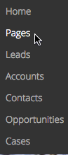
The Vertical Navigation component is used to create custom navigation items in a vertical format. Navigation items appear as a list, in straight line up to down:
These items allow end users to navigate Skuid apps, go to different web pages, or perform Action Framework actions.
Using the Vertical Navigation Component
Vertical Navigation can guide users through an app, as well as any necessary workflow actions. Use the Vertical Navigation component to build custom navigation bars that are intuitive and tailored to unique processes.
In addition to facilitating traditional navigations, the Vertical Navigation component can be used to build handy dropdown menus within a Skuid page that are connected to a broad range of actions with the Action Framework.
Manually Add Items to Vertical Navigation
- Drag and drop the Vertical Navigation component into a Skuid page.
- Format the Vertical Navigation component according to layout and orientation requirements.
- Click the Vertical Navigation component in the canvas, then click add to add new navigation items; rename them in the property pane.
- To remove an item, click delete.
- Configure items by clicking them, then editing in the Vertical Navigation Properties pane. (Optional)
Add actions to individual navigation items
Select a navigation item in the canvas and click the Actions tab.
Click add Add Actions to add a new action. (This defaults to the Go to URL action.).
Select the appropriate action and adjust preferences as necessary.
Note
Multiple actions may be added to a single menu item. Be mindful of actions that may interfere with each other.
Properties
Vertical Navigation Properties
Basic tab [[]]
Item Source: Choose the source of navigation menu items.
Skuid Platform:
- Manual
- User Menu
- Apps
Skuid on Salesforce:
- Manual
- Salesforce Tabs for Current App
- Salesforce Apps
Note
If item source selected is Salesforce Apps, the Navigation defaults to first app listed. To change the label, insert a custom value for the Label Property.
- Salesforce Apps with Tabs
- Salesforce User Menu
Note
Other than Manual, all options automatically populate menu items.
Advanced tab [[]]
- Unique Id (optional): Skuid automatically generates an alphanumeric Id for the component; if preferred, give it a practical name.
Styles tab [[]]
Global styles for this component are set in the Design System Studio. The following Style properties can be adjusted for an individual page.
Style Variant: Style variants are created and set in the Design System Studio. Some components have pre-defined variants for a specific aspect of a component’s style. Also, Skuid Builders can style and customize elements to create their own themes within the DSS. These themes will dynamically populate as selectable values in the Style Variant dropdown menu.
Spacing: Sets the spacing of the Header relative to other components on the page. Spacing can be managed for Top Margin, Bottom Margin, Left Margin, Right Margin. All margins can be set to one of the following:
- None
- Extra Small
- Small
- Reduced
- Regular
- Increased
- Large
- Extra Large
- Huge
Note
These sizes are relative to one another; the baseline is determined by Design System settings.
Display Logic tab [[]]
Standard display logic options are available.
Vertical Navigation Item Properties
These properties control the behavior and look of the individual navigation items within the Vertical Navigation component.
Basic tab [[]]
Label: The text that appears within each navigation item. Used to indicate where the navigation item will take the end user or what the item will do when clicked.
Type: Specifies the functionality of the navigation item.
- Action: Allows the builder to customize the actions taken when a user clicks the navigation item.
- Section: Makes the navigation item act like a parent folder that displays/collapses its contents when clicked.
Note
You can add sub-navigation items to an action type navigation item. These sub-nav items will display when the parent is clicked, even if the action moves the end user away from the page. Because of this, it’s important that the navigation bar persists across the app when the parent item’s action is triggered.
Actions tab [[]]
Customize the actions taken when a end user clicks a navigation item.
Convert existing actions into an action sequence by clicking.
Add actions by clicking.
Note
Navigation items default to the Go to URL Action Type, but this property, Associated URL, and Open URL in can be changed in Properties Pane.
Display Logic tab [[]]
Standard display logic options are available.