Design System Studio
The Design System Studio (DSS) is a tool for designing and configuring styles for Skuid applications and pages. With no HTML or CSS involved, you can style your components with custom colors, fonts, and sizes to match your company’s style guide and branding. For increased customizing flexibility, the DSS allows for creating variants of components.
Warning
API version 1 components cannot be styled by configuring a design system in the Design System Studio, they must be styled using themes.
Concepts and Prerequisites
The Design System Studio supports the creation and customization of a design system. A design system is a file containing the variables and style variants that compose overarching style rules for all visual elements.
A design system consists of:
- Variables: Global style declarations separated by categories, which are based on the general purpose of the variable (Color, Typography, etc.). Similar to CSS style rules.
- Style variants: Design variations of a component made by applying custom variables and configurations to a base set of visual design properties. Variants are then available as style options within the App Composer.
Understanding how these two concepts interact within a design system and how a design system connects to Skuid components in the App Composer is key to making a functional and appealing UI for your app.
A new design system comes with default variables, like colors, borders, opacity, shadows, spacing, and typography. Some default variables can be modified and new variables may be created. When a builder creates a new variable—for example, a Color variable called “Logo Fuschia” that aligns with the company’s style guide—Logo Fuschia is then available for use in component style variants as well as within the App Composer for some granular configurations.
Every component in the DSS comes with a default style variants—what the component looks like “out of the box.” Using variables (default and custom) and component-specific property configurations, builders create their own component style variants, which are displayed as selectable options in the corresponding component Style tab within the App Composer.
To help connect with these concepts, think of a default component style variant like a builder-grade house:

This house is the base model. No fancy decorations, no cool colors. It’s built to live in. Simply functional. You decide to buy one in a neighborhood filled with houses of the same design (congrats!) and set to work on putting your mark on it.
Enter the home improvement store—in Skuid, this is, the DSS. At the DSS, pick out variables (paint, windows, siding, etc). You could even go so far as mixing your own shade of blue (keeping a record of which colors are mixed to make it) so you can always come back and get the same color. You return home, remodel the house—apply the variables to the variant—and:
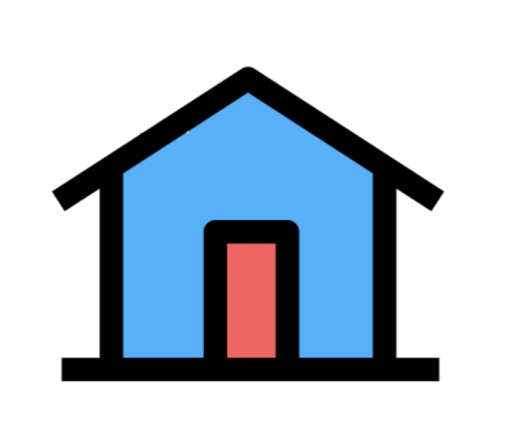
Now it’s a house with your specific design. Though the functionality is the same, it looks completely different, a variation of all the other houses in the neighborhood.
Using the Design System Studio
When an app builder adds any component to their page in the App Composer, the component uses a set of default Skuid styles, called variables, within the DSS. Component styles are customized in the DSS to either:
- Change the default style variables
- Create new style variables
Once a variable is created, it can then be applied to a component style variant.
Design System
A design system is a file containing the variables and style variants that compose overarching style rules for all visual elements. The DSS is accessed by configuring an individual design system, so the first step to styling an application is to create a design system that will contain the app’s custom style rules.
Creating a Design System
- In the Skuid navigation bar, hover over the Design Systems tab.
- In the dropdown, click Design Systems.
Update out of date design systems [[]]
As Skuid continues to make improvements to its systems and components, sometimes the IDs, CSS classes, and HTML structure of its components may change behind-the-scenes. This means that each Skuid design system must also be updated to reflect those new IDs, classes, and structures. Otherwise, the style rules of a design system will no longer be applied correctly. While new default design system are installed with each Skuid upgrade, custom design system still need to be updated to match. The Update all button does just that, reconciling any updates to default design system with the custom design system based upon them.
Note
- It is best practice to run this process after each Skuid upgrade.
- This process may take several minutes.
- You may download your design systems prior to updating them for local backups.
- Navigate to Design Systems.
- Click Update all.
Variables
Similar to CSS style rules, variables are global style declarations (separated by categories), based on the general purpose of the variable (Color, Typography, etc.). Variables are used, along with component-specific property configurations, to create component style variants.
Every component uses a different combination of variables depending on the component’s function and purpose, so not every variable will be used in a component.
Adding Variables
- Add custom variables for use in your component style variants by opening the Variables accordion.
- Click the category you want to add a variable to.
- Click Add.
- Give the new variable a name in the Label field. See best practices for creating names for custom variables.
- Configure the properties of the new variable.
- Make adjustments as desired.
Applying Variables to Style Variants
Once a variable is created, it is available to be used on any categorically-related property in all style variants. Color variables may be used in color properties, spacing variables in space properties, etc. Click the variant, then click it’s properties and locate the one to configure. Click the dropdown list for that property to see the available variables. For example:
- In the Components accordion, select Button.
- Select the Default style variant.
- In the properties pane, click the menu under Background Color.
- Select your custom variable.
Best Practices
It’s best to start by configuring the design system’s variables before moving onto component-level configuration. Setting the high-level design choices found in the Variables section allows for a consistent palette of custom color, text, border, and other options based on a company’s style guide before even selecting a DSS Component to style.
The Design System Studio is built with consistency and reusability in mind. If a change is made to the Primary Border Size variable, that change will appear in any style variant using that Primary Border Size variable. Therefore, consider the overall styling of the app—via the variables— before creating component style variants. The assigned Design System will act as a living style guide for all apps associated with it.
Consider how you name your variables. A well-named variable can instantly convey its purpose wherever that variable appears. There are two main conventions for naming variables; each has pros and cons.
The first convention is naming by function, which bases a name around the function that the style represents. For example: create a specific color for form submission buttons. Following functional name convention, this button could be named “Submission Button Primary Color.”
The second convention is by style, which bases a name specifically on its stylistic identify. For example, a company uses the Comic Sans font as a primary body text. Their app builder makes a new typography variable for this font face. Following the style naming convention, this variable could be named “Comic Sans.”
Skuid default variables come with both conventions as examples. It’s up to the app builder to choose which they’d like to follow.
| Function | Style |
|---|---|
| Pros: | |
| The Skuid Primary default color variable is already used in most components, so changing color globally is as simple as modifying the default primary color skuid provides. | Allows for a design-focused design system that acts as more of a literal style guide instead of a functional style Guide. |
| Allows for easy context cluing, and gives a new designer working in the design system immediate understanding of that variable’s purpose. | Allows for easy context cluing of what that variable actually looks like. For example, in a drop down menu where you’d select a color for an element, the color variable will display as “Red” and not just “Primary.” |
| Cons: | |
| Naming by function doesn’t give visual context. If a color variable is named “Submission Button” it’s not clear what color that actually is, making it difficult to understand the style ramifications of selecting a variable within a property’s dropdown list. | The Primary default color is used across all DSS components. Deleting it in favor of variable that follows style naming convention requires the designer to update any component property that once pointed towards the Primary variable. |
| Using the style naming convention, there’s more chance for functional inconsistency because it’s harder to know what function the color represents. | |
| A variable named after its font face could be used in multiple components for multiple purposes, leading to usability and visual cueing issues. If there’s not a system in place to keep track of variable purpose, stylistic cohesion could be impacted. |
Designers could also try mixing conventions, providing function first, then adding style. For example, a button color only for form submission could be called, Form Submission Button - Red. A font face only for headings could be called, Headings Font - Arial Bold.
Components
In the DSS, you’ll find both components as editable options.
Components are made up of other components. Components and their children components are all listed under the Components header.
Selecting a component in the DSS will display all the configuration properties associated with the selected item. Most configuration properties require the use of variables as values, while some use property-specific values. If a component has any component dependencies, they will be listed under the Nested Components tab found in the properties pane.
Note
Any Nested Component must be styled and configured outside of the parent component in its own style variant.
Preview With…:
Some components have a property called Preview With, which gives the option to view a customized component with common configurations available within the App Composer. This property is key to understanding how custom styles will apply to an app in runtime.
Best Practices
- Even if a global variables have been configured, the unique properties of components require the creation of variables (and style variants) to use in the component. It’s normal for a workflow in the DSS to include a lot of interplay between variable creation and component configuration.
- Like variables, it’s important to give variants names that provide context for the style to the app builder. Consider two Button style variants, one used only for form submission, the other to refresh a form. Names that don’t incorporate function like “Form button 1” and “Form Button 2” aren’t useful for providing context. Names that do incorporate function, like “Form Button - Submit” and “Form Button - Refresh” are clear and purposeful. Someone unfamiliar with the design system would immediately know where those variants would be used and what they’re used for.
Creating new style variants within DSS components
To add new Style Variants to use in the App Composer
- Select the component you’d like to style.
- Click Add.
- Give your new Style Variant a name in the Label field. See best practices for creating names for custom Style Variants.
- Configure the Style Variant properties by:
- Choosing between component-specific property options
- Passing in Variables when applicable
Applying a design system to a Skuid Page
Create a design system in the DSS.
Navigate to the Skuid page that contains the component you want to style.
Click on the Page header in the canvas.
In the Properties Pane, under Design System:
- Select the name of the desired design system from the dropdown.
Warning
Selecting your design system on Page Properties is critical. If you skip this step, your style variants will not be loaded into the page.
Applying Style Variants to Skuid Components
Style variants are applied within the App Composer by clicking a component on the canvas and navigating to its Styles properties. Style variants, and other style properties, can then be adjusted:
- In the Properties Pane, select the Styles tab.
- Select your style variant in the Style Variant dropdown.