In This Section
- Concepts
- Data
- Build
- The Composer
- The Page Index
- Context
- Pages
- Models
- Components
- Best Practices
- Debugging Skuid in the Console
- Logic
- Style
- Deploy
- Extend
- Reference
- The Property Library
- API Reference
- skuid.debug
- skuid.runtime
- skuid.$
- skuid.actions
- skuid.ajax
- skuid.builder.core
- skuid.builder.core.coreProps
- skuid.calendar
- skuid.collaboration
- skuid.component
- skuid.componentType
- skuid.events
- skuid.formula
- skuid.hotkeys
- skuid.label
- skuid.lightning
- skuid.load
- skuid.model
- skuid.model.Model
- skuid.mustache
- skuid.page
- skuid.sfdc
- skuid.snippet
- skuid.time
- skuid.utils
- skuid.version
- Component-Specific APIs
- Skuid Model Metadata Object
- Skuid Model Child Relationship Metadata Object
- Skuid Model Condition Metadata Object
- Skuid Model Field Metadata Object
- Skuid Model Record Type Metadata Object
- Page XML API
- skuid-sfdx
- Skuid Metadata Object Reference
- Skuid Glossary
- Formula and Function Reference
- Skuid and Date/Time
- Early Access Expectations
- Open Source Software Attributions
- Site Administration
- Tutorials
- Skuid Page Tutorials
- Build a Custom List Page
- Build a Custom Detail Page
- Compose a Branded Header and Navigation
- Compose a One-Page App Using Tab Actions and Conditional Rendering
- Conditionally Display Fields
- Highlight Critical Data: Wrappers, Rich Text, and Ui-Only Fields
- Mass Create Records
- Show Products in an Opportunity Page
- Skuid Pages for standard Salesforce CRM
- Salesforce Tutorials
- Skuid Page Tutorials
- Legal terms and conditions
- Skuid SFX Evaluation Guide
In This Topic
- Compose a Branded Header and Navigation
- Step 1: Compose a new page
- Step 2: Add a responsive grid
- Step 3: Add a logo
- Step 4: Add Navigation Component
- Step 5: Add global search
- Step 6: Add another Navigation Component
- Step 7: Add another Navigation Component
- Step 8: Create a profile picture section
- Step 9: Add Page Regions
- Click Save and Preview
- Use dependent pages
Compose a Branded Header and Navigation
This tutorial shows how to create a custom header and navigation bar that you can use across multiple pages (like the one used in the Skuid app itself). Our custom header will incorporate a company logo, a responsive grid, Salesforce tabs and some custom stuff.
In this use case we are going to:
- Enable a header (Step 1B)
- Use a responsive grid to create flexible sections within our header (Step 2)
- Add a company logo (Step 3)
- Create a nav bar based on the Salesforce tabs fort the current app (Step 4)
- Configure a custom global search (Step 5)
- Include a dropdown navigation of Salesforce apps (Step 6) and another for the Salesforce User Menu (Step 7)
- Add a user picture (Step 8)
- Make this page a principal page (Step 1A) so you can use it as a template for other pages (Step 9)
The finished header will look like this:
We’re going to show you how to build a header like this one.
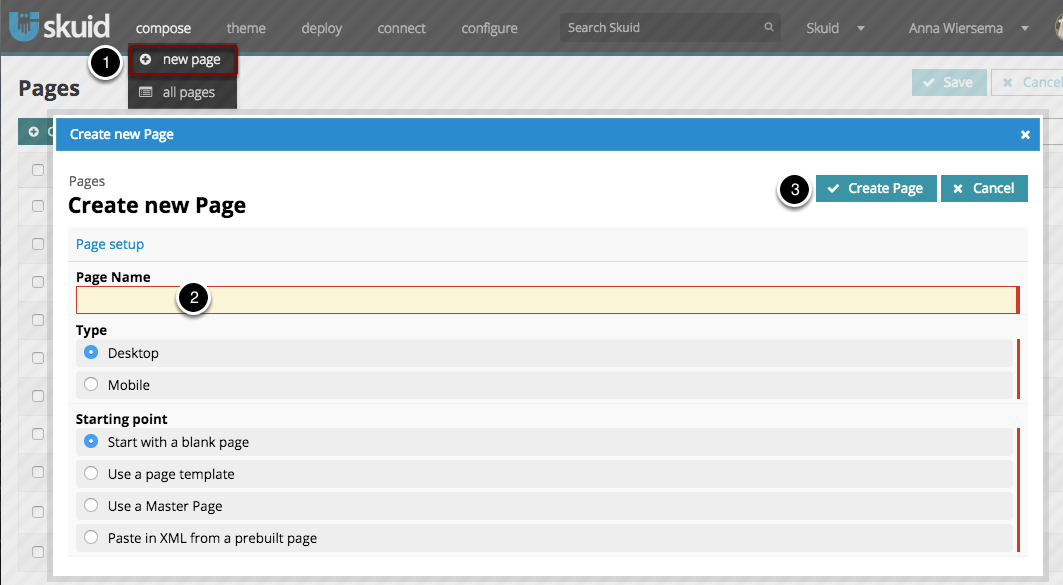
Step 1: Compose a new page
- Click Compose > New Page.
- Name your new page (don’t worry about Type or Starting point).
- Click Create Page.
You may notice the standard Skuid header looks a lot like the header we’re going to build - that’s because Skuid header and navigation was built using Skuid… Pretty meta, right?
A. Make this page available as a principal
- Page Properties are shown when you first open a page, or anytime you click on the page name.
- Check to make this page Available as a principal page. We’ll talk more about this later.
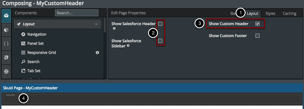
B. Set a Custom Header
- In Page Properties, click Layout.
- If you want, you can uncheck these boxes to hide the standard Salesforce Header and Sidebar.
- Check this box to Show Custom Header.
- The Header area will appear below.
Step 2: Add a responsive grid
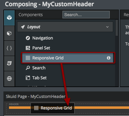
Drag and drop a Responsive Grid into the header. The Responsive Grid will allow us to divide the header into flexible horizontal sections that will wrap as needed.
A. Add divisions
Click Add divisions.
We’ll have six divisions in this responsive grid: one for your logo, one for tabs, one for search and one each for user picture, other apps, setup info. For each division we can specify how we want it to behave (e.g. is it flexible? how small do we want it to get?).
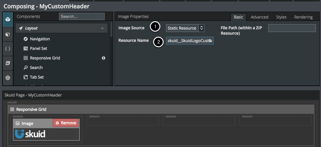
Step 3: Add a logo
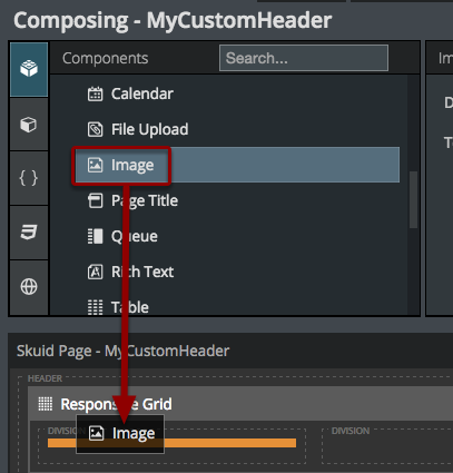
Drag and drop the Image Component into one of your header divisions - say the leftmost.
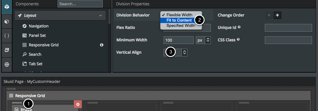
B. Size the division
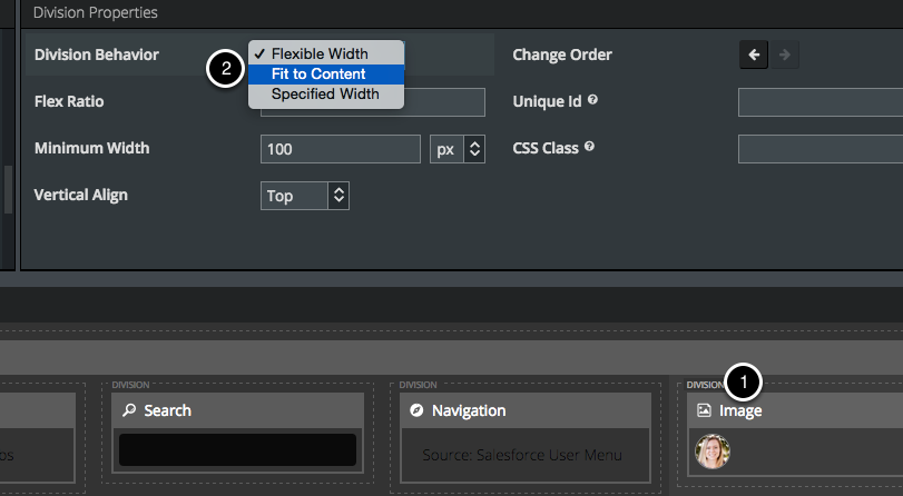
Click on the division and select Fit to Content.
This will ensure that the division is always only the size of the Image, and leave more room for the other, flexible divisions.
- Click on the Division header, right above your Image Component.
- Select Fit to Content.
- Choose Center for Vertical Alignment.
Note
This is a good idea for all of your divisions, because it will looks sharper that way.
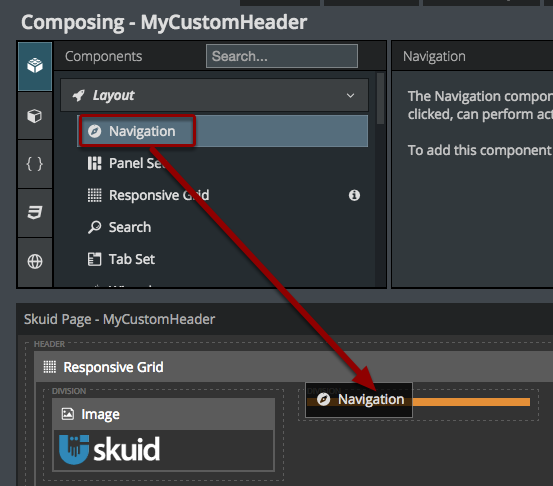
Step 4: Add Navigation Component
Add the Navigation Component to your second division.
We’ll use the second division for a nav bar. We’ll keep this division flexible, so the nav section can take up as much or as little room as the other divisions leave it.
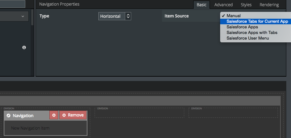
For this example, we’ll select “Salesforce Tabs for the Current App” as the item source.
This will auto-populate the Navigation Component with the Tabs for the Salesforce App that this page will be included in. You can also add more nav items with “manual” as the source to redirect to your own pages and run custom actions. (More info on the Navigation Component.)
Step 5: Add global search
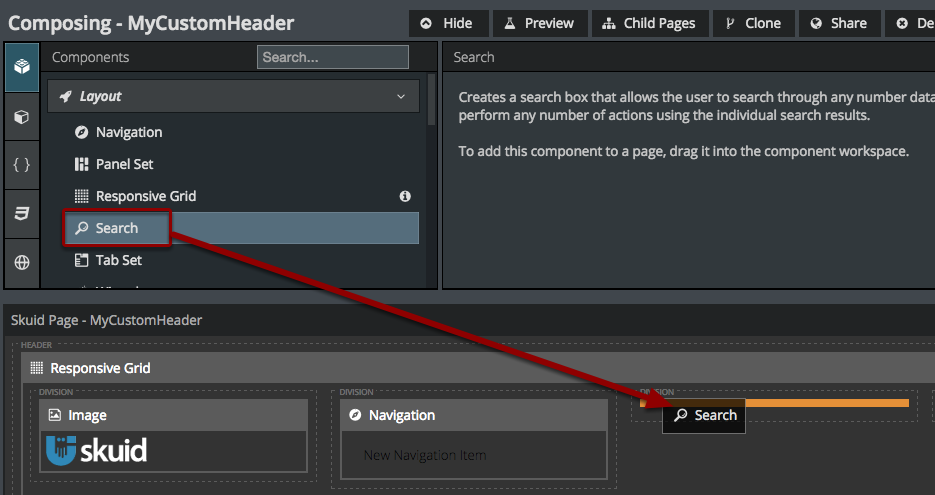
Build your own global search in the third division.
Drag and drop a search component into the third division of your header.
A. Select search objects
Select a few crucial objects to search on.
For this Search, we’ll just do a basic search on Accounts and Contacts.
- Click Return Objects.
- Click to add objects to search on.
- For each object, select the SObject to search on, the Display Template, and the fields you want to include in the Search and/or Template. You can also select a helpful icon.
B. Add Select Actions
What will happen when users click on an item in the search results? You decide! For this example, we’ll just do a simple redirect where clicking on an item takes you to its detail page.
- Click Select Actions.
- Click on the plus sign to add an action.
- Choose Go to URL as the action type.
- For the URL enter /{{Id}}. This template will pull in the ID of the record in focus to redirect users to its detail page.
(More info on the Search Component.)
C. Edit the division’s size
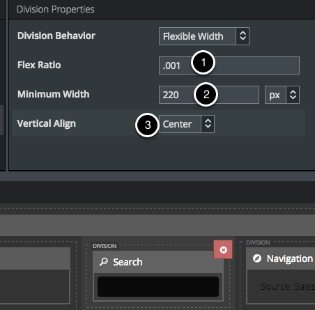
We still want this division to be flexible, but we want it to be smaller than the other flexible divisions.
- Enter .001 as the Flex Ratio.
- Enter 220 px as the Minimum Width.
- Choose Center for Vertical Alignment.
Note
This is a good idea for all of your divisions, because it will looks sharper that way.
Step 6: Add another Navigation Component
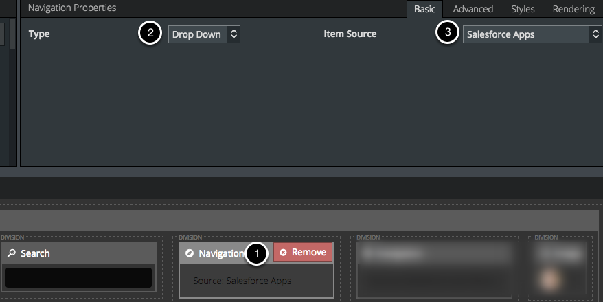
This time, add a Navigation Component for the Salesforce App menu.
- Drag and drop a Navigation Component into your fourth division.
- Choose Drop Down as the Type.
- Choose Salesforce Apps as the Item Source.
You can also add more nav items with “manual” as the source to redirect to your own pages and run custom actions. (More info on the Navigation Component.)
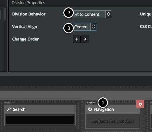
A. Fit to Content
- Click Division (just above the Navigation Component).
- Choose Fit to Content for the Division Behavior.
- Choose Center for Vertical Alignment.
Note
This is a good idea for all of your divisions, because it will looks sharper that way.
Step 7: Add another Navigation Component
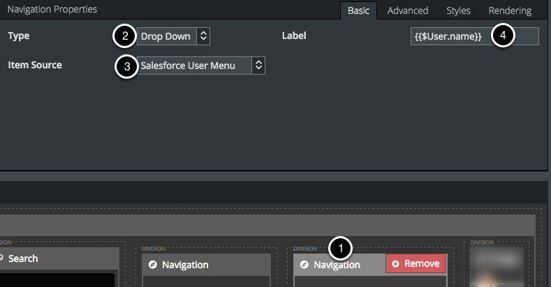
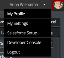
Add one more Navigation Component to incorporate the Salesforce User Menu.
- Drag and drop another nav bar into your fourth division.
- Choose Drop Down as the Type.
- Choose Salesforce User Menu as the Item Source.
- For Label, use the template {{$User.name}}.
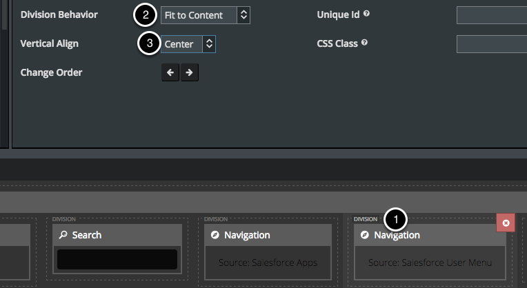
A. Fit to Content
- Click Division (just above the Navigation Component).
- Choose Fit to Content for the Division Behavior.
- Choose Center for Vertical Alignment.
Note
This is a good idea for all of your divisions, because it will looks sharper that way.
Step 8: Create a profile picture section
This is not as scary as it seems!
A. Add a model on the User Object
- Click Models.
- Click to add a new Model.
- Choose User as the SObject Type.
- Enter ‘1’ as Max # of records.
B. Add Name and ‘Url for Thumbnail sized Photo’ fields
- Click Fields.
- Check to include the Full Name and ‘Url for Thumbnail sized Photo’ fields.
C. Add a condition
Add a condition where the User ID is the ID of the user running this page.
- Click Conditions, and click to add a condition.
- Choose User ID as the field.
- Click Value and select Running user attribute as the Content.
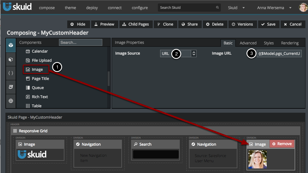
D. Add an image component
Drag and drop an Image Component into your final division.
Select URL as the Image Source.
- For Image URL, use the template {{$Model.CurrentUser.data.0.SmallPhotoUrl}} but replace “CurrentUser” with the name of the model you just created. For example, if you named your model “User,” then your merge syntax would be {{$Model.User.data.0.SmallPhotoUrl}}.
Note
Don’t worry if your image doesn’t automatically show up - it will on the page preview.
But why doesn’t this photo look like cute little round one in the Skuid header?
E. Edit Image Styles
I discovered how to format the image (and really how to build this whole header) by going into the SkuidCoreprincipal page, which is included in the Skuid App, and basically ripping it off. This is a great way to learn how to use Skuid: (1) find pages composed by people smarter than you, (2) figure out how they work, and (3) tweak them to do what you want to do.
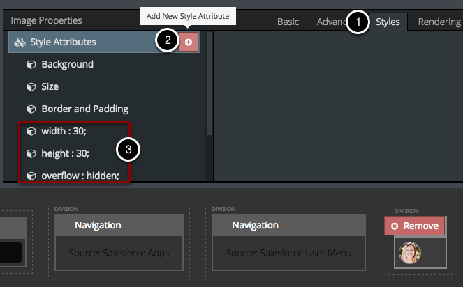
In this case, you can use the Style Attributes of the Image Component to make the image smaller and circular.
- Click Styles.
- Click to add new Style Attributes.
- Add the following Style Attributes:
- width: 30
- height: 30
- overflow: hidden
- border-radius: 40px [this makes it round]
- border: 1px solid rgba(255,255,255,0.4) [this adds that sweet grey border]
F. Fit to Content (again!)
This will ensure that the division is always only the size of the Image, and leave more room for the other, flexible divisions.
- Click on the Division header, right above your Image Component.
- Select Fit to Content.
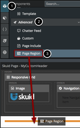
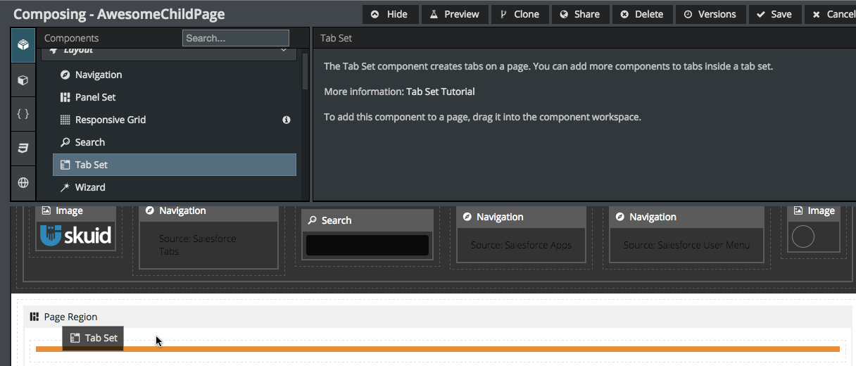
Step 9: Add Page Regions
In Step 1, we made this a principal page. When you make a page a principal page, you will automatically get a bonus component - Page Region. Page Regions are what will be customizable on your dependent pages. dependent pages inherit the rest of the page from their parent page, so put page regions anywhere on this page that you will want to be customizable at the individual page-level (these will not be customizable on the principal page).
Click Save and Preview
Success! You’ve created a working, branded header.
Here are our six divisions, pretty as a picture, but even better than a picture because the navigation actually takes you where you want to go and the Search actually works.
- Notice how this division (our second one) takes up more space than the others. That’s because it’s flexible and the others are all “Fit to Content” (Step 3b) or have a smaller flex ratio (Step 5c).
- Our Search Component and its redirects work. Golden! Note that it automatically brings in our custom labels (Personnes for Contacts).
- This part is our Page Region, which is customizable on dependent pages.
Use dependent pages
Whenever you want a new page to have this custom header, make it a dependent of this page.
There are two ways to do this.
- On your principal page, click dependent pages to bring up a list of all this Page’s children.
- Click Create New dependent page.
Or …
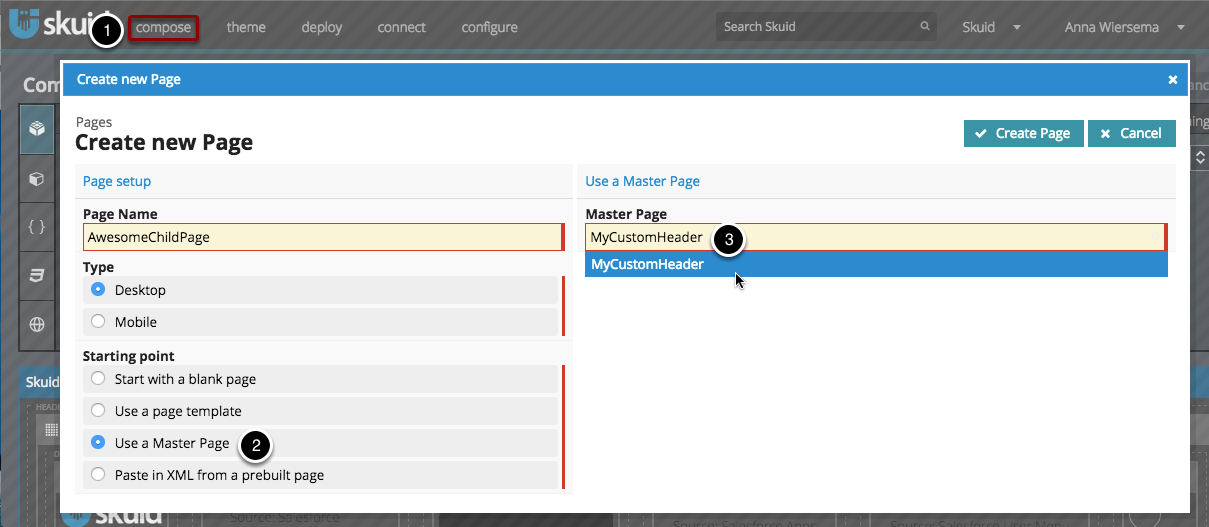
- Click Compose > New Page.
- Click Use a principal page.
- Start typing the name of your custom header page, and click to select it.
The Header (and everything else from the principal page) will be automatically included and you can just focus on customizing the Page Region.
For more information, check out the tutorial on Principal and Dependent Pages.

