Welcome to Skuid Chicago
It’s here! Our 2021 Chicago release—a culmination of extensive customer feedback, insights from industry analysts, and months of hard work and innovation. Chicago has some exciting enhancements you’re going to love, like a new Calendar component, a migration utility, and more.
Skuid continues to expand the declarative toolkit with the Chicago release. It includes several enhancements to the core product, all of which can help customers build better apps and improve user experience.
So you can make the most of Chicago, we designed an entire release series with videos, blog posts, demos, and more. The Skuid developer community is another resource with peer-to-peer user support and knowledge sharing. Connect with us there and see what awesome things Skuid builders are doing in Chicago.
Declarative expansion
Calendar
With Chicago, building calendar pages has never been easier and the new Calendar component gives your users the ability to do more in a calendar view. Display Salesforce events, tasks, custom object records, or data from other sources like a REST API or Google Calendar. With the flexibility of Skuid data modeling and Action Framework, builders can set controls for users to add, edit, or delete calendar events.
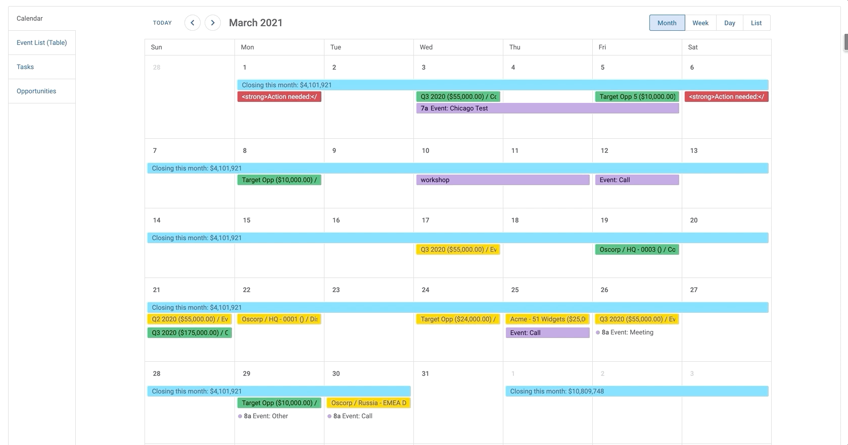
In fact, by more tightly integrating the Calendar with Action Framework and Design System Studio, we’ve reduced the need for excess custom code that building previous calendar experiences required.
One big update you’ll appreciate: all-day/multi-day events. Display week-long conferences and all-day kickoffs, or even just reminders and deadlines, alongside meetings and calls.
The new Calendar component also comes with new styling options in Design System Studio. Create seamless branded calendar experiences in your customer or partner community as well as internal apps like group calendars for sales and project teams.
With these powerful Calendar updates, build an entire sales app around a calendar experience, share a calendar on a partner portal, or embed calendars into record details to make account planning faster and easier.
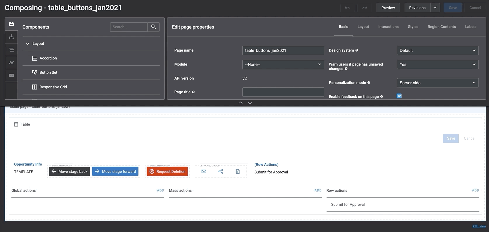
Button fields for Tables and Forms
Put a button anywhere. OK, that sounds a bit much, but it’s true. A builder can now design apps and pages to match how people work, and the user can take action right at the point of decision. Here’s what that means:
Instead of the user needing to search for the button (usually by scrolling, left, right, up, or down), builders can put the button or interaction where it’s needed.
Responsive Grid properties
We’ve updated the Responsive Grid to support additional properties like background color, image, and vertical alignment for grid divisions. Centering elements vertically and horizontally within a page is now a more straightforward process.
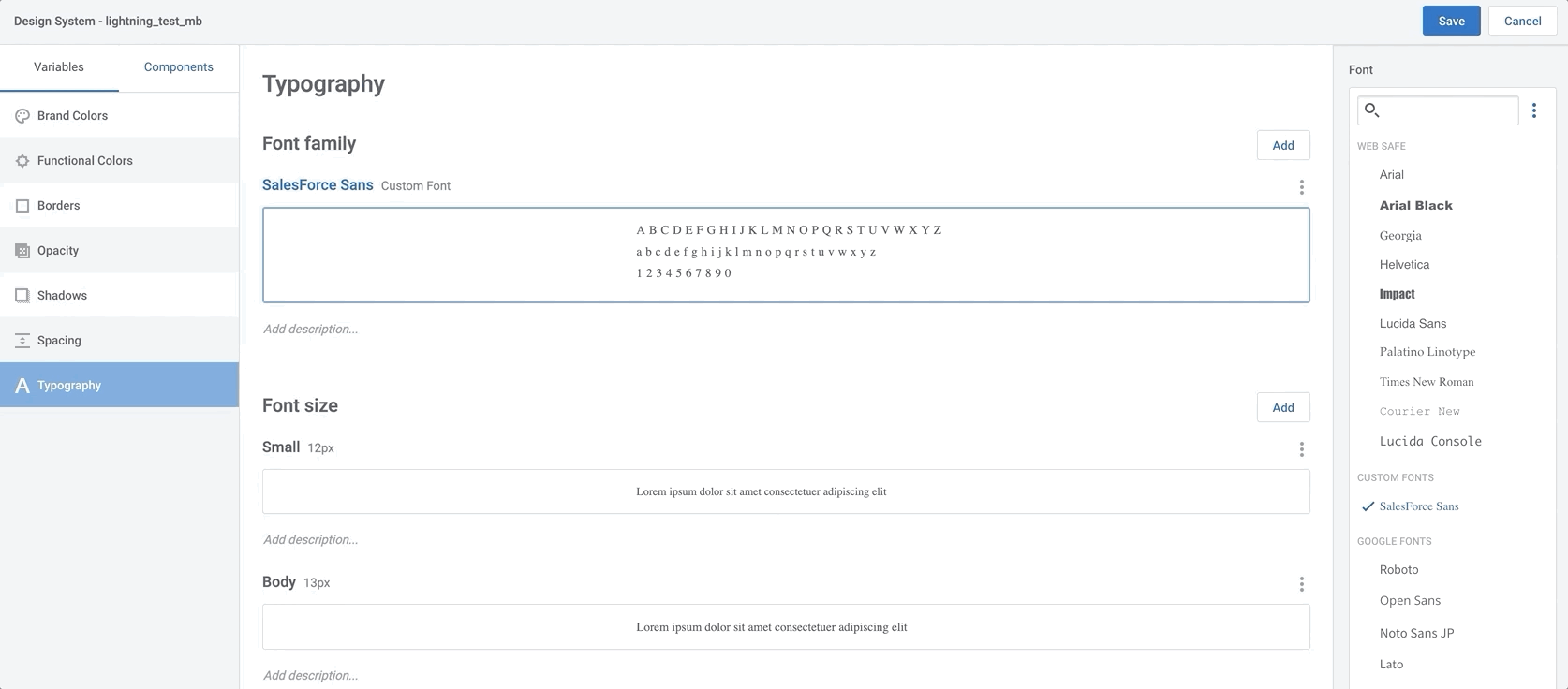
Custom font
Small touches make big impacts, and we’ve made several tweaks to help you personalize your brand.
If you want to stand out in a crowded market, consistency in styling matters. That’s why you don’t have to stick with out-of-the-box typography anymore. With our new custom font feature, add your own unique fonts to reinforce your brand identity.
Design System Studio will now support referencing a custom font by URL. It may be in a CDN, or maybe it’s a static resource in your Salesforce org, but now you can get that iconic font that represents you, without code.
Conversion simplified
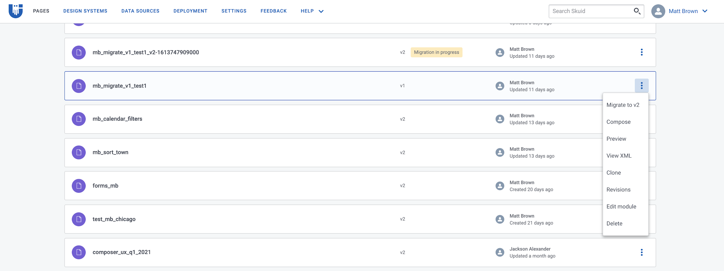
There’s a new interface, new features, and a more powerful Skuid experience. Our v2 pages represent the next step for user interface development, and we’ve built a migration utility to help bring your v1 pages into the future.
Migration utility
With all the amazing features we’ve packed into Chicago, taking advantage of them means moving to v2. To help make the transition easier, we’ve added a migration utility tool that reduces the heavy lifting, making the process smoother and faster. The migration wizard is your guide.
Vertical tabs
Vertical tab sets are used commonly for side navs and subtabs in v1, presenting an issue for customers who want to migrate. We’ve added a Vertical Navigation component in the Chicago release as an option for how a tab container renders.
Form columns
Add columns to a Form without splitting the form into multiple components, allowing for easier adherence to design specs. This removes an obstacle for customers wanting to migrate their pages with v1 Field Editors that use columns and column sets. Now, those columns and column sets will migrate into a v2 Form component. For new users, this update makes the Form component even more powerful.
Ditch the sheet
Export data
Exporting data shouldn’t feel like a tooth extraction. For instance, there are times you want to trigger an export of a Table component’s data without requiring the user to click through a menu. Now you can trigger an export of Table data from anywhere by adding an export action to a button or any interactive part of a page.
List component enhancements
With the List component, it’s easier to create hierarchy navigation pages, contact queues, task management consoles, and more. These “small” enhancements to the list component—styling the selected state for a list item and drawer actions—translate to big impact. With a list and a detailed view on the same page, your users can quickly and easily find what they’re seeking without opening another tab and breaking their flow of work.
Complex data sorting: multi-column Table sorting & Sort Builder
You don’t have to swivel between experiences when working with data in spreadsheets and Skuid. Some powerful spreadsheet tools that users rely on are now available in Chicago.
With the new Sort Builder, your data components like Tables, Lists, Decks, and Filter Sets now have a way to build sorts. Users can dynamically manipulate these data sets instead of builders baking sorts into the page or changing data sorts via JavaScript.
Small tweaks
Ink icon update
We’ve freshened up the Ink icon set used within the Skuid app-admin experience—just a few tweaks with heavier lines to improve readability on different types of monitors and screens. Your existing apps are in for a facelift using the default Ink icon set.
Known issue
DSC-2796 Migrated child pages do not inherit the design system of the master page If you migrate a v1 child page to v2, the child page will apply the default Ink design system at runtime - rather than the design system of the master page. For now, you can go to the child page’s properties and set the Design system property to match the design system of the master page.
This issue will be resolved in an upcoming maintenance release.