Calendar
The Calendar component allows you to display a calendar with events and tasks from one or more sources on a Skuid page. Builders can permit users to add, edit, or delete calendar events.
Using the Calendar component
To create a calendar and fill it with the events drawn from a linked data source, you need to manage two aspects of calendar creation:
Event sources: This is a model on a data source where calendar information is stored. Calendars can have more than one event source and display them all on one Calendar component.
Note
Disable the Query on page load property for any models used by the Calendar component. The component itself queries for data—so querying on page load would result in duplicate queries.
Views: Calendars come in different formats (month, week, or day calendar pages, or event lists); in similar fashion, the Calendar component can display month, week, and day views, as well as a list of events. Configure each of these views to suit your preferences.
Working with event sources and views lets you customize calendars that address end users’ unique needs.
Assumptions
Start with a Skuid page that includes a model on an object with scheduling information. Models must include a start date (or datetime). Be sure to add event fields to the model (such as start and end date or datetime fields).
Note
Thinking of reusing a model employed elsewhere on the page? Skuid recommends using a separate model for the Calendar component. If you want another component on the page to interact with the same object as the Calendar’s model, it’s tempting to re-use the model, but doing so may result in unexpected behavior. Create a separate model instead.
Create a Calendar
Add a Calendar component to the page. If you save and preview, you’ll immediately see the calendar on the page—empty (without any events). Now customize and configure:
In the General tab, set the Calendar’s Valid date range property and (depending on which value you choose) any associated properties.
In the Sources tab, add at least one event source and configure it:
Note
Need to add more than event source? Add another one and configure. Take a look at the Source tab for best practices.
- Be sure to set the Name, Start, and End fields.
- Configure the on-click action included in the event source so that when users click on an event, Skuid opens a modal with event details.
- If you want users to be able to create new events, configure the create event action included in the event source.
Customize the calendar’s Views: You’ll need to have at least one view available—or you can have all four available, allowing the user to toggle between them.
Note
Week and Day view also allow you to group events, an option that may be helpful for your end users.
Working with the Calendar
Start date and End date properties [[]]
Time is endless, stretching backward and forward into infinity. Unless you’re in a Skuid Calendar, where time is finite and covers specific times that fit between two parameters: start and end.
In Skuid’s calendar component, there are three places where you define these start and end parameters:
- In the General tab: The Valid date range property defines the range of dates that will display in the calendar.
- In the Sources tab: Each event source’s Start field and End field properties determine what field is used to define the start time and end time of individual events.
- In the Views tab: In Week view and Day view, the Default start time and Default end time properties determine the time parameters of the calendar’s display, defining the first time entry indicated on the calendar day, and the last one.
Use more than one event source [[]]
To combine events from multiple event sources onto a single calendar, add and configure additional sources in the Sources tab.
- Create a new model for each source and include the appropriate event fields in the model.
- To make sure events from different event sources are visually distinguishable, consider selecting a distinct Background color for each new source.
- Configure separate event actions for the new event source.
Note
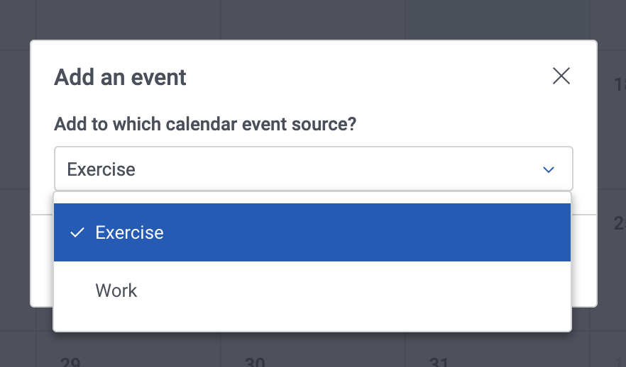
If using multiple event sources, when users create new events, they will be asked to select which event source the event should be saved to.
Use Calendar merge variables [[]]
Calendar merge variables allow access to data that the Calendar stores about records in context.
Use groupings [[]]
Divide individual days (in *Day *or *Week *view) into lanes with groupings.
Group options are set in the Event source tab — where you set the field to group by — and in the View tab, under the Week and Day sections — where you determine how the groups display.
Note
If grouping by field values from another object, then select the reference field for the Grouping field on the event source. This tells the Calendar where the values for grouping will come from. Set the specific values for grouping in the Grouping template property under View > Week or Day.
End user experience
Once configured, the calendar lets users view and interact with the events.
From the top of the calendar:
- The Today button moves the calendar to the current date.
- When multiple views are available, switch between viewing the calendar by month, week, or day using the view toggle.
- Navigate between months (Month view), weeks (Week view), or days (Day or List view) using the date toggle.
Click on an event to view its details.
- When interacting with a Calendar on a mobile device, click and hold to view an event.
Drag and drop events to a new location on the calendars. This will change the event’s date and time accordingly.
Drag and drop start times and end times for events (Day and Week views).
The following features can also be enabled for end users in the Composer:
- Click on an empty space with the calendar to create a new event.
- Click on an event to edit it.
- Delete an event.
Create a new event
If end users have permission to create a new event, they can do one of the following:
- In Month view: Click on the day in the calendar.
- In Week or Day view: Click on the day and time on the calendar.
Skuid opens the New event modal. Users enter information for the new event, then click Create.
Note
If there is more than one event source, Skuid will ask the end user to specify which source to create the event in.
Properties
(Just need to look up a property? Try going directly to the Property Library.)
General tab [[]]
Remember user’s last date: If checked, remembers the last date the end user was on, and returns to that date the next time the user accesses the calendar.
Remember user’s last view: If checked, remembers the last calendar view (month, week, day) selected, and returns to that view the next time the user accesses the calendar.
Unique ID: Skuid automatically generates an alphanumeric Id for the component; if preferred, give it a practical name.
Valid date range: Configures the calendar to display dates only within a specified range. Options include:
None
Specific dates and times:
- Start Date: The start of the date range.
- End Date: The end of the date range.
Dynamic date range: Skuid establishes a range of dates based on a specific date or by formulas, including Now, This week and others.
Use fields from model: The model the events will be pulled from. This model’s date fields are used for the next two properties.
Warning
Do not use an event source model to create this date range. Selecting a source model will surface start and end dates from the model’s first record and use them as the global range.
- Start Date: Select start date field for the calendar using the field picker.
- End Date: Select the end date field for the calendar using the field picker.
Sources tab [[]]
A source is the collection of event and activity data pulled from a model for the calendar.
The following properties determine where the calendar events will source from, how they will display to the end users, and how much control users have over events.
To add event sources, click Add event source next to Event sources and configure.
The event source [[]]
Model: The model the events will be sourced from.
Source name: A practical name for the event source. This is helpful when pulling in calendar events from more than one source.
Event title field: (Required) The field to use for the event’s title. Select using the field picker.
Date field type: Select which type of date fields are used for the Start field and End field (below):
Start/end date and time
All-day field: The field that designates whether an event lasts the enter calendar day. Select using the field picker.
Note
The Calendar only accepts checkbox or boolean fields fields for this property.
Start field and End field: (Required) The fields that contain an event record’s datetime information. Select using the field picker.
Start/end date
- Start field and End field: (Required) The fields that contain an event record’s date information. Select using the field picker.
Single date
- Date field: (Required) The field that contains an event record’s date information. Select using the field picker.
Grouping field: The field to group events by in the Day or Week views. Select using the field picker.
Event template: The text that displays for the event in the calendar grid. .. Note:: You can only select fields that have already been added to the model.
Allow HTML: If checked, any HTML markup within the Event template field value will be parsed and rendered per the markup.
Color Format: The color events this source uses when displayed on the calendar. Accepts any HTML compatible color.
Single specific value: Sets a specific color for events on the calendar using the color picker. (You can also type in the HEX code—for example,
#123466—for the color.)- Color: The HEX code for the selected color.
Result of template: Determine event colors using a formula. This option allows the builder to set different colors for different event categories—for example, to color-code events from different creators.
- Color: The field or template that returns a HEX code.
Event actions [[]]
Once a source is created, you can determine what happens when a user clicks on a date or an event, or when a user moves or adjusts an event in the calendar.
Note
Who has permission to create or edit events? Components will always yield to the data source permissions the end user has related to an object. End users that previously did not have access to an object still cannot edit those objects within Skuid.
Interaction type:
- On-click: Determines what occurs when a user clicks an event within the Calendar. Defaults to showing a modal that displays the event’s details. This can also be triggered by a Calendar component action through the Action Framework.
- Create event: Determines what occurs when a user tries to create an event by clicking an empty space in the Calendar grid. This can also be triggered by a Calendar component action through the Action Framework.
- Event update: Determines what occurs when a user modifies an event by dragging and dropping it to a new date or time.
Interaction name (optional): Skuid automatically generates an alphanumeric ID for the On-click and Event update actions; if preferred, give the action a practical name.
Additional event actions
The Calendar component automatically includes default on-click and create event actions, but if you want to add additional actions—or use the Calendar actions in an action list—click Add action on the event and then configure.
You can also trigger Calendar actions elsewhere on the page.
Click Add action, then select:
- Action Type: Use the Action Framework to launch actions.
Click Add action, then select:
- Action Type: Use the Action Framework to launch actions.
Views tab [[]]
These properties determine how month, week, and day views, as well as the list view, display. The Calendar component automatically includes one of each of the following view options, ready for configuration.
To add an additional view, click Add view. In the newly-created view, select its type:
Type of view: Select the view to configure:
- Month
- Week
- List
- Day
Month section [[]]
The runtime calendar includes an option to display events in a monthly calendar.
- View name: A practical name for the view.
- Hide weekends: If checked, Skuid hides Saturday and Sunday from the calendar.
- Enable dragging/dropping of events: If checked, allows end users to drag and drop events to a new location on the calendar.
- Max events per cell: Sets the number of events that can be displayed in a single calendar day.
Week section [[]]
The runtime calendar includes an option to display events in a weekly calendar.
View name: A practical name for the view.
Hide weekends: If checked, Skuid hides Saturday and Sunday from the calendar.
Enable dragging/dropping of events: If checked, allows end users to drag and drop events to a new location on the calendar.
Group with lanes: Divides each day of the week into lanes, based on the field used in the Grouping template, and groups events under their associated category.
Grouping model: When grouping events, the model which contains the field to be used as the Grouping Template.
Grouping template: The field used to divide days into lanes and then group events into their associated lane category.
Allow HTML: If checked, allows the builder to use standard HTML markup in the Grouping Template.
Grouping display format: Determines the way groups are displayed.
- Vertical: Divides groups vertically within the day column, with a header at the top of the column that indicates the group.
- Horizontal: Divides groups horizontally within the day column, with a header at the left that indicates the group.
Default start time: The first hour displayed for weekly calendars.
Default end time: The last hour displayed for weekly calendars.
Divisions per hour: The number of divisions per hour. Two divisions (the default) allows scheduling every 30 minutes. Change it to any integer between 1 (hours) or 12 (five minute divisions).
Day section [[]]
The runtime calendar includes an option to display events in a daily calendar, divided by hours and (if a Grouping Template is used) by categories.
View name: A practical name for the view.
Enable dragging/dropping of events: If checked, allows end users to drag and drop events to a new location on the calendar.
Group with lanes: Divides each day of the week into lanes, based on the field used in the Grouping template, and groups events under their associated category.
Grouping model: When grouping events, the model which contains the field to be used as the Grouping Template.
Grouping template: The field used to divide days into lanes and then group events into their associated lane category.
Allow HTML: If checked, allows the builder to use standard HTML markup in the Grouping Template.
Grouping display format: Determines the way groups are displayed.
- Vertical: Divides groups vertically, with a header at the top of the column that indicates the group.
- Horizontal: Divides groups horizontally, with a header at the left that indicates the group.
Default start time: The first hour displayed for weekly calendars.
Default end time: The last hour displayed for weekly calendars.
Divisions per hour: The number of divisions per hour. Two divisions (the default) allows scheduling every 30 minutes. Change it to any integer between 1 (hours) or 12 (five minute divisions).
List section [[]]
If configured, the runtime calendar includes an option to display events in an events list.
- View name: A practical name for the view.
- Hide weekends: If checked, Skuid hides Saturday and Sunday from the calendar.
- Enable dragging/dropping of events: If checked, allows end users to drag and drop events to a new location on the calendar.
- Max events per cell: Sets the number of events that can be displayed in a single list day.
Display tab [[]]
Calendar height section [[]]
Height Strategy: This sets the height for the Calendar component.
Fit to content: This sizes the Calendar component.
Fixed height: Sets an absolute height for the Calendar.
Not specified
Short (240px)
Medium (480px)
Tall (720px)
Custom: Uses a custom height.
- Custom height: The height of the Calendar, using a number and a sizing unit.
Other section [[]]
- Show header: When checked, displays the header of the Calendar. When unchecked, the Calendar header - along with the title, view control buttons, and date picker buttons - are removed.
Styles tab [[]]
Global styles for this component are set in the Design System Studio. The following Style properties can be adjusted for an individual page.
Style section [[]]
- Style variant: Style variants are created and set in the Design System Studio. Some components have pre-defined variants for a specific aspect of a component’s style. Also, Skuid builders can style and customize elements to create their own themes within the DSS. These themes will dynamically populate as selectable values in the Style Variant dropdown menu.
Spacing section [[]]
Spacing: Sets the spacing of the component relative to other components on the page. Spacing can be managed for Top margin, Bottom margin, Left margin, and Right margin. All margins can be set to one of the following:
- None
- Extra Small
- Small
- Reduced
- Regular
- Increased
- Large
- Extra Large
- Huge
Note
These sizes are relative to one another; the baseline is determined by Design System settings.
Display Logic tab [[]]
Standard display logic options are available to display or hide the component or feature.
Troubleshooting
Problems getting the calendar to display properly [[]]
Having problems? Make sure:
- If using the Day or Week view, that the relationship field between the grouping object and the primary event object is included in the primary event object model.
- You’ve defined the correct actions on the Sources tab for the On-click, Create event, and Event update actions.
- To include at least one view in your calendar.
Still having problems? Post your question on community.skuid.com.
I’m getting events with empty areas preceded by a colon. [[]]
If you create a custom Event template in the Event source, for example {{Subject}}: {{Description}}, and one of the fields does not have content, Skuid displays that with a “dangling colon.” For example, if there is no content in the {{Description}} for a call record, that displays as “Call: ”; one with a description displays as “Call: Bob at Acme.”
To get rid of that colon if there’s no description in the event, use the a conditional merge syntax expression to conditionally render the event display:
{{Subject}}{{#Description}}:{{Description}}{{/Description}}
This tells Skuid that “If there’s a description, show the colon and the description; if no description, no colon.”
I created a new event and I don’t see it on the calendar after the model was requeried. [[]]
Check the Calendar’s model configuration. The new record may have been excluded from the model by the record limits on the model or by the model conditions.
Setting up complex models [[]]
Setting up a Calendar using standard models is relatively straightforward, but if you need more granular control over the Start dates and End dates for Valid Date Range property (on the General tab) when set to Use Fields from model, use a UI-only model.
- Create a new, UI-only model with two UI-only fields on it, one for the calendar’s start date and one for the end date.
- Set the UI-only Start field:
- In the General tab:
- Display Type: Datetime
- In the Default Items tab:
- Content: Single Specified Value
- Value: Specific Date. Enter the correct date in the date field.
- In the General tab:
- Repeat step 2 for the UI-only End field, setting the ending date and time.
- In the Sources tab:
- Model: Use the UI-only model.
- Start field and End field: Use the UI-only fields.