Table
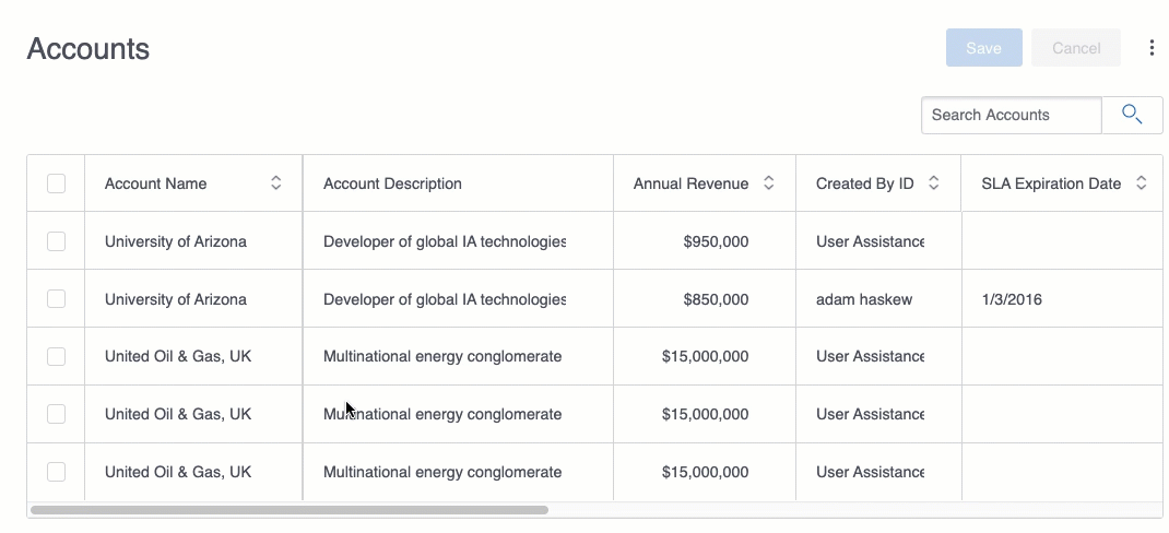
A functional and versatile component, the Table displays a list of records. Like a spreadsheet, selected fields are displayed as columns and records are listed as individual rows. The Table component is not only a way to display records, but also to search, edit, and add records.
Using the Table component
Note
The content below assumes you have a Skuid page and at least one working model with fields selected and no conditions set.
The Table component is one of the basic building blocks of Skuid pages. Once you’ve added a Table to the page, customize it:
- Add a Table to a Skuid page.
- Adjust the Table properties to customize the overall functionality of the table.
Note
The Table must be attached to a model to display data.
- Add fields and adjust their properties to control the appearance and functionality of table columns. You can add model fields or template fields.
Note
The field window “remembers” the order in which you selected the fields. Check the field boxes in the order you want them to appear on the table.
Now, get creative:
- Add filters to make it easier to dynamically sort records.
- Use drawers to reveal additional data.
- Create custom actions to affect one or more records.
- Customize table views:
- Add a scrollbar to make it easier to navigate large tables
- Customize table columns:
- Conditionally render columns
- Allow users to control columns
- Add summaries to numeric columns
- Allow users to Export data as a spreadsheet.
- Click row header boxes to open mass update options.
It’s all possible with the Table component!
Table headers
Every Table includes a header and a footer. Depending upon the property settings, these sections can include:
- Header
- the Table’s title
- the Save and Cancel buttons
- a search box
- the icon to open the Configure table and Export table data features
- the Mass Actions checkbox
- (there can also be filters in the header)
- Footer
- a picklist to set number of records displayed per page
- an indicator of which set of rows are showing and links to jump to the next or last increment
The component’s header and footer can be hidden using properties in the Display > Other tab.
Sticky headers
If the height of the Table component is shorter than the amount of data being displayed—in other words, the Table contains more records than can be seen at one time on the screen—the end user can scroll through the data. In this case, the header remains visible at the top of the Table (a “sticky header”) no matter how far a user scrolls down.
Note
If using IE 11, the header will not “stick” but instead scroll out of sight.
General features
Click Add features to add features to your table, including actions, filters, and views.
Add fields and buttons [[]]
Click Add Fields dropdown to insert fields into a table. You can also add a button group from that drop down.
Add Button Group
This inserts a button group directly into the Table component at the selected location.
When you add buttons to the Table component, these buttons have their own properties. All Table button properties are the same as those for Ink Button Set buttons.
Add features [[]]
Click Add features to add features to your table, including actions and filters.
Add Actions
You can access Row Actions, Global Actions, and Mass Actions via the Add features menu on the component. Actions can then be updated by clicking on them.
Add Filters
You can filter data within a Table component using either the Filter Set component, or by adding a filter on the Table component itself (Add features > Table filter). Learn more about creating, configuring, and conditionally rendering filters.
Additional Table features
Give end users control over columns [[]]
- The property Allow users to reorder columns (Display tab > Configuration) lets users drag and drop column headers to reorder them on the page.
- The property Allow column hiding (Display tab > Configuration) lets users open the Table Settings modal and choose whether the associated column will be visible on the page.
Note
These settings persist whenever end users revisit the page, as they are stored in the Personalization framework.
Give users the ability to sort records [[]]
There are two ways to apply a sort in the Table component:
- Click on the Sort Builder in the component and build a sort.
- Click on the sort icon in the column header.
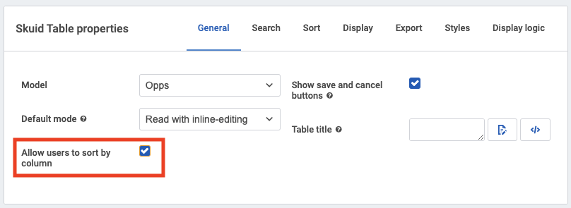
To enable sort within the column header, check the box to Allow users to sort by column on the General tab of the Table properties.
Click the sort icon in the column header to interact with the sort dropdown.
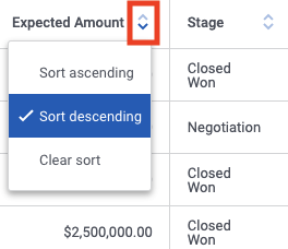
The sort dropdown provides three options:
- Sort ascending
- Sort descending
- Clear sort
As you select or clear options in the dropdown, the sort sequence in the Sort Builder will update accordingly.
Use a character counter in string and textarea fields [[]]
A character counter helps end users know when they are approaching the content limit for text entry fields and encourages them to make input more succinct. Skuid property Show length counter adds a counter for string fields and the larger textarea fields:
- Click the string or textarea field within the component.
- In the Field Properties pane, check Show length counter.
When editing the field, end users will now see a character countdown (“25/ 128”) that indicates the number of characters used (the first number) and how many total characters are allowed (the second number).
Note
- The counter is enabled by default for standard textarea fields.
- The counter is not available for Salesforce rich text area type fields.
Change the field character limits
When using the counter, the character limits are preset by the data source. (For example, Salesforce sets a limit of 128 characters for string fields, and 3200 characters for textarea fields). These limits are set by the field’s metadata.
To change the limit:
- Click the model with the field whose limit you want to override, then click Fields.
- Click the specific textarea or string field.
- In the Field’s Description pane, check Override field metadata.
- Under Length, set the length to the desired number of characters.
- Click Save.
For more information on field metadata overrides, see Field Metadata Overrides.
Best practices
To learn how to limit the records displayed, read the Conditions topic.
Properties
(Just need to look up a property? Try going directly to the Property Library.)
Table properties
The Table component has the following customizable properties.
General Tab [[]]
Model: The model the Table will display data from.
Note
When you have multiple models, make sure you select the correct one!
Default mode:
- Read with inline-editing (default): Displays records in read mode on page load. End users can click Edit to convert to Edit mode.
- Edit: Records display in edit mode on page load; end users can toggle individual records to read mode by clicking Edit. Edit mode is best used for new, clone, and edit pages where you want all table rows open for editing.
- Read-only: Records display in read mode and cannot be edited.
Note
Skuid works with your data source’s security settings so users will not be able to edit records they don’t have permission to edit (even if the table is set to Edit mode). While you should not use this as a security measure, setting the Default Mode to Read-Only ensures that the end user can not edit the Table’s content on the page.
Allow Users to Sort by Column: Check this box to display buttons that allow end users to sort the table by this column’s values, both ascending and descending. (Checked by default.)
Note
Columns with sorting allowed have clickable triangles: up-pointed triangles sort the column in Ascending (Z to A) order; down-pointed triangles sort the column in Descending (A to Z) order.
Warning
To retain record cohesion, sorting an individual column simultaneously reorders the rest of the table. For this reason, sorting should be used judiciously. It is also recommended not to use more than one sorted column per table.
Search tab [[]]
In this tab are properties that control whether or not you have a search box, and when search terms and conditions are applied.
Search properties [[]]
Show search box: If checked, Skuid displays a search box above the component.
Search method: Determines if a search will query the server and filter its data, or filter local data on the client.
Server (default): Returns search results from all data on the server.
Client: Returns search results from only the data that is currently loaded on the page. Large data sets may require lengthy time to filter. If end users commonly need to sort only the data they have loaded within the page—as opposed to every record on the server—this property may speed the filter process.
Warning
If the server contains a large data set not yet loaded into the page, but Search Method is set to Client, the filter may return incomplete results because it’s filtering incomplete data. This may result in unexpected omissions.
Search results: Determines which results are displayed based on the end user’s search query.
Match exactly: Results are only shown for records that contain the search term verbatim.
If the user searches for George Washington, only the records containing George Washington exactly as written—with no other terms in between—would be displayed.
Contain all terms: Results are shown for records that contain all of the terms in the query, even if they may appear in a different order or disconnected from each other.
If the user searches for George Washington, any record containing George and Washington would be displayed, as long as both terms were anywhere within the record.
Contain at least one term: Results are shown for records that contain any of the terms in the query.
If the user searches for George Washington, any record containing George or Washington would be displayed.
Search box placeholder text: The text that appears in the search box before the end user starts a search. (The default is “Search.”)
Empty search behavior: Determines what happens when the search box is emptied.
Re-query for model data (default): The data displayed in the component returns to the state it was in when you first loaded the page.
Remove all model data: The data is removed from the component and its associated model (but not from the data object).
Note
Why do this? If you want to use a component to display the list of search results—handy when you have a lot of search results—you need to have an empty component each time you do a new search, so you can display the newly returned results in it. Without this property, the component’s model will be re-queried when the text is cleared from the search box.
Search fields [[]]
Specifies which fields will be searched against from the component’s search bar.
Note
Depending on the data source used for the model attached to the component, this property may not be available.
Use SOSL to improve search performance (Salesforce data sources only): SOSL quickly can search multiple objects at a time within a single search query. SOSL does not directly search the database, but instead queries an index of Salesforce text fields. Individual search fields may not be added when this property is enabled.
Warning
Because the search is against the index, results are limited to what is present in the index, and will not include data that may have been recently updated in the database. The index updates very quickly, but expect a delay of up to 30 seconds between changes made to the database, and their appearance in the search results.
Note
SOSL can search Text fields (including Long Text fields), but not Picklist fields and Reference fields.
Fields to search: Sets which Types of fields to query with SOSL. The options are:
- Name Fields (default)
- All Text Fields
- Email Field
- Phone Fields
- SideBar Fields (Name, Phone, Email, External Ids)
Searches on Salesforce data sources can use one of two query languages: SOQL or SOSL. SOQL can only search one object at a time in a single query, but searches all searchable fields in that object in real-time.
Field: Skuid searches on searchable fields by default. Search can be narrowed to individual fields by clicking Add new Search Field, and then using the field picker to select the field.
Note
- (Salesforce data sources only) SOQL can search Picklist fields and Reference fields, but not Long Text fields.
- You can add multiple search fields.
Search operator: Select from the following logical operators:
- =
- starts with
- Contains
Skuid on Salesforce [[]]
By default, Salesforce Objects use SOQL. To ensure proper functionality, enable the Allow Search property on any Salesforce objects to be included in the search.
For more information on using these search options with Salesforce, check out Salesforce’s SOQL and SOSL Reference Guide.
Sort tab [[]]
Sort properties [[]]
These properties determine the appearance and behavior of the Sort Builder.
- Show sort builder: Check to display the Sort Builder in the component at runtime.
- Button icon: The icon to display next to the label. Click the icon picker to select a different icon.
- Button label: The label text that appears on the Sort Builder at runtime. Change the text to match what you want to say to your end users.
- Sort client-side: Check to only sort on field values that are loaded into the page at the time the sort is applied. This means that the sort will be applied to data in the model, not to data still on the server.
Display tab [[]]
Pagination section[[]]
start-line: 48 end-line: 87
Skuid on Salesforce [[]]
By default, Salesforce Objects use SOQL. To ensure proper functionality, enable the Allow Search property on any Salesforce objects to be included in the search.
For more information on using these search options with Salesforce, check out Salesforce’s SOQL and SOSL Reference Guide.
Display tab [[]]
Table height section [[]]
Visible rows: Controls how many rows are visible in the table, or you can select “Show All.” The default setting is 10 rows; this choice is displayed at the bottom of the table and can be overridden by the end users, who can also navigate through the “pages” of records.
Note
Searches, sorting, and filters will query the entire set of records—even the rows that haven’t been loaded into the table yet.
Show page size dropdown: Checked by default, this displays a page size indicator at the bottom of the list. This indicator allows end users to choose to display more or fewer records per page, overriding the Visible Rows setting.
Always reset pagination after save or query: Click to reset to the first page after any edits or queries to the model.
Table height section [[]]
Height Strategy: This sets the height for the Table component.
Fit to content: This sizes the Table component.
Max Height (optional): The maximum height of the Table component. Options are:
None
Short
Medium
Tall
Custom: Uses a custom height.
- Custom Height: The height of the table, using a number and a sizing unit.
Min Height (optional): The minimum height of the Table. component. Options are:
None
Short
Medium
Tall
Custom: Uses a custom height.
- Custom Height: The height of the table, using a number and a sizing unit.
Fixed height: Sets an absolute height for the Table.
Row height section[[]]
Medium
Tall
Custom: Uses a custom height.
- Custom Height: The height of the table, using a number and a sizing unit
Row height section[[]]
Row height strategy:
Fixed height: Sets an absolute height for rows in the table.
Height: Sets the height of the table.
Default: Uses the default row height defined in the Design System Studio.
Custom: Uses a custom row height.
- Custom Height: The height of the row, using a number and a sizing unit.
Cell overflow: Determines how content that overflows the cell is handled.
- No scroll: A cell with content that overflows the cell height does not include a scroll bar; overflow content is only accessible to the user if they choose to edit the cell.
Drawers section[[]]
- Min height: The minimum height of the row, using a number and a sizing unit.
Configuration section [[]]
Drawers section[[]]
- Enable drawers: When checked, Skuid adds a > (Left Arrow) at the head of the row of fields on the table. Click this arrow—or click Configure Drawer—to open the Drawer modal.
Configuration section [[]]
Allow users to reorder columns: If checked, allows end users to reorganize their tables in the runtime page by dragging and dropping the column headers to new locations. (Checked by default.)
Allow column hiding: Check to allow end users to choose whether to show or hide this specific column using the Table Settings dialog.
- More actions button icon: The icon that opens the More Actions dialog, allowing the end user to select Configure table or Export table data. Click the icon selector to choose the icon.
Set number of frozen columns: If you will have many columns in the Table, it can be useful to freeze 1 (or more) of the columns on the left side of the table. Users can scroll to the right to see additional columns that may not fit on screen, while still seeing the important data in the initial column(s). This property is blank by default, meaning that all columns (except the row actions and drawer icon columns) are not frozen.
Note
If Allow users to reorder columns is checked, end users can move columns into and out of the frozen zone. The number of frozen columns remains the same: a column moved in replaces one that was already in the frozen zone. That column moves outside of the frozen zone.
Allow users to freeze columns: Indicates the options for allowing the user to adjust the number of frozen columns in runtime.
Errors section [[]]
Advanced section [[]]
- Via Table settings modal: Users set the number of columns to freeze using the Number of Columns to Freeze option in the Table Settings modal.
- Either by drag and drop or via Table settings: Users adjust columns using either the drag and drop method, or via the Table Settings modal.
Note
Allow users to freeze columns helps end users navigate tables with extensive columns. Using this feature with drawers can produce a confusing user experience.
Errors section [[]]
Other section [[]]
Advanced section [[]]
- Unique ID (optional): Skuid automatically generates an alphanumeric ID for the component; if preferred, give it a practical name.
- Enable adaptive columns: If checked, columns will adapt to the size of the content.
- Save icon (optional): The icon on the Save button. Click the icon selector to choose the icon.
- Cancel icon (optional): The icon on the Cancel button. Click the icon selector to choose the icon.
Other section [[]]
Export tab [[]]
Export properties allow end users to configure and customize the data they’d like to export into a CSV file.
Warning
Data export is not supported when using the Salesforce Mobile app.
Export options [[]]
Note
These properties only display if the Enable export is checked and the end user clicks Export options in the footer of the Table component.
Use table columns as export columns: If checked, the Table will export all columns added to the Table. If unchecked, Export Columns is displayed in the Properties Pane allowing users to add new columns and customize which fields are exported.
Note
Checking Allow Users to Show/Hide Column on a field’s properties will not affect which columns are exported. If users hide columns within a Table, their export will still include all columns within the component.
Append row ID column: If checked, a column will be added to the export which contains the ID of each exported row.
Attempt to load in all records before export: If checked, Skuid will load every available record before exporting.
Warning
Some data sources may limit how many records are returned in one call. If a call tries to return records that exceed a data source’s stated limit, an error will be returned and the export will fail.
Custom file name: If set, the value of this field will be used as custom name for the exported CSV file.
Export columns [[]]
These properties allow end users to configure and customize the columns they’d like to export into a CSV file.
Note
These properties only display if Use Table Columns as Export Columns is unchecked, a user has added at least one column, and the new column added under Export Columns is selected.
- Column type: The type of column used in the export:
- Field: This option allows you to select a single field for export. Unselected columns will not be exported.
- Field: The specific model field to export, selectable from picklist populated with fields from the connected model.
- Header type: Determines what column header text is displayed in the exported CSV:
- Use field label: If checked, the exported CSV will display the field’s Label metadata, which is often a less-technical, human-readable name. For example: Account Name or Employees
- Use field API name: If checked, the exported CSV will display the field API name, which is often used by systems for data import or other backend processes. For example: Name or NumberOfEmployees.
- Custom label: If checked, the exported CSV will display a custom label instead of any associated label or API name.
- Label: The custom text to be displayed as a column header.
- Template: Use template column types to include multiple fields in one column through merge syntax.
- Template: Specifies which fields the template should include by either selecting them from the field picker, manually entering their merge variables, or using custom text.
- Label: The custom text to be displayed as a column header.
- Field: This option allows you to select a single field for export. Unselected columns will not be exported.
Styles tab [[]]
Global styles for this component are set in the Design System Studio. The following Style properties can be adjusted for an individual page.
Style variant: Style variants are created and set in the Design System Studio. Some components have pre-defined variants for a specific aspect of a component’s style. Also, Skuid builders can style and customize elements to create their own themes within the DSS. These themes will dynamically populate as selectable values in the Style Variant dropdown menu.
Spacing: Sets the spacing of the component relative to other components on the page. Spacing can be managed for Top margin, Bottom margin, Left margin, and Right margin. All margins can be set to one of the following:
- None
- Extra Small
- Small
- Reduced
- Regular
- Increased
- Large
- Extra Large
- Huge
Note
These sizes are relative to one another; the baseline is determined by Design System settings.
Display logic tab [[]]
Standard display logic options are available to display or hide the component or feature.
Field properties [[]]
Once fields are added to the Table component, each field has a specific set of properties. These properties vary, depending upon the field type. Click on the field within the table to reveal and edit its properties.
Template fields [[]]
In addition to adding Fields from the Add Fields drop down on the component, it’s possible to add a Template. This creates a field on the table which can be configured from the Field Properties tab.
Template fields provide a way to display arbitrary text or HTML alongside field data. Other fields may be included within a template field through the use of merge syntax.
A basic template field for a full name may look like this:
{{FirstName}} {{LastName}}
It is also possible to update any fields included within a template field at runtime by double-clicking the Template field within the component.
For additional information, see Using Fields.