Calendar
The Skuid Calendar component allows you to display a calendar (including events from one or more sources) on a Skuid page. Users can be permitted to add, edit, or delete these calendar events.
Using the Calendar Component
To format a calendar and fill it with the events drawn from a linked data source, you need to manage two aspects of calendar creation:
- Event Sources: This is a model on a data source where calendar information is stored. Calendars can have multiple event sources. Connect to Google Calendars, link to Salesforce events, pull in calendar data from another data entity—and display them all on one Calendar component.
- Views: Calendars come in different formats (month, week, or daily calendar pages); in similar fashion, the Calendar component can display month, week, and day scheduling views. Configure each of these views to suit your preferences: hide weekends, enable drag and drop, group events, set the calendar’s start and end time, and more
Working with Event Sources and Views lets you create customized calendars that address your users’ unique needs.
Create a Calendar
Start with a Skuid page with a model on an object/entity that includes scheduling information. This model should be exclusively for use by the Calendar component.
Warning
Even if you are using a model on the same object/entity for another component on the page, the Calendar component requires a separate model to use as the event source.
Be sure to uncheck the box next to Query on Page Load. (This will streamline the performance of the Calendar.) Add event fields to the model (such as start and end datetime fields).
Note
The calendar only accepts datetime fields to specify an event’s Start and End.
Drag and drop a Calendar component onto the page. If you save and preview, you’ll immediately see the calendar on the page—but not events. Time to customize and configure:
Add an Event Source and configure it.
Be sure to set the Name, Start, and End fields.
If desired, adjust how the event appears on the calendar (Event Display), and what happens when users click on the event (Event Behavior).
Note
Need to add more than Event Source? It’s easy—just add another one and configure. Take a look at Using more than one Event Source for best practices.
Next, customize the calendar Views. You’ll need to have at least one view available—or you can have all three available, allowing the user to toggle between them. Week and Day Scheduling View also allow you to group events, an option that may be helpful for your users.
Using more than one Event Source
To combine events from multiple event sources onto a single calendar, simply add and configure additional event sources. Also make sure to:
- Create a new model for each event source, and include the appropriate event fields in the model.
- Configure the Event Display for each new event source:
- To make sure events from different event sources are visually obvious, select a distinct Background Color for each new source.
- Configure Event Behaviors for each new event source.
- Use Show Custom Popup for Event On-Click Action. Configure the popup to include the fields from that event source’s model.
The User’s Experience
Once configured, the calendar lets users view and interact with the events.
- From the top of the calendar:
- When multiple views are available, switch between viewing the calendar by month, week, or day using the view toggle.
- Navigate between months (Month view), Weeks (Week view) or Days (Day Scheduling view) using the date toggle.
- Click on a day of the week abbreviation to show/hide it from the calendar. (Month and Day views)
- Change the time parameters for the calendar (Week and Day Scheduling views).
- Click on an event to view its details.
- Drag and drop events to a new location on the calendars. This will change the event’s date and time accordingly.
- Day View only:
- Use the search bar to narrow down grouping records.
- From the calendar’s footer, change how many grouping categories are shown on this page, and flip through pages of results.
- If the user has permissions:
- Click on an event to edit the event.
- Open event and delete it from the event detail page
Creating a New Event
If users have permission to create a new event (Event Source Properties > Event Behavior), they can do one of the following:
- In Month view: Hover over a day and click the + that appears in the top right corner to create a new event.
- In Week or Day Scheduling view: Double click a time on the calendar.
Skuid opens the New Event popup, which displays the fields designated in the Basic and Display Properties tabs for the event source. (You can use the default version of this popup or create one in the Event Behavior tab.) Users enter information for the new event, then click Save.
Note
If there is more than one Event Source, Skuid will ask the user to specify which type of event to create, then open the New Event popup.
Troubleshooting
Having problems getting the calendar to display properly? Make sure:
- to include at least one view in your calendar.
- that every field used in the Event Source is included in the model.
- if using the Day Scheduling View, that the relationship field between the grouping object and the primary event object is included in the primary event object model.
- you don’t have any typos in the background color name or code.
Still having problems? Post your question on community.skuid.com.
Properties
Calendar Properties
These properties govern the display of the actual calendar month/week/day form.
Preferences Tab
- Remember user’s last Date: Remembers the last date the user was on, and returns to that date the next time the user accesses the calendar.
- Remember user’s last View: Remembers the last calendar view (month, week, day) selected, and returns to that view the next time the user accesses the calendar.
Valid Date Range Tab
If you only want to display a limited range of events, you can set the calendar so that only displays events within the specified range. This can be handy when setting a calendar that will be used for a fixed time span, such as a conference
Note
Do not use the event source’s model to create this date range. Instead:
- Create a new, UI-only model with two UI-only fields on it, one for the calendar’s start date and one for the end date.
- Set the UI-only Start field:
- Basic > Display Type: Datetime.
- Default Items > Content: Single Specified Value
- Default Items > Value: Specific Date. Click the date field and navigate to the correct starting date. If desired, adjust the starting time.
- Repeat step 2 for the UI-only End field, setting the ending date and time.
Use the UI-only model for the Valid Date Range model, and the UI-only fields for the Start Field and End Field (below).
- Valid Date Range Model: The model the events will be pulled from. This model’s date fields are used for the next two properties.
- Start Field: A field picker that allows you to select the start date field for the calendar.
- End Field: A field picker that allows you to select the end date field for the calendar.
Advanced Tab
- Unique Id (optional): Skuid automatically generates an alphanumeric Id for the component; if preferred, give it a practical name.
- CSS Class (optional): Assign a CSS class to the component’s DOM element.
Rendering Tab
Conditional rendering allows you to display or hide the Button Set component, based on defined data conditions.
Event Properties
These properties determine where the calendar events will be sourced from, how they will be displayed to the users, and how much control users will have over events. (Event Sources can be added to the calendar by clicking Add Event Source from the component itself. Click on the Event Source to delete it.)
Basic Tab
Source Name: A plain language name for the event source. This is helpful when pulling in calendar events from more than one source.
Model: The model the events will be source from.
Note
This model must be on an object or entity that manages calendar events.
Name Field: (Required) Use the field picker to select the correct Name field.
Note
This field is required because a valid name or description field is necessary when creating new events
Start Field and End Field: (Required) Use the field picker to select the event Start and End fields that will be used locate events on the calendar.
Note
The Calendar component only accepts datetime fields for these two properties.
Grouping Field: (Optional) To group events in the Day Scheduling view (for example, grouping events by client) you must select the field to group by.
Skuid on Salesforce [[]]
To edit the field that events will be grouped by within the day scheduling view, select WhatId as the Grouping Field. Selecting any other field will display the data, but will not allow it to be edited.
Note
This is a Salesforce requirement.
Event Display Tab
Event Template: The text that displays for the event. When users click on the event to open it, the default popup displays the fields specified in the Basic Properties tab.
Note
You can only select fields that have already been added to the model.
To show additional fields on the calendar (and in the default popup), you can create a custom Event Template to be displayed instead, for example. {{Subject}}: {{Description}}.
Note
No description is displayed for events with that have no content in a description field. In this case, there will be a “dangling colon.” (For example, a call with no description will display as “Call: ” while one with a description will display as “Call: Bob at Acme.”
To get rid of that colon if there’s no description in the event, use the following merge syntax to conditionally render the event display:
{{Subject}}{{#Description}}:{{Description}}{{/Description}}.That tells Skuid that “If there’s a description, show the colon and the description; if no description, no colon.”
Warning
If you use this merge syntax for conditional rendering, users won’t be able to edit the description field in the default popup; instead, create a custom popup, which will allows users to edit the description field.
Background Color: The color events from this source will use when displayed on the calendar. You can use any HTML compatible color.
Note
If the object includes a field that stores a color HEX code (for example #123466), select the field using the field picker, or use {{merge tags}} to apply this color.
Render Snippet Name: If using a render snippet to perform custom actions or provide additional functionality, enter the snippet’s name here.
Event Behavior Tab
Allow Creation of Events, Allow Editing of Events, and Allow Deletion of Events: Check these boxes to allow users to create, edit, or delete events on the calendar.
Note
Skuid respects the user permissions that have been set up on the data source. Use these controls to disable create/edit/delete permission for users who would normally have permission to create/edit/delete records on this object
Event On-Click Behavior: Determines what happens when a user clicks the event.
None: No on-screen action is triggered when a user clicks an established event, or adds a new one.
Show default Popup: The calendar’s default popup opens, displaying fields included in the event source model. Users can edit the fields.
Show custom Popup: A custom popup opens; users can edit the included fields.
Note
When adding components to the popup that will be configured with fields, make sure the component is on the correct Event Source model.
Run Snippet: Skuid runs the designated snippet.
Run Snippet then show custom Popup: Skuid runs the designated snippet then opens the custom popup.
Configure On-Click Popup: Opens the Event Source On-Click Popup box; add a field editor and the desired fields to create the custom popup that users will see when they click an event, or add a new one.
Snippet to Run On-Click: The name of the snippet to run.
Ignore Conflicts when Positioning: By default, the calendar will prevent you from scheduling overlapping events. When this box is clicked Skuid will ignore conflicts.
View Properties
These properties determine how month, week, and day (scheduling) views display. (Views can be added to the calendar by clicking Add View from the component itself. Click on the View to delete it.)
No Tab (Month View) or Basic Tab (Week View or Day Scheduling View)
View Type: The different calendar formats:
Month View: Displays events on a monthly calendar.
Week View: Displays events on a weekly calendar.
Day Scheduling View: Displays events on a daily calendar, divided by
Note
For Day Scheduling view, you must have an additional model to group your Calendar Events
Enable Dragging/Dropping of Events: Check to allow users to drag and drop events to a new location on the calendar.
Hide Weekends: Check to hide Saturday and Sunday from the calendar.
Group with Lanes: For the Week view, divides each day of the week into lanes, based on the field used in the Grouping Template, and groups events under their associated category.
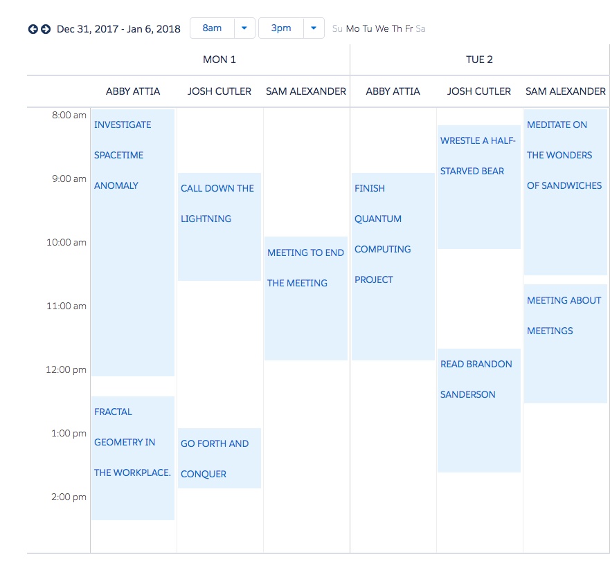
Week View without grouping lanes:
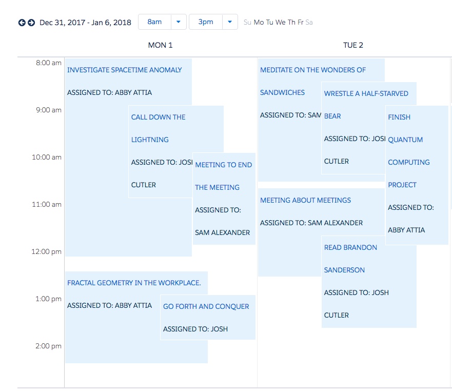
Week View with grouping lanes based on an “owner” field to divide the calendar day across three employees:
Grouping Model:
In Week View: When grouping events, the model which contains the field to be used as the Grouping Template.
In Day Scheduling View: A separate model from the event source model, which contains fields to be used with the Grouping Template.
Note
Include the lookup relationship field in the event source model for the relationship between the event source model, and this second model, to function properly.
Grouping Template:
- In Week View: The field used to divide days into lanes and then group events into their associated lane category. For example, if using a “room” field, all events that occur in conference room 1 will be in a different lanes than those that occur in conference room 2.
- In Day Scheduling View: The field used to divide days in categories, and group events with their associated category row. For example, if using a name field on model for an entity that lists accounts, events associated with client A will be in a separate row from those associated with client B, and so on.
Visible Rows: In Day Scheduling View, the number of category rows visible when the calendar loads. This can be set to 5, 10, 25, or 50 rows; users can also modify row display in runtime.
Show Search Box: When checked, displays a search box to search all events in the calendar.
Search Method: For Day Scheduling View only.
- Client: (Default) Searches records already loaded into the calendar day via the Grouping Model.
- Custom: Uses a custom snippet to search the event source model, rather than the Day Scheduling View Grouping Model.
- Custom Search Snippet: The name of the search snippet.
Advanced Tab
- Default Start Hour: The first hour displayed for weekly and daily calendars.
- Default End Hour: The last hour displayed for weekly and daily calendars.
- Divisions Per Hour: The number of divisions per hour. Four divisions (the default) allows scheduling every 15 minutes. Change it to any integer between 1 (hours) or 12 (five minute divisions)