Table Component: Custom Field Renderers
The Table component contains a rich variety of field renderers for displaying and editing standard Salesforce fields (see skuid.ui.fieldRenderers()). Beyond standard renderers, Skuid also provides Templates which can give you enormous flexibility in displaying the data you need (just drag one into a Table to create a custom field).
Occasionally, though, you may find that you need an even more customized experience within a Table. For example, you may want to use a jQuery UI slider control rather than a textbox or embed a YouTube video while still allowing the URL to be editable. Custom field renderers give you the power to display and edit your data however you see fit.
Field Renderer Snippet Reference
A field renderer snippet is run whenever a field is rendered within a cell on the table. If, for example, a single Custom Field Renderer is used for two fields and there are 10 rows currently displayed on the page, then the Field Renderer snippet will be executed 20 times, once for each field in each row.
Standard field renderers have three functions: read, readonly and edit. A custom field renderer, however, has only one. Therefore, a Custom Field Renderer will be called for all modes - both for reading and editing. This will become clearer as we go through the tutorial. Just keep this in mind:
Note
A Custom Field Renderer will execute once for each rendered cell and is responsible for displaying the field in “read,” “readonly,” and “edit” modes.
A field renderer snippet has two arguments available to it:
- arguments[0] (skuid.ui.Field): The Field which represents the field associated with the current cell.
- arguments[1] (object): The value of the field for the current row. The type of this argument depends on the associated field.
Example 1: Displaying an Icon
Note
This tutorial only works with Classic themes in API version 1. If you’re working with other themes, use the sk-icon CSS class with the Skuid’s standard or Font Awesome icons.
Because Skuid’s Lightning icon set uses a different markup to implement icons (SVGs instead of CSS content), this tutorial will not work with those icons.
In this example, we will create a custom field renderer for the Rating field of our Lead records.
- For “cold” leads we will display a blue flag.
- For “warm” leads we will display an orange flag.
- For “hot” leads we will display a red flag.
- For leads without a rating, we’ll display a (magic) 8 ball.
To begin, create a new Skuid page with the following properties:
- Page Name: SkuidSample_CustomFieldRenderer
- Type: Desktop
- Page Template: Object list / tab page
- Primary Object: Lead
On the new page, include the Rating field in the Lead model and add the Rating field to the table .
In the Rating’s Field Properties, set the following properties:
- Field Renderer: Custom (run a Snippet)
- Render Snippet Name: SkuidSample.RatingFieldRenderer
Now, go to the “Resources” tab and create a new Javascript resource with the following properties:
- Resource Location: In-Line (Snippet)
- Snippet Name: SkuidSample.RatingFieldRenderer
We will now edit the Snippet body and add the value of the field to the table cell.
Begin by deleting the placeholder code.
Next, create a reference to the table cell’s parent DOM element. This is available from the Field object, the first argument passed to the snippet. (The cell’s parent element is actually a DOM element wrapped in a jQuery function, which makes DOM manipulation significantly easier.)
1 2 | var field = arguments[0];
var cellElem = field.element;
|
The cell’s value is made available as the snippet’s second parameter.
1 | var value = arguments[1];
|
All that remains is to set the text of the parent element to the value of the second parameter via jQuery’s text( ) function, like so:
1 | cellElem.text( value );
|
The page preview should look something like this:
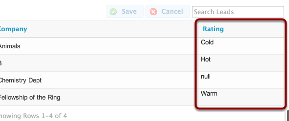
This is a great test to make sure that the code is reading in the correct value, but it’s not very useful. In fact, a basic Template field provides a bit more functionality than this.
It’s time to customize the field with an icon. Skuid uses the silk icon set and applies the icons to DOM elements with a CSS class name. To display an icon based on the value of the cell, just add branching logic (an if or switch statement) and then add a div element to the cell with the appropriate CSS class. (Notice also that you can create a reference to Skuid’s version of jQuery via the skuid.$ property):
var $ = skuid.$,
field = arguments[0],
value = arguments[1];

var cellElem = field.element;
var iconElem =
    $( '<div>' ) // create the icon container
        .addClass('ui-silk') // mark the container as a silk icon container
        .appendTo( cellElem ); // add the container to the cell

switch( value )
{
    case 'Hot':
        // apply the red flag icon to the container
        iconElem.addClass('ui-silk-flag-red');
        break;
    case 'Warm':
        // apply the orange flag icon to the container
        iconElem.addClass('ui-silk-flag-orange');
        break;
    case 'Cold':
        // apply the blue flag icon to the container
        iconElem.addClass('ui-silk-flag-blue');
        break;
    default:
        // apply the 8 ball icon to the container
        iconElem.addClass('ui-silk-sport-8ball');
        break;
}
The final result shows the icons in place of the text:
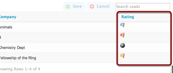
Awesome! We’ve made a simple field renderer to display Ratings as flags.
Example 2: Enabling the Standard Editor
The flags look great, but there’s one glaring problem. The field doesn’t provide an editor:
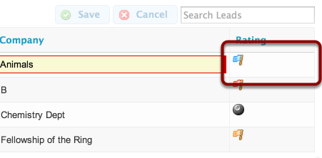
When creating a custom field renderer, the renderer is responsible for rendering the field in all of the possible states (read, readonly and edit). Fortunately, there is an easy way to bring the edit functionality back: delegating rendering to the standard field editor when the field mode is “edit.” You can call an instance of a field renderer from Skuid’s standard library using skuid.ui.getFieldRenderer().
For example, to render an editable picklist field, call…
1 | skuid.ui.getFieldRenderer('PICKLIST').edit( field, value );
|
… passing in the appropriate skuid.ui.Field and current value.
To determine which mode the field should be rendered as, check the value of the mode property on the field object. Also, rather than hardcoding the field type, use the displaytype property from the field’s metadata as a key into the fieldRenderers map.
The finished code should look something like this:
1 2 3 4 5 6 7 8 9 10 11 12 13 14 15 16 17 18 19 20 21 22 23 24 25 26 27 28 29 30 31 32 33 | var $ = skuid.$;
var field = arguments[0];
var value = arguments[1];
switch( field.mode ){
case 'edit':
skuid.ui.getFieldRenderer(field.metadata.displaytype).edit( field, value );
break;
case 'read':
case 'readonly':
var cellElem = field.element;
var iconElem =
$( '<div>' )
.addClass('ui-silk')
.appendTo( cellElem );
switch( value )
{
case 'Hot':
iconElem.addClass('ui-silk-flag-red');
break;
case 'Warm':
iconElem.addClass('ui-silk-flag-orange');
break;
case 'Cold':
iconElem.addClass('ui-silk-flag-blue');
break;
default:
iconElem.addClass('ui-silk-sport-8ball');
break;
}
break;
}
|
And the result:
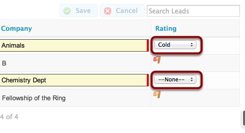
The field renderer now handles the “read” and “readonly” modes and delegates rendering to the standard renderer for the “edit” mode.
Example 3: Building a Custom Editor
Example 2 produced a useful snippet (a user can certainly get work done!), but the editor feels out of step with the normal display. To fix this, we’ll now create a custom editor with a list of icons and allow the user to select the correct icon corresponding to the Lead’s Rating.
Fortunately, Skuid makes it incredibly easy to update the model from Javascript. If you’ve already got a Field (which was passed as the first parameter to our snippet), then you can do it with just one line of code:
1 | field.model.updateRow( field.row, field.id, <insert value here> );
|
That’s it… the rest is just UI! In fact, Skuid will even handle sending messages to other controls and components on the page, notifying them of the change. When you call this function, the Save and Cancel buttons will automatically light up. Clicking them will commit the changes in the Model to the database - and all of that happens with this single line of code.
Here’s the full working example:
var $ = skuid.$,
field = arguments[0],
value = arguments[1];

var cellElem =
    field.element
        .css( 'margin', '3px' );

switch( field.mode )
{
    case 'read':
    case 'readonly':
        var iconElem =
            $( '<div>' )
                .addClass( 'ui-silk' )
                .appendTo( cellElem );

        // Based on the value, apply a particular icon style to the iconElem
        switch( value )
        {
            case 'Hot': iconElem.addClass('ui-silk-flag-red'); break;
            case 'Warm': iconElem.addClass('ui-silk-flag-orange'); break;
            case 'Cold': iconElem.addClass('ui-silk-flag-blue'); break;
            default: iconElem.addClass('ui-silk-sport-8ball'); break;
        }
        break;

case 'edit':
    // The click handler is applied to each rating option <div>. It sets
    // the appropriate styling and updates the Model with the selected value
    function optionClickHandler ( event )
    {
        // "unselect" all options
        $.each( options, unselect );

        // Get the value of the clicked rating option
        var selVal = $( event.target ).data( 'value' );
        // Apply "selected" styling to the appropriate icon
        select(
            options.filter(
                function( opt ){ return opt.data('value') === selVal; }
            )[0]
        );

        // And here it is......
        // Update the model with \*\*one\*\* line of code!
        field.model.updateRow( field.row, field.id, selVal );
    }

    // Create a function to style "selected" elements (opacity = 100%)
    function select ( i, elem )
    {
        $( elem || i ).css( 'opacity', '1.0' );
    }

    // Create a function to style "unselected" elements (opacity = 20%)
    // Note: opactity is not compatible with IE8! use:
    // -ms-filter: "progid:DXImageTransform.Microsoft.Alpha(Opacity=50)";
    function unselect ( i, elem )
    {
        $( elem || i ).css( 'opacity', '0.2' );
    }

    // Create an array of our icon DOM elements
    // The "data-value" attribute is used to associated the DOM element
    // with one of the values in the Rating picklist
    var options =
    [   $( '<div>' ).attr( 'data-value', null )
            .addClass( 'ui-silk ui-silk-sport-8ball' ),
        $( '<div>' ).attr( 'data-value', 'Hot' )
            .addClass( 'ui-silk ui-silk-flag-red' ),
        $( '<div>' ).attr( 'data-value', 'Warm' )
            .addClass( 'ui-silk ui-silk-flag-orange' ),
        $( '<div>' ).attr( 'data-value', 'Cold' )
            .addClass( 'ui-silk ui-silk-flag-blue' ) ];

    // Initialize the option elements and add them to the table cell element
    $.each( options,
        function( i, opt ){
            opt.click(optionClickHandler)
                .addClass( 'inline' ).addClass( 'buttonicon' )
                .appendTo( cellElem );

            // Apply styling to the already-selected rating
            if ( opt.data( 'value' ) == value )
                select( opt );
            else
                unselect( opt );
        });
    break;
}
And here’s how it looks on the page:
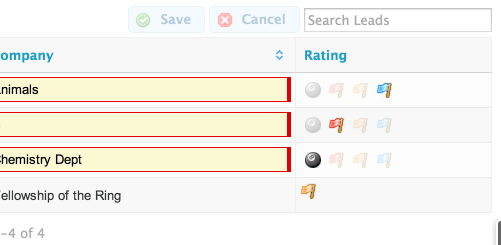
As already mentioned, changing the value of the flag automatically enables the Save and Cancel buttons on the table:
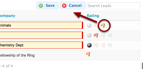
Clicking Save will commit the change to the database and then re-render the table in “read” mode.
That’s it! We have a completely custom interface making full use of the Skuid Models with only a few lines of Javascript.
Example 4: Reading Other Fields
So far, the examples we’ve covered demonstrate working with a single field, but the Skuid API gives you the tools to interact with any of the data on the page - any field in any record on any model - with a few simple lines of Javascript.
To demonstrate this, we will now create a new custom field renderer which displays the Lead’s email address. The email address will be a “mailto:” hyperlink, meaning that the user’s preferred email application will launch when the link is clicked… unless the Email Opt Out field is set to true. If the Lead has opted out of emails, then we will display non-hyperlinked text with a strike-through (signaling that the email address should not be used). Just to add a little extra spice, we’ll also display the Lead’s First and Last Name.
To begin, add the “Email” and “Email Opt Out” fields to the Lead Model and then add the fields to the Table.
Just as in Example 1, go to the “Resources” tab in the App Elements pane and create a new Javascript resource with the following properties:
- Resource Location: In-Line (Snippet)
- Snippet Name: SkuidSample.EmailFieldRenderer
Delete the placeholder code and add the following code. The code builds the baseline UI and is very much like Example 2.
1 2 3 4 5 6 7 8 9 10 11 12 13 14 15 16 17 18 19 20 21 22 23 24 25 26 27 | var $ = skuid.$;
var field = arguments[0];
var value = arguments[1];
switch( field.mode )
{
case 'edit':
skuid.ui.getFieldRenderer(field.metadata.displaytype).edit( field, value );
break;
case 'read':
case 'readonly':
// If the email address is null, then just skip the rest of the logic
if ( !value ) break;
var cellElem = field.element.addClass( 'nx-fieldtext' );
var linkElemTemplate =
'<a href="mailto:{{{Email}}}">' +
'<div class="inline ui-silk ui-silk-email-go"></div> ' +
'Send Email to {{{FirstName}}} {{{LastName}}} at {{{Email}}}</a>';
// mergeRow calls mustache to parse the template and returns the result
$( field.model.mergeRow( field.row, linkElemTemplate ) )
.appendTo( cellElem );
break;
}
|
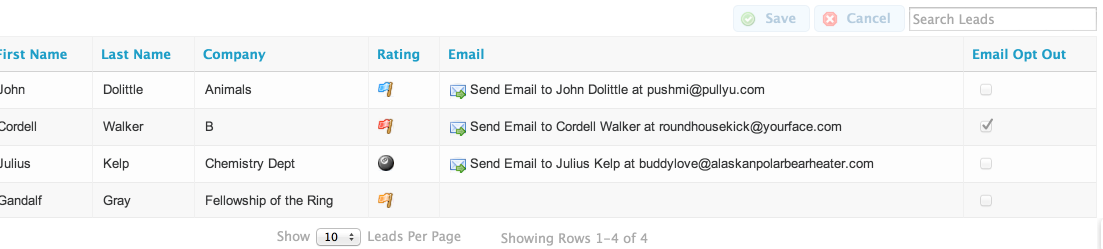
Here’s how it looks:
As in previous examples, most everything needed is accessible via the Field argument. In this case, we will use the field argument to access the model and field value:
1 | var isOptOut = field.model.getFieldValue( field.row, 'HasOptedOutOfEmail');
|
Now branch the code to display the appropriate UI:
1 2 3 4 5 6 7 8 9 10 11 12 13 14 15 16 17 18 19 20 21 22 23 24 25 26 27 28 29 30 31 32 33 34 35 | var $ = skuid.$;
var field = arguments[0],
value = arguments[1],
model = field.model,
row = field.row;
switch( field.mode )
{
case 'edit':
skuid.ui.getFieldRenderer(field.metadata.displaytype).edit( field, value );
break;
case 'read':
case 'readonly':
// If the email address is null, then just skip the rest of the logic
if ( !value ) break;
var cellElem = field.element.addClass( 'nx-fieldtext' );
var isOptOut = model.getFieldValue( row, 'HasOptedOutOfEmail'); var linkElemTemplate = '';
if ( !isOptOut ) linkElemTemplate =
'<a href="mailto:{{{Email}}}">' +
'<div class="inline ui-silk ui-silk-email-go"></div> ' +
'Send Email to {{{FirstName}}} {{{LastName}}} at {{{Email}}}</a>';
else
linkElemTemplate =
'<div class="inline ui-silk ui-silk-email-delete"></div> ' +
'Do Not Email! ' +
'<span style="text-decoration: line-through;">{{{Email}}}</span>';
// mergeRow calls mustache to parse the template and returns the result
$( field.model.mergeRow( field.row, linkElemTemplate ) )
.appendTo( cellElem );
break;
}
|
And the result:
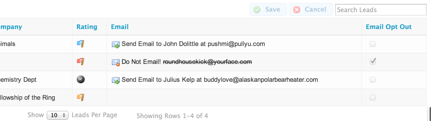
Field rendering and behavior is now based on the Field’s value as well as neighboring Fields within the same row.
This technique could be easily expanded to pull values from other models. Rather than using the Field’s Model, for example, you could use skuid.model.getModel() ( ‘<model id>’ ) to get a reference to any Model defined in the Page Composer. You could use getRowById() ( ‘<row id>’ ) to get a specific row then call Field() and skuid.model.Model for more information.
Recipes
Numeric Slider
var field = arguments[0],
    value = arguments[1],
    $ = skuid.$;

if ( field.mode == 'read' )
{
    // For Read mode, just use the standard Integer read-mode renderer
    skuid.ui.getFieldRenderer('INTEGER').read(field,value);
}
else if (field.mode == 'edit')
{
    // For Edit mode, render a jQuery ui slider
    // with step size 1 and boundary range [0,10].
    // Whenever this slider is updated,
    // the data row in context will be updated as well.
    var slider = $('<div>').slider({
        value:value || 0,
        min: 0,
        max: 10,
        step: 1,
        slide: function( event, ui ) {
            // Update our model with the new value
            field.model.updateRow(
                field.row,
                field.id,
                ui.value,
                { initiatorId : field._GUID}
            );
        }
    });
    field.element.append(slider);
}
Embed a YouTube Video
Note
If you only need to display a YouTube video (without the need for editing), then you may want to consider dragging a Template into a table - it’s a generally easier solution to embedding static HTML content.
1 2 3 4 5 6 7 8 9 10 11 12 13 14 15 16 17 18 19 | var field = arguments[0],
value = arguments[1],
$ = skuid.$;
switch ( field.mode )
{
case "edit":
// For EDIT mode, use the standard String edit-mode renderer
skuid.ui.getFieldRenderer('STRING').edit( field, value );
break;
default:
// For all other modes, render an iframe containing the youtube video
$( '<iframe width="356" height="200" frameborder="0">' )
// The value is assumed to be a YouTube Video ID...
// Adjust this line if you prefer the entire link, etc...
.attr( 'src', '//www.youtube.com/embed/' + encodeURI( value ) )
.appendTo( field.element );
break;
}
|