skuid.ui
Classes
skuid.ui.Editor
An Editor represents a connection to a Model. It provides a way of issuing changes and receiving notifications about updates. An Editor is usually associated with a particular control, such as a textbox, but may also represent an abstract relationship within memory, such as an in-line snippet which should receive notifications about changes to a Model without actually rendering a control to edit the Model.
See skuid.ui.Editor.
skuid.ui.Field
A Field is an object which represents a single value associated with a record which is stored within an sObject. The Field exposes a value, the context for that value and the record with which the value is associated, among other things.
See skuid.ui.Field.
skuid.ui.Item
An Item represents some logically cohesive data which forms a unit within a List. For example, an Item may be rendered as a row within a Table or Queue.
See skuid.ui.Item.
skuid.ui.List
A List represents an abstract collection of related items which can be rendered as a UI element. For example, a List may be rendered as a Table or Queue with rows of data. List contains properties and methods to enable and support common list-related UI features (such as pagination).
See skuid.ui.List.
Properties
-
skuid.ui.fieldRenderers¶ object
A simple map of all Skuid’s standard renderers for each Salesforce Display Type including BOOLEAN, TEXT, REFERENCE and FILE.
Direct access to this map is not recommended. Instead, these Field Renderers can be accessed using
skuid.ui.getFieldRenderer().See skuid.ui Field Renderers for a thorough reference.
-
skuid.ui.renderers¶ object
A simple map of “basic” renderers that generate a simple UI element without tying it to a specific skuid.ui.Field. These renderers are useful for generating UI controls that don’t necessarily or directly affect Models, including BOOLEAN, DATE and TEXT controls.
Direct access to this map is not recommended. Instead, these renderers can be accessed using
skuid.ui.getRenderer().See skuid.ui Basic Renderers for a thorough reference.
-
skuid.ui.searchableDisplayTypes¶ object
Read-Only.
A map of display types that can be used to search for records. As of the Spring ‘14 release, the following display types are included:
- ID
- STRING
- TEXT
- PICKLIST
- MULTIPICKLIST
- COMBOBOX
- PHONE
- URL
- REFERENCE
- TEXTAREA
Use the following code to test if a skuid.ui.Field can be used for searching:
1
var isSearchable = field.metadata.displaytype in skuid.ui.searchableDisplayTypes;
—
skuid.ui.Editor
An Editor represents a connection to a Model. It provides a way of issuing changes and receiving notifications about updates. An Editor is usually associated with a particular control, such as a textbox, but may also represent an abstract relationship within memory, such as an in-line snippet which should receive notifications about changes to a Model without actually rendering a control to edit the Model.
Constructor
-
new skuid.ui.Editor(parentElement, options)¶ Instantiates a new editor. parentElement is the parent dom element that this editor will attach itself to. The options.showSaveCancel property will tell the editor whether or not to create a save and cancel button for this editor.
Prototype Functions
-
skuid.ui.Editor.element()¶ $( DOM Element )
The root node containing the UI for the Editor. For instance, in a Table, element would refer to the Table component’s jQuery-wrapped top-level <div> element.
Note
The Element associated with a Editor will have a reference to the Editor stored in the jQuery object data attribute. For example, to get at the Editor corresponding to a Table component with Id “table-id”, you could do $(‘#table-id’).data(‘object’).*
-
skuid.ui.Editor.registerModel(model)¶ Indicates to a Model that this editor will be editing it. Once registered, an Editor will be notified when changes are made to the Model. If a change is made, handleChange() will be called. If new data comes in from the server, handleDataRefresh() will be called. If the model is saved or cancelled, handleSave() or handleCancel() will be called.
Arguments: - model (skuid.model.Model) – The Model to register with the current Editor.
-
skuid.ui.Editor.save()¶ Saves all models associated with this editor.
-
skuid.ui.Editor.cancel()¶ Cancels all models associated with this editor.
-
skuid.ui.Editor.clearMessages()¶ Clears out all error / warning / info messages that an Editor is currently displaying, removing the messages from the Editor’s internal store of messages and visibly removing them from the Editor’s messages area in the DOM.
-
skuid.ui.Editor.handleMessages(messages, otherData)¶ Used for adding error, warning, or informational messages to an Editor’s UI. Called internally by skuid.model.Model.prototype.save() when there are missing required fields, or when there’s a save problem. are always dealt with at the skuid.ui.Editor level.
You can use this method to add custom error, warning, or informational messages to a particular Editor.
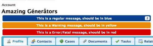
Any messages passed in to handleMessages are added to an internal Editor messages list if and only if the messages have not already been added — that is, if the text of the message is NOT identical to a message that the Editor is already displaying. Rather, any duplicate messages passed in will cause a number to be added to the message DOM element indicating how many times a duplicate message has been processed (see image below).
Arguments: - messages (objects[]) –
An array of objects with the following properties:
- message (string): A user-friendly message
- severity (string): Defines the severity (and thus styling) of the message. One of:
- < none specified> - Informational message for a normal event. Displayed in blue
- WARNING - An issue on the page that could cause undesirable behavior. Displayed in yellow
- ERROR - A problem occurred with a specific operation, forcing the operation to terminate. Displayed in red
- FATAL - A problem occurred that has caused severe problems with the entire page, such that further actions on the page are either not possible or especially dangerous. Displayed in red
- otherData (object) –
An object defining additional parameters used by Editors for properly displaying messages. Valid properties include:
- initiatorId (string): the Unique Id of an Editor object (obtained via the _GUID property). If initiatorId is provided, then ONLY the Editor whose Unique Id equals initiatorId will actually display the provided messages — otherwise, all Editors upon which handleMessages was called will display all of the messages provided. This is not used much in custom development, but it is used internally by Skuid to prevent all Editors from displaying errors initiated by any other Editor (which would be a visual mess).
- All types of messages can be removed by the user simply by clicking on the message’s generated DOM node. All messages are displayed in a .nx-message DOM node and added to a .nx-messages DOM container. Here is an example:
 1
 2
 3
 4
 5
 6
 7
 8
 9
10
11
12
13
14
15
16
17
18
19
20
21
22
var $ = skuid.$;
var pageTitle = $('#MyPageTitle');
var editor = pageTitle.data('object').editor;
editor.handleMessages(
    [
       {
          message: 'This is a regular message, should be in blue'
       },
// Since this is a duplicate, it should not be displayed twice
       {
          message: 'This is a regular message, should be in blue'
       },
       {
          message: 'This is a Warning message, should be in yellow',
          severity: 'WARNING'
       },
       {
          message: 'This is a Error/Fatal message, should be in red',
          severity: 'ERROR'
       }
    ]
);
- messages (objects[]) –
Overriding and Extending Editors
Skuid Editors have four prototype methods that can be overridden or extended. The four methods are:
- handleCancel()
- handleChange()
- handleDataRefresh()
- handleSave()
Each of these Editor prototype methods corresponds directly with a Model prototype method. When these Model prototype methods are called on a Model, the Model will call the appropriate corresponding Editor methods on all registered Editors. Here is an overview of the Model - Editor method correspondence:
- Model.updateRow[s]() —> calls Editor.handleChange() on all registered Editors
- Model.createRow () —> calls Editor.handleChange() on all registered Editors
- Model.save() —> calls Editor.handleSave() on all registered Editors
- Model.cancel() —> calls Editor.handleCancel() on all registered Editors
- Model.updateData() —> calls Editor.handleDataRefresh() on all registered Editors
-
skuid.ui.Editor.handleCancel()¶ Called at the end of skuid.model.Model.prototype.cancel() / skuid.model.cancel([models]). By default, this disables the Save/Cancel buttons for an Editor and removes any “Saving…” processing messages, so it is recommended that if you override this method, you should first call the prototype.
-
skuid.ui.Editor.handleChange(changeInfo)¶ Called after a skuid.model.Model object, with which the current Editor is registered, has completed updating a row (initiated via updateRow()) or creating a row (initiated via createRow()).
By default, this enables the Save/Cancel buttons for an Editor and disables Filters and Search on any skuid.ui.List objects (e.g. Tables, Queues). If overriding this function, it is highly recommended that you first call the prototype.
Arguments: - changeInfo (object) –
Contains two properties:
- hadPriorChanges (boolean): true if the Model had any changes prior to updateRow / createRow being called
- changes (object): a mapping of changed values by field API name, by row Id, or a simple map of changed values by field API name if only one row was changed.
For example:
1 2 3 4 5 6 7 8 9
{ hadPriorChanges: true, changes: { '0010000000003bcAAA': { 'Name': 'Genepoint CHANGED', 'Description': 'Something I just changed' } } }
- changeInfo (object) –
-
skuid.ui.Editor.handleDataRefresh()¶ Called at the end of skuid.model.Model.prototype.updateData() or skuid.model.Model.prototype.load() on any Editors registered on a Model.
This method has no default prototype method, however various Components provide implementations of it, for instance Calendar’s implementation of handleDataRefresh automatically redraws its Event Sources in response to new Model data, therefore it would be best to call the prototype handleDataRefresh, if it exists, before writing any custom functionality of your own.
-
skuid.ui.Editor.handleSave(totalSuccess)¶ Called at the end of skuid.model.Model.prototype.save() / skuid.model.save([models]). By default, this re-enables the Save/Cancel buttons for an Editor and removes any “Saving…” processing messages, so it is recommended that if you override this method, you should first call the prototype via skuid.ui.Editor.prototype.handleSave.call(editor,totalSuccess);
Arguments: - totalSuccess (boolean) – Indicates if all records for which a save was attempted were successfully inserted, updated, or deleted (as requested). If there were any errors on any Model, then totalSuccess will be false.
skuid.ui.Field
A Field is an object which represents a single value associated with a record which is stored within an sObject. The Field exposes a value, the context for that value and the record with which the value is associated and, generally, a UI element to edit that field.
Constructor
-
new skuid.ui.Field(row, model, editor, config)
Instantiates a new Field that can generate an HTML element for displaying / interacting with a particular field on a particular row in a particular model. The Skuid JavaScript equivalent of the <apex:inputField> tag.
Example:
1 2 3 4 5 6 7 8 9 10 11 12 13 14 15 16 17 18 19 20 21 22 23 | // Get a reference to the model and row we'll be working with
var model = skuid.model.getModel('AccountData'),
row = model.getFirstRow();
// Creating an editor is for advanced scenarios.
// You typically set this to null.
var editor = null;
// Create a new skuid.ui.Field
// corresponding to the 'MailingCity' field
var f = new skuid.ui.Field(
row,
model,
editor,
{
fieldId: 'MailingCity',
register: true
}
);
// Render the field, running the corresponding field renderer logic
// using the metadata Skuid finds for the 'MailingCity' field.
f.render();
|
Properties
-
skuid.ui.Field.editor¶ skuid.ui.Editor
The skuid.ui.Editor associated with the field, if any. This will be populated for most standard Skuid Fields (e.g. Fields in a Field Editor or Table).
-
skuid.ui.Field.element¶ $( DOM Element )
A jQuery wrapped DOM element representing the parent node for the field. Add HTML content to element to have it displayed in the appropriate place on the screen.
Note
Elements directly associated with a Field will have a reference to the Field stored in the jQuery object data attribute. For example, to get at the Field corresponding to the first <td> element in the first row of a Table Component with Id “table-id”, you could do $(‘#table-id tr:first-child > td:first-child’).data(‘object’).
-
skuid.ui.Field.id¶ string
The field API name. e.g. “FirstName”, “CreatedBy”, “CustomField__c”
-
skuid.ui.Field.item¶ skuid.ui.Item
A skuid.ui.Item object representing the list item associated with the row to which the current field belongs.
-
skuid.ui.Field.label¶ string
The field label as defined by the “Custom Label” property from the Page Composer or as defined by the Salesforce sObject field result metadata.
-
skuid.ui.Field.metadata¶ Skuid Model Field Metadata Object
Metadata about the field.
-
skuid.ui.Field.mode¶ string
The Skuid display mode to use when rendering this Field. One of:
- “read” (read mode, with ability to doubleclick into Edit mode, aka “Inline-Edit Mode”)
- “readonly” (read mode, NO ability to doubleclick into Edit mode)
- “edit” (starts out in Edit mode)
-
skuid.ui.Field.model¶ skuid.model.Model
The skuid.model.Model from which the current Field is derived.
-
skuid.ui.Field.name¶ name
The field alias. This is usually only used for aggregate queries.
-
skuid.ui.Field.required¶ boolean
Indicates if the field is required, as specified either by the Page Composer or the Salesforce field’s metadata. Required fields will be wrapped in a red border to indicate that they must have some value in them in order for the corresponding Model to be saved.
-
skuid.ui.Field.row¶ object
The data row that this skuid.ui.Field is editing on its model, represented as a JavaScript object containing a simple mapping of field names to field values for the current row. For example, the current row of a Model with fields “Name” and “CustomField__c” would be represented as:
1 2 3 4
{ 'Name': '<name value>', 'CustomField__c': '<custom field value>' }
Prototype Functions
-
skuid.ui.Field.render()¶ Renders the field, creating or modifying field.element, a DOM element. Runs the appropriate field renderer logic based on the specified data field’s metadata and the field’s current mode.
For example: - If field.id were
'MailingCity'on the Account object, and field.mode were'edit', then the('TEXT')['edit']renderer would be used. - If field.id were'CreatedDate'and field.mode were'readonly', then the('DATETIME')['readonly']renderer would be used.For more documentation about field renderers, see skuid.ui Field Renderers.
Overriding Field Prototype Functions
Skuid Fields have one prototype method that may need to be overriden: handleChange().
Note
This will only be called by Skuid if the skuid.ui.Field is registered on a particular model. If a change is made to the skuid.ui.Field’s corresponding row and field in that model, then Skuid will call the skuid.ui.Field’s handleChange() method as soon as the model has finished processing the change.
handleChange() is only called by Models as a result of calls to the Model updateRow() method – handleChange is NOT called after calls to the Model save(), cancel(), or updateData() methods. However, render() WILL be called after save(), cancel(), or updateData(), as a given Field’s DOM element will be completely rebuilt as a result of these three events.
-
skuid.ui.Field.handleChange(newValue)¶ - By default, re-renders the Field. Override this method if using the Field as a Listener and you want to perform some custom logic based on the new value for the Field.
Arguments: - newValue (object) – The new value that was entered for this Field’s row and field in the model. For example, if you call field.model.updateRow(field.row,field.id,’Cheese’), then handleChange(“Cheese”) would be called on the field.
skuid.ui.Item
An Item represents some logically cohesive data which forms a unit within a List. For example, an Item may be rendered as a row within a Table or Queue.
Properties
-
skuid.ui.Item.deleted¶ boolean
Read-only. Indicates whether this Item has been marked for deletion.
-
skuid.ui.Item.element¶ $( DOM Element )
The root node containing the UI for the Item. For instance, in a Table, element would refer to a particular jQuery-wrapped <tr> element in the table body.
Note
Elements directly associated with an Item will have a reference to the Item stored in the jQuery object data attribute. For example, to get at the Item corresponding to the first <tr> element in a Table with Id “table-id”, you could do $(‘#table-id tr:first-child’).data(‘object’).
-
skuid.ui.Item.fields¶ skuid.ui.Field [ ]
An array of fields associated with this Item.
-
skuid.ui.Item.list¶ skuid.ui.List
The List to which this Item belongs.
-
skuid.ui.Item.mode¶ string
The Skuid display mode to use when rendering this Field. One of:
- “read” (read mode, with ability to doubleclick into Edit mode, aka “Inline-Edit Mode”)
- “readonly” (read mode, NO ability to doubleclick into Edit mode)
- “edit” (starts out in Edit mode)
-
skuid.ui.Item.row¶ object
A simple mapping of field names to field values for the current row. For example, a row within a Model with two fields, “Name” and “CustomField__c”, and a field from a lookup relationship, “skuid__AttachmentId__c” from the sObject “skuid__Image__c” using the relationship named “Image__r”, would be represented as:
1 2 3 4 5 6 7 8 9 10
{ 'Name': '<name value>', 'CustomField__c': '<custom field value>', 'Image__c': '<image Id>' 'Image__r': { 'Id': '<image Id>', 'skuid__AttachmentId__c': '<attachment Id>' } }
-
skuid.ui.Item.selected¶ boolean
Indicates whether or not this Item is selected within its list. For example, if the parent List is represented within a Table component, then this value would be true for “checked” rows.
Prototype Functions
-
refreshFields()¶ Resets the mod e of all fields in the fields array to match the Item’s mode and then calls render() for all Fields whose mode was changed.
-
toggleEdit()¶ If the Item is not read-only, toggles the mode between “read” and “edit” and calls refreshFields().
Returns: The Item (so as to enable function chaining). Return type: skuid.ui.Item
-
toggleDelete(notifyModel)¶ Toggles whether the item is “marked” for deletion.
Arguments: - notifyModel (boolean) – Indicates whether the underlying row object should be marked/unmarked for deletion in the parent skuid.model.Model. Defaults to false, meaning the Model will not be notified and the record will not be deleted when the Model is committed to the database.
Returns: The Item (so as to enable function chaining).
Return type: skuid.ui.Item
skuid.ui.List
A List represents an abstract collection of related items which can be rendered as a UI element. For example, a List may be rendered as a Table or Queue with rows of data. List contains properties and methods to enable and support common list-related UI features (such as pagination).
Properties
skuid.ui.List.currentPage¶integer
The 0-based index of the currently displayed page.
skuid.ui.List.currentPageSize¶integer
The number of items displayed per page.
skuid.ui.List.currentView¶string
The name of the currently selected table view.
skuid.ui.List.editor¶skuid.ui.Editor
The editor associated with the List.
skuid.ui.List.element¶$( DOM Element )
The root node containing the UI for the List. For instance, in a Table, element would refer to the Table’s jQuery-wrapped <table> element.
Note
The Element associated with a List will have a reference to the List stored in the jQuery object data attribute. For example, to get at the List corresponding to the <table> element in a Table Component with Id “table-id”, you could do $(‘#table-id table’).data(‘object’).
skuid.ui.List.mode¶string
The Skuid display mode to use when rendering this Field. One of:
- “read” (read mode, with ability to doubleclick into Edit mode, aka “Inline-Edit Mode”)
- “readonly” (read mode, NO ability to doubleclick into Edit mode)
- “edit” (starts out in Edit mode)
skuid.ui.List.model¶skuid.model.Model
The Model from which the data within the List is derived.
skuid.ui.List.renderedItems¶object
A cache of all skuid.ui.Item objects which have been rendered by the List. This cache is occasionally cleared, such as when a Model is reloaded.
renderedItems is a simple object map of record Ids to Items:
skuid.ui.List.visibleItems¶skuid.ui.Item [ ]
An array of Items object currently visible within the parent List. For instance, if you there are 100 records in your List’s Model, and you are showing 10 records per page, and are on page 2, then visibleItems will contain Items 11-20.
Functions
-
skuid.ui.List.addRequiredField(fieldObject)¶ Registers a Required Field with the List, such that, when validateRequiredFields() is called on the List, if that Field has no value, a validation error message will be returned.
Arguments: - fieldObject (object) – (REQUIRED) Either a skuid.ui.Field or a JavaScript object with an id attribute containing the API name of a Model Field that should be considered Required.
EXAMPLE: Either/or required fields:
1 2 3 4 5 6 7 8 9
// If DoNotCall is true, then Email should be required, // otherwise, Phone should be required if (row.DoNotCall===true) { list.removeRequiredField({ id: 'Phone' }); list.addRequiredField({ id: 'Email' }); } else { list.removeRequiredField({ id: 'Email' }); list.addRequiredField({ id: 'Phone' }); }
-
skuid.ui.List.getSelectedItems()¶ Returns an Array of all skuid.ui.Items in the List that are currently selected.
-
skuid.ui.List.goToPage(number)¶ A zero-based function that navigates a list to a specific page of visible rows. For example, to navigate to the first page of a Deck component’s list:
1 2
var deck = skuid.component.getById("sk-1RkxB-136") // Create a reference to the specific Deck component. deck.list.goToPage(0) // Go to the first page of visible rows.
Then to navigate to the second page:
1
deck.list.goToPage(0)
And so on.
Arguments: - number (number) – The page number to send a list to.
-
skuid.ui.List.newItem(row, options)¶ Creates a new skuid.ui.Item for the given Model row object, calls render() on the Item, and then adds the Item to the List’s renderedItems property. By default the Item’s mode will be whatever mode the List itself is in, and the Item will not be selected.
Arguments: - row (Model row object) – (REQUIRED) The Model row that will be displayed in this Item.
- options (object) – (OPTIONAL) Additional settings. * editModeForNewItems: If true, then the Item will be created in “edit” mode, regardless of what the List’s current mode is.
-
skuid.ui.List.nextPage()¶ Progresses the specified list to the next page of visible rows. If there are no additional pages after the current page when this function is called, no action will be taken.
-
skuid.ui.List.prevPage()¶ Navigates the specified list to the previous page of visible rows. If there are no additional pages before the current page when this function is called, no action will be taken.
-
skuid.ui.List.removeRequiredField(fieldObject)¶ Un-registers a Required Field with the List, such that, when validateRequiredFields() is called on the List, no validation errors will be added if that Field does not have a value.
Arguments: - fieldObject (object) – (REQUIRED) Either a skuid.ui.Field or a JavaScript object with an id attribute containing the API name of a Model Field that should no longer be considered required.
EXAMPLE: Either/or required fields:
1 2 3 4 5 6 7 8 9
// If DoNotCall is true, then Email should be required,
// otherwise, Phone should be required
if (row.DoNotCall===true) {
   list.removeRequiredField({ id: 'Phone' });
   list.addRequiredField({ id: 'Email' });
} else {
  list.removeRequiredField({ id: 'Email' });
   list.addRequiredField({ id: 'Phone' });
}
-
skuid.ui.List.render(options)¶ Renders the List.
First, calls any setUp() or beforeRender() functions on the currently-selected List View.
Next, determines which Items should be visible, renders these Items if either (a) they not been rendered yet or (b) doNotCache is set to true, otherwise the currently rendered Item is used and shown.
Finally, any renderComplete() and tearDown() functions on the currently-selected List View are called.
Arguments: - options (object) –
an optional object containing settings to use for performing the render.
- doNotCache (Boolean): if true, then existing rendered Items are thrown out and each Item that the List determines should be visible is newly rendered. Also, the List’s Filters bar will be rebuilt.
- refreshFields (Boolean): if true, and if doNotCache is NOT true, then as part of the render, existing skuid.ui.Fields for Items that should be visible will be re-rendered.
- resetPagination (Boolean): If true, then the currentPage of the List is set to 0, and the set of visibleItems will be determined using Page 0 as the starting point.
- options (object) –
-
skuid.ui.List.validateRequiredFields()¶ - For each required field defined on the List, the List will validate each of its Rendered Items to ensure that the row has values for each required field. If any required fields do not have values, a Message object is created. This method returns a list of all Message objects created.
Returns: Array of Message objects Message object properties:
- severity: the Severity of the Message. Will be “ERROR” for all required field validation messages.
- status: a Status Code for the Message. Will be “REQUIRED_FIELD_MISSING” for all required field validation messages.
- message: a String describing the error that occurred. Will be “Required fields have no value: ” + comma-separated list of Field labels.
- fields: An array of the Labels of the Fields that do not have values.
skuid.ui Basic Renderers
Skuid Basic Renderers provide utility functions for quickly spinning up value editors that conform with the Skuid UI. In fact, most of the Field Renderers use Basic Renderers when in edit mode. Unlike Field Renderers, however, Basic Renderers are not tied to a specific model, row or field. They are general purpose editors and require additional “manual” wiring to connect the editor with a particular data store (be that a Model or just an in-memory JavaScript object).
They are accessed using skuid.ui.getRenderer().
-
skuid.ui.getRenderer(displayType)¶ - This function retrieves a Skuid standard renderer while also performing some logic to determine which renderer features can be utilized based on the platform runtime (i.e. Skuid Platform or Skuid on Salesforce).
Arguments: - displayType – The Renderer display type to be called
Each Renderer exposes an edit() function which generates a jQuery-wrapped HTML element that can be inserted into the DOM and represents a UI editor appropriate to the type represented by the Renderer’s name. For example, BOOLEAN generates a checkbox and DATE generates a date picker.
An example of using a Basic Renderer to render a skuid.ui.Field as an email text box:
1 2 3 4 5 6 7 8 | field.element.append(
skuid.ui.getRenderer('TEXT').edit({
inputType: 'email',
value : field.row[field.id],
onChange : function( value ) {
field.model.updateRow( field.row, field.id, value );
}
}));
|
Renderer Display Types
-
skuid.ui.renderers.BOOLEAN¶ -
skuid.ui.renderers.skuid.ui.renderers.BOOLEAN.edit(options)¶ Creates an HTML checkbox element.
Arguments: - options (object) –
A simple object with the following properties:
- onChange (function( newValue )): A function called whenever the value of the checkbox element changes and which accepts a single parameter, newValue, representing the new value.
- value (boolean): The initial value of the checkbox: true representing “checked” and false representing “unchecked”.
Returns: A jQuery-wrapped <input> element of type “checkbox”.
Return type: $( HTML Element )
- options (object) –
-
-
skuid.ui.renderers.DATE¶ -
skuid.ui.renderers.skuid.ui.renderers.DATE.edit(options)¶ Creates a jQuery UI DatePicker.
Note
The UI representation of the date uses the current user’s locale, while internal representations of the date use the Salesforce Date String. Attempting to pass a non-UTC formatted date to the DATE renderer (for example, setting options.value to a US-style formatted date string, “MM/dd/yyyy”) will cause an error.
Arguments: - options (object) –
A simple object with the following properties:
- onChange (function( newValue )): A function called whenever the value of the date input changes. For example, when a date is selected from the calendar popup, or after each keypress (if typing in a value). newValue is a Salesforce Date String which is either zero-length (for a zero-length input) or a best guess at the date (for partial dates). If the date cannot be determined, then today’s date will be returned.
- value (string): A Salesforce Date String, used as the initial value of the date picker.
Returns: A jQuery-wrapped <input> element with the jQuery UI DatePicker plugin applied to it.
Return type: $( HTML Element )
- options (object) –
-
-
skuid.ui.renderers.DATETIME¶ -
skuid.ui.renderers.skuid.ui.renderers.DATETIME.edit(options)¶ Creates a jQuery UI DatePicker and a series of UI controls for selecting the time.
Note
The UI representation of the date uses the current user’s locale, while internal representations of the date use the Salesforce DateTime string. Attempting to pass a non-UTC formatted date to the DATE renderer (for example, setting options.value to a US-style formatted date string, “MM/dd/yyyy 12:30 AM”) will cause an error.
Arguments: - options (object) –
Optional. A simple object with the following properties:
- onChange (function( newValue )): Optional. A function called whenever the value of the date input or time dropdowns change. For example, when a date is selected from the calendar popup, when a new time is selected from the dropdown, or after each keypress (if typing in a value). newValue is a Salesforce DateTime string which is either zero-length (for a zero-length input) or a best guess at the date (for partial dates). If the date cannot be determined, then today’s date will be returned.
- value (string): Optional. A Salesforce DateTime string, used as the initial value of the date picker. The time portion is required.
Returns: A jQuery-wrapped <div> element containing an <input> element with the jQuery UI DatePicker plugin applied to it as well as several dropdown controls allowing the user to select a time (as appropriate for their local time zone).
Return type: $( HTML Element )
- options (object) –
-
-
skuid.ui.renderers.MULTIPICKLIST¶ -
skuid.ui.renderers.skuid.ui.renderers.MULTIPICKLIST.edit(options)¶ Creates a jQuery MultiSelect (by Eric Hynds) or, if specified, a list of checkboxes.
Arguments: - options (object) –
A simple object with the following parameters:
- checkboxSetName (string): Optional. When renderas is set to “CHECKBOXES”, this value will be incorporated into the HTML input element ids and will help to distinguish them from other checkboxes on the page with the same field names. It is very important to set this property to a value that is unique for the page.
- entries (object [ ]): Optional. An array of simple JavaScript objects which will be used to populate the UI control. Each object should have two properties: label (string) which is the value displayed to the user and value (object) which is the internal representation of the display value (and the one stored in the database).
- maxSelected (integer): Optional. The maximum number of items that may be selected at once.
- noneSelectedText (string): Optional. If renderas is not set to “CHECKBOXES”, then the text to display to the user when no options are selected.
- onChange (function( newValue )): Optional. A function called whenever the selection changes. The newValue (string) is a list, separated by the valueDelimiter, of all selected values. For example, if “a” and “b” are selected and then the user selects “c”, then onChange would be called and newValue would be “a;b;c”.
- renderas (string): Optional. If set to “CHECKBOXES”, then the control will be rendered as a list of checkboxes. Otherwise, Eric Hynd’s jQuery MultiSelect widget will be used.
- value (string): Optional. A list of values separated by the valueDelimiter which represented the items that should be marked as selected. For example, if “b” and “c” should be selected, then value should be set to “b;c”.
- valueDelimiter (string): Optional. One or more characters used to separate value lists. Defaults to “;” (semi-colon).
Returns: A jQuery-wrapped <div> element containing the requested UI elements.
Return type: $( HTML Element )
- options (object) –
-
-
skuid.ui.renderers.PICKLIST¶ -
skuid.ui.renderers.skuid.ui.renderers.PICKLIST.edit(options)¶ Creates a dropdown or, if specified, a list of radio buttons.
Arguments: - options (object) –
A simple object with the following parameters:
- addNoneOption (boolean): Optional. If true, adds an option to select “no value”. The label can be set using noneLabel.
- buttonSetName (string): Optional. When renderas is set to “RADIO_BUTTONS”, used as the value of the name attribute of the input elements. This value groups radio buttons together (so that selecting one causes all other to be de-selected, etc.). It is very important to set this property to a value that is unique for the page.
- entries (object [ ]): Optional. An array of simple JavaScript objects which will be used to populate the UI control. Each object should have two properties: label (string) which is the value displayed to the user and value (object) which is the internal representation of the display value (and the one stored in the database). Entry objects may also define an optional disabled property which, when set to true, makes an entry un-selectable.
- mode (string): Optional. If renderas is set to “RADIO_BUTTONS” and mode is “read”, then the rendered radio buttons will be disabled.
- noneLabel (string): Optional. The text to display to the user when no option has been selected. If addNoneOption is true, then an option with a blank value will be added to the list with this label.
- onChange (function( newValue )): Optional. A function called whenever the selection changes.
- renderas (string): Optional. If set to “RADIO_BUTTONS”, then the control will be rendered as a list of radio buttons. Otherwise, an HTML <option> element will be used.
- value (string): Optional. A value indicating which item should be selected initially.
Returns: A jQuery-wrapped element containing the requested UI elements. If renderas is set to “RADIO_BUTTONS”, then the element will be a <div>. Otherwise, the element will be a <select>.
Return type: $( HTML Element )
- options (object) –
-
-
skuid.ui.renderers.TEXT¶ -
skuid.ui.renderers.skuid.ui.renderers.TEXT.edit(options)¶ Creates an HTML <input> element of a given type.
Arguments: - options (object) –
A simple object with the following parameters:
- onChange (function( newValue )): Optional. A function called whenever the value changes.
- inputType (string): Optional. Any input type attribute value. For example: “color”, “email”, “month”, “number”, “password”, “tel”, “text”, “time”, “url” and “week”.
- value (string): Optional. The initial value.
Returns: A jQuery-wrapped <input> element.
Return type: $( HTML Element )
- options (object) –
-
skuid.ui Field Renderers
Field Renderers are responsible for rendering a given skuid.ui.Field’s element property. They are accessed using skuid.ui.getFieldRenderer().
-
skuid.ui.getFieldRenderer(field, displayType)¶ - This function retrieves a Skuid field renderer while also performing some logic to determine which field renderer features can be utilized based on the platform runtime (i.e. Skuid Platform or Skuid on Salesforce) as well as the data source being accessed.
Arguments: - field (skuid.ui.Field) – (Optional, but recommended) A skuid.ui.Field whose metadata (e.g. field type and data source) will help determine the appropriate Field Renderer features to utilize
- displayType – (Optional) A Field Renderer display type which will override any display type specified by the
field’s metadata
In most cases, Skuid will automatically select an appropriate renderer based on the field’s type and data source.
Applying a Field Renderer explicitly is most useful when using a Custom Field Renderer Snippet, in which case Skuid will not choose a Field Renderer for you (for an example, see Table Component: Custom Field Renderers, Example 2).
When using a Custom Field Renderer, you can apply one of the Field Renderers and then apply any additional styling you need, such as making a field’s text bold or applying color or other special effects. You can also intercept and change the value displayed to the user, though caution must be used if the field is not “readonly” since the value may be written back to the database.
Skuid Field Renderers are accessible via the skuid.ui.getFieldRenderer() function. For example, to access the EMAIL Field Renderer, you would use
1 2 3 4 5 | var renderer = skuid.ui.getFieldRenderer('EMAIL')
// or using a variable
var rendererName = 'EMAIL';
var renderer = skuid.ui.getFieldRenderer(rendererName);
|
To select a renderer dynamically based on a field’s type, use the field’s metadata:
1 | var renderer = skuid.ui.getFieldRenderer[field.metadata.displaytype];
|
After setting a Field Renderer display type, additional options may be chained for the the Field Renderers mode. This may be done using bracket or dot notation. For example, to use a field renderer from a custom field renderer snippet:
1 2 3 | var field = arguments[0],
value = arguments[1];
skuid.ui.getFieldRenderer('EMAIL').edit( field, value );
|
For a more complete example, see Table Component: Custom Field Renderers. See below for a reference of Field Renderer display types and their modes
Most Field Renderers expose three functions: edit(), read(), and readonly(). The last function, readonly(), is an alias for the read() function and is really only useful when selecting a rendering function based on the Field’s mode property (e.g. skuid.ui.getFieldRenderer(‘BOOLEAN’)[field.mode]( field, value )).
Most Field Renderers are based on the Salesforce DisplayType Enum values, though the following are Skuid-specific:
- CHILDREL: for iterating over Child Relationship data and processing a per-row Template
- COMBO: for Template fields
- CUSTOM: for running a custom field renderer (defined with a Snippet)
- FILE: for rendering a lookup to a Skuid Image object as a File Uploader / display.
- REFPICK: for rendering a reference field (lookup/master-detail) as a picklist
If your goal is to generate the UI element but you don’t need to attach it to a model, or you need fine control over the “onchange” event, then one of the Basic Renderers may be a more convenient choice.
Field Renderer Display Types
Note
The labels appearing within the screenshots below were added for clarity. Field Renderers do not create labels.
-
skuid.ui.fieldRenderers.BOOLEAN¶ 
-
skuid.ui.fieldRenderers.skuid.ui.fieldRenderers.BOOLEAN.edit(field, value)¶ Populates the element property of the given Field object with a UI element for editing a boolean (true/false) field within a Model.
Arguments: - field (skuid.ui.Field) – Required. The Field object to be rendered.
- value (boolean) – Optional. The value to display within the UI. Defaults to false.
-
skuid.ui.fieldRenderers.BOOLEAN.read(field, value)¶ Populates the element property of the given Field object with a UI element for displaying a boolean (true/false) field within a Model.
Arguments: - field (skuid.ui.Field) – Required. The Field object to be rendered.
- value (boolean) – Optional. The value to display within the UI. Defaults to false.
-
-
skuid.ui.fieldRenderers.CHILDREL¶ 
-
skuid.ui.fieldRenderers.skuid.ui.fieldRenderers.CHILDREL.read(field)¶ Populates the element property of the given Field object with a UI element for displaying a series of child objects.
Child objects are rendered using a template specified by field.options.template. The template is rendered once for each child row and the rendering results are appended to one another.
The template is required and must be defined before calling this function.
Arguments: - field (skuid.ui.Field) – Required. The Field object to be rendered.
-
-
skuid.ui.fieldRenderers.COMBO¶ 
-
skuid.ui.fieldRenderers.skuid.ui.fieldRenderers.COMBO.edit(field)¶ Renders a Skuid template and populates the element property of the given field with the result. The UI elements are enclosed within an anchor tag that, when clicked, will open a popup allowing the user to edit fields included within the template.
Because the template is rendered in the context of the row, and not just the field, the value of the Field’s fieldId property is inconsequential, but you must set the field.options.template property to a valid template string or an error will occur. In addition, you may set the field.options.label property to set the title of the popup to something other than “undefined”.
Arguments: - field (skuid.ui.Field) – Required. The Field object to be rendered.
-
skuid.ui.fieldRenderers.COMBO.read(field)¶ Renders a Skuid template and populates the element property of the given Field with the result.
Because the template is rendered in the context of the row, and not just the field, the value of the Field’s fieldId property is inconsequential.
Arguments: - field (skuid.ui.Field) – Required. The Field object to be rendered.
-
-
skuid.ui.fieldRenderers.COMBOBOX¶ 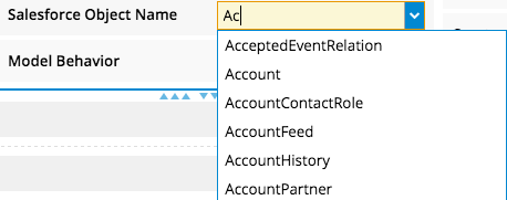
A combobox field renderer gives users two ways to select options within a field: they can enter some text, which queries a set of values and makes autocomplete suggestions. Or, they can select an option from the full list of entries—similar to a picklist—before or after typing text.
-
skuid.ui.fieldRenderers.skuid.ui.fieldRenderers.COMBOBOX.edit(field, value)¶ Populates the element property of the given Field object with a UI element for editing a combobox field within a Model. The UI element is an HTML <input> tag.
Arguments: - field (skuid.ui.Field) – Required. The Field object to be rendered.
- string (value) – Optional. The value to display within the UI. Defaults to an empty value.
-
skuid.ui.fieldRenderers.COMBOBOX.read(field, value)¶ Populates the element property of the given Field object with a UI element for displaying a combobox field within a Model.
Arguments: - field (skuid.ui.Field) – Required. The Field object to be rendered.
- string (value) – Optional. The value to display within the UI. Defaults to an empty value.
-
-
skuid.ui.fieldRenderers.CURRENCY¶ 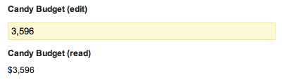
-
skuid.ui.fieldRenderers.skuid.ui.fieldRenderers.CURRENCY.edit(field, value)¶ Populates the element property of the given Field object with a UI element for editing a currency field within a Model.
Arguments: - field (skuid.ui.Field) – Required. The Field object to be rendered.
- value (number) – Optional. The value to display within the UI. Defaults to an empty value.
-
skuid.ui.fieldRenderers.CURRENCY.read(field, value)¶ Populates the element property of the given Field object with a UI element for displaying a currency field within a Model.
Arguments: - field (skuid.ui.Field) – Required. The Field object to be rendered.
- value (number) – Optional. The value to display within the UI. Defaults to an empty value.
-
-
skuid.ui.fieldRenderers.CUSTOM¶ 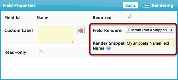
-
skuid.ui.fieldRenderers.skuid.ui.fieldRenderers.CUSTOM.edit(field, value)¶ Populates the element property of the given Field object with a blank UI element and then calls the custom field renderer specified in the Page Composer. Alternatively, you can set the field.options.snippet property to choose a snippet at run-time.
Note that calling this function has the same effect as calling read()… it is the responsibility of the snippet to determine the field’s mode and render the appropriate UI.
Arguments: - field (skuid.ui.Field) – Required. The Field object to be rendered.
- value (number) – Optional. The value to display within the UI. Defaults to an empty value.
-
skuid.ui.fieldRenderers.CUSTOM.read(field, value)¶ Populates the element property of the given Field object with a blank UI element and then calls the custom field renderer specified in the Page Composer. Alternatively, you can set the field.options.snippet property to choose a snippet at run-time.
Note that calling this function has the same effect as calling edit()… it is the responsibility of the snippet to determine the field’s mode and render the appropriate UI.
Arguments: - field (skuid.ui.Field) – Required. The Field object to be rendered.
- value (number) – Optional. The value to display within the UI. Defaults to an empty value.
-
-
skuid.ui.fieldRenderers.DATE¶ 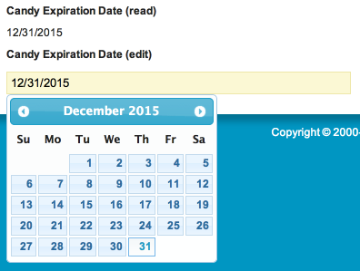
-
skuid.ui.fieldRenderers.skuid.ui.fieldRenderers.CUSTOM.edit(field, value) Populates the element property of the given Field object with a UI element for editing a date field within a Model. The date is displayed in a format defined by the user’s locale.
Arguments: - field (skuid.ui.Field) – Required. The Field object to be rendered.
- value (string) – Optional. A UTC-formatted date string. For example, November 5, 1955 would be represented as “1955-11-05”. Defaults to an empty value.
-
skuid.ui.fieldRenderers.CUSTOM.read(field, value) Populates the element property of the given Field object with a UI element for displaying a date field within a Model. The date is displayed in a format defined by the user’s locale.
Arguments: - field (skuid.ui.Field) – Required. The Field object to be rendered.
- value (string) – Optional. A UTC-formatted date string. For example, November 5, 1955 would be represented as “1955-11-05”. Defaults to an empty value.
-
-
skuid.ui.fieldRenderers.DATETIME¶ 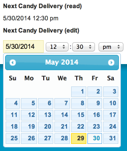
-
skuid.ui.fieldRenderers.skuid.ui.fieldRenderers.DATETIME.edit(field, value)¶ Populates the element property of the given Field object with a UI element for editing a datetime field within a Model. The date is displayed in a format defined by the user’s locale.
Arguments: - field (skuid.ui.Field) – Required. The Field object to be rendered.
- value (string) – Optional. A UTC-formatted date and time string. For example, 9:00 PM on November 5, 1955 would be represented as “1955-11-05T21:00:00”. Defaults to an empty value.
-
skuid.ui.fieldRenderers.DATETIME.read(field, value)¶ Populates the element property of the given Field object with a UI element for displaying a date field within a Model. The date is displayed in a format defined by the user’s locale.
Arguments: - field (skuid.ui.Field) – Required. The Field object to be rendered.
- value (string) – Optional. A UTC-formatted date and time string. For example, 9:00 PM on November 5, 1955 would be represented as “1955-11-05T21:00:00”. Defaults to an empty value.
-
-
skuid.ui.fieldRenderers.DOUBLE¶ 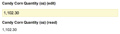
-
skuid.ui.fieldRenderers.skuid.ui.fieldRenderers.DOUBLE.edit(field, value)¶ Populates the element property of the given Field object with a UI element for editing a numeric field with a decimal part within a model.
Arguments: - field (skuid.ui.Field) – Required. The Field object to be rendered.
- value (number) – Optional. The value to display within the UI. Defaults to an empty value.
-
skuid.ui.fieldRenderers.DOUBLE.read(field, value)¶ Populates the element property of the given Field object with a UI element for displaying a numeric field with a decimal part within a model.
Arguments: - field (skuid.ui.Field) – Required. The Field object to be rendered.
- value (number) – Optional. The value to display within the UI. Defaults to an empty value.
-
-
skuid.ui.fieldRenderers.EMAIL¶ 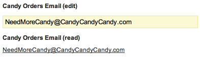
-
skuid.ui.fieldRenderers.skuid.ui.fieldRenderers.EMAIL.edit(field, value)¶ Populates the element property of the given Field object with a UI element for editing an email address within a Model. The UI element is an HTML <input> tag of type “email”.
Arguments: - field (skuid.ui.Field) – Required. The Field object to be rendered.
- value (string) – Optional. The value to display within the UI. Defaults to an empty value.
-
skuid.ui.fieldRenderers.EMAIL.read(field, value)¶ Populates the element property of the given Field object with a UI element for displaying an email address within a Model. If the value is not empty, then the address is wrapped in an <a> tag with a “mailto:” href attribute set to the current email address.
Arguments: - field (skuid.ui.Field) – Required. The Field object to be rendered.
- value (string) – Optional. The value to display within the UI. Defaults to an empty value.
-
-
skuid.ui.fieldRenderers.FILE¶ 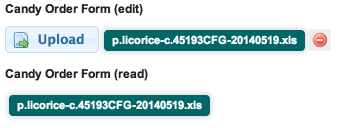
-
skuid.ui.fieldRenderers.skuid.ui.fieldRenderers.EMAIL.edit(field) If the given Field object is a reference to a skuid__Image__c record, then this function populates the element property of the given Field object with a UI element for editing a file.
If the given Field object is not a reference to a skuid__Image__c record, then nothing will be visible on the screen.
Arguments: - field (skuid.ui.Field) – Required. The Field object to be rendered.
-
skuid.ui.fieldRenderers.EMAIL.read(field) If the given Field object is a reference to a skuid__Image__c record, then this function populates the element property of the given Field object with a UI element for downloading a file.
If the given Field object is not a reference to a skuid__Image__c record, then nothing will be visible on the screen.
Arguments: - field (skuid.ui.Field) – Required. The Field object to be rendered.
-
-
skuid.ui.fieldRenderers.INTEGER¶ 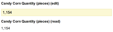
-
skuid.ui.fieldRenderers.skuid.ui.fieldRenderers.INTEGER.edit(field, value)¶ Populates the element property of the given Field object with a UI element for editing a numeric field with no decimal part within a Model.
Arguments: - field (skuid.ui.Field) – Required. The Field object to be rendered.
- value (number) – Optional. The value to display within the UI. Defaults to an empty value.
-
skuid.ui.fieldRenderers.INTEGER.read(field, value)¶ Populates the element property of the given Field object with a UI element for displaying a numeric field with no decimal part within a Model.
Arguments: - field (skuid.ui.Field) – Required. The Field object to be rendered.
- value (number) – Optional. The value to display within the UI. Defaults to an empty value.
-
-
skuid.ui.fieldRenderers.MULTIPICKLIST¶ 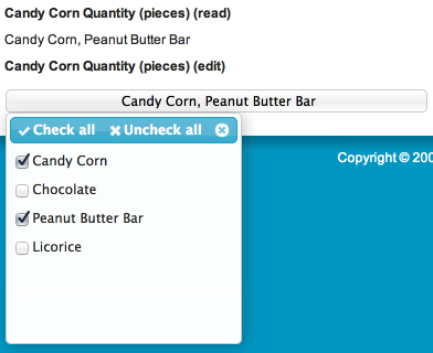
-
skuid.ui.fieldRenderers.skuid.ui.fieldRenderers.INTEGER.edit(field, value) Populates the element property of the given Field object with a UI element for editing a multi-select picklist field within a Model. Available values are automatically retrieved from the field metadata.
Arguments: - field (skuid.ui.Field) – Required. The Field object to be rendered.
- value (number) – Optional. The selected values, separated by semi-colons (“;”). Defaults to an empty value (no selected values).
-
skuid.ui.fieldRenderers.INTEGER.read(field, value) Populates the element property of the given Field object with a UI element for displaying a multi-select picklist field within a Model. Available values are automatically retrieved from the field metadata.
Arguments: - field (skuid.ui.Field) – Required. The Field object to be rendered.
- value (number) – Optional. The selected values, separated by semi-colons (“;”). Defaults to an empty value (no selected * values).
-
-
skuid.ui.fieldRenderers.PERCENT¶ 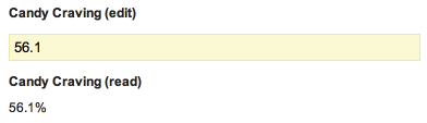
-
skuid.ui.fieldRenderers.skuid.ui.fieldRenderers.PERCENT.edit(field, value)¶ Populates the element property of the given Field object with a UI element for editing a percent field within a Model.
Arguments: - field (skuid.ui.Field) – Required. The Field object to be rendered.
- value (number) – Optional. The value to display within the UI. Defaults to an empty value.
-
skuid.ui.fieldRenderers.PERCENT.read(field, value)¶ Populates the element property of the given Field object with a UI element for displaying a percent field within a Model.
Arguments: - field (skuid.ui.Field) – Required. The Field object to be rendered.
- value (number) – Optional. The value to display within the UI. Defaults to an empty value.
-
-
skuid.ui.fieldRenderers.PICKLIST¶ 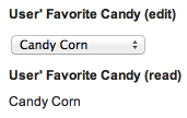
-
skuid.ui.fieldRenderers.skuid.ui.fieldRenderers.PICKLIST.edit(field, value)¶ Populates the element property of the given Field object with a UI element for editing a picklist field within a Model. Available values are automatically retrieved from the field metadata.
Arguments: - field (skuid.ui.Field) – Required. The Field object to be rendered.
- value (number) – Optional. The selected value. Defaults to an empty value (no selected value).
-
skuid.ui.fieldRenderers.PICKLIST.read(field, value)¶ Populates the element property of the given Field object with a UI element for displaying a picklist field within a Model. Available values are automatically retrieved from the field metadata.
Arguments: - field (skuid.ui.Field) – Required. The Field object to be rendered.
- value (number) – Optional. The selected value. Defaults to an empty value (no selected value).
-
-
skuid.ui.fieldRenderers.REFERENCE¶ 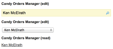
-
skuid.ui.fieldRenderers.skuid.ui.fieldRenderers.REFERENCE.edit(field, value)¶ Populates the element property of the given field object with a UI element for editing a reference field within a model. A reference field holds a Salesforce record Id. Skuid displays the record using a default template. When editing the reference field, the user chooses a record from a list of “options”, which are derived from a set of available records.
By default, the renderer will display an auto-complete textbox. When the user starts typing, Skuid will search for records where the Name field contains the user-entered text, and display those records as options.
The REFERENCE Field Renderer is highly configurable to enable a wide range of use-cases:
Display a Picklist
To display a picklist, rather than an auto-complete textbox, set the field.options.type property to “REFPICK”. This works best for objects which contain only a handful of records. If there are too many records, a picklist may become unwieldy.
Change the Option Display Template
By default, both the auto-complete textbox and the picklist display options using the records’ Name field. To change this, set field.options.template to a Skuid Template string. Fields referenced in the template must be included in your Model.
For example, in an Account Model, to display Account Owners (User objects) by the Name field followed by a dash followed by the Employee Number field, include both AccountOwner.Name and AccountOwner.EmployeeNumber in your Account Model. Then set field.options.template to “{{Name}} - {{EmployeeNumber}}”. Note that the template field id’s are not prefixed by the reference field id (AccountOwner).
Change the Search Fields (Auto-Complete Only)
By default, the auto-complete textbox searches for records based on the fields contained within field.options.template. If you wish to override this behavior, you may set the field.options.searchFields to an array of Field Metadata Objects. You must include all of the desired search fields in your Model. Skuid will import the fields’ metadata by each field’s id so, in short, you only need to specify the id of each field and Skuid will do the rest.
For example, in an Account Model, to search for an Account Owner (User object) by either Name or Employee Number, include both AccountOwner.Name and AccountOwner.EmployeeNumber in your Account Model. Then set field.options.searchFields to [ { id: “Name” }, { id: “EmployeeNumber” } ]. Note that the search field id’s are not prefixed by the reference field id (AccountOwner).
Tokenize the Search String
By default, Skuid uses the entire search string when searching for matching records. For example, if field.options.searchFields was set to [ { id: “FirstName” }, { id: “LastName” } ], a search string of “Jane Douglas” would only return records where FirstName or LastName equaled “Jane Douglas” (likely resulting in limited or no returned records).
You may choose to “tokenize” the search string so that each word is searched for individually. For example, setting tokenizeSearch to true would return all records where “Jane” was the FirstName or LastName and “Douglas” was the FirstName or LastName.
To do this, set field.options.tokenSearch to true and, optionally, field.options.delimiter to the character which should be used to split up the search string (a blank space, ” “, by default).
Speed Up the Search
By default, Skuid will search anywhere within a field. For example, if the field Name is included in a search and the user enters “Alf”, returned records would include names like “Alfred” and “Gandalf”. While this provides a more comprehensive search, it is also significantly slower. If you are searching very large fields across many thousands of records, the lag may be noticeable and a problem for your users’ productivity.
To speed things up, set field.options.fastsearch to true. This will limit the search to just the first characters of each field, so only results like “Alfred” would be returned.
Change the Option Source
By default, options are auto-sourced, meaning the records are fetched directly from the referenced object. You may also choose to model-source options by retrieving records from an existing Skuid Model. Set field.options.optionsource to “model” and field.options.optionmodel to the Skuid Model Id which contains records of the referenced field’s type. Sourcing options from a Model allows for a finer level of control than auto-sourcing, as Models can be easily filtered, sorted and manipulated by the user (using Skuid’s declarative components) or programmatically via Skuid’s Model API.
Change the Order of Options (Auto-Sourced Only)
By default, options are ordered by the Name field. To change the ordering of records, set field.options.order to a SOQL-compliant ORDER BY clause. For example, to sort User records by last name in ascending order and then by first name in descending order, set field.options.order to “LastName, FirstName DESC”.
Change the Returned Fields for Records/Options (Auto-Sourced Only)
By default, Skuid will fetch just the fields needed to support the options’ template, as defined by field.options.template. If you wish to fetch additional fields, you may set fields.options.returnFields to an array of Field Metadata Objects. You must include all of the desired return fields in your Model, including those used in your template. Skuid will import the fields’ metadata by each field’s id so, in short, you only need to specify the id of each field and Skuid will do the rest. The field metadata in the returnFields array also supports a special property named showInSearchDialog which, if set to true, will include the field when showing the search results.
For example, in an Account Model, to return the Name and Employee Number for each record, set field.options.returnFields to [ { id: “Name” }, { id: “EmployeeNumber” } ]. To make the Employee Number visible in the search results, set field.options.returnFields to [ { id: “Name” }, { id: “EmployeeNumber”, showInSearchDialog: true } ].
param skuid.ui.Field field: Required. The Field object to be rendered. param string value: Optional. A Salesforce Id. Defaults to an empty value.
-
skuid.ui.fieldRenderers.REFERENCE.read(field, value)¶ Populates the element property of the given Field object with a UI element for displaying a reference field within a Model. The UI element is wrapped within a link to open the referenced object.
The display of the field is based on field.options.template. See the documentation for
skuid.ui.fieldRenderers.REFERENCE.edit()for more information.Arguments: - field (skuid.ui.Field) – Required. The Field object to be rendered.
- value (string) – Optional. A Salesforce Id. Defaults to an empty value.
-
-
skuid.ui.fieldRenderers.TEXT¶ 
-
skuid.ui.fieldRenderers.skuid.ui.fieldRenderers.TEXT.edit(field, value)¶ Populates the element property of the given Field object with a UI element for editing a text field within a Model. The UI element is an HTML <input> tag.
Arguments: - field (skuid.ui.Field) – Required. The Field object to be rendered.
- value (string) – Optional. The value to display within the UI. Defaults to an empty value.
-
skuid.ui.fieldRenderers.TEXT.read(field, value)¶ Populates the element property of the given Field object with a UI element for displaying a text field within a Model.
Arguments: - field (skuid.ui.Field) – Required. The Field object to be rendered.
- value (string) – Optional. The value to display within the UI. Defaults to an empty value.
-
-
skuid.ui.fieldRenderers.TEXTAREA¶ 
-
skuid.ui.fieldRenderers.skuid.ui.fieldRenderers.TEXTAREA.edit(field, value)¶ Populates the element property of the given Field object with a UI element for editing a textarea field within a Model. The UI element is an HTML <textarea> tag or, for fields that support HTML formatting, a CK Editor.
Arguments: - field (skuid.ui.Field) – Required. The Field object to be rendered.
- value (string) – Optional. The value to display within the UI. Defaults to an empty value.
-
skuid.ui.fieldRenderers.TEXTAREA.read(field, value)¶ Populates the element property of the given Field object with a UI element for displaying a textarea field within a Model.
Arguments: - field (skuid.ui.Field) – Required. The Field object to be rendered.
- value (string) – Optional. The value to display within the UI. Defaults to an empty value.
-
-
click2Dial¶ Override the click2Dial behavior for skuid
-
createFieldSet