Chart
The Chart component lets you display data using a variety of chart options, allowing users to visualize data and see trends. Customize and style the chart’s display using color and layout properties.
Before you chart, think about why to chart.
Using the Chart Component
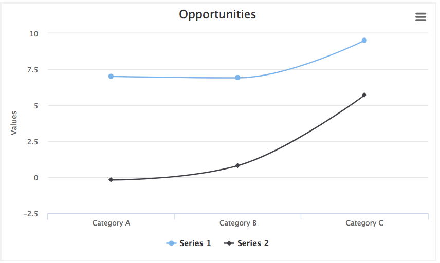
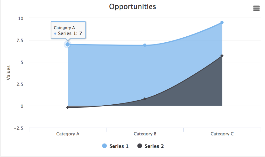
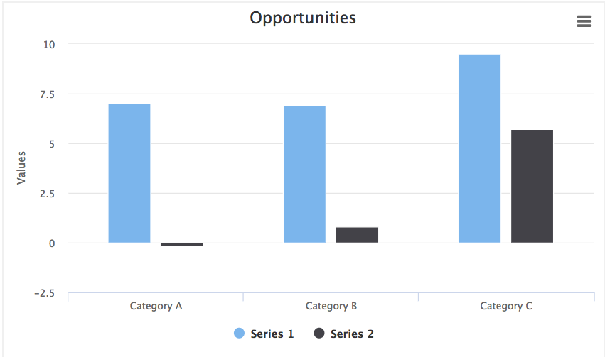
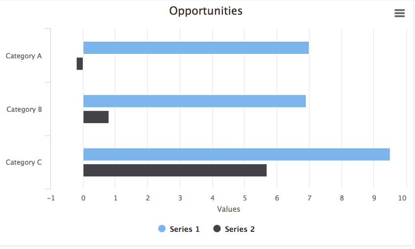
The Chart component offers numerous visualization types—Line, Area, Column, Bar, Pie, Donut, Funnel, Pyramid, Scatter, and Bubble—letting you select the visualization method that will be most effective for your users.
Note
The content below assumes you have a Skuid page and at least one working model with fields selected.
After you drag and drop a Chart component into the canvas, set it up:
In the Basic tab, choose the type of chart, and title it.
- If using a Line or Scatter type chart, set the chart’s Data (x axis) and Category (y axis) axes in the Axis tab.
Note
For Line and Scatter charts, it’s critical to complete the Axis settings before selecting the Series.
In the Series tab, select the data that will be displayed on the chart.
Then customize its appearance:
- Use the Styling tab to adjust the look and feel of the chart.
- Conditional Rendering lets you control when (or if) the Chart is displayed.
Print or download the chart [[]]
Print or download the runtime chart (in PNG, JPEG, PDF, or SVG formats) by selecting options from the hamburger menu at the top of the chart.
Note
SVG vector images scale to massive sizes—useful if you want to make a poster of the chart.
Properties
Basic tab [[]]
The Basic tab is where you manage chart types and basic chart behaviors.
- Default Type: Sets the type of chart to use. Skuid offers three groups of chart types:
| The Line Charts group includes the following chart types: | |
|---|---|
| Line (default) | Spline (spline charts display smooth curves through the different data points) |
 |
 |
| Area | Area Spline (spline charts display smooth curves through the different data points) |
 |
 |
| Column | Bar |
 |
 |
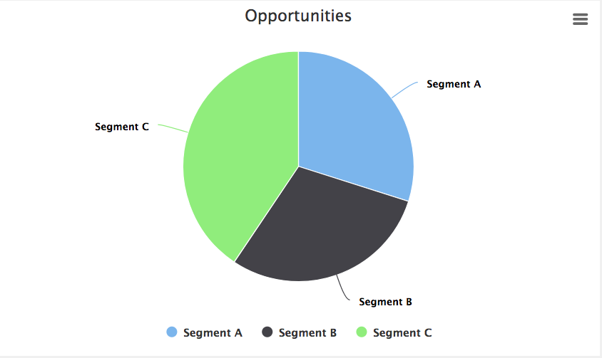
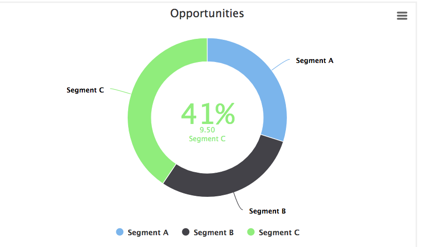
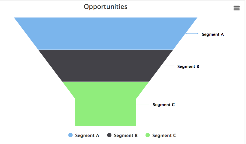
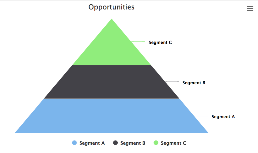
| The Pie Charts group includes the following chart types: | |
|---|---|
| Pie | Donut |
 |
 |
| Funnel | Pyramid |
 |
 |
| The Scatter Charts group includes the following chart types: | |
|---|---|
| Scatter | Bubble |
 |
 |
- Additional Chart Types: After setting the primary chart type, this sets which chart types (from within the same chart group) are also available for viewing. Users can toggle between these additional options at runtime via a picklist within the chart.
- Model: The model the chart pulls data from.
- Title and Subtitle: The title header that sits at the top of the chart; the subtitle sits below it. Both are optional. Title content can be added by:
- Typing in plain text
- Adding a merge variable for a field within the chart’s model using the field picker
- Using global merge variables plus text, for example, {{Model.labelPlural}} by Close Date, which displays at the model name plus the text “by Close Date.” Learn about merge syntax and the global merge variables that can be used in a Chart title/subtitle..
Axes tab [[]]
In this tab, configure the Data and Category axis for Line and Scatter type charts. (Axis are not configurable for Pie type charts.) These settings create the parameters for the chart: how much data, and how that data will be chunked.
Note
You can add more than one axis to your chart. Multiple axes bring more data to your charts, including data from more than one model. This can, however, add confusion to your chart, so use additional axes with caution.
If using more than one axis, check the Flip parameter so the the second axis’s data will be on the opposite side of the chart, making it easier to read.
Line type charts [[]]
Data Axes
Configure the axes that pull in data to be displayed in your chart component. The data axis is typically associated with the Y (vertical) axis, although this not required.
- ID: A unique ID for the axis; can be referenced using Global Merge variables or Javascript.
- Title: A descriptive title for the axis, which appears as a label beside the chart at runtime.
- Flipped: By default, the data axis is on the left side of the chart. If checked, shifts the data axis to the right side.
- Integers Only: If checked, the axis values only displays as whole numbers (no decimal points).
- Min Value: The lowest number to display on the axis.
- Max Value: The highest number to display on the axis.
Category axes for Line type charts
Configure the axes that provide categories for the data displayed in the data axes. This is where charts can come alive, and make data visual and comprehensible. The category axis is typically associated with the X (horizontal) axis, although it is not required to make your category axis the x axis.
Note
You can use multiple axes to display more categories from multiple models, but you need to set up those additional models in the Series tab.
ID: A unique ID for the axis; can be referenced using Global Merge variables or Javascript
Title: A descriptive title for the axis, which appears as a label below the chart at runtime.
Category Type: The Category Type can be either Field or Template. While it’s possible to use a field as the category type, Skuid recommends using the template option as best practice, as it offers more flexibility and the ability to use merge syntax; however, if you want to access date options, you’ll need to choose the field option.
Field: The Category Field determines how the axis groups the data.
Category Field: The model field used to divide and group data.
Note
The field chosen may open additional options that will appear.
Template: The Category template uses a field as the template to group the data.
- Category Template: A merge template used to divide and group data.Type in a field’s merge variable for the template, or select a field to use the field name for the template.
Fill in Values: (Date/time fields only) Automatically fills in gaps in category values when there is no data for the time period designated by the Default Date Granularity property. For example, if the date granularity setting is Calendar Month, but there is no model data for June, selecting Fill in Entire Year will display an (empty) June category. Fill in values include.
- Skip Missing Dates: Discards any empty categories.
- Fill in Gaps: Fills in all data gaps.
- Fill in Entire Week: Fills in data gaps within a week.
- Fill in Entire Month: Fills in data gaps within a month.
- Fill in Entire Year: Fills in data gaps within a year.
Default Date Granularity: (Date/time fields only) Groups date/time information by:
None (no date/time grouping)
Day
Calendar Week
Calendar Month
Calendar Quarter
Calendar Year
Note
Skuid calculates weeks in the year by the week containing January 1.
If January 1 is a Monday, that week (December 31-January 6) is week 1. But if January 1 is a Thursday, again, that week (December 28-January 3) is week 1.
Your organization may start counting calendar weeks using a different January date, especially in years where January 1st is on a Thursday or Friday.
Additional Granularity: (Date/time fields only) Adds additional date/time granularities and displays them in a picklist at runtime, allowing the user to select from the offered date options.
Flipped: By default, the category axis is on the bottom of the chart. If checked, shifts the category axis to the top.
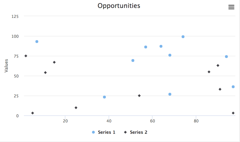
Scatter type charts [[]]
Because there is no actual “category” for Scatter type charts, the x axis and y axis are grouped together under a Data Axes property, with the y axis representing the data values. Providing an ID for the x axis is simply a way to conceptualize and define the relative values that will be used in the chart.
Note
Defining both an x and a y axis is required for the scatter chart to render.
In addition to the standard properties listed for Line type charts, Scatter charts have an additional property:
Type: While the default setting has a Y Axis representing data values, you can define the data axis as the X Axis.
Note
Because scatter charts may have multiple models—and no category axis—this allows you to determine which axis will provide maximum clarity and insight for the user.
Series tab [[]]
A Series is the collection of data pulled from a model to be used in the chart. Click to add a series to the chart.
Note
You can create more than one series for a chart.
Series properties for Line and Pie type charts [[]]
Model: The model that is the source of the data. If you have only one model on your page, that model will be the Chart Default. However, if you have multiple models, then the Chart Default is the model selected as the default model under the Basic tab. If you choose a model from the picklist, then another option will display in the Properties section for you:
- Category Field: If you select Chart Default as the model, Skuid automatically selects the Category Axis field as the Category Field. However, if you select a model from the picklist, you need to manually select the Category Field here. This field must be the same as the field selected when you configured your Category Axis.
Aggregate Function: The chart data is aggregated according to the function you select from this picklist: Average, Sum, Max, Min, and Count. You can also choose not to aggregate the data with “None.”
Data Field: The field in the model that will supply the data.
Note
The available fields are determined by the fields added to the model.
Split Type: Splits up the data displayed in a chart. See more about Split fields in the section below.
- None: No split is used
- Field: Split data using the selected field.
- Split Field: Select the Split field from the picklist of fields on the model.
- Template: Split data using the selected field as a template.
- Split Template: Select the field to use as a template from the picklist of fields on the mode
Type: To restrict data display to only one type of chart, use the Type setting to lock the chart type for this data series. Used with multiple series to have each series display using a different chart type (within the same chart type group.)
Series properties for Scatter type charts [[]]
Scatter type charts have the following additional properties:
X Aggregate Function: The chart data on the x axis is aggregated according to the function you select from this picklist: Average, Sum, Max, Min, and Count. You can also choose not to aggregate the data with “None.”
X Data Field: The field in the model that will supply the data for the X aggregation.
Note
The available fields are determined by the fields added to the model.
Y Aggregate Function: The chart data on the y axis is aggregated according to the function you select from this picklist: Average, Sum, Max, Min, and Count. You can also choose not to aggregate the data with “None.”
Y Data Field: The field in the model that will supply the data for the y aggregation.
Note
The available fields are determined by the fields added to the model.
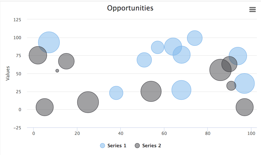
Size Aggregate Function: (Bubble charts only) Bubble chart data for the relative size of the bubble is aggregated according to the function selected:.
- Average
- Sum
- Max
- Min
- Count
- None (do not aggregate the data)
Size Field: (Bubble charts only) The field in the model that will determine the relative size of the bubble. Low values create a proportionally smaller bubble compared to high values, which create a larger bubble.
Note
The available fields are determined by the fields added to the model.
Split fields
The Split Field property allows you to “split” up the data displayed in the chart. These splits will be visibly indicated in the chart, usually by color-coding.
| Fields Not Split | Split Fields |
|---|---|
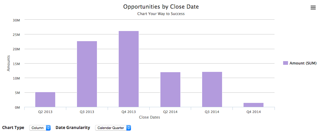
| In this chart, the Opportunities are categorized by by quarterly close date. Data for each close date is bundled together and there is no split field. | This chart uses the Stage field as a split field to show how each stage of an Opportunity (prospecting, qualification, needs analysis, etc.) contributes to the total Opportunity amount for each quarter. |
 |
 |
Note
Want to display the splits within a column, stacked vertically, as they are above? Set this option using the Stacking property on the Styling tab. The segments “split” up the column; a legend identifies what each split represents.
Styling tab [[]]
The Style tab properties let you customize charts.
Colors [[]]
Click Generate Colors to generate a color swatch and apply it to the chart. The hexadecimal code of the selected colors will appear in the Chart Colors property.
Note
If there are more values in the chart than there are available colors, component will reuse the colors from the palette starting with the topmost color.
Background Color: The background color of the chart.
Back Button Background: If using the drilldown chart feature, the background color for the back button.
Back Button Color: If using the drilldown chart feature, the color for the back button.
Chart Colors: The hexadecimal code of the colors selected using Generate Colors. Delete individual colors by clicking ; edit colors by changing the hexadecimal code.
Note
Click Add Another Value to add more chart colors (using the color’s hexadecimal code) . You can use this feature to build a custom color palette from scratch.
Height [[]]
Chart Height: The height of the chart.
Note
While this feature offers sizing measurements in pixels, em, percentage, vh or vw, Skuid recommends using pixels only for setting the chart height.
Stacking [[]]
Note
Stacking only applies to charts from the Line group (Line, Spline, Area, Area Spline, Column, Bar).
- Stack Series: If you set a Split Field for the chart data, the chart displays each division in the data (the “split”) in its own line, area, bar, or column side-by-side. Or, they can be be stacked.
- Chart Default: Stacking follows the default settings for the chart.
- On: Turns stacking on.
- Off: Turns stacking off.
Legend [[]]
This section lets you control the location and layout of the chart’s legend. .. note:: Some layout options cannot be combined. For example, you cannot choose Horizontal Alignment/Center and Vertical Alignment/Middle; this would put the legend in the middle of the chart. If you choose conflicting options, the options will adjust to the last choice you made.
- Layout:
- Chart Default: Layout follows the default settings for the chart.
- Horizontal: The legend is listed horizontally (along the x axis), with items sitting side by side (default).
- Vertical: The legend is listed vertically (along the y axis), with item stacked.
- Off: No legend is displayed.
- Horizontal Alignment
- Chart Default: Horizontal alignment follows the default settings for the chart.
- Center: The legend is displayed directly above or below the chart, depending on the vertical alignment (default).
- Left: The legend is displayed to the left of the chart.
- Right: The legend is displayed to the right of the chart.
- Vertical Alignment
- Chart Default: Vertical alignment follows the default settings for the chart.
- Bottom: The legend is displayed at the bottom of the chart (default).
- Middle: The legend is displayed in the middle of the chart.
- Top: The legend is displayed at the top of the chart.
Data Labels [[]]
- Display Data Labels
- Chart Default: The display of data labels on the chart follows the default settings for the chart.
- On: Turns on data label display.
- Off: Turns off data label display.
Advanced tab [[]]
Unique Id (optional): Skuid automatically generates an alphanumeric Id for the component; if preferred, give it a practical name.
CSS Class (optional): Assign a CSS class to the component’s DOM element.
Before Render Snippet: Run the selected snippet immediately before the chart is displayed; used to create advanced display options.
Exporting:
Chart default: Skuid defaults to client-side processing of the chart in preparation for export.
Server-side: The chart object is sent to Highchart’s export server for processing, with results returned to the browser for export.
Note
This option is recommended if you are using JavaScript with the Highcharts API to extend the chart’s capabilities. Client-side processing may not have all of the same of options as the full Highcharts API used by server-side processing.
Client-side: The chart is prepared for export in the browser.
Disabled: No chart export options are presented to the user.
Rendering tab [[]]
Conditional rendering allows you to display or hide the Chart, based on defined data conditions.
Advanced Chart Management
Use Skuid with a Salesforce multicurrency org [[]]
Multinational businesses often need to manage and convert a variety of currency inputs. When building charts using a Salesforce multicurrency org, Skuid admins have the option of setting which currency is used for the chart details.
Note
Both org and user-specific currency options are set and managed within the Salesforce org’s setup. Best practice: Have user-facing Skuid features employ the user’s currency.
- Click on the chart within the canvas to see its properties.
- In the Properties pane, under Use default currency of Org rather than User:
- Unchecked (the default) means that users see charts and chart details displayed using the default currency of their User settings.
- Checked means that users see charts displayed using the org’s default currency.
Note
This option must be set for each chart on the page.
Working with Highcharts merge variables [[]]
Skuid’s charts use the Highcharts Point object API for merge variables within the {{$Chart.point}} namespace to expose different fields of data associated with a single point in a graph. (At runtime, this is a point on a chart series clicked by the user.) Highcharts merge variables require a chart point (the Point object) for context, and must be used within a drilldown chart or a series on-click action. Because of this, they cannot be used outside of the Chart component.
Warning
This feature uses an external API; Skuid cannot provide support for any fields that might be deprecated in the future. Additionally, point object fields can have different meanings in different types of charts depending upon the chart type’s structure.
When working with Highcharts merge variables, follow the Highcharts documentation.
Warning
Using undocumented fields is not recommended.
Troubleshooting
Incorrectly set conditions and properties are common sources of trouble for visualizations.
I don’t seem to be getting the data I expected in my chart. [[]]
Charts are visualizations of the content in your models, so the models are the first place to look when charts don’t behave as expected. Make sure the model is feeding the correct data, and all the data you want, to the chart.
Hint: One way to verify a model’s data is to attach the model to a Table component as well as to a Chart. Use the Table to verify that the model is returning the correct data. Once you’ve done that, delete the table.
My chart shows an unexpectedly low number of records. [[]]
- Check the model: is there a value in Max # of records (limit)? Chart data is limited to this number or records. Delete this value so that all records are included in the chart.
I’m using Skuid on Salesforce and getting an error message telling me that my Apex heap size is too large. [[]]
If you are using a very large record set and getting an Apex heap size error, you may need to use an aggregate model instead of a regular model. Aggregate models allow you to more effectively gather and display massive amounts of records. Learn more about using aggregate models.
Warning
If you are using aggregate models and multiple series in a chart, the Alias Name for each aggregation in the aggregate model must be unique. If the Alias Names are not unique, then one of the series in your chart may not render. See Working with aggregations in a chart component in the Aggregate Model topic.