Build Component Packs
Component packs are compressed archives that allow Skuid to read and store custom components within its component library, alongside standard Skuid components. If you are creating custom components, you’ll need to create a component pack to distribute your components for use within Skuid.
Building component packs requires that you are familiar with:
- The resource files used to build components
- The manifest files used to reference your resources
- How the properties within each of these files interact with each other across files and within Skuid
What’s in a component pack?
Component packs contain two types of files: resource files and manifest files.
- Resource files contain the Javascript, CSS, and images that are use to define and construct the components in the pack. While component packs typically contain resource files within the archive, you may also reference resource files within a separate static resource through manifest files.
- Manifest files, like a cargo manifest, declare all resources needed for the components within the pack, describing them in a way Skuid will understand. You’ll be writing a runtime definition manifest—which declares all resource files used at runtime—and a builder definition manifest—which declares all of the code used within the App Composer. These manifest files specify the following:
- Component names
- Component pack folder structure within the App Composer
- Location of component resources
- Other dependencies of components in the pack
You bundle these files together into a zip archive—your literal component pack. You or other users can then upload that component pack and use your components freely within Skuid.
This tutorial assumes you already are familiar with creating a custom component, so we’ll describe how to assemble a basic component pack using the resource files for the basic component described within that tutorial.
You can download the example component pack we’ll be assembling here.
Collecting your resource files
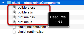
Resource files are the heart of your custom components, containing the data used to build the components stored in the component pack. This is the space where you can flex your coding muscles and put on a show.
For every component you include within your component pack, you’ll likely—but not always—have four resource files:
- runtime.js: The JavaScript code used to generate your component at runtime
- builders.js: The JavaScript code used to generate your component for declarative use within the App Composer
- runtime.css: The CSS styling for your component at runtime.
- builders.css: The CSS styling for your component within the App Composer.
For each component, collect these resources files into a sensible directory structure, and review that the properties within them are set properly. After you’ve assembled all of your resource files, you’ll use manifest files to outline and declare the resource files in a format that Skuid can recognize.
How to create manifest files
Where resource files are the heart of your custom components, manifest files are the heart of your component packs. Written as JSON, the properties outlined within your manifest files tell Skuid what your components are and where to find their resources inside, or outside, of the pack.
You will need to create two manifest files in total: one for your runtime resources (runtime definition manifest) and one for your builder resources (builder definition manifest). Across these two manifest files you’ll specify the component pack id, components, folder structure, and resource dependencies.
Note
The manifest files are where you’ll determine the id property of your component pack—an id must match across the manifest files. This ID property will be used as the Name field within the Component Pack tab in Skuid.
Whether you choose “kpiindicators” or “jetpackninja” as your component pack id, you should pick something distinctive that will not overlap with other component packs.
For the below examples, we’ll call our component pack “firstcustom.”
Runtime Definition Manifest
This file defines the resource files (Javascript, CSS, and other resources) needed for all components in your component pack at runtime.
Skuid will assume that the file name for your runtime definition manifest is skuid_runtime.json. You can choose whatever name you would like, but you must be sure that
- it is a .json file;
- the name of the file must match runtime definition manifest referenced in the Additional Properties drawer of the component pack. As such, it is best practice to not change the name of the runtime definition manifest after distributing your component pack.
Below is a sample runtime definition manifest—containing only the required properties—used by our component pack, named firstcustom. You can find more optional properties within the Manifest Files Property Definitions section.
Note that the format listed below is best used when all resources and components must be loaded into memory if any are used within a page. If your component pack contains multiple components, read more about how to properly format your runtime definition manifest to optimize load time .
Replace the following variables with the values appropriate to your component pack:
- id
- component id
- JavaScript resource files
- CSS resource file
1 2 3 4 5 6 7 8 9 10 11 12 13 14 15 16 17 18 | {
"id": "firstcustom",
"components": [
{
"id": "firstcustom_sayhello"
}
],
"js": [
{
"path": "runtime.js",
}
],
"css": [
{
"path": "runtime.css",
}
]
}
|
Multiple components in one pack
An obvious use for component packs is packaging multiple custom components into one resource. One thing you must be conscious of when doing this is loading the JavaScript resources globally.
Inside your runtime definition manifest, listing off all of your runtime resources in one JavaScript array will tell Skuid to load all of these components if any single instance of them are in the page. The obvious disadvantage of this: longer load times.
Instead it is best practice to build your manifest files where each component ID is associated directly with a JavaScript runtime file, like so:
1 2 3 4 5 6 7 8 9 10 11 12 13 14 15 16 17 18 19 20 21 22 23 24 25 26 27 28 29 | {
"id": "businessneeds",
"components": [
{
"id": "leadstatus",
// these resources will only be loaded if the leadstatus component is on the current page:
"js": [
{ "path": "components/leadstatus/runtime.js" }
]
},
{
"id": "opportunitytool",
// these resources will only be loaded if the opportunitytool component is on the current page:
"js": [
{ "path": "components/opportunitytool/runtime.js" }
]
},
// etc...
],
"js": [
// these resources will be loaded if one or more of the above components are on the current page:
{
"path": "libs/jsen/jsen.min.js"
},
{
"path": "foundation/runUtil.js"
}
]
}
|
Builder Definition Manifest
The builder definition manifest is a file that defines the Javascript, CSS, and other Resources needed for the App Composer to add all of the components in your component pack to the components library.
Skuid will assume that the file name for your runtime definition manifest is skuid_builders.json. You can choose whatever name you would like, but you must be sure that it is
- a .json file;
- the name of the file must match runtime definition manifest referenced in the Additional Properties drawer of the component pack. As such, it is best practice to not change the name of the builder definition manifest after distributing your component pack.
Below is a sample builder definition manifest—containing only the required properties—used by our component pack, named firstcustom. You can find more optional properties within the Manifest Files Property Definitions section.
In contrast to the runtime definition manifest, we have a few additional properties here: folderId and the folders array. You can declare one or more folders within the folders array to organize your components within the App Composer, and then assign each individual component to a folder with the folderId field. For more information, see the Component Definition Properties and Folder Definition Properties sections.
As before, replace the following variables with the values appropriate to your component pack:
- Id
- component id - make sure this matches the appropriate component id in your runtime definition manifest
- folderId
- folders array
- JavaScript resource files
- CSS resource file
1 2 3 4 5 6 7 8 9 10 11 12 13 14 15 16 17 18 19 20 21 22 23 24 25 26 | {
"id": "firstcustom",
"components": [
{
"id": "firstcustom_sayhello",
"folderId": "firstcustom"
}
],
"folders": [
{
"id": "firstcustom",
"name": "First Custom Component",
"icon": "sk-icon-component-pack"
}
],
"js": [
{
"path": "builders.js",
}
],
"css": [
{
"path": "builders.css",
}
]
}
|
Referencing resources within separate static resources and namespaces
If you are developing a component pack that depends on resource files contained within a separate Salesforce static resource, even one contained within a managed package, you can specify the resource and namespace properties.
For example, if our example component pack used CSS from a static resource called “ComponentCSS” that contained all of our CSS, which is contained within a managed package namespace called “managedpackage,” our manifest files would look like this:
Runtime Definition
1 2 3 4 5 6 7 8 9 10 11 12 13 14 15 16 17 18 19 20 21 | {
"id": "firstcustom",
"components": [
{
"id": "firstcustom_sayhello"
}
],
"js": [
{
"path": "runtime.js",
"namespace": "managedpackage"
}
],
"css": [
{
"path": "runtime.css",
"resource": "ComponentCSS",
"namespace": "managedpackage"
}
]
}
|
Builder definition
1 2 3 4 5 6 7 8 9 10 11 12 13 14 15 16 17 18 19 20 21 22 23 24 25 26 27 28 29 | {
"id": "firstcustom",
"components": [
{
"id": "firstcustom_sayhello",
"folderId": "firstcustom"
}
],
"folders": [
{
"id": "firstcustom",
"name": "First Custom Component",
"icon": "sk-icon-component-pack"
}
],
"js": [
{
"path": "builders.js",
"namespace": "managedpackage"
}
],
"css": [
{
"path": "builders.css",
"resource": "ComponentCSS",
"namespace": "managedpackage"
}
]
}
|
For additional information, see the Resource Reference Definition section.
Package your files into a zip archive
Before taking the final steps to package your files, it’s best practice to do a final check for these issues within your files:
- The runtime and manifest files must be mapped correctly
- Resources paths indicated in the manifest files must be accurate
- The id property for the component pack is distinctive
- Any external resource names match the name of the appropriate static resources
After reviewing your files, compress all of them into a .zip file. Most operating systems have built-in support for this process:
- Select all of the files to be compressed
- Right click the selected files
- Click the appropriate option within the right click menu:
- Windows: Send to > Compressed(zipped) folder
- Mac: Compress X Items
It is important to note that your manifest files must be in the top directory of the component pack archive. Otherwise, Skuid will not be able to properly read the files, meaning your components shall be lost in the ether.
After zipping your various files into one archive, you’ve got a fully fledged component pack! It is best practice to test your component pack by uploading it to ensure that your manifest and resource files all work correctly. If you have any issues, see the troubleshooting section.
Manifest File Property Definitions
Basic properties
These basic properties tell Skuid about your component pack as a whole and will include more specific component definition properties, folder definition properties, and resource reference definition properties as arrays.
id - Component pack Id
The unique id for your component pack. If you are using more than one component pack, then you must be sure that each id is different to avoid collisions between components.
components - List of component ids included in the Manifest
A list of the component definitions included in your component pack. For more on component definitions, see Component Definition Properties.
folders - List of Folders included in the Manifest
A list of the folder definitions in your component pack. The folder property is only in the builder definition manifest. For more information on folder properties, see Folder Definition Properties.
js - List of Javascript Resources for the component pack
A list of Javascript resources that will be used for all components in the pack. If you have a Javascript file that will be used for only one component, then put that in the individual component resource dependencies. For more on Resource Reference definitions, see Resource Reference Definition Properties.
css - List of CSS Resources for the component pack
A list of CSS resources that will be used for all components in the pack. If you have a CSS file that will only be used for only one component, then put that in the individual component resource dependencies. For more on Resource Reference definitions, see Resource Reference Definition Properties.
Component Definition Properties
These properties are used to specifically define each individual component or group of components.
id - Component Id
The Id for your Component in the component pack. In the XML, your component will be described with a tag like this:
<componentPackId__componentId/>. This must be consistent across your resource files, your runtime definition manifest, and your builder definition manifest.In the example used in this tutorial the XML looks like this:
<firstcustom__sayhello/>folderId (optional) - Folder Id
Used only in the builder definition manifest, this is the id of the folder where the components will be stored in the App Composer’s component pane. This field must correspond to a folder defined in the folders array. For more information about the folders array, see below.
alwaysLoad (optional)- Always Load Indicator
Boolean property that determines if the dependencies of this component should be loaded when the pack is loaded; regardless of whether or not the individual component is requested.
pathsToChildComponents (optional)- Paths to Child Components
Array of “selector” strings that specify the path(s) through this component’s XML tree to the location of XML nodes containing child components. If any paths are provided, Skuid will—at runtime—navigate through this component’s XML hierarchy and examine each of the child components requested to determine if it needs to load in any resource dependencies for the components found to function.
For instance, if one of the tabs in a Tab Set component contains a Chart component, Skuid needs to know this so that it will be able to load in the JavaScript and CSS dependencies for the Chart component as defined in its component pack’s manifest file.
The “path” syntax is roughly CSS selector syntax. For example, the Tab Set component has an XML structure like this:
<tabset><tabs><tab><components><skuidvis__chart.../></components></tab></tabs></tabset>Its corresponding pathsToChildComponents property in the runtime manifest file is
["tabs>tab>components"].customLabelDependencies (optional)- Custom Label Dependencies
Developing multilingual, localized apps with your components? You can utilize custom labels defined within Salesforce through this property.
If you have buttons in your component that have corresponding custom labels within Salesforce, then you would want to identify these custom labels as dependencies of your component so that you can use them in JavaScript when creating your buttons. To do so, specify an array of the Custom Label API name strings needed for a given component / component pack.
For example, if in Salesforce you have created two Custom Labels with API Names “Load_More” and “Refresh”, then you would request these via customLabelDependencies:
["Load_More","Refresh"].Then—within your runtime and builder resource files—you could set your buttons’ labels to
skuid.label.read('Load More')andskuid.label.read('Refresh').
Folder Definition Properties
These properties are used to determine the appearance of the folder within the App Composer containing your components. It is not directly related to the directory structure of your archive. To utilize the folders defined here, assign components to a folder using the folderId property.
id - Folder Id
The unique id for this folder.
name - Folder Name
The name of the folder
Icon (optional) - Folder Icon
A CSS Class that will be used for the folder icon.
Resource Reference Definition Properties
These optional properties allow you to point to resources that may or may not be located within the component pack itself.
referenceType (Optional) - Reference Type
Can be one of two values: “external” or “local.” The default is “local.” Specifies whether the path of this reference is an external link or a relative link.
Resource (Optional) - Resource
Specify a Static resource other than the current one (containing this Manifest). If this property is not set, then all local paths will be assumed to be in this resource.
namespace (Optional) - Namespace
Goes with the resource property. If the resource being referenced is part of a managed package and has a namespace, this specifies that namespace.
path (Optional) - Path
If the static resource is a zip file, then this specifies the path within that zip file to the requested resource.
Troubleshooting
As manifest files and resource files depend on both well-formatted code and accurately typed references, there are many places where things can go wrong. If you’re having issues with your component pack, look below to find an understanding of where your problems may be.
Errors messages
If you encounter the errors below, the component pack ID listed in the runtime definition manifest and/or the builder definition manifest may not match the name listed within your Component Packs configuration screen. Double check your manifest files to ensure your component pack ID is free from typos, and ensure that the ID is entered correctly within the Component Packs tab in Skuid.
An error occurred while attempting to load the "CompnentPackName" component pack. The name of your pack does not match the name in the package definitionAttempt to de-reference a null object: An unexpected error has occurred. Your solution provider has been notified. (skuid)
If you see an error similar to the following, you may have improperly formatted JSON within your manifest files:
An error occurred while attempting to load the "CompnentPackName" component pack. Your package definition may not be in the correct format. Error:Unexpected character ('"' (code 34)): was expecting comma to separate OBJECT entries
Ensure that your properties are properly separated by commas.
Component folder does not appear
If your component folder does not appear within the App Composer, then you should ensure that the Folder Definition Properties within your builder definition manifest are free from typos and properly formatted.
Component folder appears without a component inside
If you are able to locate your component’s folder, but not the draggable component element, there may be errors in your builder resource files or your builder definition manifest.
There are a variety of things that could cause issues within the JavaScript code of your builder resource files. Check your browser’s console to see if any easily identifiable JavaScript errors appear. It should alert you to some formatting errors, such as stray commas, which can completely prevent your component from appearing.
Ensure that your code is properly formatted, and your builder definition manifest matches the component ID listed in your builder resource files.
Components disappear from the canvas when reloading the App Composer
If you can drag your component to the App Composer canvas, but find that it disappears from the canvas when you reload the page, your component may generating an XML node that doesn’t point to your component. To double check this, ensure that the defaultStateGenerator within your builder resource files matches the componentType within your runtime resource files.
Component Packs in earlier versions of Skuid
If you built components in Skuid prior to the Superbank Release, then you’ll need to follow the directions in Create a Skuid Custom Component to make sure that your components run smoothly with the current release of Skuid.
Additional Resources
- If you are experienced with Yeoman, then you can check out this Skuid Component Generator for building the basic directory structure for Skuid components, courtesy of Skuid user rtmruczek