The Property Library
Fields, Models, and Pages
Fields [[]]
Once fields are added to the Table or Form component, each has a specific set of properties. These properties vary, depending upon the component and field type. Click on the field within the table to reveal and edit its properties.
General tab [[]]
Field ID: The API name of the selected field.
Show inline help (Available on Form components): Determines how Skuid displays any help text associated with this field, whether through its metadata or a field metadata override.
As help icon tooltip: When selected, a help icon appears beside the field’s label. Hovering over the icon causes the tooltip to appear and display the help text.
Tooltip position: Determines where the tooltip containing the help text appears in relation to the icon/field.
Note
Skuid attempts to render the help text in the selected position, but if this is not possible due to height/width constraints at runtime, the help text may render in a different position.
Tooltip style: Determines which style variant to use when the tooltip is displayed.
Tooltip compact size: Determines whether to use the options specified in the Compact section of the chosen tooltip style variant, which have smaller line height, font, and padding settings by default.
As underline tooltip: When selected, the field’s label is underlined to indicate a tooltip is available. Hovering over any part of the label causes the tooltip to appear and display the help text.
Tooltip position: Determines where the tooltip containing the help text appears in relation to the icon/field.
Note
Skuid attempts to render the help text in the selected position, but if this is not possible due to height/width constraints at runtime, the help text may render in a different position.
Tooltip style: Determines which style variant to use when the tooltip is displayed.
Tooltip compact size: Determines whether to use the options specified in the Compact section of the chosen tooltip style variant, which have smaller line height, font, and padding settings by default.
Below label: When selected, help text appears directly beneath the field label. The help text is always present and can’t be dismissed.
Hidden: No help text is displayed.
Label/Custom label: The name for the field (or template field). Replaces default field label with custom text. Use the field picker to select a field to use as the column label.
Note
This feature lets you choose another field’s name and re-label the column with it, to shorten or clarify the column’s identity or purpose for users.
Placeholder: Text or prompts that appear inside editable sections within the component. Commonly used to provide instruction for more complex field requirements, this field is compatible with merge syntax.
Read-only: If checked, text fields are read only and cannot be edited by users. This setting does not persist across Skuid pages.
Note
Skuid automatically respects the validation rules and field-level security from your data source.
Required: If checked, text input is required.This setting does not persist across Skuid pages and will not override existing data model settings within the data source.
Note
Skuid automatically respects the validation rules and field-level security from your data source.
Clip heading text: If checked, if a column’s heading text exceeds the size of the column, the text is truncated (with ellipses indicating additional content.)
Horizontal alignment: Adjusts alignment of text or value within a field to left (default) or right.
Display as: Determines how values are entered in Edit mode.
Text (String fields): Renders the field as text.
Password (String fields): Renders the field as a password, with the content hidden by asterisks.
Picklist: (Reference fields) Renders the reference field options as a picklist: a dropdown menu of selectable options.
Radio: (Picklists fields) Renders the field as radio buttons.
Note
For multi-select picklists, Skuid renders a multi-select list of checkboxes instead.
Button Group: (Picklist fields) Renders the field as a set of buttons.
Combobox (Picklist fields): Renders the picklist field options as a combobox, a text box in which user entry triggers a dropdown menu. As users type, the menu narrows available options. Users can also access the dropdown using the combobox’s menu selector ().
Enable autocomplete: When enabled, available options are filtered and suggested to the user based on what they’ve entered in the field. Selecting an option then places that value in the combobox.
Skuid searches for the user’s input across the entire value, so values do not have to match exactly. For example, inputting
Example Valuewould matchFirst Example ValueandDifferent Example Value
Date (Date-time fields): Renders the field as a date.
Datetime (Date fields): Renders the field as a datetime.
Autocomplete: (Reference fields) The default for reference fields, this renderer tries to autocomplete entries based on the options available for this field.
Checkbox (Boolean fields): Renders the field as a checkbox.
Switch (Boolean fields): Renders the field as a toggle switch.
Custom:
- Display method: Sets a custom display method defined in JS snippets.
Numeric field types have different field renderer options:
Number: Renders the field as a number.
Slider: Allows the user to enter the value as a position on a slider.
- Minimum value: The starting numerical range for the slider.
- Maximum value: The ending numerical range for the slider
- Step: The increments used in the slider.
Stepper: Allows the user to enter the value via an entry box with “+” and “-” handles to increment or decrement the numeric value
- Minimum value: The starting numerical range for the stepper.
- Maximum value: The ending numerical range for the stepper
- Step: The increments used in the stepper.
Add “None” option: Includes a null value in the list.
- None Option Label: Sets the text for the “None” option.
Limit # values to: For reference fields rendered as picklists, restricts the number of allowed values on the picklist.
Note
The default behavior displays all values for the field. However, if the field includes a large number of distinct values, the page may need to query a lot of data, resulting in a slow page load. Limiting the number of picklist options reduces the query and load time.
Allow user to hide/show?: Permits the user to show or hide columns using the Table Setting modal, and determines whether the selected column is shown by default.
- Yes, and show the field by default
- Yes, and hide the field by default
- No
Note
This property is available when Allow column hiding is checked in the Display tab’s Configuration section (in Table properties).
Column summaries: (Number fields) Add summaries to the bottom of each column: Sum, Average, Min, Max, or Median. Enter the value as a:
Minimum value: The starting numerical range for the stepper.
Maximum value: The ending numerical range for the stepper
Step: The increments used in the stepper.
# of decimal places: (Currency and measurement fields) Choose the number of decimal places. Options: 0-8 or use the field’s metadata to determine the number of decimal places.
Show length counter (Textarea fields): When the field is in Edit mode, it displays a character countdown (“25/ 128”) indicating the number of characters used and how many total characters are allowed.
Note
- The counter is enabled by default for standard textarea fields.
- The counter is not available for Salesforce rich text area fields.
- Template: (Template fields) Specifies which fields the template field should include by either selecting them from the field picker, manually entering their merge variables, or using custom text.
- Sort field: (Template fields) When sorting is enabled for the table, specifies which of the template’s fields to use for sorting.
Search tab [[]]
(For reference fields)
The Search tab is available for reference fields on the Form and on the Table component when the Table or Form is in Edit mode. Search allows end users to search for content from within the model (or from a selected model) when editing a reference field.
Search properties [[]]
Option source:
Automatic: Searches for and lists possible content options from within the object the reference field is referencing.
Model: Searches for and lists possible content options from any model on the page.
- Option model: If using “Model” as the Option source, the name of the model.
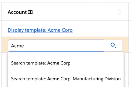
Display template: Determines how the reference field’s selected value is displayed. Configure the template with fields (via merge syntax), text, and formatting.
Search template: Determines how reference fields display in the search dropdown. Configure the template with fields (via merge syntax), text, and formatting.
In this example, the display and search templates are configured with merge syntax and text.
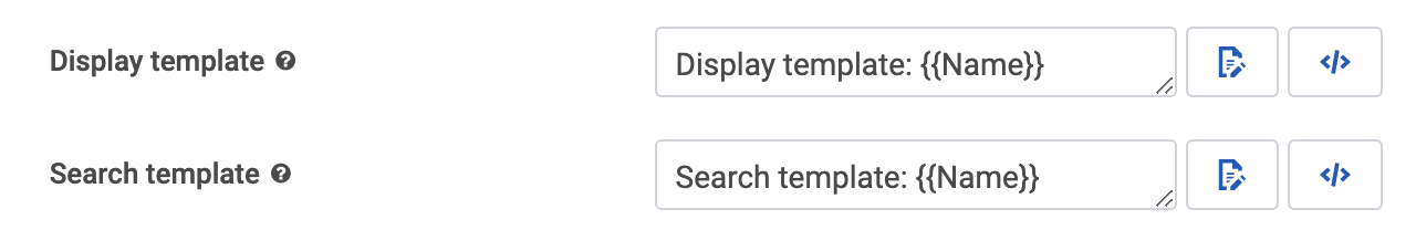
Notice where the display and search templates appear at runtime.
- Visible Rows: Determines the amount of results available from the model (5, 10, 25, 50, Show all)
- Tokenize autocomplete search: If checked, each word typed into the search bar is “tokenized” — meaning each word is searched for individually. A tokenized search for “George Washington” returns any record with “George” and “Washington”. For example, “George Washington,” “George Michael Washington,” and “George is headed to Washington”. An untokenized search for “George Washington” returns only records with “George Washington” exactly.
Search fields [[]]
Note
Depending on the data source used for the model attached to the component, this property may not be available.
Use SOSL to improve search performance: (Salesforce data sources only) SOSL quickly can search multiple objects at a time within a single search query. SOSL does not directly search the database, but instead queries an index of Salesforce text fields. Individual search fields may not be added when this property is enabled.
Warning
Because the search is against the index, results are limited to what is present in the index, and will not include data that may have been recently updated in the database. The index updates very quickly, but expect a delay of up to 30 seconds between changes made to the database, and their appearance in the search results.
Note
SOSL can search text fields (including long text fields), but not picklist fields and reference fields.
Fields to search: Sets which Types of fields to query with SOSL. The options are:
- Name Fields (default)
- All Text Fields
- Email Field
- Phone Fields
- SideBar Fields (Name, Phone, Email, External Ids)
Searches on Salesforce data sources can use one of two query languages: SOQL or SOSL. SOQL can only search one object at a time in a single query, but searches all searchable fields in that object in real-time.
Use default ordering: If checked, no additional sorting is applied to the result of the search.
- Fields to order records by: If Use default ordering is unchecked, sets how the returned items will be ordered using the field name and the order instructions. For example, Name ASC orders the list by name, from A to Z; Name DESC orders the list by name, from Z to A.
If Use SOSL to improve search performance is not checked, Search can be narrowed to individual fields by clicking Add new search field and then configuring the search parameters
- Field: The field to use in the search. Use the field picker to select.
Note
(Salesforce data sources only) SOQL can search picklist fields and Reference fields, but not long text fields. To search long text fields, use SOSL.
Return field in query results: Returns field data, even if the field isn’t searched, and makes that field data available for merge variables
Show field in search popup: Show a field in the search popup, even if the column that contains the field is hidden on the table.
- Custom label: Displays a custom header for the column being searched in the popup.
Search using Salesforce fields [[]]
By default, Salesforce Objects use SOQL. To ensure proper functionality, enable the Allow Search property on any Salesforce objects to be included in the search.
For more information on using these search options with Salesforce, check out Salesforce’s SOQL and SOSL Reference Guide.
Link tab [[]]
(For reference fields)
The Link tab determines whether an end user can navigate to a referenced record’s detail page (or some other custom URL) by clicking on the record in the table. If using the field as a link, you can set the following properties:
Navigation type:
Data source default: If a data source type has default behaviors configured for reference fields—for example, navigating to a detail page using the record ID a la Salesforce—then that behavior will be used in Skuid.
No link: The reference fields will display as unclickable plain text.
Skuid page: Set the field to link to a Skuid page.
- Skuid page: The name of the linked Skuid page.
Custom URL: Set the field to link to a specified URL.
URL: The URL that an end user will be taken to. Can accept merge syntax, which can be particularly useful for URL parameters.
Open URL in:
Current Window:
- Opens the URL in the current window.
- If using the Skuid page is within an iFrame, opens the URL in the current iFrame.
Note
Other content blocks on the page will remain the same.
New Tab: Opens the URL in a new tab.
Note
Custom URL navigation links are not fully supported in Lightning apps with console navigation and behave differently than other navigation types.
To accomplish the tab-opening behavior expected in the console, we recommend using the Go to URL action.
Styles tab [[]]
Global styles for this component are set in the Design System Studio. The following Style properties can be adjusted for an individual page.
Style variant: Style variants are created and set in the Design System Studio. Some components have pre-defined variants for a specific aspect of a component’s style. Also, Skuid builders can style and customize elements to create their own themes within the DSS. These themes will dynamically populate as selectable values in the Style Variant dropdown menu.
Note
To refresh available style variant options, click Refresh style variants.
This is useful for when changes to the design system (like style variants or variable options) have been made in another browser window or by another user.
Interactions tab [[]]
(For template fields on Table and Form components)
Click Add interaction then select:
- Action type: To initialize the display of the record details, choose the interaction:
- Click: Best for desktop, as well as mobile.
- Right-click: The right-click interaction will launch the actions added here. A common pattern is to create a customized context menu by using the Show/hide menu action.
- Disable the browser’s default menu?: Override the browser’s context menu for the Skuid page, component, or element. If the browser’s context menu is not disabled, then the actions will run while the browser’s context menu appears on screen.
In the More Options menu on the selected interaction, click Add action, then edit the Action Type:
- Action Type: Use the Action Framework to launch actions.
Filters tab [[]]
(For reference fields)
In partnership with the settings in the Search Tab, the Filters tab lets you create Lookup Filters to limit the search/display content provided when editing reference fields.
Click Add New Lookup Filter and set the following properties for Lookup Filter conditions:
Set the following properties for Lookup Filter conditions:
Field: The field in the current model to use as a filter for the searchable reference field.
Operator: The relationship between the field and its filter content.
Content: The type of value used to filter the reference field’s data.
Single specified value: Returns records that meet the specified value.
- Value: Indicate the value to filter by.
Multiple specified values: Returns records that meet at least one of the several specified values.
- Values: Indicate the values to filter by; for each separate value, click Add Another Value.
Field from another model: Use a field from another model as the filter for the Lookup field.
- Source model: The name of the model.
- Source field: Field on the source model.
- If no row in source model, then …
- Deactivate this Condition
- Abort this Model’s Query
Page/URL parameter value: Returns records that meet the specified Salesforce Lightning page or URL parameter, for example, the id parameter.
Parameter: Indicates the specific parameter to filter by.
If this Parameter is not provided, then …
- Set its value to Blank
- Deactivate this Condition
- Abort this Model’s Query
Running user attribute: Returns records if the value of a field on the model matches the value of a field on the current user’s record.
Userinfo Property: The value on the current user’s record to be used as a filter, usually an ID property. Options include:
- Default currency
- First name
- Last name
- Locale
- Name
- Organization ID
- Organization name
- Profile ID
- Profile name
- Session ID
- User ID (default)
- User name
- Use role ID
- User type
- Is multi currency org
None - blank value: Returns records only if the specified field is empty.
Another field from row: Returns records only if the field on the referenced record matches a separate field on that same record.
- Depends On: Select the field to compare with.
Advanced tab [[]]
(For date- or time-related fields)
Show month & year picker: If checked, Skuid displays month and year pickers during Edit Mode, to make it easy to jump to a specific year.
Year picker lower bound and Year picker upper bound: Sets the upper and lower boundaries of the list of possible years. Options include:
- “Selected” measures from a date selected on the Date Picker. Increments are 1-10, 20, 30 40, 50, 60, 70, 80, 90, and 100.
- “Today” measures from the current date. Increments are 1-10, 20, 30 40, 50, 60, 70, 80, 90, and 100.
Show today button: If checked, the month/year pickers include a Today button that allows users to quickly jump to the current date.
Minute picker increment: For editable date-time fields, select the minute increments (1, 5, 10, 15, 20, 30) for the displayed Time Picker.
Display logic tab [[]]
Standard display logic options are available to display or hide the component or feature.
Field Metadata [[]]
General tab [[]]
Field ID: The name of the selected field.
Display type: The type of field. Options include:
- Picklist fields and multi-select Picklists
- String fields
- Date and datetime fields
- Number/integer, and currency fields
- Address and phone fields
- Text and textarea fields
- URL fields
- Boolean fields
Override field metadata: If checked, displays override options. These options vary depending upon the original Display type for the field.
Label: Replaces default field label with custom text. Use the field picker to select a field to use as the column label.
Note
This feature lets you choose another field’s name and re-label the column with it, to shorten or clarify the column’s identity or purpose for users.
Inline help text (Form/Field Editor only): If Show inline help is set in the field’s General tab, Skuid displays the text in this field as just-in-time user help.
Note
This option only works when the field is displayed in a Form.
Display type: A list of display types that the field can be converted into, including:
Note
This field lets you override the field type, temporarily altering how the field displays within Skuid—into a new field type, termed a “display type.” Overriding the field type in this way, however, does not alter the field type in the original data source.
- Checkbox
- Combobox
- Currency
- Date
- Datetime
- Formula
- Multi-select picklist
- Number
- Percent
- Picklist
- Reference
- Text
- Textarea
- Url
- Unique ID (UUID)
Depending on the Display type selected, Skuid offers additional properties:
Required: If checked, text input is required. This setting does not persist across Skuid pages and does not override existing data model settings within the data source.
Note
Skuid automatically respects the validation rules and field-level security from the data source.
Picklist source: The source for the values displayed in the picklist:
- Manual: Picklist values are created manually by the builder in the Picklist tab.
- Rows in model: Picklist values are pulled from a model.
- Snippet: Picklist values are sourced from a JavaScript snippet.
Return type and Formula return type: Determines how Skuid displays the resulting values:
Checkbox
Currency
Date
Datetime
Note
Skuid stores all date and datetime fields in ISO 8601 format.
When directly manipulating the value of a date or date time field in a Skuid model, the value must be formatted as follows:
- Dates:
yyyy-MM-dd - DateTimes:
yyyy-MM-dd'T'HH:mm:ss[.SSS]'Z' - Percent
- Number
- Text
Read-only: If checked, text fields are read only and cannot be edited by users. This setting does not persist across Skuid pages.
Note
Skuid automatically respects the validation rules and field-level security from the data source.
Restrict input to picklist entries: If checked, users must select from the provided picklist entries or their input will be discarded. If unchecked, users can enter values that do not correspond to the provided picklist values.
Placeholder: Text or prompts that appear inside editable sections within the component. Commonly used to provide instruction for more complex field requirements, this field is compatible with merge syntax.
Length:
- For a currency field: The number of integers that can be entered in the field. Options: 0-17 or the field default.
- For a text or textarea field: The maximum number of characters that can be entered in this field.
Decimal places: The number decimal places that can be used in the field. Options: 0-9 or the field default.
Rich text: Enable rich text for the field.
Picklist entries tab [[]]
This tab is available when the Display type is Picklist or Multi-select Picklist and the Picklist Source is Manual.
Click Add to create a new value for the picklist dropdown menu, then configure:
- Value: The value that is stored and used in the data source.
- Label: The text displayed to the end user.
Create as many entries as needed.
Picklist models tab [[]]
This tab is available when the Display type is Picklist or Multi-select Picklist and the Picklist Source is Rows in a model.
- Model: The model that contains the field from which picklist entries are drawn.
- Entry value: The field used as the source for the values in the picklist.
- Entry label: The text displayed to the end user.
Formula tab [[]]
This tab is available when the Display type is Formula.
Construct a formula in the Enter Formula field by clicking the buttons (and dropdowns) provided:
Insert field: The field from the model’s object to be used in the formula.
Insert operator: The operator that defines the relationship between the field and its function. (Standard Skuid operators are used.)
Note
Equality operators are always interpreted strictly, meaning they compare both type and value.
For example, the formula
1 = "1"returns false, because"1"is a string type, even though the value could be interpreted as one.Even if these equality operators are formatted non-strictly—
=and!==—Skuid nonetheless interprets them strictly. Both=and==are interpreted as follows:1 = "1"returns false1 == "1"also returns falseWarning
In previous Skuid releases, equality operators could be used non-strictly as
==for equal and!==for does not equal. As of the Brooklyn Q2 Point Release, this functionality is no longer supported.
Insert function: The desired function for the formula. For more on functions, see Formula and Function Reference.
Reference tab [[]]
This tab is available when the Display type is Reference.
Reference setup
The reference Display type allows you to create a connection between the field (which is in a specific data source) and separate, secondary data source (the “reference”). In this tab, configure that relationship:
- Data source type: The reference data source type.
- Data source: The specific data source to use as the reference.
- SObject/Entity Type: The specific object within the referenced data source.
- Related entity: key field: The field on the reference object that will serve as a “bridge” between the reference data source and the primary data source. (Used as a “key” to link the data.)
- Relationship field name: The name of the field on the referenced object, stored as a UI-only field on the primary object to display a plain-language name for the referenced object. (This field stores information about the record that is referenced by the end user.)
Default items tab [[]]
This tab is used to determine pre-populated values that display during new record creation.
Note
The properties available are determined by Display type.
Content: Options include:
Single specified value: Use a specific value to pre-populate the field.
Value: The value to display to the user.
Note
Different display types offer different value options
Date fields include options to select:
- Date formula syntax
- A specific date (selected from a calendar picker)
Datetime fields include options to select a specific time.
Boolean fields let you choose true or false.
Multiple specified values: Use a set of specified values to pre-populate the field.
- Values: The values. For each additional value, click Add another value.
Field from another model: Use a field from another model to pre-populate the field.
- Source model: The name of the model that contains the field.
- Source field: The specific field on the source model.
Page/URL parameter value (Skuid SFX): Use a Salesforce Lightning page or URL parameter (for example, the ID parameter) to pre-populate the field.
- Parameter: Indicates the specific parameter.
Running user attribute: Returns records if the value of a field on the model matches the value of a field on the current user’s record. Options include:
- Default currency
- First name
- Last name
- Locale
- Name
- Organization ID
- Organization name
- Profile ID
- Profile name
- Session Id
- User ID (default)
- User name
- Use role ID
- User type
- Is multi currency org
Models [[]]
Warning
- Not all model properties listed below will be available for all data source types. If you do not see a property listed here in the Composer, it may not be available for your data source type.
Models for some data source types may have unique properties not documented here. These properties are detailed in the topics for those respective data source types.
General tab [[]]
Model ID: The unique name by which components refer to this model. Each model must have a unique name within one Skuid page. If other pages are included within that page—such as through the Page Include component or dependent pages—then the models in those pages must also have unique names.
Data source type: The data source type <data/> to use for this model, which narrows the selectable options in the Data Source property.
Data source: The data source <data/>—a connection to a system that has been configured by the Skuid builder—that the model uses to access records.
Model Object / Entity: The data object to pull data from. The label for this property can vary based on data source type, but they all mean the same thing:
- External Object Name
- Model Entity
- Salesforce Object Name
Model behavior: Some data sources allow the builder to select a specific type of model behavior:
- General: The default Skuid model.
- Aggregate: A model that collects, groups, and summarizes multiple data records into a single end result, such as a sum or a count.
- Read-only: (REST data sources) A model that can only query (and not update) data.
- Read/Write: (REST data sources) A model that can use multiple data source URLs for different data operations.
Query on page load: If unchecked, no data rows are loaded into the model when the page initially loads. Uncheck this box to use this model to create new records, or to load this model later via the Action Framework (for example, opening it in a drawer, popup, or tab).
Allow Page Render Before Query Completes: Controls whether Skuid must finish loading the metadata for the model before rendering the Skuid page. (Only available if Query on page load is checked.) By default, Skuid loads metadata for every model prior to rendering a page, even those without visible UI components. A model containing a picklist with hundreds or thousands of values could extend page load times, especially if there are many models on a page. Use this property to tailor which models have a higher priority, giving users access to the most meaningful data and UI elements first.
When unchecked, the model is considered synchronous—meaning it is given priority and its query must complete before the page renders.
When checked, the model is considered asynchronous, and the page will render even if its query is not yet finished.
Note
This model property is unavailable for server-side models.
Max # of records (limit): The maximum number of records that will be pulled in to this model when it is queried. The smaller this number is, the faster your page will load, but the less data available within the page.
Fields to order records by: Determines how the rows of records are sorted within the model. For basic models this sort statement is written as
FieldName SORT, while for aggregate models it’s written asFUNCTION(FieldName) SORT.Two sort commands are available:
- ASC: Ascending, meaning records of higher “value”—alphabetically or numerically—appear at the bottom of the record list. (If no sort command is specified, ASC is assumed.)
- DESC: Descending, meaning records of higher “value”—alphabetically or numerically—appear at the top of the record list.
So to sort a basic model’s rows by its amount field in descending value, use
Amount DESC. Or to sort an aggregate model’s rows by an aggregation that sums the amount field in descending value, useSUM(Amount) DESC.Multiple sort statements can be used in this property when separated by a comma. Sort statements are applied in the order they appear.
For example, to order a model’s rows alphabetically—ascending—by the Name field and then by their Number field descending, enter the following:
Name, Number__c DESC(Note that the first sort statement works because ASC is assumed.)
Note
If used on a Salesforce data source model, this property is also compatible with the NULLS FIRST and NULLS LAST syntax.
Create default row if model has none: When checked, a new record will automatically be created if there are no records within the model on page load. Useful for “Create New Record” pages.
Advanced tab [[]]
Prevent users from leaving page if this Model has unsaved changes: When checked, a dialog box will appear to prevent users from leaving the page if there are unsaved changes in this model. If unchecked, users can leave freely but may potentially lose data changes within this model, so determine the best behavior for your use case.
Model label: If the model’s selected object does not have a singular label—such as Account—this property can be used to specify one. However, if a label is specified for the object within the data source this property has no effect. (Correlates with the {{Model.label}} merge variable for a model.)
Model plural label: If the model’s selected object does not have a plural label—such as Accounts—this property can be used to specify one. However, if a label is specified for the object within the data source this property has no effect. (Correlates with the {{Model.labelPlural}} merge variable for a model. Commonly appears at the bottom of paginated components—like Tables or Decks—and in Page Title components.)
Defer rendering: When checked, fields specified by the data source type or marked in the Fields to Defer property will load asynchronously—meaning all other fields in the model may load and display in any components as soon as they are loaded. Deferred fields display placeholder text while they load and do not prevent other fields from rendering. Useful for fields that may incur longer load times, such as image fields or other binary files.
Note
While some data source types allow for deferred fields to be specified, some will not. For data source types that do not, the Fields to Defer property will not appear.
Fields to defer: Available for some data source types, this property sets which fields should load asynchronously. Requires Defer Rendering to be checked.
Pages [[]]
General tab [[]]
Page name: The name describing the page.
Note
Page names on Skuid SFX can use letters, numbers, underscores, and dashes. Page names for Skuid SFX form the basis of a URL; Salesforce allows the use of certain special characters in the page name provided they don’t interfere with the creation of a functional URL. To learn more, consult Salesforce’s documentation.
API version: The API version the page is built on.
Note
The API version selected at page creation determines the features available to the page. You may only use the components associated with a page’s API version. Also:
- The API version of both principal and dependent pages must match.
- The API version of a host page must match the API version of the Page Include component calling that page.
Page title: The content used in a browser’s title bar or on a tab label. (Optional)
Note
This feature has no effect if the page is:
- a dependent page
- displayed within a Page Include
- deployed within either the Skuid Page or Skuid Page Assignment Lightning components (Skuid NLX only*).
Max auto-saves: Limits the number of auto-save revisions that can be generated. These types of revisions are created each time a Skuid page is saved. Once this limit is reached, auto-save revisions are deleted—oldest first.
Note
Despite the name, Skuid pages do not automatically save as they would in a productivity app, like Microsoft Word or Google Docs. Clicking the Save button generates an auto-save that is available to you as a page revision.
- ARIA role: Determines which type of user interface element the component represents for assistive technology. The available options all refer to standard landmark ARIA roles. For more technical information on each role type, refer to MDN web docs.
- Banner: Used for defining global site details, such as company name, global search, logos, and similar information.
- Complementary: Used for content that, while related to the main content area, is not necessary for that main area to stand alone. Typically used for sidebars and other supplementary information.
- Content Info: Used for footers that appear on each page, which typically contain copyright information, navigation items, or similar content.
- Form: Used to identify sections that comprise a singular form–even though it may be comprised of multiple components.
- Main: Used to identify primary focus of the page.
- Navigation: Used to indicate a section containing links for navigating a site.
- Region: Used as a more generic landmark in order to indicate an area is relevant, but not categorized under the other available roles.
- Search: Used to indicate a section contains elements for searching the page or site.
Design system: The name of the design system that governs the page’s styling.
Several options are available in the Open design system options menu:
View: Opens the page’s design system in the Design System Studio.
Change: Changes the page’s design system. Once a new design system is selected, click Confirm to complete the change.
Refresh: Syncs the page’s available design system options with any recent changes made to the design system. Useful for when changes to the design system (like style variants or variable options) have been made in another browser window or by another user.
Note
It’s also possible to refresh design system options by clicking Refresh style variants beside the Style variant property within a component’s Styles tab.
Warn users if page has unsaved changes: If checked, when a end user tries to close the page when there are unsaved changes, Skuid issues a warning.
- No
- Yes (default)
Personalization mode: Indicates where user personalizations—remembered settings like selected tabs, filter values, etc.—are stored.
Client-side: Use for non-authenticated users (visitors to a public-facing website, community and portal users).
Note
Even if server-side is chosen for the page, non-authenticated users are defaulted to client-side storage for personalizations.
Server-side: Allows Skuid to sync user personalizations across multiple devices. (Default)
Available as a principal page: When checked, the page can be selected as a principal page when creating new pages.
Module: Allows the Skuid page to be added to a module selected from this dropdown list, which displays all modules registered within Skuid. For more information, see modules.
Tab to override: If creating a Skuid page, but still utilizing the Salesforce header UI, enter the name of your object’s tab here.
Owner: The page creator is automatically set as the owner. Select a name from the dropdown list to change a page’s owner. (You can also set a group as a page’s owner.
Note
This feature can be useful when employing field-level security to limit certain fields to access by specific end users.
Scale for Mobile Devices: Check to visually scale the page’s content and components to display more effectively on mobile devices.
Enable feedback on this page: When checked, users may submit feedback about their experience at runtime. (Checked by default.)
Layout tab [[]]
- Show Salesforce Classic header and Show Salesforce Classic sidebar: When checked, the page displays the standard Salesforce header or sidebar when viewed in Salesforce classic. (Unchecked by default.)
- Show custom header and Show custom footer: When checked, the page displays a custom header or footer, which are separate page elements than the main canvas.
Note
Once a header or footer is enabled, click on it, and it:
- can be styled from the Styles tab
- components can be added to it
- can be made “sticky” (it remains visible no matter how much a user scrolls through the page) by selecting Sticky in the General tab.
To learn more, see Create a principal and dependent page, which employs a custom header and footer in the principal page.
Interactions tab [[]]
Adds interactions—actions from the Action Framework—to the page. Page-level interactions extend to the full page—a click anywhere on the page triggers the interaction.
Click Add interaction then select:
- Action type: To initialize the display of the record details, choose the interaction:
- Click: Best for desktop, as well as mobile.
- Right-click: The right-click interaction will launch the actions added here. A common pattern is to create a customized context menu by using the Show/hide menu action.
- Disable the browser’s default menu?: Override the browser’s context menu for the Skuid page, component, or element. If the browser’s context menu is not disabled, then the actions will run while the browser’s context menu appears on screen.
In the More Options menu on the selected interaction, click Add action, then edit the Action Type:
- Action Type: Use the Action Framework to launch actions.
Styles tab [[]]
Global styles for this component are set in the Design System Studio. The following Style properties can be adjusted for an individual page.
Style variant: Style variants are created and set in the Design System Studio. Some components have pre-defined variants for a specific aspect of a component’s style. Also, Skuid builders can style and customize elements to create their own themes within the DSS. These themes will dynamically populate as selectable values in the Style Variant dropdown menu.
Note
To refresh available style variant options, click Refresh style variants.
This is useful for when changes to the design system (like style variants or variable options) have been made in another browser window or by another user.
Background: All Page background properties are the same as the Wrapper background section
Labels [[]]
Skuid allows you to use Salesforce custom labels, along with the Translation Workbench, to display user-facing text in each users’ preferred language. Learn more about creating custom labels in Salesforce.
For each custom label requested, Skuid will determine if there is a translation corresponding to the language of the end user viewing the Skuid page. If there is, Skuid displays the translated text to the user.
Note
It is considered a best-practice to use Custom Labels wherever displaying custom text to your users. Custom labels support effective localization.
To access custom labels:
- In the page properties, click the Labels tab.
- Click on Add Label.
- Label ID: Enter the label’s name as it appears in Salesforce’s Custom Labels page.
Note
To include a custom label in a template, use {{$Label.<LabelName>}}, e.g. {{$Label.Save}}.
For more information about using custom labels in Skuid, see Label Localization.
Components: Layout
Accordion [[]]
General tab [[]]
One panel open at a time: If checked, only one panel of the accordion can be open at a time. If the end user opens a new panel, the previously-opened one closes.
Sections initially open: If One panel open at a time is unchecked, builders can determine which panel to open upon page load:
- First section: Opens the first Accordion section.
- All sections: Opens all Accordion sections.
- Determine by section: If selected, opens a new Section property called Initial state (see below) to determine the open state of the selected section.
- None: No Accordion sections are open upon page load.
Open panel max height: The height of the component section (minus the section title), measured in pixels, em, rem, percentage, vh, or vw.
Icons on right: If checked, each section displays clickable icons that allow the user to expand and collapse the section.
Icon style: There are two ways to format the section icons:
- One icon: A single icon is used to open and close each section. (The selected icon rotates 45° when the section is open.)
- Icon: Click the field picker to select the icon.
- Separate icons for open/close:
- Icon when opened: Use the field picker to select the icon for an opened section.
- Icon when closed: Use the field picker to select the icon for a closed section.
- One icon: A single icon is used to open and close each section. (The selected icon rotates 45° when the section is open.)
Allow HTML in section labels: When the Allow HTML property is checked, any HTML markup within the column header label value will be parsed and rendered per the markup.
Advanced tab [[]]
- Unique ID (optional): Skuid automatically generates an alphanumeric ID for the component; if preferred, give it a practical name.
Styles tab [[]]
Global styles for this component are set in the Design System Studio. The following Style properties can be adjusted for an individual page.
Style variant: Style variants are created and set in the Design System Studio. Some components have pre-defined variants for a specific aspect of a component’s style. Also, Skuid builders can style and customize elements to create their own themes within the DSS. These themes will dynamically populate as selectable values in the Style Variant dropdown menu.
Note
To refresh available style variant options, click Refresh style variants.
This is useful for when changes to the design system (like style variants or variable options) have been made in another browser window or by another user.
Margin: Sets a component’s margin (the space around it) relative to other components on the page.
- To set margins for all sides, click border-all All.
- To set margins for each side individually, click border-separate Separate.
Margin values can be set to any configured spacing variable for the page’s design system. Margin cannot be set an arbitrary value; it must use a design system variable.
Display logic tab [[]]
Standard display logic options are available to display or hide the component or feature.
Nested elements
Section properties
General tab [[]]
Section heading: The text heading for the section. Type in section text, or select a field to use as the header. (This property accepts merge syntax.)
Initial state:
- Closed: (Default) The section is closed upon page load.
- Open: The section is open upon page load.
- Determined by open conditions: The section’s open/closed state is determined by Display Logic.
Display logic tab [[]]
Standard display logic options are available to display or hide the component or feature.
Button Set [[]]
Click the Button Set component to access this property pane.
General Tab [[]]
- Model: Button sets can be attached to one model. Doing so makes all data-related button types—such as Save, Cancel, and Delete—automatically affect the model selected here.
- Position: This field determines the alignment of the buttons within the container. You can choose:
- Right (default)
- Left
- Center
- Expand to fill: The Button Set component extends across the entire width of its container (whether it’s a page, a grid division, or a tab). By default, Button Groups are clustered together within the Button Set and displayed in the selected Position. When Expand to Fill is checked, Button Groups stretch horizontally across the entire area of the Button Set (even if the Button Group only holds one button).
Advanced tab [[]]
- Unique ID (optional): Skuid automatically generates an alphanumeric ID for the component; if preferred, give it a practical name.
Styles tab [[]]
Global styles for this component are set in the Design System Studio. The following Style properties can be adjusted for an individual page.
Style variant: Style variants are created and set in the Design System Studio. Some components have pre-defined variants for a specific aspect of a component’s style. Also, Skuid builders can style and customize elements to create their own themes within the DSS. These themes will dynamically populate as selectable values in the Style Variant dropdown menu.
Note
To refresh available style variant options, click Refresh style variants.
This is useful for when changes to the design system (like style variants or variable options) have been made in another browser window or by another user.
Margin: Sets a component’s margin (the space around it) relative to other components on the page.
- To set margins for all sides, click border-all All.
- To set margins for each side individually, click border-separate Separate.
Margin values can be set to any configured spacing variable for the page’s design system. Margin cannot be set an arbitrary value; it must use a design system variable.
Display logic tab [[]]
Standard display logic options are available to display or hide the component or feature.
Nested elements
Button Group properties
Click the border of the Button Group to access this property pane. To add a new Button Group, click the Button Set, then click Add button group.
General tab [[]]
Display type:
Detached: Buttons within the Button Group are separated by spacing.
Attached: Buttons within the Button Group are attached to each other.
Combo: Buttons are stacked under the leftmost button in the Button Group and are accessible by clicking an arrow to open the dropdown button menu.
Icon: The icon to be included to the Combo button label. Click the field picker to select an icon.
Icon position: Sets the position of the icon on the button group label.
- Left
- Right
Menu: Buttons within the Button Group are displayed as a menu on the page that can be accessed by selecting the arrow next to the Button Group’s label.
Label (optional): Text for the Button Group’s label. The default label is “Select.”
Icon (optional): The icon to be included to the Button Group label. Click the field picker to select an icon.
Icon position: Sets the position of the icon on the button group label.
- Left
- Right
Advanced tab [[]]
- Unique ID (optional): Skuid automatically generates an alphanumeric ID for the component; if preferred, give it a practical name.
Styles tab [[]]
Global styles for this component are set in the Design System Studio. The following Style properties can be adjusted for an individual page.
Style variant: Style variants are created and set in the Design System Studio. Some components have pre-defined variants for a specific aspect of a component’s style. Also, Skuid builders can style and customize elements to create their own themes within the DSS. These themes will dynamically populate as selectable values in the Style Variant dropdown menu.
Note
To refresh available style variant options, click Refresh style variants.
This is useful for when changes to the design system (like style variants or variable options) have been made in another browser window or by another user.
Display logic tab [[]]
Standard display logic options are available to display or hide the component or feature.
Button properties
Click the button itself to access this property pane. To add an new button to a Button Group, click the Button Group’s border, then click Add button.
General tab [[]]
- Button label: Text for the button. The default label is “Button.”
- Button icon (optional): The icon to be included to the button label. Click the field picker to select an icon.
- Button icon position: Set the position for the icon on the button.
- Left
- Right
ARIA label: Determines what description will be read by assistive technology, such as screen readers, by setting the aria-label HTML attribute, which is part of the Web Accessibility Initiative—Accessible Rich Internet Applications (WAI-ARIA) spec.
Used to describe elements where text may not be visible, this property can be a specific string of text, the merge variables of one or more fields, or a combination of the two.
Note
If no Aria Label is specified, access technologies will use the Button label.
Actions tab [[]]
Add actions to a button:
Click Add action, then select:
- Action Type: Use the Action Framework to launch actions.
Note
Use the Show/hide menu action to add a dropdown menu to the button.
Advanced tab [[]]
- Unique ID (optional): Skuid automatically generates an alphanumeric ID for the component; if preferred, give it a practical name.
Styles tab [[]]
Global styles for this component are set in the Design System Studio. The following Style properties can be adjusted for an individual page.
Style variant: Style variants are created and set in the Design System Studio. Some components have pre-defined variants for a specific aspect of a component’s style. Also, Skuid builders can style and customize elements to create their own themes within the DSS. These themes will dynamically populate as selectable values in the Style Variant dropdown menu.
Note
To refresh available style variant options, click Refresh style variants.
This is useful for when changes to the design system (like style variants or variable options) have been made in another browser window or by another user.
Tooltip tab [[]]
A floating box that displays when the end user hovers over a button, the tooltip provides guidance usage.
Text: The tooltip’s content.
Position: This field determines the alignment of the tooltip relative to the button:
- Top (default): Above the button.
- Bottom: below the button.
- Left: to the left of the button.
- Right: to the right of the button.
Note
The Position settings are contingent upon available space. For example, if the Button Set is at the top of the page, and the tooltip position is set to Top, the tooltip cannot display above the button: there’s not space. So it will display below the button.
Tooltip style:
- Dark (default): The tooltip box is a black.
- Light: The tooltip box is white, with a drop shadow.
Compact size?: If checked, reduces the amount of padding around the text in the tooltip box.
Hotkeys tab [[]]
This tab allows you to establish a set of hotkeys that will immediately execute the actions associated with the button. Select the modifier and key, then test.
Note
Skuid focus hotkeys will not override hotkeys previously assigned by the operating system or browser, so be sure to test the key combination. If it’s not providing the expected results, the key combination may already be assigned. Try a different combination.
Click Add Hotkey and then configure:
- Modifiers include:
- Alt
- Ctrl
- Command
- Shift
- Key: Lists all available keys.
- Ignore hotkey if end user is typing in input element: If checked, the hotkey combination will be ignored while the user is entering content into any text field. (Useful if the hotkey combo would conflict with standard data entry keys, like arrows keys.)
Display logic tab [[]]
Standard display logic options are available to display or hide the component or feature.
Carousel [[]]
General [[]]
Unique ID (optional): Skuid automatically generates an alphanumeric ID for the component; if preferred, give it a practical name.
Slide source: Determines how each slide’s content is populated
- Manual: Slide content is set per slide in the Composer.
- Rows in a model: Slide content is set as a single slide template in the Composer, which is then iterated for all rows in the selected model.
Model: (Appears when the slide source is Rows in a model.) The model whose rows are used to generate slides.
Transition effect: Determines how slides visually shift when the end user navigates forward or backward in the slide rotation.
- None: Slides instantly appear on progression
- Fade: Slides fade into each on progression
- Translate: Slides shift from left to right on progression, giving the appearance of being attached
Automatically transition slides: Determines whether or not the Carousel automatically progresses through its slides if there is no user interaction
Note
As soon as an end user progresses the slides through the component’s previous/next buttons or by activating a Go to previous slide/Go to next slide action, slides no longer automatically transition.
Transition speed in seconds: (Appears when Automatically transition slides is enabled) The length of time the slide appears for end users before progressing to the next.
Enable infinite looping: Determines whether or not the Carousel loops to the first slide if end users attempt to progress past the last slide.
Show dots: Determines whether or not the progress indication dots appear beneath the component at runtime.
Show slide counter: Determines whether or not the progress indication counter appears beneath the component at runtime.
Show next and previous buttons: Determines whether or not the pre-built next/previous buttons appear at runtime.
Previous button icon: (Appears when Show next and previous buttons is enabled) Determines which icon on the Carousel’s pre-built previous slide button.
Next button icon: (Appears when Show next and previous buttons is enabled) Determines which icon on the Carousel’s pre-built next slide button.
Styles [[]]
Global styles for this component are set in the Design System Studio. The following Style properties can be adjusted for an individual page.
Style variant: Style variants are created and set in the Design System Studio. Some components have pre-defined variants for a specific aspect of a component’s style. Also, Skuid builders can style and customize elements to create their own themes within the DSS. These themes will dynamically populate as selectable values in the Style Variant dropdown menu.
Note
To refresh available style variant options, click Refresh style variants.
This is useful for when changes to the design system (like style variants or variable options) have been made in another browser window or by another user.
Margin: Sets a component’s margin (the space around it) relative to other components on the page.
- To set margins for all sides, click border-all All.
- To set margins for each side individually, click border-separate Separate.
Margin values can be set to any configured spacing variable for the page’s design system. Margin cannot be set an arbitrary value; it must use a design system variable.
Display logic [[]]
Note
For information on individual condition properties, see the Display Logic docs.
Render conditions
These conditions govern when an element or component will display.
Render if…: The conditions that must be met to enable the element’s display.
- ALL conditions are met
- ANY conditions are met
- Custom logic is met
- Condition logic: The custom logic for grouping and applying one or more conditions.
If hidden, model field changes should be: (only available on Field rendering tabs) If the field is hidden by conditional rendering, this property determines whether any changes made to this field (via Action Framework or JavaScript) are saved in the model, or canceled.
Note
Depending on the needs of your org, it could be bad user experience to update fields without direct user input especially when that user may be unaware of they are doing so.
- Retained in model (the default)
- Cancelled
Style variant conditions
These conditions govern which style variant is applied and displayed on a component or element.
Note
You can create one, or more, style variant conditions and set each individually.
- Click Add a new condition to add a new style variant condition.
- Then, click the new style variant condition and configure.
When Skuid executes the display logic, the style variant conditions are evaluated in order.
Use this Style Variant if…: The model conditions that must be met to enable the styling.
- ALL conditions are met
- ANY conditions are met
- Custom logic is met
- Condition logic: The custom logic for grouping and applying one or more conditions.
- Style variant: The style variant to be rendered if condition(s) are met.
Nested elements
Slide properties
General [[]]
- Slide name: Determines the name of the slide, which is available through the
{{SlideName}}merge variable.
Styles [[]]
- Style variant: Style variants are created and set in the Design System Studio. Some components have pre-defined variants for a specific aspect of a component’s style. Also, Skuid builders can style and customize elements to create their own themes within the DSS. These themes will dynamically populate as selectable values in the Style Variant dropdown menu.
Background type: This controls the appearance of the slide’s background.
Default
Image: Pulls in an image from a Skuid data source.
- Data source type: Select the data source type from which you will be pulling the image.
Note
Select “Ui-Only” for images associated with Ui-Only models.
Data source: Choose the specific data source containing the desired image. (Defaults to “Ui-only” for Ui-only models.)
Image Source:
Static resource:
Note
You must have an image file uploaded as a static resource.
- Resource name: If the file has been correctly uploaded, when you start typing the filename, Skuid will autocomplete.
URL:
- Model: Skuid presents a list of available Models in the dropdown, and selects one for this field, but you can change it.
- Image URL: The URL field. The user can select a URL field from the model, enter the complete URL, or use a global merge value to identify the URL.
Note
While the latter two options do not require a model to be specified, when using merge fields for the URL, setting the model provides the needed model row context.
Size: Control the size of the image.
- Original: The image will display at its original size, without regard to the size of the slide.
- Contain: The image will scale so that it will at least meet the top and bottom margins of the slide.
- Cover: The image will scale so all parts of the slide’s background are covered by the image.
Position: Choose the orientation of the image within the slide.
Repeat: Determine if the image will repeat vertically, horizontally or both.
- No Repeat
- Horizontal
- Vertical
- Both
Special effects: Add special effects to slide image.
- No effects
- Parallax means that, when scrolling, the contents in the grid will scroll over the image
Color: Background color behind image. Defaults to transparent.
- Click the transparent symbol to open color the selection menu.
Color: Choose a color to serve as slide background. Defaults to transparent.
- Click the transparent symbol to open color the selection menu.
Masthead [[]]
General tab [[]]
- Positioning: Determines how the Masthead behaves when the page is scrolled.
- Scrolls with Page: The Masthead scrolls with all other components.
- Fixed: The Masthead is fixed to the top of the page and does not scroll (“sticky masthead”).
- Fixed when at top: If the masthead is not inherently located at the top of the page (for example, it’s beneath a large banner image), it will scroll until it reaches the top, and then become fixed there.
- ARIA role: Determines which type of user interface element the component represents for assistive technology. The available options all refer to standard landmark ARIA roles. For more technical information on each role type, refer to MDN web docs.
- Banner: Used for defining global site details, such as company name, global search, logos, and similar information.
- Complementary: Used for content that, while related to the main content area, is not necessary for that main area to stand alone. Typically used for sidebars and other supplementary information.
- Content Info: Used for footers that appear on each page, which typically contain copyright information, navigation items, or similar content.
- Form: Used to identify sections that comprise a singular form–even though it may be comprised of multiple components.
- Main: Used to identify primary focus of the page.
- Navigation: Used to indicate a section containing links for navigating a site.
- Region: Used as a more generic landmark in order to indicate an area is relevant, but not categorized under the other available roles.
- Search: Used to indicate a section contains elements for searching the page or site.
- Unique ID Skuid automatically generates an alphanumeric Id for the component; if preferred, give it a practical name.
Styles tab [[]]
Global styles for this component are set in the Design System Studio. The following Style properties can be adjusted for an individual page.
Style variant: Style variants are created and set in the Design System Studio. Some components have pre-defined variants for a specific aspect of a component’s style. Also, Skuid builders can style and customize elements to create their own themes within the DSS. These themes will dynamically populate as selectable values in the Style Variant dropdown menu.
Note
To refresh available style variant options, click Refresh style variants.
This is useful for when changes to the design system (like style variants or variable options) have been made in another browser window or by another user.
Margin: Sets a component’s margin (the space around it) relative to other components on the page.
- To set margins for all sides, click border-all All.
- To set margins for each side individually, click border-separate Separate.
Margin values can be set to any configured spacing variable for the page’s design system. Margin cannot be set an arbitrary value; it must use a design system variable.
Display logic tab [[]]
Standard display logic options are available to display or hide the component or feature.
Nested elements
Spacing properties
General Tab [[]]
Change order: Left and right arrows move the selected spacing item left or right on the masthead.
Unique ID Skuid automatically generates an alphanumeric Id for the element; if preferred, give it a practical name.
Flex ratio: This sets the size of this spacing division relative to other items in the mastheads. For example, if there are two items in the masthead, and the flex ratio for each is 1, they will each take up ½ of the masthead. If one has a flex ratio of 2, and the other has a flex ratio of 1, the first one occupies ⅔ of the grid, and the second one occupies ⅓ of it.
Min width: Sets a minimum width for the spacer. When the minimum width is exceeded, the grid division will stack above or below other masthead items. This can be specified using px, em, rem, %, vh, or vw measurements.
Note
- Em, %, vh, or vw are more responsive to screen size.
- Ensure the division’s minimum width is at least as wide as its contents.
Styles tab [[]]
Global styles for this component are set in the Design System Studio. The following Style properties can be adjusted for an individual page.
Style variant: Style variants are created and set in the Design System Studio. Some components have pre-defined variants for a specific aspect of a component’s style. Also, Skuid builders can style and customize elements to create their own themes within the DSS. These themes will dynamically populate as selectable values in the Style Variant dropdown menu.
Note
To refresh available style variant options, click Refresh style variants.
This is useful for when changes to the design system (like style variants or variable options) have been made in another browser window or by another user.
Note
To refresh available style variant options, click Refresh style variants.
This is useful for when changes to the design system (like style variants or variable options) have been made in another browser window or by another user.
Margin: Sets a component’s margin (the space around it) relative to other components on the page.
- To set margins for all sides, click border-all All.
- To set margins for each side individually, click border-separate Separate.
Margin values can be set to any configured spacing variable for the page’s design system. Margin cannot be set an arbitrary value; it must use a design system variable.
Logo properties
When you add a logo to the Masthead, the properties are the same as those for the Image component.
Navigation [[]]
General tab [[]]
Type: Controls the visual orientation of the Navigation component.
Horizontal: Navigation items align in a straight line from left to right.
- Overflow to menu navigation: If true, any navigation items that do not fit within the horizontal navigation—based on screen size—will be placed into a dropdown menu.
- Screen Size to Collapse Item Text:
- Never: The navigation component will not respond to screen size.
- Tablets and smaller: Navigation will respond to widths of 1024 pixels or smaller.
- Phones: Navigation will respond to widths of 480 pixels or smaller.
- Alternate format: Available if Screen Size to Change Format is set to either Tablets and smaller or Phones.
- Collapse to Menu: The horizontal list will transform into a dropdown menu type at the set screen size.
- Wrap Centered: The horizontal list will transform into a vertical menu at the set screen size, with navigation items centered in the navigation menu.
- Menu Icon: Select the icon of the drop down menu (optional).
Drop Down: All navigation items are collapsed into a dropdown menu indicated by a down arrow.
Use Icon: If true, an icon will display beside items in the drop down.
Label: Creates a custom label for the collapsed dropdown menu.
Note
If the item source selected is Salesforce Apps, the Navigation defaults to the first app listed. To change the label, insert a custom value for the Label Property.
Item source: Choose the source of navigation menu items.
- Manual
- Salesforce tabs for current app
- Salesforce apps
- Salesforce apps with tabs
- Salesforce user menu
Note
Other than Manual, all options automatically populate menu items.
Advanced tab [[]]
- Unique ID (optional): Skuid automatically generates an alphanumeric ID for the component; if preferred, give it a practical name.
Styles tab [[]]
Global styles for this component are set in the Design System Studio. The following Style properties can be adjusted for an individual page.
Style variant: Style variants are created and set in the Design System Studio. Some components have pre-defined variants for a specific aspect of a component’s style. Also, Skuid builders can style and customize elements to create their own themes within the DSS. These themes will dynamically populate as selectable values in the Style Variant dropdown menu.
Note
To refresh available style variant options, click Refresh style variants.
This is useful for when changes to the design system (like style variants or variable options) have been made in another browser window or by another user.
Margin: Sets a component’s margin (the space around it) relative to other components on the page.
- To set margins for all sides, click border-all All.
- To set margins for each side individually, click border-separate Separate.
Margin values can be set to any configured spacing variable for the page’s design system. Margin cannot be set an arbitrary value; it must use a design system variable.
Display logic tab [[]]
Standard display logic options are available to display or hide the component or feature.
Nested elements
Responsive Grid [[]]
Layout tab [[]]
Main Axis: Determines how to align the Responsive Grid divisions.
Note
The Ink Responsive Grid has a variety of values to represent the relationships of divisions within the grid. The easiest place to start? Try:
- Main axis: Row
- Justify content: Left
- Align divisions: Top
Row: Aligns divisions in a row.
Justify divisions: Determines how the row of grid divisions will justify along a left-right axis.
Note
Useful to locate the divisions within the grid when they have both maximum and minimum width set.
- Left (default): Divisions are justified with the left margin of the grid.
- Center: Divisions are justified in the center of the grid.
- Right: Divisions are justified with the right margin of the grid.
- Space Between: Divisions are evenly spaced within the grid, with the first division justified to the left margin and the last division justified to the right margin.
- Space Around: Divisions are evenly spaced within the grid. There is spacing between the first division and the left margin, and between the last division and the right margin.
- Stretch: Stretches the division’s contents to fit the division’s full width.
Align divisions: Determines where divisions sit within the grid, positioning them along a top-to-bottom axis.
- Top (default): Divisions are aligned with the top of the grid.
- Middle: Divisions are aligned along a center left-right axis of the grid.
- Bottom: Divisions are aligned with the bottom of the grid.
- Stretch: Stretches the division’s contents to fit the division’s full height.
Column: Stacks division on top of one another.
Justify divisions: Determines how the stacked grid divisions will justify along a top-to-bottom axis.
Note
Useful to locate the divisions within the grid when they have both maximum and minimum width set.
- Top (default): Divisions are justified along the top of the grid.
- Middle: Divisions are justified in the center of the grid.
- Bottom: Divisions are justified along the bottom of the grid.
- Space Between: Divisions are evenly spaced within the grid, with the first division justified to the top margin and the last division justified to the bottom margin.
- Space Around: Divisions are evenly spaced within the grid. There is spacing between the first division and the top margin, and between the last division and the bottom margin.
- Stretch: Stretches the division’s contents to fit the division’s full height.
Align divisions: Determines where divisions sit within the grid, positioning them along a left-right axis.
- Left (default): Divisions are aligned with the left margin of the grid.
- Center: Divisions are aligned along the center top-to-bottom axis of the grid.
- Right: Divisions are aligned with the right margin of the grid.
- Stretch: Stretches the division’s contents to fit the division’s full width.
Column gutter size (optional): The distance between divisions when they are displayed as columns, side-by-side. (Typically affects devices with larger screens, such as desktops.)
- None
- Extra Small
- Small
- Reduced
- Regular
- Increased
- Large
- Extra Large
- Huge
Row gutter size (optional): The distance between divisions when they are stacked as rows atop one another. (Typically affects smaller screen sizes or mobile devices.)
- None
- Extra Small
- Small
- Reduced
- Regular
- Increased
- Large
- Extra Large
- Huge
Advanced tab [[]]
- Unique ID (optional): Skuid automatically generates an alphanumeric ID for the component; if preferred, give it a practical name.
ARIA label: Determines what description will be read by assistive technology, such as screen readers, by setting the aria-label HTML attribute, which is part of the Web Accessibility Initiative—Accessible Rich Internet Applications (WAI-ARIA) spec.
Used to describe elements where text may not be visible, this property can be a specific string of text, the merge variables of one or more fields, or a combination of the two.
- ARIA role: Determines which type of user interface element the component represents for assistive technology. The available options all refer to standard landmark ARIA roles. For more technical information on each role type, refer to MDN web docs.
- Banner: Used for defining global site details, such as company name, global search, logos, and similar information.
- Complementary: Used for content that, while related to the main content area, is not necessary for that main area to stand alone. Typically used for sidebars and other supplementary information.
- Content Info: Used for footers that appear on each page, which typically contain copyright information, navigation items, or similar content.
- Form: Used to identify sections that comprise a singular form–even though it may be comprised of multiple components.
- Main: Used to identify primary focus of the page.
- Navigation: Used to indicate a section containing links for navigating a site.
- Region: Used as a more generic landmark in order to indicate an area is relevant, but not categorized under the other available roles.
- Search: Used to indicate a section contains elements for searching the page or site.
Interactions tab [[]]
Click Add interaction then select:
- Action type: To initialize the display of the record details, choose the interaction:
- Click: Best for desktop, as well as mobile.
- Right-click: The right-click interaction will launch the actions added here. A common pattern is to create a customized context menu by using the Show/hide menu action.
- Disable the browser’s default menu?: Override the browser’s context menu for the Skuid page, component, or element. If the browser’s context menu is not disabled, then the actions will run while the browser’s context menu appears on screen.
In the More Options menu on the selected interaction, click Add action, then edit the Action Type:
- Action Type: Use the Action Framework to launch actions.
Styles tab [[]]
Global styles for this component are set in the Design System Studio. The following Style properties can be adjusted for an individual page.
Style variant: Style variants are created and set in the Design System Studio. Some components have pre-defined variants for a specific aspect of a component’s style. Also, Skuid builders can style and customize elements to create their own themes within the DSS. These themes will dynamically populate as selectable values in the Style Variant dropdown menu.
Note
To refresh available style variant options, click Refresh style variants.
This is useful for when changes to the design system (like style variants or variable options) have been made in another browser window or by another user.
Margin: Sets a component’s margin (the space around it) relative to other components on the page.
- To set margins for all sides, click border-all All.
- To set margins for each side individually, click border-separate Separate.
Margin values can be set to any configured spacing variable for the page’s design system. Margin cannot be set an arbitrary value; it must use a design system variable.
Background [[]]
Background type: This controls the appearance of the Responsive Grid’s background.
Default
Image: Pulls in an image from a Skuid data source.
- Data source type: Select the data source type from which you will be pulling the image.
Note
Select “Ui-Only” for images associated with Ui-Only models.
Data source: Choose the specific data source containing the desired image. (Defaults to “Ui-only” for Ui-only models.)
Image Source:
Static resource:
Note
You must have an image file uploaded as a static resource.
- Resource name: If the file has been correctly uploaded, when you start typing the filename, Skuid will autocomplete.
URL:
- Model: Skuid presents a list of available Models in the dropdown, and selects one for this field, but you can change it.
- Image URL: The URL field. The user can select a URL field from the model, enter the complete URL, or use a global merge value to identify the URL.
Note
While the latter two options do not require a model to be specified, when using merge fields for the URL, setting the model provides the needed model row context.
Size: Control the size of the image.
- Original: The image will display at its original size, without regard to the size of the Responsive Grid.
- Contain: The image will scale so that it will at least meet the top and bottom margins of the Responsive Grid.
- Cover: The image will scale so all parts of the Responsive Grid’s background are covered by the image.
Position: Choose the orientation of the image within the Responsive Grid.
Repeat: Determine if the image will repeat vertically, horizontally or both.
- No Repeat
- Horizontal
- Vertical
- Both
Special effects: Add special effects to Responsive Grid image.
- No effects
- Parallax means that, when scrolling, the contents in the grid will scroll over the image
Color: Background color behind image. Defaults to transparent.
- Click the transparent symbol to open color the selection menu.
Color: Choose a color to serve as Responsive Grid background. Defaults to transparent.
- Click the transparent symbol to open color the selection menu.
Height and scrolling [[]]
Height strategy:
Fit to Content: This sizes the Responsive Grid to fit the components within.
Max height (optional): The maximum height of the Responsive Grid component. Options are:
None
Short
Medium
Tall
Custom: Uses a custom height.
- Custom Height: The height of the table, using a number and a sizing unit.
Min Height (optional): The minimum height of the Responsive Grid component. Options are:
None
Short
Medium
Tall
Custom: Uses a custom height.
- Custom Height: The height of the table, using a number and a sizing unit
Fixed Height: Sets an absolute width.
Height:
Fit to Content
Short
Medium
Tall
Custom: Uses a custom height.
- Custom Height: The height of the table, using a number and a sizing unit.
Overflow: Determines how content is handled when it overflows the grid’s height.
- Scroll: The content is scrollable and a scroll bar is displayed.
- Hide: The content that does not fit into the Responsive Grid remains hidden.
- Show: The Responsive Grid resizes the content to fit into the Responsive Grid’s height.
Display logic tab [[]]
Standard display logic options are available to display or hide the component or feature.
Nested elements
Responsive Grid divisions
Click on any Division header text within the grid to access its properties:
General tab [[]]
Flex ratio: This sets the size of this division relative to other divisions. For example, if there are two divisions in a grid, and the flex ratio for each is 1, they will each take up ½ of the grid. If one has a flex ratio of 2, and the other has a flex ratio of 1, the first one occupies ⅔ of the grid, and the second one occupies ⅓ of it.
Minimum width: Sets a minimum width for the division. This governs division wrapping on smaller screens: when the minimum width is exceeded, the grid division will stack above or below other divisions. This can be specified using px, em, rem, %, vh, or vw measurements.
Note
- Em, %, vh, or vw are more responsive to screen size.
- Ensure the division’s minimum width is at least as wide as its contents.
Maximum width: Sets a maximum width for the division.This can be specified using px, em, rem, %, vh, or vw measurements.
Align self: Sets a separate alignment for the selected division.
Note
This setting supersedes the alignment set for all divisions in the Responsive Grid properties, Layout Tab.
- Top (default): Divisions are aligned with the top of the grid.
- Middle: Divisions are aligned along a center left-right axis of the grid.
- Bottom: Divisions are aligned with the bottom of the grid.
- Stretch: Stretches the division’s contents to fit the division’s full height.
ARIA label: Determines what description will be read by assistive technology, such as screen readers, by setting the aria-label HTML attribute, which is part of the Web Accessibility Initiative—Accessible Rich Internet Applications (WAI-ARIA) spec.
Used to describe elements where text may not be visible, this property can be a specific string of text, the merge variables of one or more fields, or a combination of the two.
- ARIA role: Determines which type of user interface element the component represents for assistive technology. The available options all refer to standard landmark ARIA roles. For more technical information on each role type, refer to MDN web docs.
- Banner: Used for defining global site details, such as company name, global search, logos, and similar information.
- Complementary: Used for content that, while related to the main content area, is not necessary for that main area to stand alone. Typically used for sidebars and other supplementary information.
- Content Info: Used for footers that appear on each page, which typically contain copyright information, navigation items, or similar content.
- Form: Used to identify sections that comprise a singular form–even though it may be comprised of multiple components.
- Main: Used to identify primary focus of the page.
- Navigation: Used to indicate a section containing links for navigating a site.
- Region: Used as a more generic landmark in order to indicate an area is relevant, but not categorized under the other available roles.
- Search: Used to indicate a section contains elements for searching the page or site.
- Change order: Click to move this division left or right in the grid.
- Unique ID (optional): Skuid automatically generates an alphanumeric ID for the grid division; if preferred, give it a practical name.
Tab Container [[]]
General tab [[]]
- Unique ID (optional): Skuid automatically generates an alphanumeric ID for the component; if preferred, give it a practical name.
- Remember active tab: If true, Skuid’s personalization framework will remember the last tab an end user was on and will automatically reopen that tab when the user returns to this page.
- Defer tab rendering: Defer tab rendering makes it easier to build performant pages. Instead of loading all the data in tabs when the page loads, this directs the page to only load and render the selected tab. Combine this with Remember active tab for a great user experience.
- Allow HTML in tab labels: When the Allow HTML property is checked, any HTML markup within the column header label value will be parsed and rendered per the markup.
ARIA label: Determines what description will be read by assistive technology, such as screen readers, by setting the aria-label HTML attribute, which is part of the Web Accessibility Initiative—Accessible Rich Internet Applications (WAI-ARIA) spec.
Used to describe elements where text may not be visible, this property can be a specific string of text, the merge variables of one or more fields, or a combination of the two.
Note
If no Aria Label is specified, access technologies will use the Tab label.
Styles tab [[]]
Global styles for this component are set in the Design System Studio. The following Style properties can be adjusted for an individual page.
Style variant: Style variants are created and set in the Design System Studio. Some components have pre-defined variants for a specific aspect of a component’s style. Also, Skuid builders can style and customize elements to create their own themes within the DSS. These themes will dynamically populate as selectable values in the Style Variant dropdown menu.
Note
To refresh available style variant options, click Refresh style variants.
This is useful for when changes to the design system (like style variants or variable options) have been made in another browser window or by another user.
Margin: Sets a component’s margin (the space around it) relative to other components on the page.
- To set margins for all sides, click border-all All.
- To set margins for each side individually, click border-separate Separate.
Margin values can be set to any configured spacing variable for the page’s design system. Margin cannot be set an arbitrary value; it must use a design system variable.
Display logic tab [[]]
Standard display logic options are available to display or hide the component or feature.
Nested elements
Tab properties
General tab [[]]
- Tab label: The text that appears as the tab’s title in the component. Defaults to “New Tab.”
- Icon (optional): A visual icon that will appear beside the tab label. Commonly used to guide users to relevant information more quickly. Click to open the library of available icons.
Advanced tab [[]]
- Tab panel unique Id (optional). Allows for a tab’s content panel to be reliably referenced via JavaScript or set via a URL hash, such as
apex/skuid_UI?page=AccountDetail#CasesTab.
Actions tab [[]]
Use these properties to add actions to individual tabs on the Tab Container.
- When first shown: Actions will only run the first time an end user selects this Tab on page load.
- Whenever rendered: Actions will run every time an end user selects this Tab.
Click Add action, then select:
- Action Type: Use the Action Framework to launch actions.
Display logic tab [[]]
Standard display logic options are available to display or hide the component or feature.
Tab Set [[]]
General tab [[]]
- Unique ID (optional): Skuid automatically generates an alphanumeric ID for the component; if preferred, give it a practical name.
- Remember active tab: If true, Skuid’s personalization framework will remember the last tab an end user was on and will automatically reopen that tab when the user returns to this page.
- Defer tab rendering: Defer tab rendering makes it easier to build performant pages. Instead of loading all the data in tabs when the page loads, this directs the page to only load and render the selected tab. Combine this with Remember active tab for a great user experience.
- Allow HTML in tab labels: When the Allow HTML property is checked, any HTML markup within the column header label value will be parsed and rendered per the markup.
ARIA label: Determines what description will be read by assistive technology, such as screen readers, by setting the aria-label HTML attribute, which is part of the Web Accessibility Initiative—Accessible Rich Internet Applications (WAI-ARIA) spec.
Used to describe elements where text may not be visible, this property can be a specific string of text, the merge variables of one or more fields, or a combination of the two.
Note
If no Aria Label is specified, access technologies will use the Tab label.
Styles tab [[]]
Global styles for this component are set in the Design System Studio. The following Style properties can be adjusted for an individual page.
Style variant: Style variants are created and set in the Design System Studio. Some components have pre-defined variants for a specific aspect of a component’s style. Also, Skuid builders can style and customize elements to create their own themes within the DSS. These themes will dynamically populate as selectable values in the Style Variant dropdown menu.
Note
To refresh available style variant options, click Refresh style variants.
This is useful for when changes to the design system (like style variants or variable options) have been made in another browser window or by another user.
Margin: Sets a component’s margin (the space around it) relative to other components on the page.
- To set margins for all sides, click border-all All.
- To set margins for each side individually, click border-separate Separate.
Margin values can be set to any configured spacing variable for the page’s design system. Margin cannot be set an arbitrary value; it must use a design system variable.
Display logic tab [[]]
Standard display logic options are available to display or hide the component or feature.
Nested elements
Tab properties
General tab [[]]
- Tab label: The text that appears as the tab’s title in the component. Defaults to “New Tab.”
- Icon (optional): A visual icon that will appear beside the tab label. Commonly used to guide users to relevant information more quickly. Click to open the library of available icons.
Advanced tab [[]]
- Tab panel unique Id (optional). Allows for a tab’s content panel to be reliably referenced via JavaScript or set via a URL hash, such as
apex/skuid_UI?page=AccountDetail#CasesTab.
Actions tab [[]]
Use these properties to add actions to individual tabs on the Tab Set.
- When first shown: Actions will only run the first time an end user selects this Tab on page load.
- Whenever rendered: Actions will run every time an end user selects this Tab.
Click Add action, then select:
- Action Type: Use the Action Framework to launch actions.
Display logic tab [[]]
Standard display logic options are available to display or hide the component or feature.
Wizard [[]]
General [[]]
- Progress indication: Determines the style of the Wizard’s progress indication area, which appears at the top of the component. This property value also updates the labels of other component properties to reflect selected progress type.
- Numbered steps: Step indicators appear with their label and circular element displaying the step number.
- Navigation: Step indicators appear as navigation items that display the step label, but no numbered indicator.
- None: No step indicators appear.
- Numbered step/Navigation layout Controls how the wizard’s steps are displayed.
- Horizontal
- Vertical
- Vertical layout/navigation on smaller screens: Available when Numbered step/Navigation layout is set to Horizontal. If checked, and the end user’s screen is too narrow to display all the Wizard steps horizontally, the steps will stack vertically.
- Disable step buttons: If checked, disables the clickable progress indicator buttons. These buttons can then be conditionally enabled using display logic.
- Unique ID (optional): Skuid automatically generates an alphanumeric ID for the component; if preferred, give it a practical name.
Styles tab [[]]
Global styles for this component are set in the Design System Studio. The following Style properties can be adjusted for an individual page.
Style variant: Style variants are created and set in the Design System Studio. Some components have pre-defined variants for a specific aspect of a component’s style. Also, Skuid builders can style and customize elements to create their own themes within the DSS. These themes will dynamically populate as selectable values in the Style Variant dropdown menu.
Note
To refresh available style variant options, click Refresh style variants.
This is useful for when changes to the design system (like style variants or variable options) have been made in another browser window or by another user.
Margin: Sets a component’s margin (the space around it) relative to other components on the page.
- To set margins for all sides, click border-all All.
- To set margins for each side individually, click border-separate Separate.
Margin values can be set to any configured spacing variable for the page’s design system. Margin cannot be set an arbitrary value; it must use a design system variable.
Display logic tab [[]]
Note
For information on individual condition properties, see the Display Logic docs.
Render conditions
These conditions govern when an element or component will display.
Render if…: The conditions that must be met to enable the element’s display.
- ALL conditions are met
- ANY conditions are met
- Custom logic is met
- Condition logic: The custom logic for grouping and applying one or more conditions.
If hidden, model field changes should be: (only available on Field rendering tabs) If the field is hidden by conditional rendering, this property determines whether any changes made to this field (via Action Framework or JavaScript) are saved in the model, or canceled.
Note
Depending on the needs of your org, it could be bad user experience to update fields without direct user input especially when that user may be unaware of they are doing so.
- Retained in model (the default)
- Cancelled
Style variant conditions
These conditions govern which style variant is applied and displayed on a component or element.
Note
You can create one, or more, style variant conditions and set each individually.
- Click Add a new condition to add a new style variant condition.
- Then, click the new style variant condition and configure.
When Skuid executes the display logic, the style variant conditions are evaluated in order.
Use this Style Variant if…: The model conditions that must be met to enable the styling.
- ALL conditions are met
- ANY conditions are met
- Custom logic is met
- Condition logic: The custom logic for grouping and applying one or more conditions.
- Style variant: The style variant to be rendered if condition(s) are met.
Nested elements
Step properties
General tab [[]]
Step ID: How the step is identified for button navigation.
Step label: A plain language label that tells the user what the button is for and why they might want to click it.
Change order: Moves the step forward or backward in the Wizard’s sequence.
Align buttons: Determines the location of the step buttons within the Wizard. Options include:
- Left: All step buttons are clustered on the left.
- Right: All step buttons are clustered on the right.
- Center: All step buttons are centered.
- Separated: Step buttons are spaced out along the length of the Wizard.
Note
It’s possible to set different alignments for the horizontal and vertical layouts.
Tooltip tab [[]]
A floating box that displays when the user hovers over a button, the tooltip provides guidance usage.
Text: The tooltip’s content.
Position: This field determines the alignment of the tooltip relative to the button:
- Top (default): Above the button.
- Bottom: below the button.
- Left: to the left of the button.
- Right: to the right of the button.
Note
The Position settings are contingent upon available space. For example, if the Button Set is at the top of the page, and the tooltip position is set to Top, the tooltip cannot display above the button: there’s not space. So it will display below the button.
Tooltip style:
- Dark (default): The tooltip box is a black.
- Light: The tooltip box is white, with a drop shadow.
Compact size: Reduces the amount of padding around the text in the tooltip box.
Actions tab [[]]
Used to configure a set of actions that are triggered when the end user sees the step within the Wizard.
- When first shown: Actions will only run the first time an end user selects this step on page load.
- Whenever rendered: Actions will run every time an end user selects this step.
Click Add action, then select:
- Action Type: Use the Action Framework to launch actions.
Display logic tab [[]]
Note
For information on individual condition properties, see the Display Logic docs.
Render conditions
These conditions govern when an element or component will display.
Render if…: The conditions that must be met to enable the element’s display.
- ALL conditions are met
- ANY conditions are met
- Custom logic is met
- Condition logic: The custom logic for grouping and applying one or more conditions.
If hidden, model field changes should be: (only available on Field rendering tabs) If the field is hidden by conditional rendering, this property determines whether any changes made to this field (via Action Framework or JavaScript) are saved in the model, or canceled.
Note
Depending on the needs of your org, it could be bad user experience to update fields without direct user input especially when that user may be unaware of they are doing so.
- Retained in model (the default)
- Cancelled
Enable conditions
These conditions govern when a displayed element may or may not be enabled for use.
- Enable if…: The model conditions that must be met to enable the field’s editing.
- ALL conditions are met
- ANY conditions are met
- Custom logic is met
- Condition logic: The custom logic for grouping and applying one or more conditions.
- Message to show when disabled: A brief explanation for why the field is disabled.
Button properties
The properties available on Wizard buttons are the same as those for Button Set buttons.
Wrapper [[]]
Styles tab [[]]
Style variant section [[]]
Global styles for this component are set in the Design System Studio. The following Style properties can be adjusted for an individual page.
Style variant: Style variants are created and set in the Design System Studio. Some components have pre-defined variants for a specific aspect of a component’s style. Also, Skuid builders can style and customize elements to create their own themes within the DSS. These themes will dynamically populate as selectable values in the Style Variant dropdown menu.
Note
To refresh available style variant options, click Refresh style variants.
This is useful for when changes to the design system (like style variants or variable options) have been made in another browser window or by another user.
Spacing section [[]]
Component Spacing: Sets the spacing of the Header relative to other components on the page. Spacing can be managed for Top margin, Bottom margin, Left margin, Right margin. All margins can be set to one of the following:
- None
- Extra Small
- Small
- Reduced
- Regular
- Increased
- Large
- Extra Large
- Huge
Note
These sizes are relative to one another; the baseline is determined by Design System settings.
Background section [[]]
Background type: This controls the appearance of the Wrapper’s background.
Default
Image: Pulls in an image from a Skuid data source.
- Data source type: Select the data source type from which you will be pulling the image.
Note
Select “Ui-Only” for images associated with Ui-Only models.
Data source: Choose the specific data source containing the desired image. (Defaults to “Ui-only” for Ui-only models.)
Image Source:
Static resource:
Note
You must have an image file uploaded as a static resource.
- Resource name: If the file has been correctly uploaded, when you start typing the filename, Skuid will autocomplete.
URL:
- Model: Skuid presents a list of available Models in the dropdown, and selects one for this field, but you can change it.
- Image URL: The URL field. The user can select a URL field from the model, enter the complete URL, or use a global merge value to identify the URL.
Note
While the latter two options do not require a model to be specified, when using merge fields for the URL, setting the model provides the needed model row context.
Size: Control the size of the image.
- Original: The image will display at its original size, without regard to the size of the Wrapper.
- Contain: The image will scale so that it will at least meet the top and bottom margins of the Wrapper.
- Cover: The image will scale so all parts of the Wrapper’s background are covered by the image.
Position: Choose the orientation of the image within the Wrapper.
Repeat: Determine if the image will repeat vertically, horizontally or both.
- No Repeat
- Horizontal
- Vertical
- Both
Special effects: Add special effects to Wrapper image.
- No effects
- Parallax means that, when scrolling, the contents in the grid will scroll over the image
Color: Background color behind image. Defaults to transparent.
- Click the transparent symbol to open color the selection menu.
Color: Choose a color to serve as Wrapper background. Defaults to transparent.
- Click the transparent symbol to open color the selection menu.
Wrapper height section [[]]
Height Strategy:
Fit to Content: This sizes the wrapper to fit the components within.
Max Height (optional): The maximum height of the Wrapper component. Options are:
None
Short
Medium
Tall
Custom: Uses a custom height.
- Custom Height: The height of the table, using a number and a sizing unit.
Min Height (optional): The minimum height of the Wrapper component. Options are:
None
Short
Medium
Tall
Custom: Uses a custom height.
- Custom Height: The height of the table, using a number and a sizing unit
Fixed Height: Sets an absolute width.
Height:
Fit to Content
Short
Medium
Tall
Custom: Uses a custom height.
- Custom Height: The height of the table, using a number and a sizing unit.
Overflow: Determines how content that overflows the wrapper is handled.
- Scroll: The content is scrollable and a scroll bar is displayed.
- Hide: The content that does not fit into the wrapper remains hidden.
- Show: The wrapper resizes the content to fit into the wrapper.
Interactions tab [[]]
Click Add interaction then select:
- Action type: To initialize the display of the record details, choose the interaction:
- Click: Best for desktop, as well as mobile.
- Right-click: The right-click interaction will launch the actions added here. A common pattern is to create a customized context menu by using the Show/hide menu action.
- Disable the browser’s default menu?: Override the browser’s context menu for the Skuid page, component, or element. If the browser’s context menu is not disabled, then the actions will run while the browser’s context menu appears on screen.
In the More Options menu on the selected interaction, click Add action, then edit the Action Type:
- Action Type: Use the Action Framework to launch actions.
Display logic tab [[]]
Standard display logic options are available to display or hide the component or feature.
Advanced tab [[]]
- Unique ID (optional): Skuid automatically generates an alphanumeric ID for the component; if preferred, give it a practical name.
ARIA label: Determines what description will be read by assistive technology, such as screen readers, by setting the aria-label HTML attribute, which is part of the Web Accessibility Initiative—Accessible Rich Internet Applications (WAI-ARIA) spec.
Used to describe elements where text may not be visible, this property can be a specific string of text, the merge variables of one or more fields, or a combination of the two.
- ARIA role: Determines which type of user interface element the component represents for assistive technology. The available options all refer to standard landmark ARIA roles. For more technical information on each role type, refer to MDN web docs.
- Banner: Used for defining global site details, such as company name, global search, logos, and similar information.
- Complementary: Used for content that, while related to the main content area, is not necessary for that main area to stand alone. Typically used for sidebars and other supplementary information.
- Content Info: Used for footers that appear on each page, which typically contain copyright information, navigation items, or similar content.
- Form: Used to identify sections that comprise a singular form–even though it may be comprised of multiple components.
- Main: Used to identify primary focus of the page.
- Navigation: Used to indicate a section containing links for navigating a site.
- Region: Used as a more generic landmark in order to indicate an area is relevant, but not categorized under the other available roles.
- Search: Used to indicate a section contains elements for searching the page or site.
Components: Data
Calendar [[]]
General tab [[]]
Remember user’s last date: If checked, remembers the last date the end user was on, and returns to that date the next time the user accesses the calendar.
Remember user’s last view: If checked, remembers the last calendar view (month, week, day) selected, and returns to that view the next time the user accesses the calendar.
Unique ID: Skuid automatically generates an alphanumeric Id for the component; if preferred, give it a practical name.
Valid date range: Configures the calendar to display dates only within a specified range. Options include:
None
Specific dates and times:
- Start Date: The start of the date range.
- End Date: The end of the date range.
Dynamic date range: Skuid establishes a range of dates based on a specific date or by formulas, including Now, This week and others.
Use fields from model: The model the events will be pulled from. This model’s date fields are used for the next two properties.
Warning
Do not use an event source model to create this date range. Selecting a source model will surface start and end dates from the model’s first record and use them as the global range.
- Start Date: Select start date field for the calendar using the field picker.
- End Date: Select the end date field for the calendar using the field picker.
Sources tab [[]]
A source is the collection of event and activity data pulled from a model for the calendar.
The following properties determine where the calendar events will source from, how they will display to the end users, and how much control users have over events.
To add event sources, click Add event source next to Event sources and configure.
The event source [[]]
Model: The model the events will be sourced from.
Source name: A practical name for the event source. This is helpful when pulling in calendar events from more than one source.
Event title field: (Required) The field to use for the event’s title. Select using the field picker.
Date field type: Select which type of date fields are used for the Start field and End field (below):
Start/end date and time
All-day field: The field that designates whether an event lasts the enter calendar day. Select using the field picker.
Note
The Calendar only accepts checkbox or boolean fields fields for this property.
Start field and End field: (Required) The fields that contain an event record’s datetime information. Select using the field picker.
Start/end date
- Start field and End field: (Required) The fields that contain an event record’s date information. Select using the field picker.
Single date
- Date field: (Required) The field that contains an event record’s date information. Select using the field picker.
Grouping field: The field to group events by in the Day or Week views. Select using the field picker.
Event template: The text that displays for the event in the calendar grid.
Note
You can only select fields that have already been added to the model.
Allow HTML: If checked, any HTML markup within the Event template field value will be parsed and rendered per the markup.
Color Format: The color events this source uses when displayed on the calendar. Accepts any HTML compatible color.
Single specific value: Sets a specific color for events on the calendar using the color picker. (You can also type in the HEX code—for example,
#123466—for the color.)- Color: The HEX code for the selected color.
Result of template: Determine event colors using a formula. This option allows the builder to set different colors for different event categories—for example, to color-code events from different creators.
- Color: The field or template that returns a HEX code.
Event actions [[]]
Once a source is created, you can determine what happens when a user clicks on a date or an event, or when a user moves or adjusts an event in the calendar.
Note
Who has permission to create or edit events? Components will always yield to the data source permissions the end user has related to an object. End users that previously did not have access to an object still cannot edit those objects within Skuid.
Interaction type:
- On-click: Determines what occurs when a user clicks an event within the Calendar. Defaults to showing a modal that displays the event’s details. This can also be triggered by a Calendar component action through the Action Framework.
- Create event: Determines what occurs when a user tries to create an event by clicking an empty space in the Calendar grid. This can also be triggered by a Calendar component action through the Action Framework.
- Event update: Determines what occurs when a user modifies an event by dragging and dropping it to a new date or time.
Interaction name (optional): Skuid automatically generates an alphanumeric ID for the On-click and Event update actions; if preferred, give the action a practical name.
Additional event actions
The Calendar component automatically includes default on-click and create event actions, but if you want to add additional actions—or use the Calendar actions in an action list—click Add action on the event and then configure.
You can also trigger Calendar actions elsewhere on the page.
Click Add action, then select:
- Action Type: Use the Action Framework to launch actions.
Views tab [[]]
These properties determine how month, week, and day views, as well as the list view, display. The Calendar component automatically includes one of each of the following view options, ready for configuration.
To add an additional view, click Add view. In the newly-created view, select its type:
Type of view: Select the view to configure:
- Month
- Week
- List
- Day
Month section [[]]
The runtime calendar includes an option to display events in a monthly calendar.
- View name: A practical name for the view.
- Hide weekends: If checked, Skuid hides Saturday and Sunday from the calendar.
- Enable dragging/dropping of events: If checked, allows end users to drag and drop events to a new location within the calendar, updating their date and/or time.
- Max events per cell: Sets the number of events that can be displayed in a single calendar day.
Week section [[]]
The runtime calendar includes an option to display events in a weekly calendar.
- View name: A practical name for the view.
- Hide weekends: If checked, Skuid hides Saturday and Sunday from the calendar.
- Enable dragging/dropping of events: If checked, allows end users to drag and drop events to a new location within the calendar, updating their date and/or time.
Group with lanes: Divides each day of the week into lanes, with each lane representing a unique field value for the field listed in the Grouping template. When enabled, the following properties appear:
Grouping model: The model which contains the field to be used as the Grouping template.
Grouping template: The field used to divide the view into lanes and then group events into their associated lane category. This is typically a field that functions as an event “category” or other descriptor.
Note
Be wary of using more than one field in this template; each unique field value can create a new lane.
Show unassigned group: Determines the visibility of the unassigned group (events that do not have a value for the grouping template fields).
- Only if unassigned events exist (Default)
- Always
- Never
Label for unassigned group: The custom label displayed in the Unassigned lane, which appears in lieu of the value that would appear for the Grouping template. Can affect the placement of the lane at runtime if Unassigned group placement is set to Alphabetical.
Unassigned group placement: Determines where in the list of groups the unassigned lane will appear.
- Start: The unassigned group lane always appears at the top of all lanes.
- End: The unassigned group lane always appears at the bottom of all lanes.
- Alphabetical: The group is placed where it should be based on where the value of Label for unassigned group falls alphabetically. If that field is blank, the label is alphabetized based on where Unassigned would appear.
- Allow HTML: If checked, allows the builder to use standard HTML markup in the Grouping template.
- Grouping display format: Determines the visual layout of grouping lanes.
- Vertical: Divides groups vertically, with column header at the top of the Calendar indicating the group.
- Horizontal: Divides groups horizontally, with row header on the left of the Calendar indicating the group.
Default start time: The first hour displayed for weekly calendars.
Default end time: The last hour displayed for weekly calendars.
Divisions per hour: The number of divisions per hour. Using two divisions (the default) allows scheduling every 30 minutes. Change it to any integer between 1 (hours) or 12 (five minute divisions).
Day section [[]]
The runtime calendar includes an option to display events in a daily calendar, divided by hours and (if a Grouping Template is used) by categories.
- View name: A practical name for the view.
- Enable dragging/dropping of events: If checked, allows end users to drag and drop events to a new location within the calendar, updating their date and/or time.
Group with lanes: Divides each day of the week into lanes, with each lane representing a unique field value for the field listed in the Grouping template. When enabled, the following properties appear:
Grouping model: The model which contains the field to be used as the Grouping template.
Grouping template: The field used to divide the view into lanes and then group events into their associated lane category. This is typically a field that functions as an event “category” or other descriptor.
Note
Be wary of using more than one field in this template; each unique field value can create a new lane.
Show unassigned group: Determines the visibility of the unassigned group (events that do not have a value for the grouping template fields).
- Only if unassigned events exist (Default)
- Always
- Never
Label for unassigned group: The custom label displayed in the Unassigned lane, which appears in lieu of the value that would appear for the Grouping template. Can affect the placement of the lane at runtime if Unassigned group placement is set to Alphabetical.
Unassigned group placement: Determines where in the list of groups the unassigned lane will appear.
- Start: The unassigned group lane always appears at the top of all lanes.
- End: The unassigned group lane always appears at the bottom of all lanes.
- Alphabetical: The group is placed where it should be based on where the value of Label for unassigned group falls alphabetically. If that field is blank, the label is alphabetized based on where Unassigned would appear.
- Allow HTML: If checked, allows the builder to use standard HTML markup in the Grouping template.
- Grouping display format: Determines the visual layout of grouping lanes.
- Vertical: Divides groups vertically, with column header at the top of the Calendar indicating the group.
- Horizontal: Divides groups horizontally, with row header on the left of the Calendar indicating the group.
Default start time: The first hour displayed for weekly calendars.
Default end time: The last hour displayed for weekly calendars.
Divisions per hour: The number of divisions per hour. Using two divisions (the default) allows scheduling every 30 minutes. Change it to any integer between 1 (hours) or 12 (five minute divisions).
List section [[]]
If configured, the runtime calendar includes an option to display events in an events list.
- View name: A practical name for the view.
- Hide weekends: If checked, Skuid hides Saturday and Sunday from the calendar.
- Enable dragging/dropping of events: If checked, allows end users to drag and drop events to a new location within the calendar, updating their date and/or time.
- Max events per cell: Sets the number of events that can be displayed in a single list day.
Display tab [[]]
Calendar height section [[]]
Height Strategy: This sets the height for the Calendar component.
Fit to content: This sizes the Calendar component.
Fixed height: Sets an absolute height for the Calendar.
Not specified
Short (240px)
Medium (480px)
Tall (720px)
Custom: Uses a custom height.
- Custom height: The height of the Calendar, using a number and a sizing unit.
Other section [[]]
- Show header: When checked, displays the header of the Calendar. When unchecked, the Calendar header - along with the title, view control buttons, and date picker buttons - are removed.
Styles tab [[]]
Global styles for this component are set in the Design System Studio. The following Style properties can be adjusted for an individual page.
Style variant section [[]]
Style variant: Style variants are created and set in the Design System Studio. Some components have pre-defined variants for a specific aspect of a component’s style. Also, Skuid builders can style and customize elements to create their own themes within the DSS. These themes will dynamically populate as selectable values in the Style Variant dropdown menu.
Note
To refresh available style variant options, click Refresh style variants.
This is useful for when changes to the design system (like style variants or variable options) have been made in another browser window or by another user.
Spacing section [[]]
Note
To refresh available style variant options, click Refresh style variants.
This is useful for when changes to the design system (like style variants or variable options) have been made in another browser window or by another user.
Margin: Sets a component’s margin (the space around it) relative to other components on the page.
- To set margins for all sides, click border-all All.
- To set margins for each side individually, click border-separate Separate.
Margin values can be set to any configured spacing variable for the page’s design system. Margin cannot be set an arbitrary value; it must use a design system variable.
Display Logic tab [[]]
Standard display logic options are available to display or hide the component or feature.
Deck [[]]
General tab [[]]
Model: The model the Deck component uses to create its separate cards. Every record in the selected model that meets the model condition will have a card.
Title: The title that displays above the Deck. (If left blank, the Deck does not have a title.)
Note
This is the title for the deck as a whole, not the title of the individual cards. Titles can be added to the card layout using a Header component.
Show save and cancel buttons: Check to display Save and Cancel buttons for the deck. (Default: unchecked).
Display tab [[]]
Pagination section [[]]
- Visible rows: Controls how many rows of cards are visible in the Deck, or you can select “Show All.” The default setting is 10 rows.
- 5
- 10
- 25
- 50
- Show All
- Show page size dropdown: If checked the number of visible rows is displayed at the bottom of the Deck and can be overridden by the end users, who can also navigate through the “pages” of records.
- Always reset pagination after save or query: Click to reset to the first page after any edits or queries to the model.
Advanced section [[]]
- Unique ID (optional): Skuid automatically generates an alphanumeric ID for the component; if preferred, give it a practical name.
Layout section [[]]
- Column gutter size: Set the distance between cards.
- Row gutter size: Set the distance between rows of cards.
Other section [[]]
Row actions on left: By default, Row Actions are displayed on the right. If checked, they will be displayed on the left.
Show “Load more” button: If the Max # of records property on the model is set to a limiting number, checking this allows the end user to load additional records.
Show header: If checked, the Deck header is displayed.
Show footer: If checked, the Deck footer is displayed.
Note
Hide Header/Hide Footer supersedes any settings for individual elements in the Header or Footer. For example, if Show a save and cancel button is checked—which displays the Save and Cancel buttons—but Hide Header is also checked, the Save and Cancel buttons (which sit within the header) will not display because the header is hidden.
Card tab [[]]
- Minimum width: The minimum width of individual cards, specified in pixels, percentage, em, vh or vw.
- Vertical align: Align cards along the top, bottom, or center of the deck.
- Set maximum width: This allows you to set the maximum width automatically or manually. If manually:
- Maximum width: The maximum width of individual cards, specified in pixels, percentage, em, vh or vw.
Search tab [[]]
In this tab are properties that control whether or not you have a search box, and when search terms and conditions are applied.
Search properties [[]]
Show search box: If checked, Skuid displays a search box above the component.
Search method: Determines if a search will query the server and filter its data, or filter local data on the client.
Server (default): Returns search results from all data on the server.
Client: Returns search results from only the data that is currently loaded on the page. Large data sets may require lengthy time to filter. If end users commonly need to sort only the data they have loaded within the page—as opposed to every record on the server—this property may speed the filter process.
Warning
If the server contains a large data set not yet loaded into the page, but Search Method is set to Client, the filter may return incomplete results because it’s filtering incomplete data. This may result in unexpected omissions.
Search results: Determines which results are displayed based on the end user’s search query.
Match exactly: Results are only shown for records that contain the search term verbatim.
If the user searches for George Washington, only the records containing George Washington exactly as written—with no other terms in between—would be displayed.
Contain all terms: Results are shown for records that contain all of the terms in the query, even if they may appear in a different order or disconnected from each other.
If the user searches for George Washington, any record containing George and Washington would be displayed, as long as both terms were anywhere within the record.
Contain at least one term: Results are shown for records that contain any of the terms in the query.
If the user searches for George Washington, any record containing George or Washington would be displayed.
ARIA label: Determines what description will be read by assistive technology, such as screen readers, by setting the aria-label HTML attribute, which is part of the Web Accessibility Initiative—Accessible Rich Internet Applications (WAI-ARIA) spec.
Used to describe elements where text may not be visible, this property can be a specific string of text, the merge variables of one or more fields, or a combination of the two.
Search box placeholder text: The text that appears in the search box before the end user starts a search. (The default is “Search.”)
Empty search behavior: Determines what happens when the search box is emptied.
- Re-query for model data (default): The data displayed in the component returns to the state it was in when you first loaded the page.
Search fields [[]]
Specifies which fields will be searched against from the component’s search bar.
Note
Why do this? If you want to use a component to display the list of search results—handy when you have a lot of search results—you need to have an empty component each time you do a new search, so you can display the newly returned results in it. Without this property, the component’s model will be re-queried when the text is cleared from the search box.
Search fields: Specifies which fields will be searched against from the component’s search bar.
Note
Depending on the data source used for the model attached to the component, this property may not be available.
Use SOSL to improve search performance (Salesforce data sources only): SOSL quickly can search multiple objects at a time within a single search query. SOSL does not directly search the database, but instead queries an index of Salesforce text fields. Individual search fields may not be added when this property is enabled.
Warning
Because the search is against the index, results are limited to what is present in the index, and will not include data that may have been recently updated in the database. The index updates very quickly, but expect a delay of up to 30 seconds between changes made to the database, and their appearance in the search results.
Note
SOSL can search Text fields (including Long Text fields), but not Picklist fields and Reference fields.
Fields to search: Sets which Types of fields to query with SOSL. The options are:
- Name Fields (default)
- All Text Fields
- Email Field
- Phone Fields
- SideBar Fields (Name, Phone, Email, External Ids)
Searches on Salesforce data sources can use one of two query languages: SOQL or SOSL. SOQL can only search one object at a time in a single query, but searches all searchable fields in that object in real-time.
Field: Skuid searches on searchable fields by default. Search can be narrowed to individual fields by clicking Add new Search Field, and then using the field picker to select the field.
Note
- (Salesforce data sources only) SOQL can search Picklist fields and Reference fields, but not Long Text fields.
- You can add multiple search fields.
Search operator: Select from the following logical operators:
- =
Skuid SFX [[]]
By default, Salesforce Objects use SOQL. To ensure proper functionality, enable the Allow Search property on any Salesforce objects to be included in the search.
For more information on using these search options with Salesforce, check out Salesforce’s SOQL and SOSL Reference Guide.
Sort tab [[]]
Sort properties [[]]
These properties determine the appearance and behavior of the Sort Builder.
- Show sort builder: Check to display the Sort Builder in the component at runtime.
- Button icon: The icon to display next to the label. Click the icon picker to select a different icon.
- Button label: The label text that appears on the Sort Builder at runtime. Change the text to match what you want to say to your end users.
- Sort client-side: Check to only sort on field values that are loaded into the page at the time the sort is applied. This means that the sort will be applied to data in the model, not to data still on the server.
Interactions tab [[]]
Click Add interaction then select:
- Action type: To initialize the display of the record details, choose the interaction:
- Click: Best for desktop, as well as mobile.
- Right-click: The right-click interaction will launch the actions added here. A common pattern is to create a customized context menu by using the Show/hide menu action.
- Disable the browser’s default menu?: Override the browser’s context menu for the Skuid page, component, or element. If the browser’s context menu is not disabled, then the actions will run while the browser’s context menu appears on screen.
In the More Options menu on the selected interaction, click Add action, then edit the Action Type:
- Action Type: Use the Action Framework to launch actions.
Styles tab [[]]
Global styles for this component are set in the Design System Studio. The following Style properties can be adjusted for an individual page.
Style variant: Style variants are created and set in the Design System Studio. Some components have pre-defined variants for a specific aspect of a component’s style. Also, Skuid builders can style and customize elements to create their own themes within the DSS. These themes will dynamically populate as selectable values in the Style Variant dropdown menu.
Note
To refresh available style variant options, click Refresh style variants.
This is useful for when changes to the design system (like style variants or variable options) have been made in another browser window or by another user.
Margin: Sets a component’s margin (the space around it) relative to other components on the page.
- To set margins for all sides, click border-all All.
- To set margins for each side individually, click border-separate Separate.
Margin values can be set to any configured spacing variable for the page’s design system. Margin cannot be set an arbitrary value; it must use a design system variable.
Display logic tab [[]]
Standard display logic options are available to display or hide the component or feature.
File Upload [[]]
General Tab [[]]
Standard options [[]]
In the General tab, there are several standard options:
Save to: Choose to save the attachment to:
Data source: Select the data source where the file will be stored.
- Parent model: The model containing the records that will be associated with the uploaded file. Skuid uses this model’s data source to determine the File Storage Location options. You can also select “None” and designate a data source where the uploaded file will be stored.
Note
The File Upload component is not compatible with all data source objects. If you cannot select a model you created on a specific data source object, try selecting “None” and then follow the instructions under If None is selected for the model.
- Data source type: The data source type used to create the target data source (below).
- Data source: The target data source for the uploaded file.
- File storage location: Files uploaded are stored in a field on the object associated with the model. (For some model types, the location will be automatically filled in.) The file storage options will vary, depending upon the object/data source used by the parent model.
- Upload button label: Text for the upload button. The default label is “Upload.”
- Upload button icon: The icon to be included to the button label. Click the field picker to select an icon.
- File name: In some cases, you can rename the file. If this field is left blank, the filename will remain the same.
- File description: Short descriptive text for uploaded files.
- Upload URL: Specific URL where the file will be uploaded.
Field on model: Select a field on a model where the file will be stored.
- Model: The name of the model containing the records that will be associated with the uploaded file. Skuid populates the picklist with all models created on the page.
- Field: Select the field from the picklist.The field picklist reflects the model selected.
Additional options [[]]
Additional options open up, depending on the data source/object selected. These include:
Auto-refresh related models on successful upload: If checked, when the file uploads, Skuid will automatically identify models that are displaying data and requery.
Warning
Any unsaved changes on that model will be lost.
Use Lightning’s file upload component: If checked, Skuid uses Salesforce Lightning’s File Upload component when displayed within the Lightning Experience runtime. Typically used to get around file upload size limitations. For more information, see the section on File Upload size limitations in Lightning
Parent folder ID: The ID of the folder where the file will be uploaded. (Google Drive)
Snippet to run on completion (optional): Name of a Javascript snippet to run on completion of the upload.
If a Salesforce object is selected for the parent model [[]]
Salesforce objects have several File storage location choices that may not be available when using other data source types; when chosen, these File storage locations cause Skuid to display other properties.
In attachment to record: The file will be uploaded as an attachment to the record, stored in the Attachment object, and linked to the Parent ID of the record in context.
Need to see the list of attachments that have been uploaded? Create a model on the Attachments object, and add a table see all attachments listed.
Note
Not recommended for use with Lightning Experience. See Using File Upload with Lightning Experience for more information.
- Custom owner ID field: The field that you want to be the “owner ID” of that attachment. By default, whoever is uploading the attachment “owns” it. Select the object’s Owner ID for this field, and when you upload a file to an account owned by someone else, that Owner will automatically be designated attachment owner.
In Chatter Feed item: The file will be uploaded to the user’s associated Chatter Feed and added to the Chatter field for the object associated with the model.
- Feed text: The text that will accompany the attachment in the Chatter posts.
In field on record: The file will be uploaded to an image field on a record.
Display as:
- File name: After the file uploads, the filename displays on the screen. For image files, end users may be able to click the filename to open a preview of the file.
- File preview/image: For use with image files, after the file uploads, the image itself displays on the screen.
- Default image: The default image (Person or Org) to display before an actual image is uploaded.
Field name: The object’s field where the attachment is stored.
Note
Only the model’s reference fields can be chosen to store the uploaded file.
- Allow editing: If checked, an edit icon appears on the file preview allowing end users to replace the file with another.
- Allow removal: If checked, a delete icon appears on the file preview allowing end users to remove the file.
In content document (with record context): The file will be uploaded to and stored in the Content Document object, with a link to the ID of the record in context as the value of the Linked Entity ID field—allowing the file to be properly associated with that record. This allows users to view the list of uploaded documents in the Content Document object, and search for objects by record ID.
Note
Context is typically provided by using the File Upload component within a row’s drawer. If a parent model is specified, but no row-level context is provided—as is common on detail pages—the first row within the parent model is used to provide context.
Note
To view files uploaded to the ContentDocumentobject, you’ll need a Skuid model for the ContentDocumentLink object. This is the likely scenario for files uploaded through the File Upload component using the File Storage Location property set to the In Content Document (with Record Context) value.
A Skuid model query on the ContentDocumentobject does not return the expected results due to the specialized configuration of the object.
To view ContentDocument object files in a data component (such as Table or Deck), it’s necessary to have a model on the ContentDocumentLinkobject with, at minimum, the ContentDocument ID reference field and the Linked Entity IDreference field.
- File description: Short descriptive text for uploaded files.
- Auto-refresh related models on successful upload: If checked, when the file uploads, Skuid will automatically identify models that are displaying data and requery.
Warning
Any unsaved changes on that model will be lost.
If None is selected for the parent model on a Salesforce data source type [[]]
- File storage location:
- In Chatter files: The file will be uploaded to, and stored in, the Chatter object.
- In content document: The file will be uploaded to, and stored in, the Content object without an associated record.
- In static resources: The file will be uploaded to Static Resources
Advanced tab [[]]
- Enforce max file size: If checked, allows the builder to limit the size of the uploaded file.
- Max file size: The size limit for uploaded file (in gigabytes, megabytes, kilobytes or bytes).
Note
If you’re using Skuid SFX with the Lightning Experience and encountering difficulty with file size limits, see Lightning File Upload limits.
On-Upload actions tab [[]]
- On-upload success actions:
- Click Add action.
- Click the new the created action, then edit:
- Action Type: Use the Action Framework to launch actions that run if the file uploads successfully.
- On-upload failure actions:
- Click Add action.
- Click the new the created action, then edit:
- Action Type: Use the Action Framework to launch actions that run if the file fails to upload.
Styles tab [[]]
Global styles for this component are set in the Design System Studio. The following Style properties can be adjusted for an individual page.
Style variant: Style variants are created and set in the Design System Studio. Some components have pre-defined variants for a specific aspect of a component’s style. Also, Skuid builders can style and customize elements to create their own themes within the DSS. These themes will dynamically populate as selectable values in the Style Variant dropdown menu.
Note
To refresh available style variant options, click Refresh style variants.
This is useful for when changes to the design system (like style variants or variable options) have been made in another browser window or by another user.
Margin: Sets a component’s margin (the space around it) relative to other components on the page.
- To set margins for all sides, click border-all All.
- To set margins for each side individually, click border-separate Separate.
Margin values can be set to any configured spacing variable for the page’s design system. Margin cannot be set an arbitrary value; it must use a design system variable.
Display logic tab [[]]
Standard display logic options are available to display or hide the component or feature.
Filter Set [[]]
General tab [[]]
Model: Select the model that the filters within the Filter Set will affect.
Layout: This field will determine how filters are placed within the Filter Set container.
- Horizontal: Filters and the Reset appear as buttons arranged horizontally.
- Vertical: Filters are arranged vertically; each filter stretches to fill the horizontal area of the Filter Set. The Reset button is below the filters.
- Vertical with accordions: Filters are arranged vertically in accordion sections.
Reset button: Determines when the filter’s Reset button displays:
- Enable when filters activate: The Reset button is present but disabled on the Filter Set. It is enabled when the user interacts with the filter.
- Render when filters activate: The Reset button does not display on the Filter Set until the user interacts with the filter.
- Always hide: The Reset button is always hidden.
Note
This setting can be useful when there are only 1 or 2 filters in the Filter Set.
Apply filters immediately: If checked, all changes made to filters, or any text typed into the search bar, will be applied immediately. If unchecked, Skuid displays the Apply and Cancel buttons. The changes will not be applied until the end user selects Apply. (Checked by default.)
Apply search as you type: (Available if Apply filters immediately is checked.) If checked, Skuid initiates searches as the user types in search text. If not checked, the user must click Enter or search icon to trigger a search.
Search tab [[]]
In this tab are properties that control whether or not you have a search box, and when search terms and conditions are applied.
Search properties [[]]
Show search box: If checked, Skuid displays a search box above the component.
Search method: Determines if a search will query the server and filter its data, or filter local data on the client.
Server (default): Returns search results from all data on the server.
Client: Returns search results from only the data that is currently loaded on the page. Large data sets may require lengthy time to filter. If end users commonly need to sort only the data they have loaded within the page—as opposed to every record on the server—this property may speed the filter process.
Warning
If the server contains a large data set not yet loaded into the page, but Search Method is set to Client, the filter may return incomplete results because it’s filtering incomplete data. This may result in unexpected omissions.
Search results: Determines which results are displayed based on the end user’s search query.
Match exactly: Results are only shown for records that contain the search term verbatim.
If the user searches for George Washington, only the records containing George Washington exactly as written—with no other terms in between—would be displayed.
Contain all terms: Results are shown for records that contain all of the terms in the query, even if they may appear in a different order or disconnected from each other.
If the user searches for George Washington, any record containing George and Washington would be displayed, as long as both terms were anywhere within the record.
Contain at least one term: Results are shown for records that contain any of the terms in the query.
If the user searches for George Washington, any record containing George or Washington would be displayed.
ARIA label: Determines what description will be read by assistive technology, such as screen readers, by setting the aria-label HTML attribute, which is part of the Web Accessibility Initiative—Accessible Rich Internet Applications (WAI-ARIA) spec.
Used to describe elements where text may not be visible, this property can be a specific string of text, the merge variables of one or more fields, or a combination of the two.
Search box placeholder text: The text that appears in the search box before the end user starts a search. (The default is “Search.”)
Empty search behavior: Determines what happens when the search box is emptied.
- Re-query for model data (default): The data displayed in the component returns to the state it was in when you first loaded the page.
Search fields [[]]
Specifies which fields will be searched against from the component’s search bar.
Note
Why do this? If you want to use a component to display the list of search results—handy when you have a lot of search results—you need to have an empty component each time you do a new search, so you can display the newly returned results in it. Without this property, the component’s model will be re-queried when the text is cleared from the search box.
Search fields: Specifies which fields will be searched against from the component’s search bar.
Note
Depending on the data source used for the model attached to the component, this property may not be available.
Use SOSL to improve search performance (Salesforce data sources only): SOSL quickly can search multiple objects at a time within a single search query. SOSL does not directly search the database, but instead queries an index of Salesforce text fields. Individual search fields may not be added when this property is enabled.
Warning
Because the search is against the index, results are limited to what is present in the index, and will not include data that may have been recently updated in the database. The index updates very quickly, but expect a delay of up to 30 seconds between changes made to the database, and their appearance in the search results.
Note
SOSL can search Text fields (including Long Text fields), but not Picklist fields and Reference fields.
Fields to search: Sets which Types of fields to query with SOSL. The options are:
- Name Fields (default)
- All Text Fields
- Email Field
- Phone Fields
- SideBar Fields (Name, Phone, Email, External Ids)
Searches on Salesforce data sources can use one of two query languages: SOQL or SOSL. SOQL can only search one object at a time in a single query, but searches all searchable fields in that object in real-time.
Field: Skuid searches on searchable fields by default. Search can be narrowed to individual fields by clicking Add new Search Field, and then using the field picker to select the field.
Note
- (Salesforce data sources only) SOQL can search Picklist fields and Reference fields, but not Long Text fields.
- You can add multiple search fields.
Search operator: Select from the following logical operators:
- =
Skuid SFX [[]]
By default, Salesforce Objects use SOQL. To ensure proper functionality, enable the Allow Search property on any Salesforce objects to be included in the search.
For more information on using these search options with Salesforce, check out Salesforce’s SOQL and SOSL Reference Guide.
Sort tab [[]]
Sort properties [[]]
These properties determine the appearance and behavior of the Sort Builder.
- Show sort builder: Check to display the Sort Builder in the component at runtime.
- Button icon: The icon to display next to the label. Click the icon picker to select a different icon.
- Button label: The label text that appears on the Sort Builder at runtime. Change the text to match what you want to say to your end users.
- Sort client-side: Check to only sort on field values that are loaded into the page at the time the sort is applied. This means that the sort will be applied to data in the model, not to data still on the server.
Advanced tab [[]]
- Unique ID If you’ll be adding snippets, custom components, or other developer-related additions to your page, assign a specific DOM ID for your button set.
- Apply Icon (optional): The icon on the Apply button. Click the icon selector to choose the icon.
- Reset Icon (optional): The icon on the Reset button. Click the icon selector to choose the icon.
Styles tab [[]]
Global styles for this component are set in the Design System Studio. The following Style properties can be adjusted for an individual page.
Style variant section [[]]
Style variant: Style variants are created and set in the Design System Studio. Some components have pre-defined variants for a specific aspect of a component’s style. Also, Skuid builders can style and customize elements to create their own themes within the DSS. These themes will dynamically populate as selectable values in the Style Variant dropdown menu.
Note
To refresh available style variant options, click Refresh style variants.
This is useful for when changes to the design system (like style variants or variable options) have been made in another browser window or by another user.
Spacing section [[]]
Note
To refresh available style variant options, click Refresh style variants.
This is useful for when changes to the design system (like style variants or variable options) have been made in another browser window or by another user.
Margin: Sets a component’s margin (the space around it) relative to other components on the page.
- To set margins for all sides, click border-all All.
- To set margins for each side individually, click border-separate Separate.
Margin values can be set to any configured spacing variable for the page’s design system. Margin cannot be set an arbitrary value; it must use a design system variable.
Layout section [[]]
Layout: Determines how to align the filters within the Filter Set.
When the Layout property in the General tab is set to Horizontal:
Justify items: Determines how the row of filters will justify along a left-right axis.
- Auto: Filters are justified using the browser’s default.
- Left: Filters are justified with the left margin of the Filter Set.
- Center: Filters are justified with the center of the Filter Set.
- Right: Filters are justified with the right margin of the Filter Set.
- Space between: Filters display spaced evenly across the Filter Set.
- Space around: Filters are evenly spaced within the Filter Set. There is spacing between the first filter and the left margin, and between the last filter and the right margin.
- Stretch: Stretches the filter’s contents to fit the filter’s full width.
Note
This feature is more visible when the Layout property is set to Vertical.
Align items: Determines where filters sit within the Filter Set along a top-to-bottom axis.
- Auto: Filters are aligned using the browser’s default.
- Top: Filters are aligned with the top of the Filter Set.
- Middle: Divisions are aligned along a center left-right axis of the Filter Set.
- Bottom: Filters are aligned with the bottom of the Filter Set.
When the Layout property in the General tab is set to Vertical or Vertical with Accordions:
Justify items: Determines how the row of filters will justify along a top-to-bottom axis.
- Auto: Filters are justified using the browser’s default.
- Top: Filters are justified with the top margin of the Filter Set.
- Middle: Filters are justified with the center of the Filter Set.
- Bottom: Filters are justified with the bottom margin of the Filter Set.
- Space between: Filters display spaced evenly across the Filter Set.
- Space around: Filters are evenly spaced within the Filter Set. There is spacing between the first filter and the top margin, and between the last filter and the bottom margin.
- Stretch: Stretches the filter’s contents to fit the filter’s full width.
Align items: Determines where filters sit within the Filter Set along a top-to-bottom axis.
- Auto: Filters are aligned using the browser’s default.
- Left: Filters are aligned with the left margin of the Filter Set.
- Center: Divisions are aligned along the center axis of the Filter Set.
- Right: Filters are aligned with the right margin of the Filter Set.
Display logic tab [[]]
Standard display logic options are available to display or hide the component or feature.
Nested elements
Filter properties
Properties for the individual filters. Skuid includes the following automatic filters:
- Date range: Filters a table to display items that fall within a selected date range.
- Numeric range: Filters a table to display items that fall within the designated numeric range.
- Multi-select option: Select more than one filter criteria; when activated, displays items that meet those criteria.
- Select option: Filters a table to display items that meet a specified filter criteria.
- Toggle: Toggle a filter on or off; when activated, displays only items that meet the filter criteria; click the toggle filter again to display all items.
Each filter type includes the Filter method property, which offers two options:
Client: Returns filter results from only the data that is currently loaded on the page. Large data sets may require lengthy time to filter. If users commonly need to sort only the data they have loaded within the page—as opposed to every record on the server—this property may speed the filter process.
Warning
If the server contains a large data set not yet loaded into the page, but Filter Method is set to Client, the filter results will be only a subset of the complete data set. This may result in unexpected omissions.
Server: (Default) Returns filter results from all data on the server.
Additional properties for the individual filters (by Filter type):
General tab [[]]
Pick options and conditions: Automatically
Skuid uses the chosen Date/Datetime field to filter.
- Date/datetime field: Select the field (that returns a date) to filter on from the picklist. The Filter button will drop down a set of entry fields for start date and end date.
- Show label above filter:
- Yes, use field’s label
- Yes, use custom label
- No
- Filter label: Enter the label for the filter button.
- Remember last-selected filter value: When a user returns to this page, Skuid will remember their previously-selected options.
Pick options and conditions: Manually
Skuid requires a condition to use as the filter.
- Filter label: Enter the label for the filter button.
- (Start of range) Model condition to affect and (End of range) Model condition to affect: Appears when Manually is selected. For Data Range and Numeric Range, use model conditions to limit the Start value and End value for the ranges.
- Remember last-selected filter value: When a user returns to this page, Skuid will remember their previously-selected options.
Pick options and conditions: Automatically
Skuid uses the chosen Numeric field as the filter.
- Numeric field: Select the field (that returns a number) to filter on from the picklist. The Filter button will drop down a set of entry fields for minimum and maximum amount.
- Show label above filter:
- Yes, use field’s label
- Yes, use custom label
- No
- Filter label: Enter the label for the filter button.
- Remember last-selected filter value: When a user returns to this page, Skuid will remember their previously-selected options.
Pick options and conditions: Manually
Skuid requires a condition to use as the filter.
- Filter label: Enter the label for the filter button.
- (Start of range) Model condition to affect and (End of range) Model condition to affect: Appears when Manually is selected. For Data Range and Numeric Range, use model conditions to limit the Start value and End value for the ranges.
- Remember last-selected filter value: When a user returns to this page, Skuid will remember their previously-selected options.
Pick options and conditions: Automatically
Note
Automatically generating the list of filter options is the best choice in most situations.
Filter field: Select the field to filter on from the picklist. This will populate the Filter dropdown list with filter options.
Show label above filter:
- Yes, use field’s label
- Yes, use custom label
- No
Filter label: Enter the label for the filter button.
Display as:
Dropdown
Enable autocomplete: When enabled, available options are filtered and suggested to the user based on what they’ve entered in the field. Selecting an option then places that value in the combobox.
Skuid searches for the user’s input across the entire value, so values do not have to match exactly. For example, inputting
Example Valuewould matchFirst Example ValueandDifferent Example Value.
- Checkboxes
Remember last-selected filter value: When a user returns to this page, Skuid will remember their previously-selected options.
Pick options and conditions: Manually
Note
Manually generating the list of filter options can be more complicated. However for builders working with multiple or complex model conditions, or those desiring a higher degree of granularity, manually creating the option list can be a useful alternative.
- Filter label: Enter the label for the filter button.
- Model condition to affect: Select the model condition used to limit the number of displayed values for a filtered field.
- Display as:
- Dropdown
- Checkboxes
- Remember last-selected filter value: When a user returns to this page, Skuid will remember their previously-selected options.
Pick options and conditions: Automatically
Note
Automatically generating the list of filter options is the best choice in most situations.
Displays all possible options for a filter:
Filter field: Select the field to filter on from the picklist. This will populate the Filter dropdown list with filter options.
Show label above filter:
- Yes, use field’s label
- Yes, use custom label
- No
Filter label: Enter the label for the filter button.
“None Selected” option text: Enter the text displayed on the Filter button if no filter selections have been made.
Display as:
Dropdown
Checkboxes
Radio
- Option limit: Sets limit for the number values shown.
Remember last-selected filter value: When a user returns to this page, Skuid will remember their previously-selected options.
Pick options and conditions: Manually
Note
Manually generating the list of filter options can be more complicated. However for builders working with multiple or complex model conditions, or those desiring a higher degree of granularity, manually creating the option list can be a useful alternative.
Uses a condition to limit the number of choosable options for the filter:
Filter label: Enter the label for the filter button.
Model condition to affect: Select the model condition used to limit the number of displayed values for a filtered field.
Create “None Selected” option: If checked, Skuid adds a “none selected” option to the filter options list.
“None Selected” option text: Enter the text displayed on the Filter button if no filter selections have been made.
Display as:
Dropdown
Checkboxes
Radio
- Option Limit: Sets limit for the number values shown.
Remember last-selected filter value: When a user returns to this page, Skuid will remember their previously-selected options.
- Filter label: Enter the label for the filter button.
- Conditions to toggle: Allows the selection of condition(s) to toggle from a list of available conditions on the model.
- Remember last-selected filter value: When a user returns to this page, Skuid will remember their previously-selected options.
Sources tab [[]]
Choosing Pick options and condition Manually with Select option as the Filter Type activates the Sources feature, which allows you to control where the list of options that are listed on the filter are sourced from.
Click Add option source, and then configure the Source Type:
Manual: Manually create the list of filter options. Choosing this property activates the Option feature.
Click Add option on the filter source, then configure. Drag and drop manual filter source entries to reorder them. Each option added has the following properties:
What condition(s) will this option affect?:
Affect the default condition: The option selected is used as the value in the model’s default condition.
- Value: The data to be passed from this option item to the model condition. For example, if the value is set as 42 and the end user selects this option from the list, then the value of 42 is passed into the model condition.
Affect other condition(s): The option selected is used as the value in other conditions on the model, but not on the default condition.
Choosing this property activates the Effect feature.
Click Add effect on the filter option, then configure:
Action: Activate or deactivate a model condition. This action works in relation to the condition’s state (Always on, Filterable default on, Filterable default off, Always off).
- Activate and set value: Activate and set the condition to a specific value.
- Activate: Activate the condition without setting a value. Typically used for conditions with Always off or Filterable default off states.
- De-activate: Deactivate the condition.
Model condition: The model condition to interact with.
Value: The value to set the condition to when using the Activate and set value option.
- Label: A user-friendly label for option.
Rows in a model: Use the values in the rows of a model as the source for the filter’s options. Use this feature to create a dynamic picklist that can update with user input.
Why use this? When accessing the values from a selected model using Pick options and conditions > Automatically, Skuid only lists values that have records associated with them; “empty” values (values with no associated records) do not display on the dropdown. To ensure that all values—even newly-added—are included in the list of filter options, use Pick options and conditions > Manually and select this property for the Source Type.
Note
Filter values display according to the default order provided in the model. To change that order: in the model used to provide the filter source, include the API name (StageName, not Stage) for the field in the Fields to order records by property followed by either ASC (Z to A) or DESC (A to Z); for example StageName DESC.
Merge source: The model which contains the field employed in the default condition for this filter.
Option label template: The label for the filter option. This property accepts typed text or merge syntax (in triple brackets).
Which conditions will this source’s options affect?:
- Just the default condition
- Default condition and others
Value to inject into the default condition: This defaults to {{Id}}, but can be changed to any field in the model associated with the condition.
Warning
Be sure to include the double curly brackets to designate the value as a merge variable; if missing, the condition may misread the merge syntax and throw an error.
Picklist options for condition’s field: Use a picklist field as the source for the filter’s options. If there is a specific requirement to Pick options and conditions for the filter manually, this property replicates the results of using Pick options and conditions > Automatically: employing the field designated in the condition as the source of the filter options.
- Label prefix (optional): Text inserted before the filter’s label. For example, if the filter is on the Status field (with categories such as New, Closed, Pending, etc.), adding a prefix of
Status:results in Option labels such asStatus: New; Status: Closed; Status: Pending. - Label suffix (optional): Similar to Label Suffix, text to be inserted after the filter’s label. If the filter is on the Status field (with categories such as New, Closed, Pending, etc.), adding a suffix of Status results in Option labels such as New Status; Closed Statis; Pending Status.
- Label prefix (optional): Text inserted before the filter’s label. For example, if the filter is on the Status field (with categories such as New, Closed, Pending, etc.), adding a prefix of
Custom source (Snippet): Use a JavaScript snippet as the source for the filter’s options. The filter options are created from objects within the snippet. To learn more, see Use a JavaScript Snippet as a Filter Option Source.
- Snippet name: The name of the snippet that contains the list of filter option text.
Styles tab [[]]
Global styles for this component are set in the Design System Studio. The following Style properties can be adjusted for an individual page.
Style variant: Style variants are created and set in the Design System Studio. Some components have pre-defined variants for a specific aspect of a component’s style. Also, Skuid builders can style and customize elements to create their own themes within the DSS. These themes will dynamically populate as selectable values in the Style Variant dropdown menu.
Note
To refresh available style variant options, click Refresh style variants.
This is useful for when changes to the design system (like style variants or variable options) have been made in another browser window or by another user.
Layout:
Align self: (vertically) ability to override container’s value (grid divisions do this)
- Auto
- Top
- Middle
- Bottom
Flex ratio: This sets the size of this filter relative to other filters in the Filter Set. For example, if there are two filters in a Filter Set, and the flex ratio for each is 1, they will each take up 1/2 of the Filter Set. If one has a flex ratio of 2, and the other has a flex ratio of 1, the first one occupies 2/3 of the grid, and the second one occupies 1/3 of it.
Minimum width: Sets a minimum width for the filters within the Filter Set. This governs wrapping on smaller screens: when the minimum width is exceeded, the filter will stack above or below other filters. This can be specified using px, em, rem, %, vh, or vw measurements.
Maximum width: Sets a maximum width for the division. This can be specified using px, em, rem, %, vh, or vw measurements.
Display logic tab [[]]
Standard display logic options are available to display or hide the component or feature.
Form [[]]
General tab [[]]
Model: The model that contains the fields the Form displays. Revisions made in the Form affect the model selected here.
Default mode: Select the default record interaction for end users. Options are:
- Read with inline-edit (default): All fields will appear in read mode but can be edited on click if a user has permission to do so.
- Edit: All available fields appear in edit mode on page load.
Note
Forms are most easily read in Edit mode.
- Read-only: All fields appear in read-only mode regardless of user permissions.
ARIA label: Determines what description will be read by assistive technology, such as screen readers, by setting the aria-label HTML attribute, which is part of the Web Accessibility Initiative—Accessible Rich Internet Applications (WAI-ARIA) spec.
Used to describe elements where text may not be visible, this property can be a specific string of text, the merge variables of one or more fields, or a combination of the two.
Show save and cancel buttons: If true, Save/Cancel options will appear allowing end users to save changes made within the Form. If false, the Save/Cancel buttons will not appear above the component.
Display tab [[]]
Fields and sections [[]]
Label position:
Top: The field’s label displays above the field.
Left: The field’s label displays to the left of the field.
- Label minimum width and Label maximum width: Sets the lower and upper size limits for the label.
- Label flex ratio: Sets the size of this label relative to the input field’s width.
- Input field/text minimum width and Input field/text maximum width: Sets the lower and upper size limits for the input field.
- Input field/text flex ratio: Sets the size of this input field relative to the label’s width.
Allow HTML in field labels and section headers: When the Allow HTML property is checked, any HTML markup within the column header label value will be parsed and rendered per the markup.
It’s also possible to use this feature for other, more advanced HTML elements.
Warning
While using custom HTML can allow for powerful customizations, it can come with risks. Custom HTML can result in unexpected behaviors. If you do use custom HTML, test your pages thoroughly in a sandbox environment after each Skuid update.
Errors section [[]]
- Show errors inline: Display messages next to the field
- Show inline error only on hover: Only displays the message inline if the end user hovers over the field.
Advanced section [[]]
- Unique ID (optional): Skuid automatically generates an alphanumeric ID for the component; if preferred, give it a practical name.
Styles tab [[]]
Global styles for this component are set in the Design System Studio. The following Style properties can be adjusted for an individual page.
Style variant: Style variants are created and set in the Design System Studio. Some components have pre-defined variants for a specific aspect of a component’s style. Also, Skuid builders can style and customize elements to create their own themes within the DSS. These themes will dynamically populate as selectable values in the Style Variant dropdown menu.
Note
To refresh available style variant options, click Refresh style variants.
This is useful for when changes to the design system (like style variants or variable options) have been made in another browser window or by another user.
Margin: Sets a component’s margin (the space around it) relative to other components on the page.
- To set margins for all sides, click border-all All.
- To set margins for each side individually, click border-separate Separate.
Margin values can be set to any configured spacing variable for the page’s design system. Margin cannot be set an arbitrary value; it must use a design system variable.
Display logic tab [[]]
Standard display logic options are available to display or hide the component or feature.
Nested elements
Column properties
General tab [[]]
Division behavior: Determines how the column will size itself in relation to other columns within the Form component.
Flexible width: Flexible width columns take up as much room as is available; when the screen size shrinks they also size down to their minimum width before wrapping within the Form component.
- Flex ratio: This sets the size of this column relative to other columns. For example, if there are two columns in a Form component, and the flex ratio for each is 1, they will each take up ½ of the Form. If one has a flex ratio of 2, and the other has a flex ratio of 1, the first one occupies ⅔ of the Form, and the second one occupies ⅓ of it.
- Minimum width: Sets the lower limit for the column’s width. This can be specified using px, em, rem, %, vh, or vw measurements.
Note
Make sure the column’s minimum width is at least as wide as its contents!
Fit to content: This sizes the column to fit the width of the content within the Form component.
Specified width: Sets a fixed width for the column.
- Width: Sets the width of the column. This can be specified using px, em, rem, %, vh, or vw measurements.
Vertical align: Adjusts vertical alignment to top, center, or bottom of the column.
Change order: Adjusts the order in which columns appear from left to right.
ARIA label: Determines what description will be read by assistive technology, such as screen readers, by setting the aria-label HTML attribute, which is part of the Web Accessibility Initiative—Accessible Rich Internet Applications (WAI-ARIA) spec.
Used to describe elements where text may not be visible, this property can be a specific string of text, the merge variables of one or more fields, or a combination of the two.
- ARIA role: Determines which type of user interface element the component represents for assistive technology. The available options all refer to standard landmark ARIA roles. For more technical information on each role type, refer to MDN web docs.
- Banner: Used for defining global site details, such as company name, global search, logos, and similar information.
- Complementary: Used for content that, while related to the main content area, is not necessary for that main area to stand alone. Typically used for sidebars and other supplementary information.
- Content Info: Used for footers that appear on each page, which typically contain copyright information, navigation items, or similar content.
- Form: Used to identify sections that comprise a singular form–even though it may be comprised of multiple components.
- Main: Used to identify primary focus of the page.
- Navigation: Used to indicate a section containing links for navigating a site.
- Region: Used as a more generic landmark in order to indicate an area is relevant, but not categorized under the other available roles.
- Search: Used to indicate a section contains elements for searching the page or site.
Display logic tab [[]]
Standard display logic options are available to display or hide the component or feature.
Section properties
General tab [[]]
- Show section heading: Toggle section title text at the top of a section.
- Section heading: Update text that appears in section header.
Display logic tab [[]]
Standard display logic options are available to display or hide the component or feature.
Field properties
Once fields are added to the Form component, each field has a specific set of properties. These properties vary, depending upon the field type. Click on the field within the Form to reveal and edit its properties.
Template fields [[]]
In addition to adding Fields from the Add Fields drop down on the component, it’s possible to add a Template. This creates a field on the table which can be configured from the Field Properties tab.
Template fields provide a way to display arbitrary text or HTML alongside field data. Other fields may be included within a template field through the use of merge syntax.
A basic template field for a full name may look like this:
{{FirstName}} {{LastName}}
It is also possible to update any fields included within a template field at runtime by double-clicking the Template field within the component.
For additional information, see Using Fields.
Client-side validation [[]]
Show error message when: This determines when error messages appear. It applies to all validation rules for the given field.
User leaves the field: This is the standard blur HTML event, so errors appear as soon as the user navigates away from the input.
User changes the field’s value: This is the standard change HTML event. Errors appear when the user pauses briefly after adjusting the input and disappear when the user fulfills the input requirements.
User leaves the field and then on subsequent value changes: Errors appear when the user first navigates away from the field and then navigates back—the validation then behaves like “User changes the field’s value.”
This is useful when you don’t want to immediately show an error message, but you’d like to validate when they return to the input—thus minimizing the errors the user may encounter before they’ve finished changing the input.
Save model changes action runs: Errors appear when the user initiates the Save model changes action.
Validation properties
Only validate on save: (Only available on Required validation): When enabled, ignores the value of Show error message when and only validates whether the field has a value when the user saves.
Required: (Only available on Required validation) Validates based on whether or not the field value is empty when validations are set to run.
Note
If the field’s metadata states that a field is required, this field is set to True and cannot be updated.
Enable: When selected, the specific validation rule is applied to the input and error messages display when requirements aren’t met.
Note
Enable is set per-rule, so you can enable/disable individual validation rules for one field.
Validate based on: The type of requirements that the input must meet to pass validation
- Field length: Validates whether or not the user has typed more characters than allowed by the field’s metadata.
- Format: Validates based on one of four standard input formats:
- Date:
MM/DD/YYYY - Email:
example@example.com - Social Security number:
###-##-#### - URL:
example.com
- Date:
- Formula: Validates based on a custom formula. If the formula runs and returns FALSE, error messages appear.
- Snippet: Validates based on a JavaScript snippet. If the snippet runs and returns FALSE, error messages appear.
- Snippet: The name of the snippet to validate with
Override default error message with: Replaces the system’s default inline message with a custom message.
Header [[]]
General tab [[]]
- Model: The model the Header is connected to, providing fields and context to any merge variables used in the Title and Subtitle properties.
- Title: The text to be displayed as a top-level heading within the component. This property can be a specific string of text, the merge variables of one or more fields chosen with the field picker, or a combination of the two.
- Subtitle: The text to be displayed as a second-level heading above the title. This property can be a specific string of text, the merge variables of one or more fields chosen with the field picker, or a combination of the two.
- Add border separator: Adds a thin rule at the bottom of the component to visually separate it from the component that follows.
- Heading level: Indicates the hierarchical position for this Header component relative to others on the page, with 1 being the highest level. In effect, this wraps the Header’s title in HTML tags. Heading Level 1 = <h1> tags; Heading Level 2 = <h2> tags, and so on. This helps assistive technologies correctly navigate the page using the Header components as outline levels.
Note
Changing this property does not change the visual appearance of the component. Visual styles are set in the Design System.
- ARIA role: Determines which type of user interface element the component represents for assistive technology. The available options all refer to standard landmark ARIA roles. For more technical information on each role type, refer to MDN web docs.
- Banner: Used for defining global site details, such as company name, global search, logos, and similar information.
- Complementary: Used for content that, while related to the main content area, is not necessary for that main area to stand alone. Typically used for sidebars and other supplementary information.
- Content Info: Used for footers that appear on each page, which typically contain copyright information, navigation items, or similar content.
- Form: Used to identify sections that comprise a singular form–even though it may be comprised of multiple components.
- Main: Used to identify primary focus of the page.
- Navigation: Used to indicate a section containing links for navigating a site.
- Region: Used as a more generic landmark in order to indicate an area is relevant, but not categorized under the other available roles.
- Search: Used to indicate a section contains elements for searching the page or site.
Advanced tab [[]]
- Unique ID (optional): Skuid automatically generates an alphanumeric ID for the component; if preferred, give it a practical name.
Styles tab [[]]
Global styles for this component are set in the Design System Studio. The following Style properties can be adjusted for an individual page.
Style variant: The font sizing for Titles and Subtitles is set in the theme using the Design System Studio. To adjust sizes in a specific instance, use the Style Variant. Options are:
- Default
- Small
- Medium
- Large
- Extra Large
- Huge
- Gigantic
Note
These sizes are relative to the baseline determined by the Design System settings.
Note
To refresh available style variant options, click Refresh style variants.
This is useful for when changes to the design system (like style variants or variable options) have been made in another browser window or by another user.
Margin: Sets a component’s margin (the space around it) relative to other components on the page.
- To set margins for all sides, click border-all All.
- To set margins for each side individually, click border-separate Separate.
Margin values can be set to any configured spacing variable for the page’s design system. Margin cannot be set an arbitrary value; it must use a design system variable.
Display logic tab [[]]
Standard display logic options are available to display or hide the component or feature.
Nested elements
Button properties [[]]
When you add buttons to the Header component, these buttons have their own properties. All Header button properties are the same as those for Ink Button Set buttons.
Image [[]]
General Tab [[]]
Data source type: The data source type used to access the data source that contains the image.
Data source: The data source containing the image.
Image source: See the section below for details on the various image source options.
Model: The model the Image component is connected to.
Alternative text: Add descriptive text about the image that can be used by access/assistive technologies such as screen readers and conforms to Web Accessibility Initiative—Accessible Rich Internet Applications (WAI-ARIA) specifications. This property can be a specific string of text, the merge variables of one or more fields, or a combination of the two. Alt text also increases a search engine’s ability to index the image.
Note
If no Alternative Text is specified, access/assistive technologies will either ignore the image, or (in some cases) speak a generic label, such as “Image displayed.”
The Image source property
Attachment: Use an image file that has been uploaded and attached to a record on a parent object via a custom attachment field.
Note
This option only accepts lookup relationship fields that have File as the related object.
The object must have a custom attachment field created on it.
Model: The model containing the custom attachment field.
Image field: Click the field picker to select the attachment image’s ID field.
Note
You may need to click next to the image field’s name to access and select the actual attachment field ID. You need to select this, not the reference field, for the image component to work
If the image field is a Photo URL field, use URL as the image source.
Static resource: Use an image stored as a static resource.
Note
If this property is selected, you must have an image file uploaded as a static resource.
Resource name: If the file has been correctly uploaded, when you start typing the filename, Skuid will autocomplete.
File path (within Zip Static Resources): If the static resource contains multiple files (for example, a zipped resource), specify the path to the specific image here.
URL: Use an online image.
- Model: It is not necessary to specify a model. However, if using merge fields for the URL, setting the model the provides the needed model row context.
- Image URL: Enter the complete URL.
Note
See note above about using merge syntax with URL fields.
Advanced tab [[]]
- Unique ID (optional): Skuid automatically generates an alphanumeric ID for the component; if preferred, give it a practical name.
Interactions tab [[]]
Click Add interaction then select:
- Action type: To initialize the display of the record details, choose the interaction:
- Click: Best for desktop, as well as mobile.
- Right-click: The right-click interaction will launch the actions added here. A common pattern is to create a customized context menu by using the Show/hide menu action.
- Disable the browser’s default menu?: Override the browser’s context menu for the Skuid page, component, or element. If the browser’s context menu is not disabled, then the actions will run while the browser’s context menu appears on screen.
In the More Options menu on the selected interaction, click Add action, then edit the Action Type:
- Action Type: Use the Action Framework to launch actions.
Note
Use the Show/hide menu action to add a dropdown menu to the image.
Styles tab [[]]
Style Variant section [[]]
Global styles for this component are set in the Design System Studio. The following Style properties can be adjusted for an individual page.
Style variant: Style variants are created and set in the Design System Studio. Some components have pre-defined variants for a specific aspect of a component’s style. Also, Skuid builders can style and customize elements to create their own themes within the DSS. These themes will dynamically populate as selectable values in the Style Variant dropdown menu.
Note
To refresh available style variant options, click Refresh style variants.
This is useful for when changes to the design system (like style variants or variable options) have been made in another browser window or by another user.
Spacing section [[]]
Note
To refresh available style variant options, click Refresh style variants.
This is useful for when changes to the design system (like style variants or variable options) have been made in another browser window or by another user.
Margin: Sets a component’s margin (the space around it) relative to other components on the page.
- To set margins for all sides, click border-all All.
- To set margins for each side individually, click border-separate Separate.
Margin values can be set to any configured spacing variable for the page’s design system. Margin cannot be set an arbitrary value; it must use a design system variable.
Size section [[]]
- Height (optional): The height of the Image component.
- Width (optional): The width of the Image component.
Display logic tab [[]]
Standard display logic options are available to display or hide the component or feature.
List [[]]
When you add a List to the page, there are several properties you can modify:
General tab [[]]
- Model: The List will draw and display data from this model.
- Title: The title that displays above the List. (If left blank, the List does not have a title.)
Display tab [[]]
Pagination section [[]]
- Visible rows: Controls how many rows are visible in the table, or you can select “Show All.” The default setting is 10 rows; this choice is displayed at the bottom of the table and can be overridden by the end users, who can also navigate through the “pages” of records.
Note
Searches, sorting, and filters will query the entire set of records—even the rows that haven’t been loaded into the List yet.
- Show page size dropdown: Checked by default, this displays a page size indicator at the bottom of the list. This indicator allows users to choose to display more or fewer records per page, overriding the Visible Rows setting.
- Reset pagination on query: Click to reset to the first page after any edits or queries to the model.
Drawers section [[]]
- Enable drawers: When checked, Skuid adds a > (Left Arrow) to the left of any fields, icons, avatars, or images on the list. Click this arrow—or click Configure Drawer—to open the Drawer modal.
Advanced section [[]]
- Unique ID (optional): Skuid automatically generates an alphanumeric ID for the component; if preferred, give it a practical name.
Other section [[]]
Row actions on left: By default, Row Actions are displayed on the right. If checked, they will be displayed on the left.
Show “Load more” button: If the Max # of records property on the model is set to a limiting number, checking this allows the end user to load additional records.
Show header: If checked, the List header will display.
Show footer: If checked, the List footer will display.
Note
Show header/footer supersedes any settings for individual elements in the header or footer. For example, if Show search box is checked in the Search tab, but Show header is also checked, the search box (which sits within the header) will not display because the header is hidden.
Search tab [[]]
In this tab are properties that control whether or not you have a search box, and when search terms and conditions are applied.
Search properties [[]]
Show search box: If checked, Skuid displays a search box above the component.
Search method: Determines if a search will query the server and filter its data, or filter local data on the client.
Server (default): Returns search results from all data on the server.
Client: Returns search results from only the data that is currently loaded on the page. Large data sets may require lengthy time to filter. If end users commonly need to sort only the data they have loaded within the page—as opposed to every record on the server—this property may speed the filter process.
Warning
If the server contains a large data set not yet loaded into the page, but Search Method is set to Client, the filter may return incomplete results because it’s filtering incomplete data. This may result in unexpected omissions.
Search results: Determines which results are displayed based on the end user’s search query.
Match exactly: Results are only shown for records that contain the search term verbatim.
If the user searches for George Washington, only the records containing George Washington exactly as written—with no other terms in between—would be displayed.
Contain all terms: Results are shown for records that contain all of the terms in the query, even if they may appear in a different order or disconnected from each other.
If the user searches for George Washington, any record containing George and Washington would be displayed, as long as both terms were anywhere within the record.
Contain at least one term: Results are shown for records that contain any of the terms in the query.
If the user searches for George Washington, any record containing George or Washington would be displayed.
ARIA label: Determines what description will be read by assistive technology, such as screen readers, by setting the aria-label HTML attribute, which is part of the Web Accessibility Initiative—Accessible Rich Internet Applications (WAI-ARIA) spec.
Used to describe elements where text may not be visible, this property can be a specific string of text, the merge variables of one or more fields, or a combination of the two.
Search box placeholder text: The text that appears in the search box before the end user starts a search. (The default is “Search.”)
Empty search behavior: Determines what happens when the search box is emptied.
- Re-query for model data (default): The data displayed in the component returns to the state it was in when you first loaded the page.
Search fields [[]]
Specifies which fields will be searched against from the component’s search bar.
Note
Why do this? If you want to use a component to display the list of search results—handy when you have a lot of search results—you need to have an empty component each time you do a new search, so you can display the newly returned results in it. Without this property, the component’s model will be re-queried when the text is cleared from the search box.
Search fields: Specifies which fields will be searched against from the component’s search bar.
Note
Depending on the data source used for the model attached to the component, this property may not be available.
Use SOSL to improve search performance (Salesforce data sources only): SOSL quickly can search multiple objects at a time within a single search query. SOSL does not directly search the database, but instead queries an index of Salesforce text fields. Individual search fields may not be added when this property is enabled.
Warning
Because the search is against the index, results are limited to what is present in the index, and will not include data that may have been recently updated in the database. The index updates very quickly, but expect a delay of up to 30 seconds between changes made to the database, and their appearance in the search results.
Note
SOSL can search Text fields (including Long Text fields), but not Picklist fields and Reference fields.
Fields to search: Sets which Types of fields to query with SOSL. The options are:
- Name Fields (default)
- All Text Fields
- Email Field
- Phone Fields
- SideBar Fields (Name, Phone, Email, External Ids)
Searches on Salesforce data sources can use one of two query languages: SOQL or SOSL. SOQL can only search one object at a time in a single query, but searches all searchable fields in that object in real-time.
Field: Skuid searches on searchable fields by default. Search can be narrowed to individual fields by clicking Add new Search Field, and then using the field picker to select the field.
Note
- (Salesforce data sources only) SOQL can search Picklist fields and Reference fields, but not Long Text fields.
- You can add multiple search fields.
Search operator: Select from the following logical operators:
- =
Skuid SFX [[]]
By default, Salesforce Objects use SOQL. To ensure proper functionality, enable the Allow Search property on any Salesforce objects to be included in the search.
For more information on using these search options with Salesforce, check out Salesforce’s SOQL and SOSL Reference Guide.
Sort tab [[]]
Sort properties [[]]
These properties determine the appearance and behavior of the Sort Builder.
- Show sort builder: Check to display the Sort Builder in the component at runtime.
- Button icon: The icon to display next to the label. Click the icon picker to select a different icon.
- Button label: The label text that appears on the Sort Builder at runtime. Change the text to match what you want to say to your end users.
- Sort client-side: Check to only sort on field values that are loaded into the page at the time the sort is applied. This means that the sort will be applied to data in the model, not to data still on the server.
Interactions tab [[]]
Action type: To initialize the display of the record details, choose the interaction:
- Click: Best for desktop, as well as mobile.
After-click state: Determines how a List item behaves after it has been selected.
- No change: The item (despite being clicked) displays as unselected.
- Clicked item displays as selected: The item displays as selected in the List.
- Right-click: The right-click interaction will launch the actions added here. A common pattern is to create a customized context menu by using the Show/hide menu action.
- Disable the browser’s default menu?: Override the browser’s context menu for the Skuid page, component, or element. If the browser’s context menu is not disabled, then the actions will run while the browser’s context menu appears on screen.
Note
Using a Page Include with your List? There’s a specific action for that: Run component > Page Include.
- Skuid page: The name of the associated page.
- Page Include component Id: Click to select the Page Include from the list. (If you have given the Page Include a unique name, it will appear here). When a Page Include is selected, a flashing yellow outline will indicate the chosen item within the canvas.
- Query string: Use id={{Id}}. This tells the Page Include to load the record whose ID matches the ID of the record the end user clicked.
Styles tab [[]]
Global styles for this component are set in the Design System Studio. The following Style properties can be adjusted for an individual page.
Style variant: Style variants are created and set in the Design System Studio. Some components have pre-defined variants for a specific aspect of a component’s style. Also, Skuid builders can style and customize elements to create their own themes within the DSS. These themes will dynamically populate as selectable values in the Style Variant dropdown menu.
Note
To refresh available style variant options, click Refresh style variants.
This is useful for when changes to the design system (like style variants or variable options) have been made in another browser window or by another user.
Margin: Sets a component’s margin (the space around it) relative to other components on the page.
- To set margins for all sides, click border-all All.
- To set margins for each side individually, click border-separate Separate.
Margin values can be set to any configured spacing variable for the page’s design system. Margin cannot be set an arbitrary value; it must use a design system variable.
Display logic tab [[]]
Standard display logic options are available to display or hide the component or feature.
Nested elements
When you add items to a List, there are several properties you can modify:
Column properties [[]]
Click the item (Field, Template, Avatar, Icon, or Image) element to configure the following options:
- Width behavior: Determines the way items fill the List.
- Fill: Allots a percentage of the space to the selected item, based on the fill ratio.
- Fill Ratio: This sets the amount of space for this item relative to other items in the List. For example, a flex ratio of 2 will be double the width of an item with a flex ratio of 1.
- Fixed: Allots a fixed amount of the space to the selected item, based on the Width settings.
- Width
- Extra Small
- Small (default)
- Medium
- Large
- Extra Large
- Custom
- Custom width amount: This can be specified using px, em, %, vh, or vw measurements.
- Width
- Fill: Allots a percentage of the space to the selected item, based on the fill ratio.
Item properties [[]]
Click the item (Field, Template) element to configure the following options:
Type:
- Field: Uses the field Id, i.e. {{Name}}
- Field label: Uses the plain language field name, ie., Account Name.
- Template: Opens the Template property field.
- Template: The fields (selected using the field picker) to display in the queue.
Display style override: By default, any additional fields added to an item use the default text styling. To override that, select one of the following additional style options (all of which are configured in the Design System Studio)
- None
- Style 1
- Style 2
- Style 3
Field: The field to use for the list item. Select from the picklist.
Click the item (Avatar, Icon, or Image) element to configure the following options:
Style variant: The format of the Avatar
- Default (This is set in the Design System Studio)
- Circular
- Square
Image URL: The URL for the image to be used as the Avatar. Or, pick an Image field from the picklist.
Icon: The image to be used as the icon. Select from the picklist.
Alternate text: Add descriptive text about the image that can be used by access/assistive technologies such as screen readers and conforms to Web Accessibility Initiative—Accessible Rich Internet Applications (WAI-ARIA) specifications. This property can be a specific string of text, the merge variables of one or more fields, or a combination of the two. Alt text also increases a search engine’s ability to index the image.
Note
If no Alternative Text is specified, access/assistive technologies will either ignore the image, or (in some cases) speak a generic label, such as “Image displayed.”
Size: The size of the Avatar or Icon.
- X-Small
- Small
- Medium
- Large
Fallback type: An alternative if there is not an Avatar available.
- Text: Replacement text for the Avatar.
- Fallback text: The text to be displayed instead of the Avatar.
- Icon: Replacement text for the Avatar.
- Fallback icon: The icon to be displayed instead of the Avatar.
- Text: Replacement text for the Avatar.
Drawer properties [[]]
General tab
Show drawer icon: Determines whether or not to display an icon next to the record. If unchecked, the drawer can be opened and closed by configuring a global action (in a Table component) or row action (in a Table or List component) to run the Open/Close A Drawer action.
Icon: Click the icon picker to select a different icon.
Configure drawer: Opens the drawer configuration modal.
Before load actions
Before Load Actions refers to actions used before a drawer is loaded. Generally, these actions are used to activate and set the values of model conditions, and to query models to ensure that the contextually-relevant data will display in the drawer.
For more information, see Add Nested Rows to your Table with Drawers
Message Area [[]]
General tab [[]]
- Model:
- None: Select this to add message block content without referencing context or using merge syntax.
- [Specific models]: All models within the page will be listed as options. To utilize context—for example, to reference a particular field—select a model.
Advanced tab [[]]
- Unique ID Skuid automatically generates an alphanumeric ID for the component; if preferred, give it a practical name.
Styles tab [[]]
Margin: Sets a component’s margin (the space around it) relative to other components on the page.
- To set margins for all sides, click border-all All.
- To set margins for each side individually, click border-separate Separate.
Margin values can be set to any configured spacing variable for the page’s design system. Margin cannot be set an arbitrary value; it must use a design system variable.
Display logic tab [[]]
Standard display logic options are available to display or hide the component or feature.
Nested elements
Message Block properties
General tab [[]]
- Title: Determines the bold text at the top of a message block. Not compatible with merge syntax.
- Description: Determines the full message, beneath the title, within the message block. Compatible with merge syntax, which may utilize context if a model is set on the Message Area component.
- Icon: Determines which icon is displayed beside the message block’s title and description. Defaults to an Information icon.
- Show close icon: Determines whether or not a close icon is displayed at runtime—allowing end users to dismiss message blocks within the component. If unchecked, the only way to dismiss the message block is via the Clear Message Blocks component action. Unchecked by default.
Advanced tab [[]]
- Unique ID Skuid automatically generates an alphanumeric ID for the component; if preferred, give it a practical name.
Styles tab [[]]
Global styles for this component are set in the Design System Studio. The following Style properties can be adjusted for an individual page.
Style variant: Style variants are created and set in the Design System Studio. Some components have pre-defined variants for a specific aspect of a component’s style. Also, Skuid builders can style and customize elements to create their own themes within the DSS. These themes will dynamically populate as selectable values in the Style Variant dropdown menu.
Note
To refresh available style variant options, click Refresh style variants.
This is useful for when changes to the design system (like style variants or variable options) have been made in another browser window or by another user.
Context tab [[]]
Context condition options available.
Search [[]]
General tab [[]]
Properties on this tab modify how the search field operates and is displayed.
Fields to search: Limit the types of fields included in the search to:
- Name Fields
- All Text Fields
- Email Fields
- Phone Fields
Placeholder text (optional): The text that appears in the search box before the end user initiates a search. (The default is “Search.”)
Searchbox min width: Sets the minimum width of the search bar as it will appear on the page. This is set to 200px by default.
Preserve search term: When enabled, the search value entered by the end user continues to display in the search box, even if they hover over items in the search dropdown list. Unchecked, the search box will update with each value they hover over in the dropdown, giving users an indication of which result they currently have selected.
Result limit (optional): Sets a limit for the number of results (per model object) displayed in the search dropdown. For example, a limit of 5 on a page with return objects set for a File object and a Folder object will return up to 5 files and 5 folders matching the search term.
If the number of results exceeds the limit, then the end user can still get to the additional results. Click VIEW ALL in the results header to launch a modal that contains additional results.
Search icon: The icon displayed in the search bar.
Processing icon: The icon displayed when after the user initiates the search.
- ARIA labelledby: Determines which component contains text describing this element for assistive technologies. Can point to Header or Text components. For more technical information, see MDN web docs on the aria-labelledby attribute.
Advanced tab [[]]
- Unique ID (optional): Skuid automatically generates an alphanumeric ID for the component; if preferred, give it a practical name.
Global Actions tab [[]]
Properties on this tab create clickable actions that appear next to each search result. Click Add action and use the Action Framework to build a process that can be launched directly from the search bar.
- Label: This label hovers over the action.
- Icon: The clickable icon that sits next to the result.
Click Add Action Step on the Result action added (above), and edit:
- Action Step: Use standard Action Framework actions to build an action script.
Return Objects tab [[]]
The Search component will search across objects specified as return objects and will then display the results to the user based properties specified for each return object.
For each object to be included in the search, click Add Return Object, and then edit:
Data source: The data source for the model to be included in the search.
Entity: The object within the data source.
Header display icon (optional): The icon appears next to the object’s Header Display Name in the Search return list.
Header display name: This text heads the search return list to identify items found for this model, and includes a count. If blank, the header defaults to the name of the return object and the count.
Display template (optional): Determines how each record returned from a search is displayed within a results list, commonly used with merge syntax. For example, {{Name}} {{BillingCountry}} will return items like “Jason Smythe, England.”
Fields: Use the field picker to select the fields that will be available in the display template.
Note
These fields will also be available via merge syntax for your Global Actions, Select Actions, and object-specific actions.
Fields to order records by (optional): Set how the returned items will be ordered using the field name and the order instructions. For example, Name ASC orders the list by name, from A to Z; Name DESC orders the list by name, from Z to A.
You can add row actions to each Return Object using the Action Framework, to include return object-specific actions that appear next to each search result for that return object.
Hotkeys [[]]
Enter/Return keystroke actions
Note
This feature is currently in beta. There could be changes to its design, behavior, and functionality in upcoming releases.
This subtab is used to configure a set of Action Framework actions that will run whenever the end user has the Search component in focus and presses the Enter or Return key on their keyboard. These actions are often used in conjunction with the {{searchValue}} merge variable.
Typical examples include opening a list page of results, searching a knowledge base, or redirecting to a Google search for the selected query result. These types of UX patterns are often found in communities and portals.
To add actions, click Add and then configure actions as needed. For more information, see the Action Framework topic.
Focus hotkeys tab
This tab allows you to establish a set of hotkeys that will shift the cursor focus immediately to the search bar, no matter where the end user is browsing on the page. Select the modifier and key, then test.
Note
Skuid focus hotkeys will not override hotkeys previously assigned by the operating system or browser, so be sure to test the key combination. If it’s not providing the expected results, the key combination may already be assigned. Try a different combination.
Click Add Hotkey and then configure:
- Modifiers include:
- Alt
- Ctrl
- Command
- Shift
- Key: Lists all available keys.
- Ignore hotkey if user is typing in input element: If checked, the hotkey combination will be ignored while the end user is entering content into any text field. (Useful if the hotkey combo would conflict with standard data entry keys, like arrows keys.)
Styles tab [[]]
Global styles for this component are set in the Design System Studio. The following Style properties can be adjusted for an individual page.
Style variant: Style variants are created and set in the Design System Studio. Some components have pre-defined variants for a specific aspect of a component’s style. Also, Skuid builders can style and customize elements to create their own themes within the DSS. These themes will dynamically populate as selectable values in the Style Variant dropdown menu.
Note
To refresh available style variant options, click Refresh style variants.
This is useful for when changes to the design system (like style variants or variable options) have been made in another browser window or by another user.
Margin: Sets a component’s margin (the space around it) relative to other components on the page.
- To set margins for all sides, click border-all All.
- To set margins for each side individually, click border-separate Separate.
Margin values can be set to any configured spacing variable for the page’s design system. Margin cannot be set an arbitrary value; it must use a design system variable.
Table [[]]
General tab [[]]
Model: The model the Table will display data from.
Note
When you have multiple models, make sure you select the correct one!
Default mode:
Read with inline-editing (default): Displays records in read mode on page load. End users can click Edit to convert to Edit mode.
Edit: Records display in edit mode on page load; end users can toggle individual records to read mode by clicking Edit. Edit mode is best used for new, clone, and edit pages where you want all table rows open for editing.
Data grid: Records display in edit mode on page load. Optimized for keyboard interactions, end users can quickly move through the table to navigate and edit. A complete list of keyboard interactions is listed under
- Esc - confirms changes and returns to Focus state
- Tab - confirms changes and focuses on the tab to the immediate right of the current cell
- Shift + Tab - Reverse tab through the table
- Enter - confirms changes and focuses on the tab immediately below the current cell
- Up/down - navigate the dropdown menu
Note
- If date is incomplete when changes are confirmed, the date will default in the following ways:
- Date is blank: cell is left empty
- Only month provided: defaults the day to ‘1’ and the year to [THIS YEAR]
- Only month and day provided: defaults the year to [THIS YEAR]
- While in Data grid mode, links in editable fields aren’t clickable. There are two ways to address this:
- Select the field in the Table component and check Read-only in the Field properties pane. This locks the field for the end user.
- Allow end users to toggle Table mode by adding a Change Table mode action and selecting either Edit or Read with inline-editing mode.
Read-only: Records display in read mode and cannot be edited.
Note
Skuid works with your data source’s security settings so users will not be able to edit records they don’t have permission to edit (even if the table is set to Edit mode). While you should not use this as a security measure, setting the Default Mode to Read-Only ensures that the end user can not edit the Table’s content on the page.
Allow Users to Sort by Column: Check this box to display buttons that allow end users to sort the table by this column’s values, both ascending and descending. (Checked by default.)
Note
Columns with sorting allowed have clickable triangles: up-pointed triangles sort the column in Ascending (Z to A) order; down-pointed triangles sort the column in Descending (A to Z) order.
Warning
To retain record cohesion, sorting an individual column simultaneously reorders the rest of the table. For this reason, sorting should be used judiciously. It is also recommended not to use more than one sorted column per table.
Sort columns client-side: If a field on a table has Allow sorting checked in the Field properties, additionally checking Sort Columns client-side means that Skuid will only sort the column field data that is currently loaded on the page. If end users commonly need to sort only the data they have loaded within the page—as opposed to every record on the server—this property may speed the filter process.
Warning
If the server contains a large data set not yet loaded into the page, but Sort columns client-side is set to Client, the data in the column will represent only a subset of the complete data set. This may result in unexpected omissions.
Enable export: Check to display the Export table data option in the More actions dialog, allowing end users to export the entire table (or selected rows) as a spreadsheet. See Export properties.
Warning
Data export is not supported when using the Salesforce Mobile app.
- Show save and cancel buttons: Check to display the Save and Cancel buttons above the table. (Checked by default.)
- Table title: The title that displays above the Table. (If left blank, the Table does not have a title.)
Search tab [[]]
In this tab are properties that control whether or not you have a search box, and when search terms and conditions are applied.
Search properties [[]]
Show search box: If checked, Skuid displays a search box above the component.
Search method: Determines if a search will query the server and filter its data, or filter local data on the client.
Server (default): Returns search results from all data on the server.
Client: Returns search results from only the data that is currently loaded on the page. Large data sets may require lengthy time to filter. If end users commonly need to sort only the data they have loaded within the page—as opposed to every record on the server—this property may speed the filter process.
Warning
If the server contains a large data set not yet loaded into the page, but Search Method is set to Client, the filter may return incomplete results because it’s filtering incomplete data. This may result in unexpected omissions.
Search results: Determines which results are displayed based on the end user’s search query.
Match exactly: Results are only shown for records that contain the search term verbatim.
If the user searches for George Washington, only the records containing George Washington exactly as written—with no other terms in between—would be displayed.
Contain all terms: Results are shown for records that contain all of the terms in the query, even if they may appear in a different order or disconnected from each other.
If the user searches for George Washington, any record containing George and Washington would be displayed, as long as both terms were anywhere within the record.
Contain at least one term: Results are shown for records that contain any of the terms in the query.
If the user searches for George Washington, any record containing George or Washington would be displayed.
ARIA label: Determines what description will be read by assistive technology, such as screen readers, by setting the aria-label HTML attribute, which is part of the Web Accessibility Initiative—Accessible Rich Internet Applications (WAI-ARIA) spec.
Used to describe elements where text may not be visible, this property can be a specific string of text, the merge variables of one or more fields, or a combination of the two.
Search box placeholder text: The text that appears in the search box before the end user starts a search. (The default is “Search.”)
Empty search behavior: Determines what happens when the search box is emptied.
- Re-query for model data (default): The data displayed in the component returns to the state it was in when you first loaded the page.
Search fields [[]]
Specifies which fields will be searched against from the component’s search bar.
Note
Why do this? If you want to use a component to display the list of search results—handy when you have a lot of search results—you need to have an empty component each time you do a new search, so you can display the newly returned results in it. Without this property, the component’s model will be re-queried when the text is cleared from the search box.
Search fields: Specifies which fields will be searched against from the component’s search bar.
Note
Depending on the data source used for the model attached to the component, this property may not be available.
Use SOSL to improve search performance (Salesforce data sources only): SOSL quickly can search multiple objects at a time within a single search query. SOSL does not directly search the database, but instead queries an index of Salesforce text fields. Individual search fields may not be added when this property is enabled.
Warning
Because the search is against the index, results are limited to what is present in the index, and will not include data that may have been recently updated in the database. The index updates very quickly, but expect a delay of up to 30 seconds between changes made to the database, and their appearance in the search results.
Note
SOSL can search Text fields (including Long Text fields), but not Picklist fields and Reference fields.
Fields to search: Sets which Types of fields to query with SOSL. The options are:
- Name Fields (default)
- All Text Fields
- Email Field
- Phone Fields
- SideBar Fields (Name, Phone, Email, External Ids)
Searches on Salesforce data sources can use one of two query languages: SOQL or SOSL. SOQL can only search one object at a time in a single query, but searches all searchable fields in that object in real-time.
Field: Skuid searches on searchable fields by default. Search can be narrowed to individual fields by clicking Add new Search Field, and then using the field picker to select the field.
Note
- (Salesforce data sources only) SOQL can search Picklist fields and Reference fields, but not Long Text fields.
- You can add multiple search fields.
Search operator: Select from the following logical operators:
- =
Skuid SFX [[]]
By default, Salesforce Objects use SOQL. To ensure proper functionality, enable the Allow Search property on any Salesforce objects to be included in the search.
For more information on using these search options with Salesforce, check out Salesforce’s SOQL and SOSL Reference Guide.
Sort tab [[]]
Sort properties [[]]
These properties determine the appearance and behavior of the Sort Builder.
- Show sort builder: Check to display the Sort Builder in the component at runtime.
- Button icon: The icon to display next to the label. Click the icon picker to select a different icon.
- Button label: The label text that appears on the Sort Builder at runtime. Change the text to match what you want to say to your end users.
- Sort client-side: Check to only sort on field values that are loaded into the page at the time the sort is applied. This means that the sort will be applied to data in the model, not to data still on the server.
Display tab [[]]
Pagination section [[]]
Visible rows: Controls how many rows are visible in the table, or you can select “Show All.” The default setting is 10 rows; this choice is displayed at the bottom of the table and can be overridden by the end users, who can also navigate through the “pages” of records.
Note
Searches, sorting, and filters will query the entire set of records—even the rows that haven’t been loaded into the table yet.
Show page size dropdown: Checked by default, this displays a page size indicator at the bottom of the list. This indicator allows end users to choose to display more or fewer records per page, overriding the Visible Rows setting.
Always reset pagination after save or query: Click to reset to the first page after any edits or queries to the model.
Table height section [[]]
Height Strategy: This sets the height for the Table component.
Fit to content: This sizes the Table component.
Max Height (optional): The maximum height of the Table component. Options are:
None
Short
Medium
Tall
Custom: Uses a custom height.
- Custom Height: The height of the table, using a number and a sizing unit.
Min Height (optional): The minimum height of the Table. component. Options are:
None
Short
Medium
Tall
Custom: Uses a custom height.
- Custom Height: The height of the table, using a number and a sizing unit.
Fixed height: Sets an absolute height for the Table.
Height:
Fit to Content
Short
Medium
Tall
Custom: Uses a custom height.
- Custom Height: The height of the table, using a number and a sizing unit
Row height section [[]]
Row height strategy:
Fixed height: Sets an absolute height for rows in the table.
Height: Sets the height of the table.
Default: Uses the default row height defined in the Design System Studio.
Custom: Uses a custom row height.
- Custom Height: The height of the row, using a number and a sizing unit.
Cell overflow: Determines how content that overflows the cell is handled.
- No scroll: A cell with content that overflows the cell height does not include a scroll bar; overflow content is only accessible to the user if they choose to edit the cell.
- Scroll: A cell with content that overflows the cell height includes a scroll bar.
Fit to content: Sizes the height to fit the content.
Min height: The minimum height of the row, using a number and a sizing unit.
Max height: The maximum height of the row, using a number and a sizing unit.
Cell overflow:
- No scroll: When Max Height is set, a cell with content that overflows the set height does not include a scroll bar; overflow content is only accessible to the user if they choose to edit the cell.
- Scroll: When Max Height is set, a cell with content that overflows the set height includes a scroll bar.
Drawers section [[]]
- Enable drawers: When checked, Skuid adds a > (Left Arrow) at the head of the row of fields on the table. Click this arrow—or click Configure Drawer—to open the Drawer modal.
Columns section [[]]
Allow users to reorder columns: If checked, allows end users to reorganize their tables in the runtime page by dragging and dropping the column headers to new locations. (Checked by default.)
Allow column hiding: Check to allow end users to choose whether to show or hide this specific column using the Table Settings dialog.
- More actions button icon: The icon that opens the More Actions dialog, allowing the end user to select Configure table or Export table data. Click the icon selector to choose the icon.
Set number of frozen columns: If you will have many columns in the Table, it can be useful to freeze 1 (or more) of the columns on the left side of the table. Users can scroll to the right to see additional columns that may not fit on screen, while still seeing the important data in the initial column(s). This property is blank by default, meaning that all columns (except the row actions and drawer icon columns) are not frozen.
Note
If Allow users to reorder columns is checked, end users can move columns into and out of the frozen zone. The number of frozen columns remains the same: a column moved in replaces one that was already in the frozen zone. That column moves outside of the frozen zone.
Allow users to freeze columns: Indicates the options for allowing the user to adjust the number of frozen columns in runtime.
Never: Users cannot adjust frozen columns
Using drag and drop: Users adjust frozen columns by hovering over the thicker column line until a colored bar displays, then moving that bar to the right side of the last column they want to freeze.
Note
The thicker column line will be on the right side of the first column—or on the right side of the last column set as frozen in the Set Number of Frozen Columns property (above).
Via Table settings modal: Users set the number of columns to freeze using the Number of Columns to Freeze option in the Table Settings modal.
Either by drag and drop or via Table settings: Users adjust columns using either the drag and drop method, or via the Table Settings modal.
Note
Allow users to freeze columns helps end users navigate tables with extensive columns. Using this feature with drawers can produce a confusing user experience.
- Allow HTML in column header labels: When the Allow HTML property is checked, any HTML markup within the column header label value will be parsed and rendered per the markup.
It’s also possible to use this feature for other, more advanced HTML elements.
Warning
While using custom HTML can allow for powerful customizations, it can come with risks. Custom HTML can result in unexpected behaviors. If you do use custom HTML, test your pages thoroughly in a sandbox environment after each Skuid update.
Errors section [[]]
- Show errors inline: Choose whether error messages appear inline (next to the field).
Advanced section [[]]
Unique ID (optional): Skuid automatically generates an alphanumeric ID for the component; if preferred, give it a practical name.
Enable adaptive columns: If checked, columns will adapt to the size of the content.
Note
Adaptive columns only function in Read with inline-editing mode.
Save icon (optional): The icon on the Save button. Click the icon selector to choose the icon.
Cancel icon (optional): The icon on the Cancel button. Click the icon selector to choose the icon.
Other section [[]]
Row actions on left: By default, Row Actions are displayed on the right.If checked, they will be displayed on the left.
Show row numbers: If checked, each row is numbered, with the digits displayed in the far left column
Hide header: If checked, the Table header does not display.
Hide footer: If checked, the Table footer does not display.
Note
Hide header/Hide footer supersedes any settings for individual elements in the Header or Footer. For example, if Show Save/Cancel is checked—which displays the Save and Cancel buttons—but Hide Header is also checked, the Save and Cancel buttons (which sit within the header) will not display because the header is hidden.
Export tab [[]]
Export properties allow end users to configure and customize the data they’d like to export into a CSV file.
Warning
Data export is not supported when using the Salesforce Mobile app.
Export options [[]]
Note
These properties only display if the Enable export is checked and the end user clicks Export options in the footer of the Table component.
Use table columns as export columns: If checked, the Table will export all columns added to the Table. If unchecked, Export Columns is displayed in the Properties pane allowing users to add new columns and customize which fields are exported.
Note
Checking Allow Users to Show/Hide Column on a field’s properties will not affect which columns are exported. If users hide columns within a Table, their export will still include all columns within the component.
Append row ID column: If checked, a column will be added to the export which contains the ID of each exported row.
Attempt to load in all records before export: If checked, Skuid will load every available record before exporting.
Warning
Some data sources may limit how many records are returned in one call. If a call tries to return records that exceed a data source’s stated limit, an error will be returned and the export will fail.
Sanitize field values: When enabled, all field values are prepended with a single quote and then wrapped in double quotes to ensure they are treated as strings. This helps prevent malicious formulas from running in other applications.
For example, this value:
=A4+'PotentiallyMaliciousFormula'+@Becomes this value in the exported CSV:
"'=A4+'PotentiallyMaliciousFormula'+@"
- Custom file name: If set, the value of this field will be used as custom name for the exported CSV file.
Export columns [[]]
These properties allow end users to configure and customize the columns they’d like to export into a CSV file.
Note
These properties only display if Use Table Columns as Export Columns is unchecked, a user has added at least one column, and the new column added under Export Columns is selected.
- Column type: The type of column used in the export:
- Field: This option allows you to select a single field for export. Unselected columns will not be exported.
- Field: The specific model field to export, selectable from picklist populated with fields from the connected model.
- Header type: Determines what column header text is displayed in the exported CSV:
- Use field label: If checked, the exported CSV will display the field’s Label metadata, which is often a less-technical, human-readable name. For example: Account Name or Employees
- Use field API name: If checked, the exported CSV will display the field API name, which is often used by systems for data import or other backend processes. For example: Name or NumberOfEmployees.
- Custom label: If checked, the exported CSV will display a custom label instead of any associated label or API name.
- Label: The custom text to be displayed as a column header.
- Template: Use template column types to include multiple fields in one column through merge syntax.
- Template: Specifies which fields the template should include by either selecting them from the field picker, manually entering their merge variables, or using custom text.
- Label: The custom text to be displayed as a column header.
- Field: This option allows you to select a single field for export. Unselected columns will not be exported.
Interactions tab [[]]
Click Add interaction then select:
- Action type: To initialize the display of the record details, choose the interaction:
- Click: Best for desktop, as well as mobile.
- Right-click: The right-click interaction will launch the actions added here. A common pattern is to create a customized context menu by using the Show/hide menu action.
- Disable the browser’s default menu?: Override the browser’s context menu for the Skuid page, component, or element. If the browser’s context menu is not disabled, then the actions will run while the browser’s context menu appears on screen.
In the More Options menu on the selected interaction, click Add action, then edit the Action Type:
- Action Type: Use the Action Framework to launch actions.
Styles tab [[]]
Global styles for this component are set in the Design System Studio. The following Style properties can be adjusted for an individual page.
Style variant: Style variants are created and set in the Design System Studio. Some components have pre-defined variants for a specific aspect of a component’s style. Also, Skuid builders can style and customize elements to create their own themes within the DSS. These themes will dynamically populate as selectable values in the Style Variant dropdown menu.
Note
To refresh available style variant options, click Refresh style variants.
This is useful for when changes to the design system (like style variants or variable options) have been made in another browser window or by another user.
Margin: Sets a component’s margin (the space around it) relative to other components on the page.
- To set margins for all sides, click border-all All.
- To set margins for each side individually, click border-separate Separate.
Margin values can be set to any configured spacing variable for the page’s design system. Margin cannot be set an arbitrary value; it must use a design system variable.
Display logic tab [[]]
Standard display logic options are available to display or hide the component or feature.
Nested elements
Field properties
Once fields are added to the Table component, each field has a specific set of properties. These properties vary, depending upon the field type. Click on the field within the table to reveal and edit its properties.
Template fields [[]]
In addition to adding Fields from the Add Fields drop down on the component, it’s possible to add a Template. This creates a field on the table which can be configured from the Field Properties tab.
Template fields provide a way to display arbitrary text or HTML alongside field data. Other fields may be included within a template field through the use of merge syntax.
A basic template field for a full name may look like this:
{{FirstName}} {{LastName}}
It is also possible to update any fields included within a template field at runtime by double-clicking the Template field within the component.
For additional information, see Using Fields.
Drawer properties
General tab
Show drawer icon: Determines whether or not to display an icon next to the record. If unchecked, the drawer can be opened and closed by configuring a global action (in a Table component) or row action (in a Table or List component) to run the Open/Close A Drawer action.
Icon: Click the icon picker to select a different icon.
Configure drawer: Opens the drawer configuration modal.
Before load actions
Before Load Actions refers to actions used before a drawer is loaded. Generally, these actions are used to activate and set the values of model conditions, and to query models to ensure that the contextually-relevant data will display in the drawer.
For more information, see Add Nested Rows to your Table with Drawers
Text [[]]
General tab [[]]
- Model:
- None: Select this to add text to the component without referencing context or using merge syntax.
- [Specific models]: All models within the page will be listed as options. To utilize context in the Text component—for example, to reference a particular field—select a model.
Advanced tab [[]]
Unique ID (optional): Skuid automatically generates an alphanumeric ID for the component; if preferred, give it a practical name.
Allow HTML: The template—text, HTML, or merge syntax—to use for this page. Use the picker to insert fields from the component’s chosen model as merge syntax. (Fields must be included in the model to be selectable.)
Note
Need more space?
- Click and drag the slash marks at the bottom of the entry field to enlarge that field.
- Want even more space? Click Resource Editor to open the Edit Inline Code dialog, especially useful when writing HTML code.
Styles tab [[]]
Global styles for this component are set in the Design System Studio. The following Style properties can be adjusted for an individual page.
Style variant: Style variants are created and set in the Design System Studio. Some components have pre-defined variants for a specific aspect of a component’s style. Also, Skuid builders can style and customize elements to create their own themes within the DSS. These themes will dynamically populate as selectable values in the Style Variant dropdown menu.
Note
To refresh available style variant options, click Refresh style variants.
This is useful for when changes to the design system (like style variants or variable options) have been made in another browser window or by another user.
Margin: Sets a component’s margin (the space around it) relative to other components on the page.
- To set margins for all sides, click border-all All.
- To set margins for each side individually, click border-separate Separate.
Margin values can be set to any configured spacing variable for the page’s design system. Margin cannot be set an arbitrary value; it must use a design system variable.
Display logic tab [[]]
Standard display logic options are available to display or hide the component or feature.
Components: Advanced
Chatter Feed [[]]
Feed tab [[]]
Feed type:
- Feed for model’s first row: Displays the Chatter feed for the record in the first row of the model.
Note
Need to control which record occupies the first row in the model? Use Fields to order records by with with a sort command (ASC, DESC). Or, create a condition on the model to limit which records are loaded.
News feed for running user: Displays the Chatter feed for the the current end user.
Model to show feed for: The model the Chatter Feed will display posts and comments from.
Show topics for object: If checked (and Topics are enabled in the model’s object in Salesforce), Skuid displays the topics pane in the component. End users can view, add, and edit topics on a record in the Chatter Feed.
Note
This feature is not supported in native Salesforce Lightning apps.
Show followers: If checked, Skuid displays the followers panel for the feed.
Unique ID (optional): Skuid automatically generates an alphanumeric ID for the component; if preferred, give it a practical name.
After-post actions tab [[]]
These actions run whenever a user adds a post or a comment to the Salesforce Chatter Feed.
Warning
After-post actions are not currently supported in Salesforce Lightning Experience
Click Add action, then select:
- Action Type: Use the Action Framework to launch actions.
Page Include [[]]
General tab [[]]
Type: (Skuid SFX only*) Select the type of Page Include.
Skuid page: The Page Include points to a specific Skuid page.
Skuid page: The name of the Skuid page.
Query string (optional): The URL parameters to send along with the Page Include request. Values must be URL-encoded and multiple parameters are joined with an ampersand (&). (Accepts merge syntax.)
Note
This property is useful to set filterable conditions within the page include or pass data to model conditions. For example, two options to pass a record ID from a “parent” Skuid page to the page within this component:
- Use URL parameters via merge syntax:
id={{$Param.Id}} - Use model values through merge syntax:
id={{$Model.[modelnameof parent].data.0.Id}}&whatid={{$Model.[modelname].data.0.AccountId}}
- Use URL parameters via merge syntax:
- Page Assignment: (Skuid SFX only*) Instead of pointing to a page, the Page Includes points to a Skuid page assignment.
- Object Type: The Salesforce object attached to the page assignment
- Action type: The Salesforce action overridden by the page assignment:
- Tab
- List
- View
- Edit
- New
- Clone
Advanced tab [[]]
Unique ID (optional): Skuid automatically generates an alphanumeric ID for the component; if preferred, give it a practical name.
Note
A unique name will make it easier to locate the Page Include for later use.
Show loading indicator: if checked, a loading indicator (Loading…) will display when a page include is being updated or retrieving records.
Lazy Load (optional): If checked, Page Include will not load immediately. (This makes the host page load faster because the Page Include only loads when it receives a request from the end user.)
Note
Useful for situations where you want a Page Include initially “hidden” (such as when it’s within a tab or as an option in a queue).
Display logic tab [[]]
Standard display logic options are available to display or hide the component or feature.
Components: Visualizations
Chart [[]]
General Tab [[]]
The General tab is where you manage chart types and basic chart behaviors.
- Default Type: Sets the type of chart to use. Skuid offers three groups of chart types:
| The Line Charts group includes the following chart types: | |
|---|---|
| Line (default) | Spline (spline charts display smooth curves through the different data points) |
 |
 |
| Area | Area spline (spline charts display smooth curves through the different data points) |
 |
 |
| Column | Bar |
 |
 |
| The Pie Charts group includes the following chart types: | |
|---|---|
| Pie | Donut |
 |
 |
| Funnel | Pyramid |
 |
 |
| The Scatter Charts group includes the following chart types: | |
|---|---|
| Scatter | Bubble |
 |
 |
- Additional chart types: After setting the primary chart type, this sets which chart types (from within the same chart group) are also available for viewing. Users can toggle between these additional options at runtime via a picklist within the chart.
- Model: The model the chart pulls data from.
- Title and Subtitle: The title header that sits at the top of the chart; the subtitle sits below it. Both are optional. Title content can be added by:
- Typing in plain text
- Adding a merge variable for a field within the chart’s model using the field picker
- Using global merge variables plus text, for example, {{Model.labelPlural}} by Close Date, which displays at the model name plus the text “by Close Date.” Learn about merge syntax and the global merge variables that can be used in a Chart title/subtitle.
Axes tab [[]]
In this tab, configure the Data and Category axis for Line and Scatter type charts. (Axis are not configurable for Pie type charts.) These settings create the parameters for the chart: how much data, and how that data will be chunked.
Note
You can add more than one axis to your chart. Multiple axes bring more data to your charts, including data from more than one model. This can, however, add confusion to your chart, so use additional axes with caution.
If using more than one axis, check the Flipped parameter so the the second axis’s data will be on the opposite side of the chart, making it easier to read.
Line-type charts [[]]
Data axes [[]]
Configure the axes that pull in data to be displayed in your chart component. The data axis is typically associated with the Y (vertical) axis, although this not required.
- ID: A unique ID for the axis; can be referenced using global merge variables or Javascript.
- Title: A descriptive title for the axis, which appears as a label beside the chart at runtime.
- Flipped: By default, the data axis is on the left side of the chart. If checked, shifts the data axis to the right side.
- Integers only: If checked, the axis values only displays as whole numbers (no decimal points).
- Min value: The lowest number to display on the axis.
- Max value: The highest number to display on the axis.
Category axes [[]]
Configure the axes that provide categories for the data displayed in the data axes. This is where charts can come alive, and make data visual and comprehensible. The category axis is typically associated with the X (horizontal) axis, although it is not required to make your category axis the x axis.
Note
You can use multiple axes to display more categories from multiple models, but you need to set up those additional models in the Series tab.
ID: A unique ID for the axis; can be referenced using Global Merge variables or Javascript
Title: A descriptive title for the axis, which appears as a label below the chart at runtime.
Category type: The Category type can be either Field or Template. While it’s possible to use a field as the category type, Skuid recommends using the template option as best practice, as it offers more flexibility and the ability to use merge syntax; however, if you want to access date options, you’ll need to choose the field option.
- Field: The Category Field determines how the axis groups the data.
- Category field: The model field used to divide and group data.
Note
The field chosen may open additional options that will appear.
- Field: The Category Field determines how the axis groups the data.
Template: The Category template uses a field as the template to group the data.
- Category template: A merge template used to divide and group data.Type in a field’s merge variable for the template, or select a field to use the field name for the template.
Fill in values: (Date/time fields only) Automatically fills in gaps in category values when there is no data for the time period designated by the Default Date Granularity property. For example, if the date granularity setting is Calendar Month, but there is no model data for June, selecting Fill in Entire Year will display an (empty) June category. Fill in values include.
- Skip missing dates: Discards any empty categories.
- Fill in gaps: Fills in all data gaps.
- Fill in entire week: Fills in data gaps within a week.
- Fill in entire month: Fills in data gaps within a month.
- Fill in entire year: Fills in data gaps within a year.
Default date granularity: (Date/time fields only) Groups date/time information by:
None (no date/time grouping)
Day
Calendar week
Calendar month
Calendar quarter
Calendar year
Note
Skuid calculates weeks in the year by the week containing January 1.
- If January 1 is a Monday, that week (December 31-January 6) is week 1. But if January 1 is a Thursday, again, that week (December 28-January 3) is week 1.
- Your organization may start counting calendar weeks using a different January date, especially in years where January 1st is on a Thursday or Friday.
Additional granularities: (Date/time fields only) Adds additional date/time granularities and displays them in a picklist at runtime, allowing the end user to select from the offered date options.
Flipped: By default, the category axis is on the bottom of the chart. If checked, shifts the category axis to the top.
Scatter type charts [[]]
Because there is no actual “category” for Scatter type charts, the x axis and y axis are grouped together under a Data Axes property, with the y axis representing the data values. Providing an ID for the x axis is simply a way to conceptualize and define the relative values that will be used in the chart.
Note
Defining both an x and a y axis is required for the scatter chart to render.
In addition to the standard properties listed for Line type charts, Scatter charts have an additional property:
Type: While the default setting has a Y Axis representing data values, you can define the data axis as the X Axis.
Note
Because scatter charts may have multiple models—and no category axis—this allows you to determine which axis will provide maximum clarity and insight for the user.
Series tab [[]]
A Series is the collection of data pulled from a model to be used in the chart. Click to add a series to the chart.
Note
You can create more than one series for a chart.
Series properties for Line and Pie type charts [[]]
Model: The model that is the source of the data. If you have only one model on your page, that model will be the Chart default. However, if you have multiple models, then the Chart default is the model selected as the default model under the General tab. If you choose a model from the picklist, then another option will display in the Properties section for you:
- Category Field: If you select Chart default as the model, Skuid automatically selects the Category Axis field as the Category Field. However, if you select a model from the picklist, you need to manually select the Category Field here. This field must be the same as the field selected when you configured your Category Axis.
Aggregate function: The chart data is aggregated according to the function you select from this picklist: Average, Sum, Max, Min, and Count. You can also choose not to aggregate the data with “None.”
Data field: The field in the model that will supply the data.
Note
The available fields are determined by the fields added to the model.
Split type: Splits up the data displayed in a chart. See more about Split fields in the section below.
- None: No split is used
- Field: Split data using the selected field.
- Split field: Select the Split field from the picklist of fields on the model.
- Template: Split data using the selected field as a template.
- Split t: Select the field to use as a template from the picklist of fields on the mode
Inner content: (Donut chart only) Determines how the space within the center of the donut chart is configured.
Chart default (Default): Displays the default information for the donut center.
Template: Determines what is displayed in the donut center using a template.
- Inner Content Template: Select fields to use as a template from the picklist of fields on the model. This template accepts values, $Chart merge values, and HTML.
None: No information is displayed in the donut center.
Type: To restrict data display to only one type of chart, use the Type setting to lock the chart type for this data series. Used with multiple series to have each series display using a different chart type (within the same chart type group.)
Series properties for Scatter type charts [[]]
Scatter type charts have the following additional properties:
X aggregate function: The chart data on the x axis is aggregated according to the function you select from this picklist: Average, Sum, Max, Min, and Count. You can also choose not to aggregate the data with “None.”
X data field: The field in the model that will supply the data for the X aggregation.
Note
The available fields are determined by the fields added to the model.
Y aggregate function: The chart data on the y axis is aggregated according to the function you select from this picklist: Average, Sum, Max, Min, and Count. You can also choose not to aggregate the data with “None.”
Y data field: The field in the model that will supply the data for the y aggregation.
Note
The available fields are determined by the fields added to the model.
Size aggregate function: (Bubble charts only) Bubble chart data for the relative size of the bubble is aggregated according to the function selected:.
- Average
- Sum
- Max
- Min
- Count
- None (do not aggregate the data)
Size field: (Bubble charts only) The field in the model that will determine the relative size of the bubble. Low values create a proportionally smaller bubble compared to high values, which create a larger bubble.
Note
The available fields are determined by the fields added to the model.
Split fields [[]]
The Split Field property allows you to “split” up the data displayed in the chart. These splits will be visibly indicated in the chart, usually by color-coding.
| Fields Not Split | Split Fields |
|---|---|
| In this chart, the Opportunities are categorized by quarterly close date. Data for each close date is bundled together and there is no split field. | This chart uses the Stage field as a split field to show how each stage of an Opportunity (prospecting, qualification, needs analysis, etc.) contributes to the total Opportunity amount for each quarter. |
 |
 |
Note
Want to display the splits within a column, stacked vertically, as they are above? Set this option using the Stacking property on the Display tab. The segments “split” up the column; a legend identifies what each split represents.
Display tab [[]]
The Display tab properties let you customize Chart layout.
Height [[]]
Chart height: The height of the chart.
Note
While this feature offers sizing measurements in pixels, em, percentage, vh or vw, Skuid recommends using pixels only for setting the chart height.
Stacking [[]]
Note
Stacking only applies to charts from the Line group (Line, Spline, Area, Area Spline, Column, Bar).
- Stack series: If you set a Split Field for the chart data, the chart displays each division in the data (the “split”) in its own line, area, bar, or column side-by-side. Or, they can be stacked.
- Chart default: Stacking follows the default settings for the chart.
- On: Turns stacking on.
- Off: Turns stacking off.
Legend [[]]
This section lets you control the location and layout of the chart’s legend.
Note
Some layout options cannot be combined. For example, you cannot choose Horizontal Alignment/Center and Vertical Alignment/Middle; this would put the legend in the middle of the chart. If you choose conflicting options, the options will adjust to the last choice you made.
- Layout:
- Chart default: Layout follows the default settings for the chart.
- Horizontal: The legend is listed horizontally (along the x axis), with items sitting side by side (default).
- Vertical: The legend is listed vertically (along the y axis), with item stacked.
- Off: No legend is displayed.
- Horizontal alignment
- Chart default: Horizontal alignment follows the default settings for the chart.
- Center: The legend is displayed directly above or below the chart, depending on the vertical alignment (default).
- Left: The legend is displayed to the left of the chart.
- Right: The legend is displayed to the right of the chart.
- Vertical alignment
- Chart default: Vertical alignment follows the default settings for the chart.
- Bottom: The legend is displayed at the bottom of the chart (default).
- Middle: The legend is displayed in the middle of the chart.
- Top: The legend is displayed at the top of the chart.
Data labels [[]]
This section lets you format the map’s data labels.
- Display Data Labels
- Chart default: The display of data labels on the chart follows the default settings for the chart.
- On: Turns on data label display.
- Off: Turns off data label display.
Styles tab [[]]
Global styles for this component are set in the Design System Studio. The following Style properties can be adjusted for an individual page.
Style variant: Style variants are created and set in the Design System Studio. Some components have pre-defined variants for a specific aspect of a component’s style. Also, Skuid builders can style and customize elements to create their own themes within the DSS. These themes will dynamically populate as selectable values in the Style Variant dropdown menu.
Note
To refresh available style variant options, click Refresh style variants.
This is useful for when changes to the design system (like style variants or variable options) have been made in another browser window or by another user.
Margin: Sets a component’s margin (the space around it) relative to other components on the page.
- To set margins for all sides, click border-all All.
- To set margins for each side individually, click border-separate Separate.
Margin values can be set to any configured spacing variable for the page’s design system. Margin cannot be set an arbitrary value; it must use a design system variable.
Advanced tab [[]]
Unique ID (optional): Skuid automatically generates an alphanumeric ID for the component; if preferred, give it a practical name.
Before-render snippet: Run the selected snippet immediately before the chart is displayed; used to create advanced display options.
Exporting:
Warning
Chart export is not supported when using the Salesforce Mobile app.
- Chart default: Skuid defaults to client-side processing of the chart in preparation for export.
- Server-side: The chart object is sent to Highchart’s export server for processing, with results returned to the browser for export.
Note
This option is recommended if you are using JavaScript with the Highcharts API to extend the chart’s capabilities. Client-side processing may not have all of the same options as the full Highcharts API used by server-side processing.
Client-side: The chart is prepared for export in the browser.
Note
Because it is a more secure option, exporting chart data client-side is recommended.
Disabled: No chart export options are presented to the end user.
Display logic tab [[]]
Standard display logic options are available to display or hide the component or feature.
Geochart [[]]
General Tab [[]]
- Title and Subtitle: The title header that sits at the top of the chart; the subtitle sits below it. Both are optional. Title content can be added by:
- Typing in plain text
- Adding a merge variable for a field within the chart’s model using the field picker
- Using global merge variables plus text, for example, {{Model.labelPlural}} by Close Date, which displays at the model name plus the text “by Close Date.” Learn about merge syntax and the global merge variables that can be used in a Chart title/subtitle.
- Model: The model the chart pulls data from.
- Map Group: The specific group that the displayed map belongs to. Choose from:
- Global
- Africa
- Asia
- Europe
- North America
- Oceania
- South America
- Canadian Provinces
- US States
- Map type: The individual map to be displayed. (This list changes, depending upon the map group selected.)
Series tab [[]]
Series list [[]]
A series is the collection of data pulled from a model to be used in the chart. Click next to Series List to add a series.
Note
You can create more than one series for a geochart.
Model: The model that is the source of the data. If you have only one model on your page, that model will be the Chart default. However, if you have multiple models, then the Chart default is the model selected as the default model under the General tab. If you choose a model from the picklist, then another option will display in the Properties section for you:
Aggregate function: The chart data is aggregated according to the function you select from this picklist: Average, Sum, Max, Min, and Count. You can also choose not to aggregate the data with “None.”
Data field: The field in the model that will supply the data.
Note
The available fields are determined by the fields added to the model.
Country field: The field in the model that connects the data with a country.
Note
Skuid’s default maps require 2-digit ISO 3166-1 country codes. Country information that does not match this format will not be displayed and cannot be used to associate the data with the appropriate country.
State field: The field in the model that connects the data with a state or province.
Note
Skuid’s default maps require 2-digit ISO 3166-2 state/country subdivision codes. State/country subdivision information that does not match this format will not be displayed, and cannot be used to associate the data with the appropriate state or province.
Warning
If you are unable to set series properties, make sure you have the appropriate geographic fields added to the model.
Are you drilling down from country data to state/province data? You need to have data selected for this property, or you won’t see any data when you drill down.
County field: The field in the model that connects the data with a county.
Buckets [[]]
Instead of using a gradient color scale to represent different ranges, you can intentionally organize regional data into color-coded ranges or “buckets.” Click next to Bucket to add a bucket.
- Label: The name of the bucket to be displayed in the legend below the map. For example, if you are dividing lead opportunities amounts into buckets of $10,000 to $100,000, $100,001 to $500,00, and $500,001 to $1M, you might have three separate buckets labeled:
- Between 10K and 100K
- Between 100K and 500K
- Between 500K and 1M
- From: The starting numerical range for a bucket.
- To: The ending numerical range for a bucket.
- Color: The color used on the map for all regions within the select range. You can use any HTML compatible color.
Display tab [[]]
The Display tab properties let you customize Geochart layout.
Height [[]]
Height: The height of the chart.
Note
While this feature offers sizing measurements in pixels, em, percentage, vh, or vw, Skuid recommends using pixels only for setting the chart height.
Legend [[]]
This section lets you control the location and layout of the chart’s legend.
Note
Some layout options cannot be combined. For example, you cannot choose Horizontal Alignment/Center and Vertical Alignment/Middle; this would put the legend in the middle of the chart. If you choose conflicting options, the options will adjust to the last choice you made.
- Layout:
- Geochart default: Layout follows the default settings for the chart.
- Horizontal: The legend is listed horizontally (along the x axis), with items sitting side by side (default).
- Vertical: The legend is listed vertically (along the y axis), with items stacked.
- Off: No legend is displayed.
- Horizontal alignment
- Geochart default: Horizontal alignment follows the default settings for the chart.
- Center: The legend is displayed directly above or below the chart, depending on the vertical alignment (default).
- Left: The legend is displayed to the left of the chart.
- Right: The legend is displayed to the right of the chart.
- Vertical Alignment:
- Geochart default: Vertical alignment follows the default settings for the chart.
- Bottom: The legend is displayed at the bottom of the chart (default).
- Middle: The legend is displayed in the middle of the chart.
- Top: The legend is displayed at the top of the chart.
Labels [[]]
This section lets you format the map’s labels.
- Format: The display of the map labels.
- Map default: The full name of the region.
- Data value: Displays the actual data based on the aggregate function selected.
- Off: Turns off data label display.
- Short name: The standard abbreviation for the region.
- Text color: The color of the label text. Use the color picker to select a color or enter the hexadecimal code.
- Bold labels: Make labels display as bold text.
Styles tab [[]]
Global styles for this component are set in the Design System Studio. The following Style properties can be adjusted for an individual page.
Style variant: Style variants are created and set in the Design System Studio. Some components have pre-defined variants for a specific aspect of a component’s style. Also, Skuid builders can style and customize elements to create their own themes within the DSS. These themes will dynamically populate as selectable values in the Style Variant dropdown menu.
Note
To refresh available style variant options, click Refresh style variants.
This is useful for when changes to the design system (like style variants or variable options) have been made in another browser window or by another user.
Margin: Sets a component’s margin (the space around it) relative to other components on the page.
- To set margins for all sides, click border-all All.
- To set margins for each side individually, click border-separate Separate.
Margin values can be set to any configured spacing variable for the page’s design system. Margin cannot be set an arbitrary value; it must use a design system variable.
Advanced tab [[]]
Unique ID (optional): Skuid automatically generates an alphanumeric ID for the component; if preferred, give it a practical name.
Before-render snippet: Run the selected snippet immediately before the geochart is displayed; used to create advanced display options.
Exporting:
- Geochart default: Skuid defaults to client-side processing of the geochart in preparation for export.
- Server-side: The geochart object is sent to Highchart’s export server for processing, with results returned to the browser for export.
Note
This option is recommended if you are using JavaScript with the Highcharts API to extend the chart’s capabilities. Client-side processing may not have all of the same options as the full Highcharts API used by server-side processing.
Client-side: The chart is prepared for export in the browser.
Disabled: No chart export options are presented to the end user.
Display logic tab [[]]
Standard display logic options are available to display or hide the component or feature.
Component Accessories
Drawer [[]]
General tab
Show drawer icon: Determines whether or not to display an icon next to the record. If unchecked, the drawer can be opened and closed by configuring a global action (in a Table component) or row action (in a Table or List component) to run the Open/Close A Drawer action.
Icon: Click the icon picker to select a different icon.
Configure drawer: Opens the drawer configuration modal.
Before load actions
Before Load Actions refers to actions used before a drawer is loaded. Generally, these actions are used to activate and set the values of model conditions, and to query models to ensure that the contextually-relevant data will display in the drawer.
For more information, see Add Nested Rows to your Table with Drawers
Modal [[]]
General tab [[]]
Title: A descriptive name for the modal that will appear in the modal’s header.
Full screen modal: If checked, the modal displays across the available width of the screen.
Width: Adjust the width of the modal using percentage, pixel, or other forms of measurement.
Note
This property is not available if Full screen modal is checked.
Restrict closing the modal: When enabled, modals can only be closed by clicking the X button within the modal—pressing Escape or clicking outside the modal will not close it.
Show close icon: If checked, the modal displays an icon at the corner that can be used to close the modal.
- Close icon (optional): The icon used to close the modal. Click the field picker to select an icon.
Show header: If checked, the modal includes a header with the Title contained within it. If unchecked, the header (and title) does not display.
Show button footer: If the Builder clicks Add Button in the modal, this determines whether that button displays. If checked, the modal includes a footer with one (or more) button. If unchecked, the footer—and the buttons–do not display.
Footer button alignment: Choose the alignment of the added buttons:
- Left
- Middle
- Right
Display errors: Display errors will show either “On page” or “In modal”. This controls where the errors will show allowing the end user to better understand the action they need to take.
- ARIA role: Determines which type of user interface element the component represents for assistive technology. The available options all refer to standard landmark ARIA roles. For more technical information on each role type, refer to MDN web docs.
- Banner: Used for defining global site details, such as company name, global search, logos, and similar information.
- Complementary: Used for content that, while related to the main content area, is not necessary for that main area to stand alone. Typically used for sidebars and other supplementary information.
- Content Info: Used for footers that appear on each page, which typically contain copyright information, navigation items, or similar content.
- Form: Used to identify sections that comprise a singular form–even though it may be comprised of multiple components.
- Main: Used to identify primary focus of the page.
- Navigation: Used to indicate a section containing links for navigating a site.
- Region: Used as a more generic landmark in order to indicate an area is relevant, but not categorized under the other available roles.
- Search: Used to indicate a section contains elements for searching the page or site.
Advanced tab [[]]
- Unique ID (optional): Skuid automatically generates an alphanumeric ID for the modal; if preferred, give it a practical name.
- Moveable: If checked, end users can move the modal to a different location on the screen.
- Resizable: If checked, end users can resized the modal.
Styles tab [[]]
Global styles for this component are set in the Design System Studio. The following Style properties can be adjusted for an individual page.
Style variant: Style variants are created and set in the Design System Studio. Some components have pre-defined variants for a specific aspect of a component’s style. Also, Skuid builders can style and customize elements to create their own themes within the DSS. These themes will dynamically populate as selectable values in the Style Variant dropdown menu.
Note
To refresh available style variant options, click Refresh style variants.
This is useful for when changes to the design system (like style variants or variable options) have been made in another browser window or by another user.
Display logic [[]]
Note
For information on individual condition properties, see the Display Logic docs.
Style variant conditions
These conditions govern which style variant is applied and displayed on a component or element.
Note
You can create one, or more, style variant conditions and set each individually.
- Click Add a new condition to add a new style variant condition.
- Then, click the new style variant condition and configure.
When Skuid executes the display logic, the style variant conditions are evaluated in order.
Use this Style Variant if…: The model conditions that must be met to enable the styling.
- ALL conditions are met
- ANY conditions are met
- Custom logic is met
- Condition logic: The custom logic for grouping and applying one or more conditions.
- Style variant: The style variant to be rendered if condition(s) are met.
After-close actions tab [[]]
Set actions that will occur once the modal is closed.
Click Add action, then select:
- Action Type: Use the Action Framework to launch actions.
Nested elements
Modal Button properties
When you add buttons to the modal, these buttons have their own properties. All modal button properties are the same as those for Ink Button Set buttons.
Sliding Panel [[]]
General tab [[]]
Origin: This determines which part of the screen the sliding panel will slide in from. There are four selectable options:
- Left
- Right
- Top
- Bottom
Slide Style: This property determines how a sliding panel will enter the screen. There are three options:
Overlay: The sliding panel overlays the page content.
Reveal: Main page content slides to the side to reveal the panel underneath—the opposite of overlay.
Push: Main content and panel are figuratively side-by-side, and the two slide over to show the panel.
Warning
Skuid allows builders to add multiple sliding panes to a page–and have more than one panel open at a time. It is possible to configure those panels to have different origins and slide styles.
However, mixing multiple pages, origin options, and style styles on a single page can result in unexpected behaviors (especially with Push and Reveal Slide style). For this reason, building a page where users can Reveal or Push two panels at the same time is not recommended.
Close when user clicks outside of panel: Check this box to have the sliding panel close if the end user clicks anywhere outside of the sliding panel. If this box is unchecked, users may still interact with all other Skuid components while the sliding panel is open.
Width: Sets the fixed width of the sliding panel. Accepts all standard Skuid sizing measurements.
Display errors: Display errors will show either “On page” or “In sliding panel”. This controls where the errors will show allowing the end user to better understand the action they need to take.
Styles tab [[]]
Global styles for this component are set in the Design System Studio. The following Style properties can be adjusted for an individual page.
Style variant: Style variants are created and set in the Design System Studio. Some components have pre-defined variants for a specific aspect of a component’s style. Also, Skuid builders can style and customize elements to create their own themes within the DSS. These themes will dynamically populate as selectable values in the Style Variant dropdown menu.
Note
To refresh available style variant options, click Refresh style variants.
This is useful for when changes to the design system (like style variants or variable options) have been made in another browser window or by another user.
Interactions tab [[]]
Click Add interaction then select:
- Action type: To initialize the display of the record details, choose the interaction:
- Click: Best for desktop, as well as mobile.
- Right-click: The right-click interaction will launch the actions added here. A common pattern is to create a customized context menu by using the Show/hide menu action.
- Disable the browser’s default menu?: Override the browser’s context menu for the Skuid page, component, or element. If the browser’s context menu is not disabled, then the actions will run while the browser’s context menu appears on screen.
In the More Options menu on the selected interaction, click Add action, then edit the Action Type:
- Action Type: Use the Action Framework to launch actions.
After-close actions tab [[]]
Set actions that will occur once the modal is closed.
Click Add action, then select:
- Action Type: Use the Action Framework to launch actions.
Sort Builder [[]]
Sort tab [[]]
Sort properties [[]]
These properties determine the appearance and behavior of the Sort Builder.
- Show sort builder: Check to display the Sort Builder in the component at runtime.
- Button icon: The icon to display next to the label. Click the icon picker to select a different icon.
- Button label: The label text that appears on the Sort Builder at runtime. Change the text to match what you want to say to your end users.
- Sort client-side: Check to only sort on field values that are loaded into the page at the time the sort is applied. This means that the sort will be applied to data in the model, not to data still on the server.