Compose a One-Page App Using Tab Actions and Conditional Rendering
In this tutorial, we’ll compose a one-page app using tab actions to only load our models when we need them and conditional rendering to only show components and groups of components when we need to see them. Not only will this make a fairly complex page load blazing fast, but it will also allow you to do a lot more without running into heap size limits, because you’re loading little by little.
What do you want to do?
- Part I: Use Tab Actions to Optimize a Detail Page
- Steps 2-3: Uncheck Query on page load and only query models when you need them.
- Part II: Turn your Detail Page into a One Page App
- Step 7: Use Conditionally-Rendered Wrappers to bundle components you want to show/hide together
- Step 8-9: Compose actions to trigger conditional rendering
Part I: Use Tab Actions to Optimize a Detail Page
Step 1: Click Compose > New Page
Compose a new page, or open the page you want to optimize. In this example we’re using an Account Detail Page.
Step 2: Configure all possible models to NOT load data on page load
This makes your page load faster because it doesn’t have to query the models on page load, just the easy-peasy visual stuff.
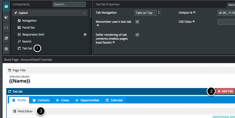
Step 3: Configure a Tab Set to query your models as needed
- Drag and drop a tabset into your page.
- Click to add tabs.
- Fill each tab with relevant components.
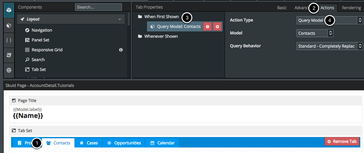
Click Actions for each tab to query the models used in that tab
- Click on each tab.
- Click Actions.
- Add an action to Query the appropriate model whenever this tab is first shown (or whenever it is shown, as you wish).
Repeat for each tab.
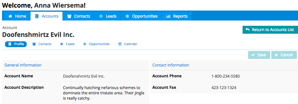
So far, we’ve created a detail page that loads faster because it’s not loading all its models on page load.
Part II: Transform your Detail Page into a One Page App
Overview of the Paradigm
- We’ll recreate the “Salesforce Tabs” on top of the page (Step 4).
- On each list there will be a row action to View Record Details - this will use the current row’s data to query the detail model (e.g. Account) (Step 8).
- When the Detail Model is queried, the List will be hidden (Step 6).
- The contents from the Detail Page are housed in a Wrapper that will only render when the Detail Model is queried (Step 7).
- In the Detail Wrapper, there’s a Page Title Action called “Return to List” that will empty the Detail Model and query the List Model, thus hiding the Detail Wrapper (Step 9).
Step 4: Reproduce Salesforce Tabs, as a Tab Set
Note
Clone this page before you start making huge changes. (Especially if it’s a live page.)
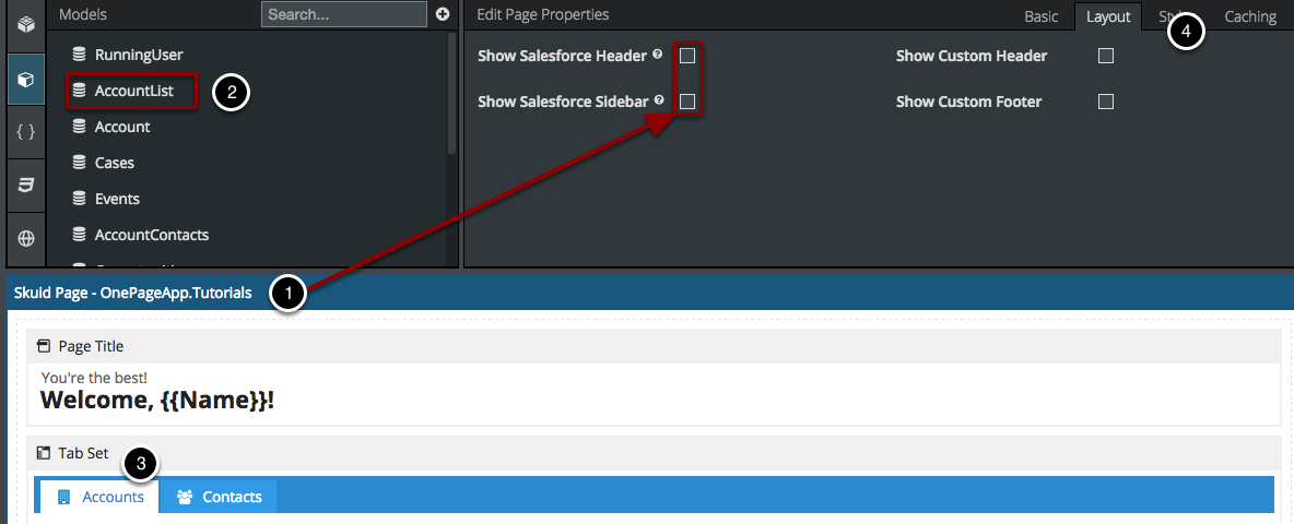
- In Page Properties > Layout you can choose NOT to show the standard Salesforce header on this page since we’re replicating it, at least the tab functionality. To replicate all of its functionality, see Compose your Own Branded Header and Navigation.
- Add more models to your page, as needed. You may need to rename some so you don’t get confused. Whenever you have a lot of models on a page (or connected via Page Includes) it’s wise to establish a naming convention. Naturally we’re choosing not to load these models’ data on page load, but we’ll choose to query them when we’re ready for them (see Steps 2-3).
- Add a Tab Set to be your “Salesforce Tabs” Tab Set. For now, we’ll just have an Accounts and a Contacts tab.
- Another way to do this would be to use the Navigation Component and, when each item is selected have it query its own model and empty the other models (to hide the other page contents that you don’t want to see for each item; you can also use wrappers to group components that you want to be shown and hidden together - see Step 7).
Step 5: Reconfigure the condition on your Detail Model
Create a Condition on your Detail Model where the Record ID is filterable default off.
- Click Detail Model > Conditions > + to add a new condition.
- Configure your condition so Record ID is Filterable default off. We’ll create a row action to populate this condition and query this model in Step 9.
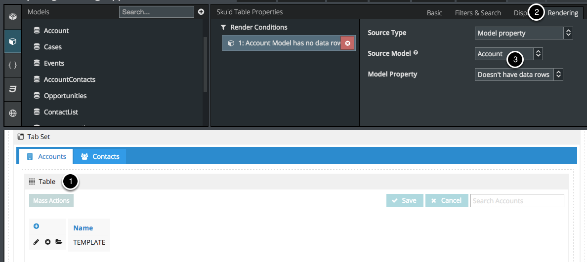
Step 6: Add a table for your List
- Add a Table on your List Model.
- In Display logic, choose to only show this table when your Detail Model is empty.
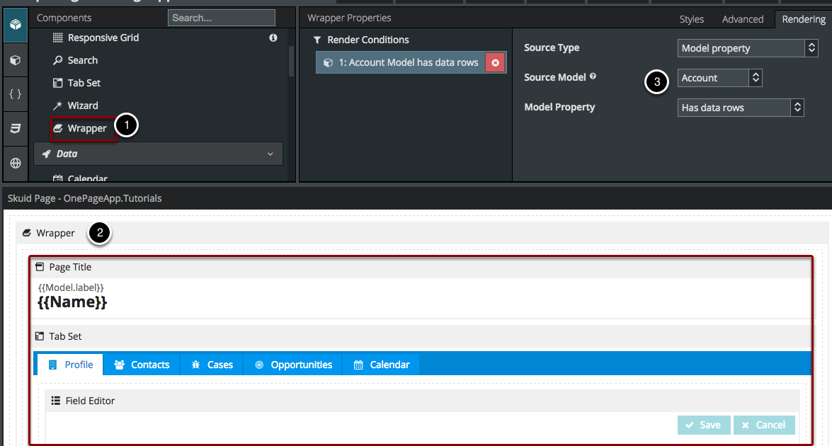
Step 7: Group your “Detail Page Components” in a Wrapper
We’re going to group the information from the Detail Page in a Wrapper so that we can conveniently show and hide it together, without having to configure conditional rendering on every component.
- Add a Wrapper to your page and drag and drop your Detail Components into it.
- In Display logic, choose to only render this wrapper (and its contents) when the Detail Model has data rows.
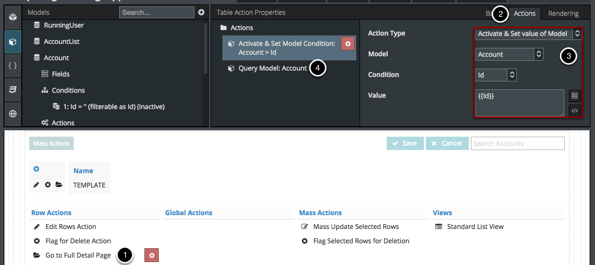
Step 8: Compose a Row Action to query your Detail Model (which will show your Detail Wrapper)
- Create a row action by clicking Table > Add Features > Add Row Action.
- Click Actions and add two actions.
- Your first action should set the Detail Model’s ID condition (see Step 5) to the ID of the row in context (using the template {{Id}}).
- Your second action should Query the Detail Model. Due to the conditional rendering we set up on the Detail Wrapper (Step 7) and on the List Table (Step 6), this should show the components in the Detail Wrapper while hiding the List.
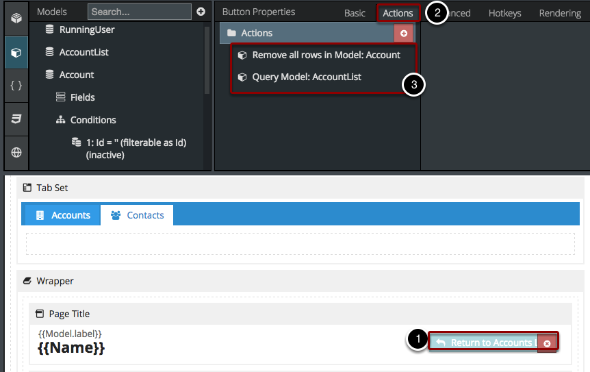
Step 9: Compose an action to hide your Detail Wrapper and return to the list
When you’re viewing the Detail part of this page, you’re going to want a way to get back to the list, so lets make an action to hide the Detail Wrapper and show the List Table again.
- Create a Page Title Action (Page Title > Add Button).
- Click Actions.
- Create two actions: one to remove all the rows in your Detail Model (thus hiding the Detail Wrapper) and another to re-query your List Model (thus showing your List again).
Repeat and Repeat and Repeat
- Also other top-level tabs should have actions to empty this model, for example if you want to see the all-Contact list, clicking on the Contacts Tab should empty your Account Detail Model so that the Account Detail info doesn’t still show up at the bottom.
- In theory you could repeat this process for each Detail Page you want to include on this big page.
- This can get really complex, really fast which leads us to:
Compelling Reasons Not To Build a One Page App
I know, I took you on this fun-filled adventure just to tell you at the end that you should actually NOT compose things this way?? Basically. But it’s fun to see what you can do in Skuid, so you can be more creative in the future composing your multi-page apps.
Problems with this One-Page App Paradigm
- The problem with building a one page app is that it gets really complicated really fast, so it’s better to build it out as separate pages so you’re not scrolling all over the Composer and opening multiple layers of tabs, wrappers, drawers, modals, etc.
- The tab action / conditional rendering paradigm I used above gets more complicated with each model you add.
- Also, even though you won’t run into heap size limits if you’re continually emptying and re-querying your models, you will run into XML Length Limits (this is a real thing!) if your page is ridiculously complex.
The best way to build an app in Skuid is to use principal / dependent pages
Compose a principal page with a header, navigation, and all the models / layout you want to be on every page of your app, and then build out the app using dependent pages. You can also use page includes.
