v2 Page API Migration Utility
Skuid’s page API migration utility expedites moving Skuid pages from API version 1 (v1) to version 2 (v2). It does this by automatically converting as many v1 elements to their v2 equivalents, and then listing other potential adjustments as manual migration tasks that must be dismissed from within the Composer.
This feature is available in any Skuid environment containing v1 pages.
Before You Begin
While the utility is designed to guide you through much of the migration process, there are several things to consider before jumping in:
- While many components are very similar, several components and component features work differently in the v2 Ink component pack. We recommend that you become familiar with v2 components, or at least have their documentation available as you explore your converted pages. See v2 component documentation for more information.
- One fundamental change in v2 is that the vast majority of style rules are no longer handled through themes or in-page CSS. Instead, design systems, created within the Design System Studio, determine the visual appearance of the UI. There are also options to extend those styles with code.
One of the first steps in migrating a page is selecting its new design system. Because of that, recreating your themes as design systems before migrating your page is encouraged. You can always change a page’s design system later.
- All components are migrated using the Default style variant.
- If you utilize multiple variants in your design system, you’ll need to assign those variants manually within the Composer.
- Custom code is very different in v2. You will need to rewrite any custom field renderers or custom components used within your v1 pages. If you are unfamiliar with how the new syntax and paradigms in v2 code, see the UI Code section of our docs.
- Updating pages to resolve their migration tasks and redeploying those pages are both tasks that can take longer than a single sitting to complete. Consider using some form of task management system to track the progress of your migration.
The Migration Process
Page migration can be broken into three separate processes:
- Converting a page to v2 from the Pages list
- Addressing migration tasks in the Composer
- Deploying the fully-migrated v2 page in place of the v1 page
Converting a page to v2
From the Skuid Pages list
Click More Options on the page you wish to migrate.
Click Migrate to v2.
This opens the introductory modal, which explains the initial steps of migration. Click Next.
In this step you’ll do a few important things:
Select the page’s new design system. While it’s highly encouraged that you have a design system prepared before migrating pages, you can always update this later.
If this page is a dependent page, you’ll select a new principal page. It is important that you convert your principal pages first and that you migrate the correct principal page for each dependent page. If you select a different principal page—or one with altered page regions—then you may see unexpected page layouts for your dependent pages.
- The dependent page will inherit the design system of the principal page.
After making your selections, click Migrate.
At this point Skuid does several things:
Your v1 page is cloned as a v2 page. That means your v1 page remains unchanged. This allows you to reference your v1 page—and keep it deployed without disrupting production—while you ensure your v2 page is properly migrated.
The v2 page is converted to use as many v2 equivalent features as possible. Your v1 components become their v2 counterparts, and most action lists and snippets will transfer. In-page CSS does not transfer, as visual styles are now referenced from the page’s design system.
- It’s important to note that some action lists and other features do not transfer. See Common Migration Tasks and Differences below for more information
With the page cloned and converted, you can now address migration tasks within the Composer.
Addressing migration tasks
When a page is migrated, it gains the Migration in progress status within the pages list. To “complete” and remove this status, you must address all of the migration tasks within the converted page.
To view a page’s migration tasks, open it in Composer. Then, click the button to open a sliding panel containing migration tasks.
Outstanding tasks are saved within the page, so you can revisit and resolve those migration tasks as your time allows.
Migration tasks represent both low-risk “In case you missed it” changes of v2 paradigms, as well as UX-affecting issues. Be sure to review tasks carefully.
Each task has two actions:
- View: This focuses the Composer window on the task as closely as possible. For example, tasks dealing with JavaScript snippets link to the JavaScript tab, while tasks explaining differences on individual components focus on the component in question within the canvas.
- Dismiss: This resolves the task from the task list, removing it from view. However, to save the dismissal of a migration task the page must also be saved.
You can retrieve recently dismissed migration tasks by clicking Undo or using the Undo hotkey (Ctrl +Z or ⌘+Z).
Note
It is also possible to retrieve older migration tasks by revisiting older page revisions. However, be careful while doing this, as revisions are only created when a page is saved. It’s possible to dismiss multiple tasks between page saves—and thus revisions may renew several tasks at once. If using page revisions in your migration process, name them appropriately to keep track of your changes.
To complete a page’s migration and resolve its “migration in progress” status, all tasks must be dismissed and then the page must be saved.
Note
While migration tasks are meant to capture the main points to consider when migrating a page there could be other issues in your page’s user experience. Before deploying your page, thoroughly test and compare it to your v1 page’s functionality.
Redeployment
Because your v1 page remains available for comparison’s sake while migrating your v2 page, your production environment should see no page-related service interruptions. However, after completing a page’s migration, you’ll need to take some steps to deploy the v2 page in place of the original v1 page.
In Skuid Platform, you must go to any app that includes the v1 page, add the newly migrated page, and update its page slug to match. See the Deploy docs for more information.
Common Migration Tasks and Differences
While the migration utility either automatically converts or explains how to manually update most migration tasks within your page, this section covers some additional differences you may see or provides more information about tasks noted in the task list.
Actions, buttons, and filters from many components now transfer to separate Button Group components
In v1, many component actions and filters are incorporated into the component itself—nested within tabs in the properties pane or only accessible by clicking specific parts of the component within the canvas.
While many component settings are still accessed this way, many buttons and filters that were previously part of some components (like Decks, Field Editors, and Tables) have been moved into distinct Button Group and Filter Set components. This change allows for more enhancements and options in some cases, while retaining existing functionality. However, the runtime will look different.
For example, the v1 Table’s default actions—inline record creation and mass updating records—we displayed within the Table component. However, the migration utility converts these actions as buttons within a separate Button Group component.
v1 Table actions:

How these action are migrated to v2:

Calendars can now accept date fields
The v2 Calendar component can use date fields—which gives it new functionality over its v1 counterpart. In v1 Calendars, some builders would utilize a UI-only formula field to convert their date fields to datetimes. This design pattern is no longer necessary.
While this should still function in v2, consider making your life easier and your Calendar more intuitive by removing that conversion!
v2 UI Code: Custom field renderers and custom components
Field renderers are used to customize the view of a field within an existing Skuid component. These are written in JavaScript and then selected within a component’s field’s properties. Custom components are entirely new UI elements that are placed within the canvas.
While v2 allows for these custom UI elements, they are built in very different ways via the virtual DOM. For conceptual information, see the UI Code topic.
Field renderers
For field renderers, often the fastest way to use them in v2 is using the element rendering strategy. Though it loses out on most of the advantages of virtual rendering, using this strategy requires less work in converting v1 code, since it utilizes direct DOM manipulation.
Refer to this element-based field renderer example for an illustration.
For example, many v1 field renderers begin by setting up some basic reference variables and make thorough use of them throughout the code:
1
2
3
var field = arguments[0],
  value = arguments[1],
  $ = skuid.$;
To access this same data in v2 with minimal changes, begin read and edit functions with:
1
2
3
4
let context = fieldComponent.getCPI().getContext(),
  field = context.field,
  value = context.value,
  $ = skuid.$;
Custom components
Custom components are in an open beta period as of the Chicago release.
If your use case requires custom components in v2, contact your account representative for more information.
Table row action differences
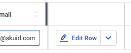
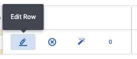
In v1 row actions were displayed on the left side of Table components, and their labels were instead revealed as tooltips on hover:

In v2, row actions are now displayed on the right side of the Table as Button Groups by default, with their labels visible in the Table. If there are more than two actions, they also collapse to a More Options menu:

If preferred, it is possible to replicate most of the v1 functionality of row actions.
Icons-only actions with tooltip labels
To display row actions as tooltips appearing on hover instead of text labels, do the following for each row action:
- Click the row action within the Table in the canvas.
- Remove the text within the Action label property in General properties tab.
- In the Tooltip tab, add the appropriate label in the Text property.
Borderless row action icons
The default Button Group has borders, which appear within the Table. To create a borderless set of row actions, create a Button Group style variant and apply it to the Table style variant.
In the Design System Studio:
- Navigate to Components > Button Group.
- Click Add to create a new style variant.
- Give the style variant a name, for example Borderless Buttons.
- Set the Nested components > Button variant to Borderless.
With the Button Group variant created, apply it to the Table component’s Button Group.
In the Composer:
- Click the Row Actions element within the Table in the canvas.
- Navigate to the Styles tab.
- Set the Style variant to the variant created above.
Display all row actions
To do this, you’ll need to make your row actions Button Group have a detached display type.
- Click the Row Actions element within the Table in the canvas.
- Set Display Type to Detached.
Your row actions no longer minimize to a More Options menu.
With all of the above modifications applied, the Table row actions appear like this:

Icon differences
While most icons convert easily to v2, a notable exception is that the Silk icon set is no longer available in Skuid. If you utilized these icons, references to them will be lost in migration. Additionally, if you utilize HTML to insert icons, with code like <i class="fa"></i>, you may see issues due to v2’s HTML constraints, particularly in templates or fields.
Consider updating these icons when migrating your pages and verifying they display correctly once migrated. If needed, enable any necessary Allow HTML properties within the field or component.
Component and page spacing is different in v2
Some spacing properties used on your v1 page do not directly translate. Your page will still function, but it may look different. You can update a component’s spacing in the Design System Studio, and you can adjust the page’s spacing in the page’s properties.
Wrapper components with width assignments are converted to Responsive Grids
Wrappers no longer have a Width property in v2. Since this is often done to facilitate page layout, these components have been converted to Responsive Grids—the width value is retained as a grid division within that Responsive Grid.
Panel Sets assigned the “Fluid with Sidebars” type convert to Responsive Grids, but won’t resize to fit the screen
A “Fluid with Sidebars” Panel Set allowed some panels to be given explicit pixel width while the remaining panel would expand or contract as needed to fill the rest of the screen width. That remaining panel would also constrain its components to its width so the panel itself would not wrap below the other panels.
These Panel Sets are converted to Responsive Grids that maintain the mix/max-specified width on their grid divisions, but the remaining division will have no properties. This means that the division will not resize its components or itself to fit the screen.
It is possible to better replicate this v1 behavior:
Add the width of all other divisions with a specified width, listed in the example below as sumWidth.
Configure the division’s properties:
Flex ratio: 1
Minimum width: A smaller width, for example* 100px*
Maximum width: calc(100vw - sumWidth)
So assuming sumWidth equals 325px:
calc(100vw - 325px)
Components now “lazy load” out of the box
In v1, lazy loading (or deferred rendering) properties had to be manually enabled. v2 components work this way by default, only rendering data when necessary, so these properties are no longer available.
Global Feedback is not available in v2
Skuid’s Feedback functionality, which allows users to provide feedback on individual Skuid pages, is not available for v2 pages.
Improved v2 Table sorting
While v1 Tables had column sorting at runtime, we thought it could be improved in v2. As of the Chicago release, we’ve made column sorting on Tables, especially multi-column sorting, more intuitive, and we’ve also included the new Sort Builder.
Selecting the wrong principal page can break a page migration
dependent pages require principal pages because their content is structured around the page regions of its coupled principal page. This is why it’s important to migrate principal pages first.
However, if you do migrate a dependent page and select the wrong principal page—or maybe the page regions changed in migration—then you could see unexpected behaviors. Of these, the most likely is not seeing the dependent page content within the canvas. This means that Skuid couldn’t find an appropriate page region within the principal page to place the content.
If this happens, verify that the right principal page was used in the migration process. If it was, then ensure the principal page was migrated properly and that none of its page regions were altered.