Action Framework
The Action Framework is a collection of actions used to interact with data, the user interface, data sources, and page logic. The framework also refers to the variety of triggers—row actions, buttons, model actions, etc.—where these actions are configured.
When to use the Action Framework
Any interaction involving data or the user interface is a good candidate for the Action Framework. For example:
- Create a single button in a popup that both saves model data and closes the popup.
- Create a row action that opens a popup, applies specified model conditions, and updates fields—all with one click.
- Create a button that toggles a component on or off, or opens and closes a sliding pane.
- Build an action script that creates a document in the cloud, sends an email, and updates a connected record.
Using the Action Framework
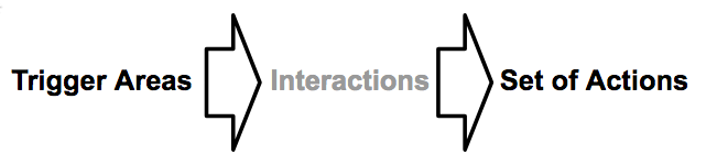
A few action concepts:
 |
||
|---|---|---|
| Actions are configured on specific trigger areas (such as buttons representing row, global, or mass actions) within a Skuid page. | In some trigger areas, you can specify interactions: specific ways a user interfaces with that trigger element. | Within the interaction, create a set of actions. |
A list of actions is an action script. A script (or part of a script) that has been saved for reuse is an action sequence, a feature available on Skuid versions v11.0.0 and above.
Warning
Context is critical with actions: they may only work with a specific record or set of records— and not work with others.
Action trigger areas
Trigger areas can be set:
On the page through interactions (clicks, presses, or swipes).
On components using row, global, or mass actions. The Action Framework is available in the following components:
- Table component (row, global, and mass actions)
- Wizard component (buttons)
- Page Title component (buttons)
- Queue component (Item On-Click Action Type)
- Deck component (click, swipe, and press interactions)
- Image component (click, swipe, and press interactions)
- Tab Set component (Tab Set actions)
On models through model actions.
Note
Model actions are added directly to the model.
Adding Actions
Add actions to pages and components by selecting an “actionable” element to open its properties and access the Actions or Interactions tab. (Most components have at least one element that can have actions added to it.)
To add actions to a page [[]]
- Click the page’s border, or the Skuid Page header.
- Click the Interactions tab in the Properties pane.
To add actions to a Table, Deck, or Queue component [[]]
Click:
Add Interactions or
Add Row actions or
Add Global Actions or
Add Mass Actions
Note
Or, on the Table component, click the Add Features dropdown arrow, then select the desired trigger type.
- Click the new action to open the Actions tab and edit:
- Action Type: Several action types are available; select Run Multiple Actions to create an action script via the Actions tab.
- Action Label: A helpful, plain language label for the action.
- Action Icon (optional): An icon for the action.
- Click the new action to open the Actions tab and edit:
To add actions to a button [[]]
- Click the button on the canvas.
- Click the Actions tab in the Properties pane.
Once the Action tab is displayed
- Click Add Action.
- Click the newly created action.
- Set its Action Type.
- Configure any properties associated with the action type.
- Repeat as necessary for each action in the action script.
Note
Need to delete an action? Click Remove Action.
Using Action triggers
Row Actions
Row actions are record-level actions represented by row buttons that use a record on the component as the context. Use Row Actions to add actions that affect individual records, such as emailing a lead, or opening a Table drawer to see more details on an account.
Pre-configured Row Actions
The Action Type property includes the following pre-configured Row Actions.
Note
selecting these Row Actions will not display the Actions tab or allow you to access the Action Framework.
- Redirect to URL: Sends users to another web page. This is the equivalent to the Go to URL action.
- Edit Record: Allows users to edit rows in the table. (Used with Save.)
- Delete Record: Allows the row in context to be deleted. (Used with Save.)
- Drawer: Opens a drawer to view additional information. This is the equivalent of the Open/Close a drawer action.
- Pop Up: Opens a popup to view additional information. This is the equivalent of the Show Popup action.
- Custom: Executes a Skuid Snippet. This is the equivalent of the Run a Skuid JavaScript Snippet action. Snippets must be registered using skuid.snippet.registerSnippet(snippetName, snippetFunction).
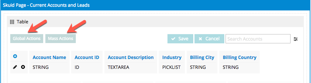
Global actions
Global actions are component-level actions represented by buttons, typically at the top or bottom of a component. These actions do not receive context (data from a specific row or area). Instead, they are used to activate more generalized sets of actions (like opening a popup containing the Wizard component to walk the user through creating a new record).
Button Set or Page Title components are often used in lieu of global actions. However, if you want to reinforce that a set of actions is specifically associated with the component’s data, use a global action.
Pre-configured Global Actions
The Action Type property includes the following pre-configured global actions.
Note
Selecting these global actions will not display the Actions tab or allow you to access the Action Framework.
- Redirect to URL: Sends users to another web page. This is the equivalent to the Go to URL action.
- Pop Up: Opens a popup to view additional information. This is the equivalent of the Show Popup action.
- Custom: Executes a Skuid snippet. This is the equivalent of the Run a Skuid JavaScript Snippet action.
Mass actions
Mass actions display when a user selects a row in a component and perform their action script upon those selected rows. Each selected row becomes context for the action. To allow users select multiple records and then to perform actions on them—for example, updating or deleting multiple records—use a mass action.
Note
Mass actions only display when one or more rows are selected; the Mass Action then applies to all selected rows.
Pre-configured Mass Actions
The Action Type property includes the following pre-configured mass actions.
Note
selecting these global actions will not display the Actions tab or allow you to access the Action Framework.
- Redirect to URL: Sends users to another web page. This is the equivalent to the Go to URL action.
- Mass Update: Allows users to update multiple rows at once. Use to edit multiple rows with the same field values. (User click Save to complete the update.)
- Mass Edit: Makes all selected rows editable. Use to edit multiple rows with different field values. (User click Save to save the edits.)
- Mass Delete: Allows users to mark all selected rows for deletion. (User click Save to complete the deletion.)
- Pop Up: Opens a popup to view additional information. This is the equivalent of the Show Popup action.
- Custom: Executes a Skuid Snippet. This is the equivalent of the Run a Skuid JavaScript Snippet action.
Button properties for multiple global and mass actions
If you have more than one global or mass action, it’s possible to configure the way those buttons present the actions to the user. To open the Global Actions or Mass Actions properties pane, click the button representing the trigger area in the component on the canvas. (This button may be greyed out.)
- Use First Item as Default Selection (optional):
- If checked: The first global or mass action is displayed. Users can select other actions actions by clicking a dropdown arrow.
- If not checked: Create a heading for the list of global or mass actions, and list the actions under it; users can select actions by clicking a dropdown arrow.
- Button Label: The text label for the button that displays the set of global or mass actions
- Button Icon (optional): An icon for the button.
- Unique Id (optional): Skuid automatically generates an alphanumeric Id for the component; if preferred, give it a practical name.
- CSS Class (optional): Assign a CSS class to the component’s DOM element.
Interactions
Interactions employ certain Action Framework sequences based on typical ways a user may interact with a page element or component. Set interactions on the Queue, Deck, and Image components, and on the Skuid page itself via the Interactions tab.
By configuring interactions, you can design pages to be used on both desktop and/or mobile devices. This lets you create (for example) an interaction where the mobile user swipes the page from left to right and opens a left-side navigation bar; the same user on a desktop might click an on-page icon to open the same navigation bar.
Click Add Interaction, then edit:
Action Type: Several action types are available:
Click: Tapping an element on mobile, clicking on desktop
Swipe: Tapping and dragging an element on mobile. You can also clarify which direction the swipe action applies to:
- Either
- Left
- Right
Note
It’s common to use swipe interactions on the page itself; they can be particularly useful for mobile apps.
Press: Tapping/clicking and holding and element.
Note
If designing specifically for a mobile app, choose Swipe or Press interactions.
Icons for actions
When creating row, global, or mass actions for a table or on a button, Skuid provides the option to identify the action with an icon. Icon sets available in Skuid include:
- Standard
- Font Awesome 3
- Font Awesome 4
- Foundation
- Icons8 Windows 10
- Ion
- Material
- Silk
Note
The Silk icon set is only available when using the Skuid Classic theme, or when using themes that are based on the Classic theme.
To select an icon:
Click the action.
In the Table Actions property pane, click next to Action Icon to open the Choose an Icon popup.
Select the icon set from the right picklist.
Search for an individual icon in the set using the Search field.
Note
The Search field only searches within the selected icon set.
Click the desired icon.
Click Save.
Best practices
To maintain consistency through a Skuid page, use icons from the same icon set.
Similarly, when possible, use the same icon set throughout an app, both for consistency and performance.
Warning
Using more than one icon set on a page may result in a slight performance lag. The more icon sets employed on a page, the more noticeable the lag.
Icons in Skuid themes
All Skuid themes—including customized themes―default to the Standard icon set.